Forum adverts like this one are shown to any user who is not logged in. Join us by filling out a tiny 3 field form and you will get your own, free, dakka user account which gives a good range of benefits to you:
No adverts like this in the forums anymore.
Times and dates in your local timezone.
Full tracking of what you have read so you can skip to your first unread post, easily see what has changed since you last logged in, and easily see what is new at a glance.
Email notifications for threads you want to watch closely.
Being a part of the oldest wargaming community on the net.
If you are already a member then feel free to login now.
2013/05/03 20:06:14
Subject: Dark Elf scheme - colour theory confusion
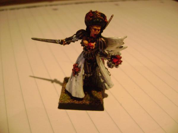
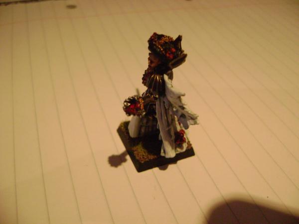
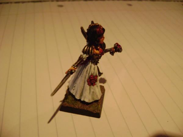
So I've been thinking of getting into the Dark Elves, and wanted to fix upon a really solid scheme that would be visually striking and interesting. I also wanted to try out a pair of colours that I've not really used much, brass and white. Below is some pictures of a test model of the potential scheme - note that this VC model has more cloth than a DE model would. The hair is unfinished.
Sorry for the picture quality, I don't have access to a decent camera. The paints that I used are:
Spoiler:
Brass = Warplock Bronze, black ink, runelord brass
White = Celestria Grey, Ulthuan Grey, White Scar
Silver = Leadbelcher, black ink, mithril silver
Skin = dwarf flesh, dwarf flesh + elf flesh, elf flesh, sepia ink
Red = mechrite red, black ink, blood red
So I went and looked at colour theory, and as near as I can tell this is the score with the model. The brass is a dark-value and low-intensity orange. It is contrasted with pure white, which is a high-value neutral. The spot/highlight colour for the white is red, a high-intensity and high-value analogue of the orangey brass. The brass is itself in places contrasted with silver, which is effectively another form of the white.
Am I right in this understanding? The concern is to avoid problems that I've had in the past, with schemes that have been so dark that the model was invisible (too uniform value) or just clashing (too many hues). If I am right in my understanding, is there any suggestions that people would make for the scheme? I was toying originally with switching the white cloth with red, but that would be two analogous warm colours next to each other, which I'm worried would make it look bland.
Any help is greatly appreciated! Colour theory confuses me greatly.
2013/05/03 23:01:30
Subject: Re:Dark Elf scheme - colour theory confusion
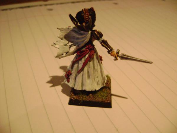
Bear in mind that the reflectivity of metallic paints can screw with pure theory. Thinking of the colors as a desaturated orange tone (brass) and white or pale grey (silver), you would expect more contrast than will sometimes evidenced, as a glare will make both colors trend toward white. Compare the sword and vambrace in the first picture, then the second- the two metallic colors are more or less distinct, depending on how much light they catch.
The Dreadnote wrote:But the Emperor already has a shrine, in the form of your local Games Workshop. You honour him by sacrificing your money to the plastic effigies of his warriors. In time, your devotion will be rewarded with the gift of having even more effigies to worship.
2013/05/04 14:02:29
Subject: Dark Elf scheme - colour theory confusion
Thanks for the article link, it was a helpful read (though he failed to apply it to models enough, I thought).
So brass - effectively orange - is really a high value colour close to white in this case? I'm thinking of using colours from red to yellow as the compliments for the brass armour, with blue (up to white) as the spot/highlight colour, which would seem to fit into the colour theory stuff. In this case the tendency of the brass towards white may be a problem?
2013/05/04 14:24:21
Subject: Dark Elf scheme - colour theory confusion
darefsky wrote: Here is the best article I've read on color theory and how it applies to models.
This was a great read. Thanks for posting it.
Glad it was helpful. There is a second article in the series as well.
I really like handcannononline.com their painting, modeling and terrain tutorials are great. They are geared more towards PP stuff but it translates well as core techniques don't really change.
Hey all, thanks for the replies so far. I'm having the problem that while I really like how the Vampire looks, I'm not sure why, which makes it troublesome to devise a colour scheme based upon it.
So I decided to try out painting up a Gondorian chap that I had lying around, working on the theory that he (ironically) looked the most like a Dark Elf out of all my models.
Now my first observation is that the red shield is a disaster - it draws the eye so well that you don't notice anything else. The brass looks way more interesting in the rear angle shot. I was working off the assumption that the brass = orange*, and so red would be a good compliment. However I think that actually it looks more like a contrast to the slightly blue white.
Beyond that, I observe that the brass - especially the darker portions - contrasts well with the white. And the white contrasts well with the red flowers on the vampire. But from my reading of colour theory, I should be looking at reds and yellows to compliment the brass, with blue contrasting; if the white is indeed slightly blue (eyedropping the GW website's Celestra Grey sample seems to suggest as much) then that would explain why it looks decent next to it.
I guess my question is, what do people think has gone wrong with the Gondorian here? Should I stick to white/cyan shields with red designs, for example?
* According to photoshop, I'm right. When I used the eyedropper tool on the Gondorian's highlights, he colour code is 4A3726, which equals a very dark and mid-saturate orange.
2013/05/05 12:29:35
Subject: Dark Elf scheme - colour theory confusion
That red on that much "real estate" on the model doesn't work and does draw the eye. However It would probably look really good if the shield were say off white and the raised edges (top and bottom) were done in red.