Switch Theme:

Are these good, color scheme and painting  [RSS] Share on facebook Share on Twitter Submit to Reddit
»
Author Message
Advert


Forum adverts like this one are shown to any user who is not logged in. Join us by filling out a tiny 3 field form and you will get your own, free, dakka user account which gives a good range of benefits to you:
  • No adverts like this in the forums anymore.
  • Times and dates in your local timezone.
  • Full tracking of what you have read so you can skip to your first unread post, easily see what has changed since you last logged in, and easily see what is new at a glance.
  • Email notifications for threads you want to watch closely.
  • Being a part of the oldest wargaming community on the net.
If you are already a member then feel free to login now.


Made in qa
Disbeliever of the Greater Good


First minitures, is the scheme good?
[img]http://www.dakkadakka.com/gallery/501657-Custom%20Tau.html
[/img]http://www.dakkadakka.com/gallery/501658-FW%20troops%20Custom.html
[img]http://www.dakkadakka.com/gallery/501659-Ethereal%20with%20warpaint.html
[/img]http://www.dakkadakka.com/gallery/501660-Battlesuit%20bosses.html

Like a Tau boss!
 
   
Made in us
Blood Angel Captain Wracked with Visions


You might want to fix up your image tags. It should look like;
[*img]image[/*img]
but without the *


Made in us
Old Sourpuss


Lakewood, Ohio

Here, I've done the work for you:


Okay, so now that we've gotten your pictures properly linked, I'm going to be blunt... you have A LONG way to go before you get something solid.
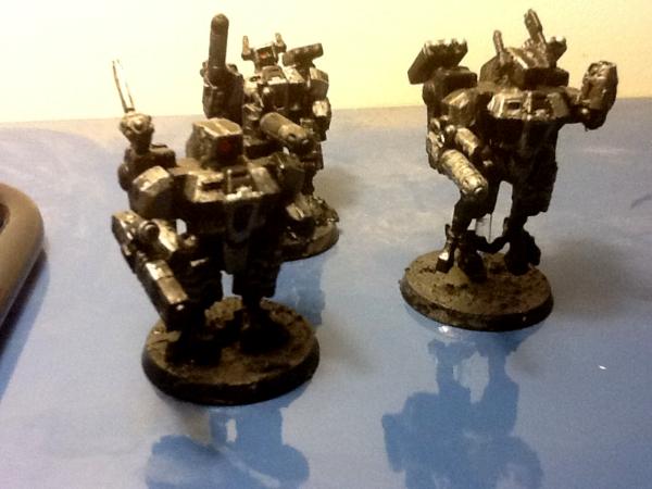
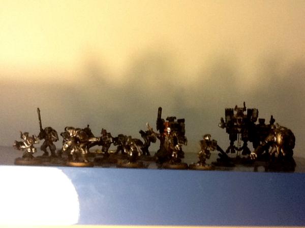
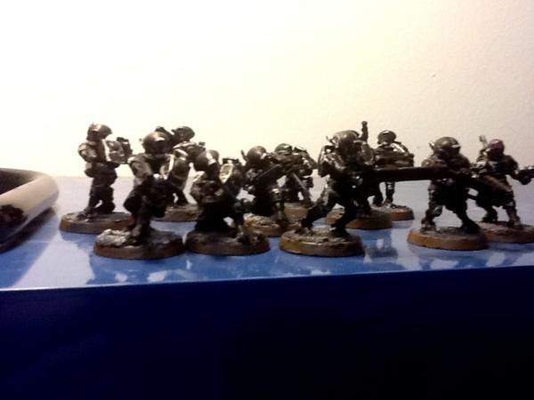
1) Use better lighting and the macro setting (looks like a flower) on your camera. Even most cell phone cameras have this setting now. If you don't have access to better lighting, take pictures outside. Daylight is best light (for the most part). Most of your issues stem from lack of lighting, without proper lighting it makes it very hard to see your minis with the colors they actually have. Just looking at the fire warriors, they seem to be nothing more than black and silver. This isn't a bad color combination on it's one, but you have to provide something else to give shape and depth besides silver and black. Throw some red, blue, anything to break up the very harsh black tones.

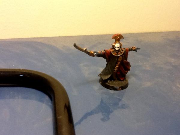
I will say this, the best model in your gallery atm is the Ethereal. You've got nice color contrasts, it's not just black and silver, you've got some reds, some whites, some golds. Better than your standard troopers.

Suggestions:
Go back, add some more colors, work on line control (this is something I still struggle with), and take pictures outside if you don't have a good photo booth setup.

DR:80+S++G+M+B+I+Pwmhd11#++D++A++++/sWD-R++++T(S)DM+

Ask me about Brushfire or Endless: Fantasy Tactics 
   
Made in fr
Swift Swooping Hawk


I like the ethereal scheme, it's hard to tell with the other because of the photo quality. Best off just taking a picture of one model at a time so you can light it better.
   
 
Forum Index » Painting & Modeling Showcase
Go to: