Hello all,
I'm hankering after starting a new army with the main intention of improving my painting rather than any particular gaming competitiveness. I've been playing my Alpha Legion army for a few years now and I'm pretty sick of painting blue and green. The lure of Chaos is still strong though, so I'm going to collect a Daemon force. After all, I can use them as allies. They also provide probably the most variety of any army for painting purposes, so should be a good way to improve my skills.
I decided to delve into colour theory a bit in order to plan out the colour schemes for the army. I decided to give each god its own pallette, covering the entire spectrum but in such a way that each god has at least one colour that overlaps with another god, giving the army some harmony.
Tzeentch Palette
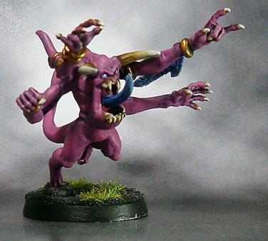
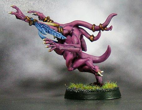
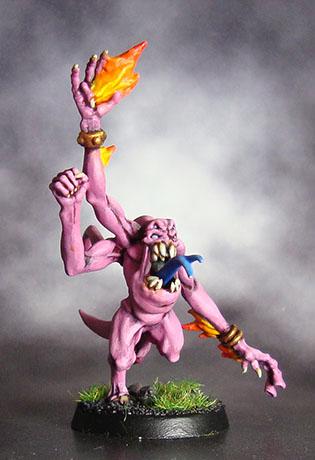
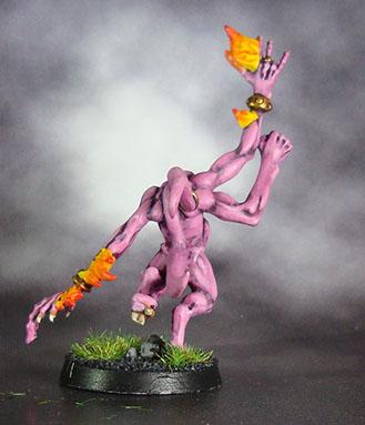
I decided my Tzeentchian contingent would be dream orientated, so I wanted them brightly coloured. The problem with doing this is that they'll steal the show away from the rest of the army - I think keeping the colour scheme fairly unified should solve this. I went with a harmonic palette, and for the flames that seem to be on most Tzeentch models I chose the base colour's complimentary colour.

So we have a blue-purple as the base colour, straying into magenta which will be used for the Horrors and also blending, and a blue/cyan for the same but on different squads to differentiate them. The complimentary colour is an orange/yellow, and will be used mainly for flames.
 Slaanesh Palette
Slaanesh is another God which requires a complimentary colour in addition to their harmonies, so I gave them the exact opposite palette to Tzeentch :

This ends up with orange/yellow as the base tone, ranging from pure orange down to green/yellow for the harmonics. This is complimented by a deep blue which is going to be claws, horns, that sort of thing. This makes a colour scheme as follows :

This doesn't really look right for Slaanesh, so I decided to make each colour a little closer to white :

This worked well
 Nurgle Palette
Nurgle's palette sits exactly between Slaanesh and Tzeentch's. It doesn't need a complimentary colour really, I think Nurgle should be more uniform.

This gives this rather fetching colour scheme.

It's a little bright and 80s though. So lets do the opposite of Slaanesh and tone it down a bit:

Much better! We'll use the Deep green as the base shade, highlight it up to the yellow/green and do some nice bluish intestines. Should look pretty sweet.
So last but certainly not least, we have Khorne...
Khorne Palette

This again is between Tzeentch and Slaanesh, on the other side of the spectrum, because we obviously want some red in there!

I don't think this needs much tweaking. Still a bit 80s bright though. Lets do the same as we did with Nurgle:

Excellent. The brown can be used a bronze, and the purple is going to be an interesting counterpoint to the pure red you see on most Khorne models.
I'm going to start on Tzeentch first. I'm likely to start on a squad of Horrors, see how the purple works out. I figure I'll do two squads of them - one purple with blue fire, and one purple with red fire, to differentiate between them. The other Tzeentchian models I reckon will go with the blue base. Let me know your thoughts!