| Author |
Message |
 |
|
|
|
|
Advert
|
Forum adverts like this one are shown to any user who is not logged in. Join us by filling out a tiny 3 field form and you will get your own, free, dakka user account which gives a good range of benefits to you:
- No adverts like this in the forums anymore.
- Times and dates in your local timezone.
- Full tracking of what you have read so you can skip to your first unread post, easily see what has changed since you last logged in, and easily see what is new at a glance.
- Email notifications for threads you want to watch closely.
- Being a part of the oldest wargaming community on the net.
If you are already a member then feel free to login now. |
|
 |
2013/09/26 23:16:46
Subject: FIXED: Advice on Gold/Silver Space Marines?
|
|

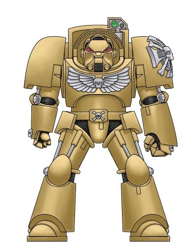
Blood Angel Terminator with Lightning Claws
|
I'm currently working on the color scheme for my own chapter of Space Marines. Its one thing to see a picture of them, but I really want to have an idea of how this color scheme will look like in real life before I invest in it, since from my personal experience largely metallic models are very hit or miss. So I was wondering if anyone has painted their marines in a similar color scheme and/or if you believe my current colors are too tacky or gaudy, and what recommendations you have to change it.
The Gilded Ones:
TACTICAL
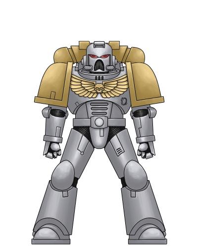
SERGEANT
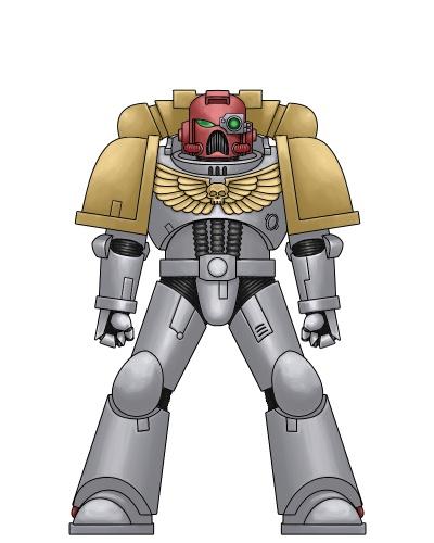
STERNGUARD VETERAN
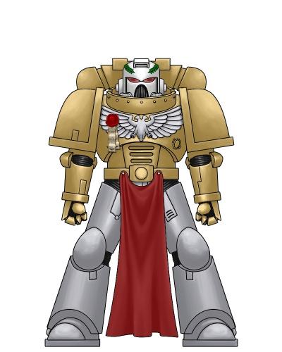
COMMAND SQUAD VETERAN
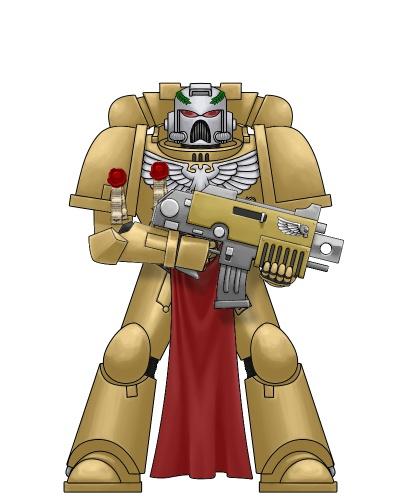
CAPTAIN w/ ARTIFICER ARMOR

ASSAULT MARINE
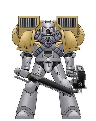
VANGUARD VETERAN
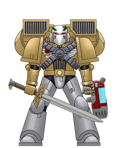
CAPTAIN w/ JUMP PACK
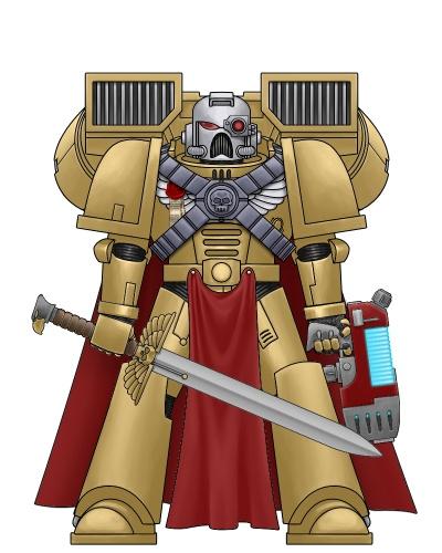
TERMINATOR
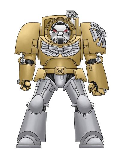
TERMINATOR CAPTAIN
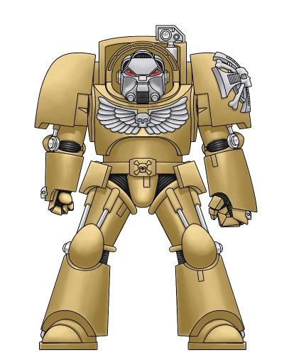
HONOUR GUARD
CHAPTER MASTER ADAMIS AURELIS
w/ ARTIFICER ARMOR
w/ TERMINATOR AMOR
|
|
This message was edited 4 times. Last update was at 2013/09/27 04:12:43
GW: "We do no demographic research, we have no focus groups, we do not ask the market what it wants" |
|
|
 |
|
2013/09/26 23:17:48
Subject: Advice on Gold/Silver Space Marines?
|
|
Loyal Necron Lychguard
|
Your pictures don't work. Upload them to Imgur or something; don't hotlink from B&C.
|
|
|
|
|
2013/09/26 23:43:23
Subject: Advice on Gold/Silver Space Marines?
|
|
Colonel
This Is Where the Fish Lives
|
 MasterSlowPoke wrote: MasterSlowPoke wrote:Your pictures don't work. Upload them to Imgur or something; don't hotlink from B&C.
Better yet, upload them to Dakka.
|
 d-usa wrote: d-usa wrote:"When the Internet sends its people, they're not sending their best. They're not sending you. They're not sending you. They're sending posters that have lots of problems, and they're bringing those problems with us. They're bringing strawmen. They're bringing spam. They're trolls. And some, I assume, are good people."
|
|
|
|
|
2013/09/27 00:21:44
Subject: Advice on Gold/Silver Space Marines?
|
|
Blood Angel Terminator with Lightning Claws
|
D'oh! Sorry about that. Fixing now...
|
GW: "We do no demographic research, we have no focus groups, we do not ask the market what it wants" |
|
|
|
|
2013/09/27 00:28:00
Subject: Advice on Gold/Silver Space Marines?
|
|
Boosting Space Marine Biker
|
Actually commenting on metallic marines: I've found that metallics are best over a neutral base coat such as grey or khaki. Some people swear by black, but my experience with any metallic over black darkens it too much. How gaudy it looks is dependant on the metallic paint itself, and I swear by the Vallejo Game Colors metallics.
|
"If A is a success in life, then A equals x plus y plus z. Work is x; y is play; and z is keeping your mouth shut." - Albert Einstein |
|
|
|
|
2013/09/27 00:29:19
Subject: FIXED: Advice on Gold/Silver Space Marines?
|
|
Blood Angel Terminator with Lightning Claws
|
Thanks Peredyne! Pics should be working now.
|
GW: "We do no demographic research, we have no focus groups, we do not ask the market what it wants" |
|
|
|
|
2013/09/27 00:34:54
Subject: FIXED: Advice on Gold/Silver Space Marines?
|
|
Long-Range Land Speeder Pilot
|
It's a very similar theme to Iron Fists, but a bit inverted, and Iron Fists look great.
My experience with metallics is limited to Citadel, but I know Vallejo has some amazing metallics. I just can't be bothered to use isopropyl or anything other than water to thin them.
I find as long as you use Citadel's base Leadbelcher for silver and Balthasar Gold as a first layer, and then use your choice of metallic on top, it looks just fine. Ironbreaker looks too similar to Leadbelcher and Runefang Steel is extremely bright though, so if you wanted a medium between Ironbreaker and Runefang I don't know what you can do other than a wash, since I don't believe you can mix black or white with metallics like you could with other colors.
Balthasar Gold with any of the Citadel golds over it look amazing. Gehenna's Gold for a rich, slightly orange gold/bright copper look, or Auric Armour Gold for a very light, bright, shining gold. Seraphim Sepia is an amazing wash for gold. Don't use Aggrax Earthshade, it's not nearly as good as Devlan Mud or Seraphim Sepia for gold.
|
Hail the Emperor. |
|
|
|
|
2013/09/27 15:53:30
Subject: FIXED: Advice on Gold/Silver Space Marines?
|
|
Blood Angel Terminator with Lightning Claws
|
 Tyberos the Red Wake wrote: Tyberos the Red Wake wrote:It's a very similar theme to Iron Fists, but a bit inverted, and Iron Fists look great.
My experience with metallics is limited to Citadel, but I know Vallejo has some amazing metallics. I just can't be bothered to use isopropyl or anything other than water to thin them.
I find as long as you use Citadel's base Leadbelcher for silver and Balthasar Gold as a first layer, and then use your choice of metallic on top, it looks just fine. Ironbreaker looks too similar to Leadbelcher and Runefang Steel is extremely bright though, so if you wanted a medium between Ironbreaker and Runefang I don't know what you can do other than a wash, since I don't believe you can mix black or white with metallics like you could with other colors.
Balthasar Gold with any of the Citadel golds over it look amazing. Gehenna's Gold for a rich, slightly orange gold/bright copper look, or Auric Armour Gold for a very light, bright, shining gold. Seraphim Sepia is an amazing wash for gold. Don't use Aggrax Earthshade, it's not nearly as good as Devlan Mud or Seraphim Sepia for gold.
I'd like to use Runefang Steel (formally Mithril Silver I believe) for the silver parts and Auric Armour Gold (Burnished Gold) for the gold parts. I haven't used the new metallic base paints before so I'll have to check them out. Biggest problem I've had with Auric Armour Gold/Burnished Gold is that you have to paint a lot of layers for it to look good, and then you lose some detail in the process. Or maybe I was just doing it wrong...
|
GW: "We do no demographic research, we have no focus groups, we do not ask the market what it wants" |
|
|
|
|
2013/09/27 16:38:26
Subject: FIXED: Advice on Gold/Silver Space Marines?
|
|

Bane Lord Tartar Sauce
|
Alright, I can think of a few things that you should know before you try this. When you do your iron colors, you should start with a basecoat of black. Gold, however, should be done over a nice dark brown.
With a lot of metallics, you're going to run into a serious contrast problem. The shine of all that metal blurs the details when you look at it, and that's one of the reasons that NMM has become so popular as an alternative. When you want to do a fully metallic color scheme, you need to reduce that shine by a significant degree.
Make friends with black wash (nuln oil, badab black). When you do your iron basecoat I would go with the mid-tone instead of the darkest one available (chainmail, ironbreaker, et cetera) over black. You want to follow that up with a heavy black wash to create shadows and mid-tones that aren't nearly so shiny. Once that's dry (might take a while, you used a lot of wash) you should go back with the brightest silver tone (mithril silver, for example) over raised portions and details you want to emphasize. The result is a two-tone silver color that really pops for the eye. It's freaking beautiful.
Now the gold is a whole other can of worms. You can't count on ts shine to make it stand out, since *everything* is going to be shiny. So you have to cheat a bit. Put down a basecoat of brown, and then go with your gold layer (I have no experience with the newest GW metallics, so I would use Shining Gold or P3 Brass Balls). Do a nice heavy black wash over that and you've got your shadows and mid-tones set like before. Now, in my experience gold doesn't highlight well over gold, so what you should do is take your gold and mix in some bright yellow. Not too too much or else you'll completely lose the shine, but enough that it has a nice yellow tint to it and is somewhat brighter than the regular paint. Use that to highlight in the same way as the silver.
Last thing, the cape and such on your commanders. Red is a terrible choice for a cape to adorn a gold color scheme. It will make your eyes water when you look at it. Instead, you need a cool color, like a dark blue, perhaps with a little white for details.
Hope all that helps you get a good effect out of your troops.
|
|
|
|
|
|
2013/09/27 17:36:51
Subject: Re:FIXED: Advice on Gold/Silver Space Marines?
|
|

Esteemed Veteran Space Marine
|
I'd sincerely recommend you take a look at Nerdfest '09's epic gold tutorial for full gold armour. He did it on a Terminator and if you follow it it picks out all the detail really well whilst keeping the shine and the use of metallic paints. It's worth a look even if you just use it for detailing on other forces/armies you have on the go:
http://www.dakkadakka.com/dakkaforum/posts/list/1440/356350.page
|
|
|
|
|
|
2013/09/27 17:43:50
Subject: FIXED: Advice on Gold/Silver Space Marines?
|
|
Blood Angel Terminator with Lightning Claws
|
 bossfearless wrote: bossfearless wrote:Alright, I can think of a few things that you should know before you try this. When you do your iron colors, you should start with a basecoat of black. Gold, however, should be done over a nice dark brown.
With a lot of metallics, you're going to run into a serious contrast problem. The shine of all that metal blurs the details when you look at it, and that's one of the reasons that NMM has become so popular as an alternative. When you want to do a fully metallic color scheme, you need to reduce that shine by a significant degree.
Make friends with black wash (nuln oil, badab black). When you do your iron basecoat I would go with the mid-tone instead of the darkest one available (chainmail, ironbreaker, et cetera) over black. You want to follow that up with a heavy black wash to create shadows and mid-tones that aren't nearly so shiny. Once that's dry (might take a while, you used a lot of wash) you should go back with the brightest silver tone (mithril silver, for example) over raised portions and details you want to emphasize. The result is a two-tone silver color that really pops for the eye. It's freaking beautiful.
Now the gold is a whole other can of worms. You can't count on ts shine to make it stand out, since *everything* is going to be shiny. So you have to cheat a bit. Put down a basecoat of brown, and then go with your gold layer (I have no experience with the newest GW metallics, so I would use Shining Gold or P3 Brass Balls). Do a nice heavy black wash over that and you've got your shadows and mid-tones set like before. Now, in my experience gold doesn't highlight well over gold, so what you should do is take your gold and mix in some bright yellow. Not too too much or else you'll completely lose the shine, but enough that it has a nice yellow tint to it and is somewhat brighter than the regular paint. Use that to highlight in the same way as the silver.
Last thing, the cape and such on your commanders. Red is a terrible choice for a cape to adorn a gold color scheme. It will make your eyes water when you look at it. Instead, you need a cool color, like a dark blue, perhaps with a little white for details.
Hope all that helps you get a good effect out of your troops.
Thanks Boss!
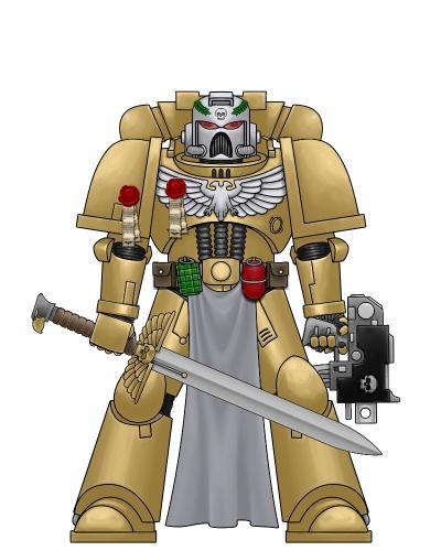
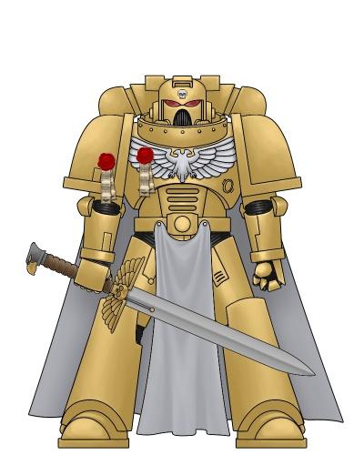
One thing though, are you sure about the no red on gold thing? I based their colors on the Adaptes Custodes, who use gold on red as seen here:
http://tutofig.com/wp-content/uploads/2012/11/Adeptus-Custodes-squad-Metallic-gold.jpg
It looks pretty good to me. I still switched colors for the cape like you suggested and I don't know, but it doesn't seem as striking to me.
http://www.bolterandchainsword.com/sm/bpe=FACB63&bpj=FACB63&bp=FACB63&bpc=FACB63&hdt=d3d4dd&hdm=d3d4dd&hdl=d3d4dd&ey=d03437&er=d3d4dd&pi=d3d4dd&nk=FACB63&ch=FACB63&eg=d3d4dd&sk=d3d4dd&abs=FACB63&bt=FACB63&cod=FACB63&ull=FACB63&lk=FACB63&lll=FACB63&lft=FACB63&url=FACB63&rk=FACB63&lrl=FACB63&rft=FACB63&slt=FACB63&sli=FACB63&srt=FACB63&sri=FACB63&ula=FACB63&lel=FACB63&lla=FACB63&lw=FACB63&lh=FACB63&ura=FACB63&rel=FACB63&rla=FACB63&rw=FACB63&rh=FACB63&bg=FFFFFF&rb=202020&gr=202020&wg=true&be=BBBBCC&laurel=true&aq=true&cloak=3B3876&loin=3b3876&mk7=333333&pp=AA0000&pws=true&/spacemarine.jpg
|
GW: "We do no demographic research, we have no focus groups, we do not ask the market what it wants" |
|
|
|
|
2013/09/27 18:31:34
Subject: FIXED: Advice on Gold/Silver Space Marines?
|
|
Ambitious Acothyst With Agonizer
|
With the gold i would do as others have said, use a brown as a good base ( im still using old colours) however i wouldnt wash it with a black, i would use a more reddish tone similar to the old chestnut ink GW used to do. This over gold and then hitting the highlights again really made the gold a strong a rich colour
|
|
|
|
|
|
|
|
 IMPOSSIBLE IS RELATIVE

