Switch Theme:

Horus Heresy medic first test with pigments  [RSS] Share on facebook Share on Twitter Submit to Reddit
»
Author Message
Advert


Forum adverts like this one are shown to any user who is not logged in. Join us by filling out a tiny 3 field form and you will get your own, free, dakka user account which gives a good range of benefits to you:
  • No adverts like this in the forums anymore.
  • Times and dates in your local timezone.
  • Full tracking of what you have read so you can skip to your first unread post, easily see what has changed since you last logged in, and easily see what is new at a glance.
  • Email notifications for threads you want to watch closely.
  • Being a part of the oldest wargaming community on the net.
If you are already a member then feel free to login now.


Made in it
Fresh-Faced New User


Italy

Hi to all
This is my first try with pigments, never used before and i must say i think i have fallen in love!
Comments and criticism are welcomed!


This message was edited 1 time. Last update was at 2014/03/07 22:56:14


Made in ca
Stormin' Stompa


Ottawa, ON

He looks pretty good to me. I especially like the blood splatter and the orange lenses.

Ask yourself: have you rated a gallery image today? 
   
Made in ca
Unhealthy Competition With Other Legions


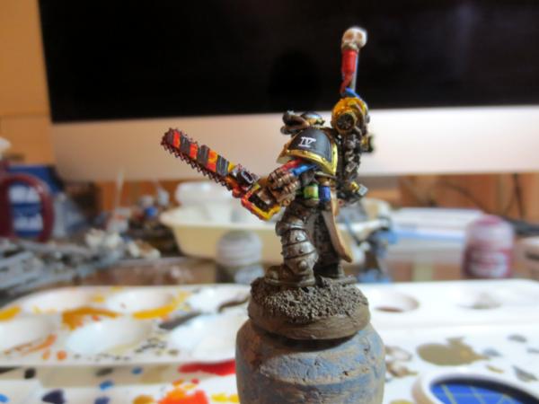
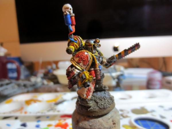
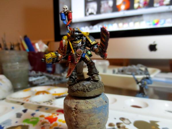
My peice of hopefully helpful advice is to narrow down your palette; right now it looks like you have silver as your primary colour and then gold for trim, but then you have a lot of blues, a lot of yellows, a ton of red and even some green and orange.

I'd use red for the blood splatter; it looks cool and its well done, but other than the medicae symbol I'd stop using it.

Next I'd choose blue OR green for the vials and apothecary gear, but make it more dark and less like its radioactive . For the vials you can paint them to make them look half full and it will help keep the colour from getting too overwhelming

I'd use whichever colour not used on the vials for his bionic eyes, either would look really cool and would really pop; sadly the orange just blends in with the yellows and golds

As for that yellow I'm really digging the hazard stripes, however the pistol casing and yellow tube isn't very useful as the solid chunks of yellow really pull my eyes towards them and to all the sweet details on the model, the exhaust vents are a maybe imo.

Anyways thats enough from me, I really love how you're doing Iron Warriors since I don't see them often (especially in HH) and you're a good painter, you just need to work on placement a bit

5,000 Raven Guard
3,000 Night Lords  
   
Made in it
Fresh-Faced New User


Italy

Thanks for the advices, well probably you are right Skymask about the palette, its a little too rich.
Main problem is that rarely notice this problems given i'm parti ally colour-blind, usually i try to paint things with a realistic color they can have in the real world, but probably should try to be more homogeneus.


Forum Index » Painting & Modeling Showcase
Go to: