| Author |
Message |
 |
|
|
|
|
Advert
|
Forum adverts like this one are shown to any user who is not logged in. Join us by filling out a tiny 3 field form and you will get your own, free, dakka user account which gives a good range of benefits to you:
- No adverts like this in the forums anymore.
- Times and dates in your local timezone.
- Full tracking of what you have read so you can skip to your first unread post, easily see what has changed since you last logged in, and easily see what is new at a glance.
- Email notifications for threads you want to watch closely.
- Being a part of the oldest wargaming community on the net.
If you are already a member then feel free to login now. |
|
 |
2014/03/18 10:20:15
Subject: Please give (gentle) criticism so I can improve
|
|

Fresh-Faced New User
|
Hello everyone,
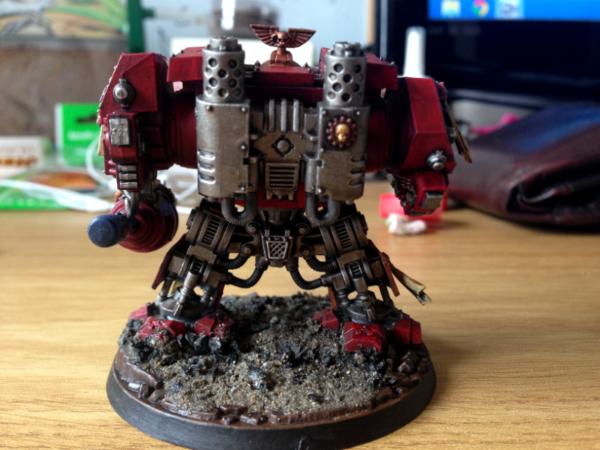
I'm a long time lurker but first time poster. I don't play 40K but I do love collecting and painting the models during quiet periods. I've linked below to 3 pictures of my latest attempt, which I'm hoping you could all give me some critique of. To put it in context, I've been painting off and on for about 6 months and have only completed a handful of models. I think that I've become OK at the very basics such as staying within the lines and using washes but because I like to display the models on my desk I'm really looking to improve and perhaps try some more advanced techniques.
I know that my model is not particularly good so please be kind, I'm not at all artistic.
Thanks!
|
|
|
 |
|
2014/03/18 10:27:12
Subject: Please give (gentle) criticism so I can improve
|
|

Pulsating Possessed Chaos Marine
|
I think your not giving yourself enough credit. for only 6 months in that's a pretty good paint job.
I hate doing it but higher contrast edging and highlighting really make a model pop.
Here's a good reference of what I'm talking about
http://www.spikeybitsblog.com/2013/04/painting-how-to-two-stage-edge.html
Highlighting a really light gold over the raised ares of the wings and crests also would look pretty nice.
Pretty good work so far
|
Age Quod Agis |
|
|
|
|
2014/03/18 10:40:28
Subject: Please give (gentle) criticism so I can improve
|
|
Fresh-Faced New User
Stafford, UK
|
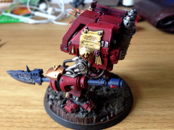
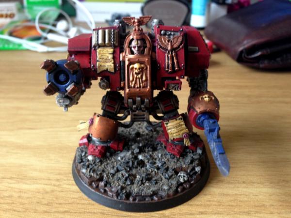
I think that looks great. The parchmentsespecially are done really well, the red looks great and the CC arm in particular looks very good.
Should be proud of that. Better standard than some of the people I play with who've been around a lot longer than 6 months!
|
|
|
|
|
2014/03/18 10:41:07
Subject: Re:Please give (gentle) criticism so I can improve
|
|
Decrepit Dakkanaut
|
To be perfectly honest it looks like you've got your basics down pat. That model looks pretty good, now I'd suggest reading and trying some tutorials on next level techniques. I'll give you a tip on that though, when learning a new style, make a crude drawing on paper and practice the technique on that paper until you get the general idea on how it works.
Keep it up for sure, you'll be improving quickly I think. 
|
|
|
|
|
2014/03/18 10:57:29
Subject: Please give (gentle) criticism so I can improve
|
|
Long-Range Ultramarine Land Speeder Pilot
|
As above really, it's good stuff.
The gold need a wash and dry brush as a minimum and the weapons look like they could do with finishing.
But seriously, impressive considering you're relatively new 
|
|
|
|
|
|
2014/03/18 11:08:42
Subject: Please give (gentle) criticism so I can improve
|
|
Dakka Veteran
|
I think that's a great model. I'd suggest washes on your Brass etc. Some weathering too could be something you learn:-)
|
|
|
|
|
2014/03/18 11:50:24
Subject: Re:Please give (gentle) criticism so I can improve
|
|
Splattered With Acrylic Paint
|
I really like the metals on the back, they look great. The 'text' on the scrolls also look good. As a newbie I can't offer too much help, except reiterate that washes do a really good job of adding depth, so it might be worth applying some to the bronze and skin.
Great model!
|
|
|
|
|
2014/03/18 12:18:36
Subject: Please give (gentle) criticism so I can improve
|
|
Imperial Agent Provocateur
The Ocean
|
looks very nice. echoing the sentiments above me, it comes up a little flat in places (especially the halberd), could definitely use some highlights and wash.
|
|
This message was edited 1 time. Last update was at 2014/03/18 12:22:46
Crusader, Honor Guard of the Cardinal's Crimson.
 |
|
|
|
|
2014/03/18 12:19:56
Subject: Please give (gentle) criticism so I can improve
|
|
Smokin' Skorcha Driver
|
As said above, more highlighting top make it really pop. Great model though !
|
|
|
|
|
|
2014/03/18 13:05:30
Subject: Please give (gentle) criticism so I can improve
|
|
The Marine Standing Behind Marneus Calgar
|
Good solid base.
Parchments are excellent.
The one thing the leapt out at me in the first picture was the mold line on the back of the upper arm/shoulder. They suck, and cleaning them is often brought up as the most irritating part of the hobby. But when you can see them, it really detracts from your paint job.
|
|
|
|
|
|
2014/03/18 15:05:33
Subject: Please give (gentle) criticism so I can improve
|
|
Fresh-Faced New User
|
Thanks for such positive replies!
As for the gold, one of my previous models was from the sanguinary guard and I painted it up before washing it with agrax earthshade but the wash just killed the shine completely. For this model I did the gold areas in bronze first then washed them and repainted bronze then gold as a highlight. What wash would be good on the gold areas to give then more definition but not lose the shine completely?
As for weathering, I'm quite keen to try that and was thinking of getting the GW technical weathering paints. Any thoughts?
|
|
|
|
|
2014/03/18 15:10:12
Subject: Please give (gentle) criticism so I can improve
|
|
Long-Range Ultramarine Land Speeder Pilot
|
I mean, obviously it depends on the effect you want to go for and perhaps the photo made it look shinier than it is IRL, but I'd go for bronzey-gold, then liberal agrax and then drybrush gold over it, but don't go mental. If it isn't bright enough, then a slight highlight but personally, I like my gold relatively dull. You can see it on the pictures in my blog in my sig for comparison.
Not really used the technical stuff to be honest, so I can't really comment.
|
|
|
|
|
|
2014/03/18 15:31:27
Subject: Please give (gentle) criticism so I can improve
|
|
Fresh-Faced New User
|
Thanks, perhaps I should have tried gold drybrushing then. I still have the rest of those sanguinary guards so I'll have the opportunity to give it a whirl!
Automatically Appended Next Post:
As an extra query, I've seen suggestions of washing a particular part of the model such as the gold areas on mine. I'm always a bit unsure about trying to restrict a wash to a particular part of the model as it seems that it would flow everywhere. I was originally tempted to try carroborg crimson on the red areas but wasn't brave enough in case it stained the other bits, am I worrying about nothing?
|
|
This message was edited 1 time. Last update was at 2014/03/18 15:33:33
|
|
|
|
|
2014/03/18 15:43:19
Subject: Please give (gentle) criticism so I can improve
|
|
Regular Dakkanaut
|
Typically I try to paint one color at a time, shade, then highlight to avoid washing over areas I don't intend to. Also some areas, like the gold, you can use less wash and a smaller brush to pinpoint the placement. Although to hold the paint in the brush I usually use a #1 of GW standard (with a good type) brush to wash small areas.
Another tip would be to seal the model with a gloss coat before washing to help the liquid flow to the crevasse easier.
Good job in general, try adding a little more depth/highlight to you colors.
|
|
|
|
|
|
2014/03/18 16:18:04
Subject: Please give (gentle) criticism so I can improve
|
|
Newbie Black Templar Neophyte
Rio Rancho, NM
|
The_Alien,
First off, great work, it looks great as is, you should be justifiably proud of you work. I will also echo the sentiment that it just needs a few area washes and after that, a smidge of drybrush highlighting.
Don't worry to much about the washes going where you don't want them. Once you start washing, you'll see what position to hold the model in to keep the wash in the area you want. The only time washes are really messy is when you do the "all over" washes. The targeted washes, applied with a standard brush can be very controlled.
As an alternative to gloss coating before your washes, you could make the pledge future shine washes. It is basically using pledge future shine (you can get at the supermarket, but make sure it has 'future shine' on it) with your wash color (usually a black or sepia color, but you can also use a darker shade of your base color for a nice effect. The pledge future shine flows really well and is basically the same binder that is used in acrylic paint, so it mixes very well. It is also VERY controllable and makes for a very nice effect. It does dry shiny, so you'll have to matte (or satin) coat your fig when you're done.
After that, a quick dry brush to extend the highlight and you'll be bang on!
Great work so far!!!!
v/r
Bill
|
|
|
|
|
|
2014/03/18 16:37:55
Subject: Re:Please give (gentle) criticism so I can improve
|
|
Brigadier General
The new Sick Man of Europe
|
This is the recipe I use for easy metallics:
1. Basecoat in a dark grey.
2. Washing with a thick black wash.
3. Drab rushing heavily with a gunmetal colour.
4. Dry rushing slightly with a bright silver.
Gives more constrast than the metal on this model either simple techniques.
|
DC:90+S+G++MB++I--Pww211+D++A++/fWD390R++T(F)DM+
|
|
|
|
|
2014/03/18 17:06:41
Subject: Please give (gentle) criticism so I can improve
|
|
Cosmic Joe
|
The writing on the parchment is excellent!
|
Also, check out my history blog: Minimum Wage Historian, a fun place to check out history that often falls between the couch cushions. |
|
|
|
|
2014/03/18 18:38:48
Subject: Re:Please give (gentle) criticism so I can improve
|
|
Nasty Nob
|
The posters have given a lot of good advice, so I'm going to try to give you a way to think about that advice, rather than more advice.
A lot of the advice is about making parts of the model more distinct. Things like highlighting (which makes small edges more visible at a distance) and washes (which make small details more visible) make elements which are already on the model stand out more, particularly on the tabletop.
For specific examples, the horned skull on the sarcophagus, and the winged blood drop, both look a little undifferentiated. You've done a good job painting them, so they aren't a blob of metallic paint or anything, but more highlighting or washes would make the small details of these elements stand out more. You could even go further and paint the blood drop itself, either as an enameled bit on the icon, or even as an actual gem.
Also, on the force halberd, a lot of the 'working', mechanical elements of the halberd are painted in the same blue as the rest of the weapon. This isn't an error or anything, but painting the 'worky bitz' differently will make those already-sculpted details stand out more.
A lot of the advice is also about giving the model more visual interest. Things like weathering (or transfers, or freehand) can liven up areas of the model which are otherwise large, flat expanses of color. For example, the dreadnought's right leg armor, and his right shoulder, are largely flat areas painted a single color. Putting a campaign badge, iconography, or battle damage on these areas, can make them more visually arresting. The leg with the (frankly awesome) scroll looks much more interesting than the other, just for that reason. The exhausts on the back, which are just bare metal, could also be painted or weathered to show soot build-up, making them more interesting as well.
That sounds like a lot of criticism, but you have already demonstrated a very good grasp of the fundamentals of good painting, so I think you are ready to find more advanced techniques you like and experiment with them.
|
|
|
|
|
|
2014/03/19 07:54:37
Subject: Please give (gentle) criticism so I can improve
|
|
Fresh-Faced New User
|
Thank you, all of the responses have been very helpful and I'll try to incorporate the suggestions into my next model :-)
|
|
|
|
|
2014/03/19 13:14:42
Subject: Please give (gentle) criticism so I can improve
|
|

Fresh-Faced New User
|
Don't wait till next model, add those suggestions to this model. 
|
|
|
|
|
2014/03/19 19:51:16
Subject: Re:Please give (gentle) criticism so I can improve
|
|

Focused Dark Angels Land Raider Pilot
|
Very nice!
The only thing that comes to mind is that all metallics need to be highlighted, otherwise they appear quite flat. Pretty much the same method as I use for painting rank n file. Base color, wash, drybrush with base again, drybrush with a highlight.
|
// Andreas
 Dark Angels 4th Company (3,830pts) 950pts fully painted Dark Angels 4th Company (3,830pts) 950pts fully painted
  |
|
|
|
|
2014/03/20 04:48:38
Subject: Please give (gentle) criticism so I can improve
|
|
Mimetic Bagh-Mari
|
Clean lines and mostly smooth paint (could be just where some ink wash didn't get covered well). I would thin out some black wash to put over your metallics
|
|
|
|
|
|
|


 20,000
  1000
1000
 4k
4k  4k Points
 Competition Index
 5000
5000  3500
3500
 2000
2000
 2000
2000
