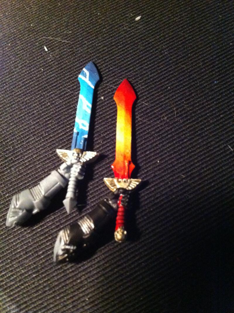
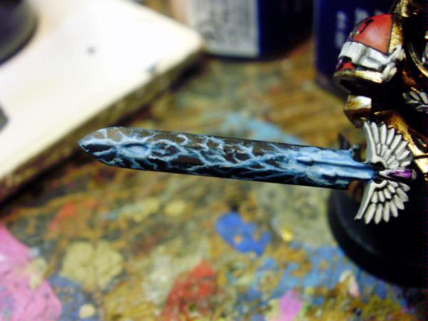
So I decided to try my hand at wet blending colours for some power swords, a blue one for me and a fire-themed one for my salamanders-playing friend.
Couple questions.
1) Does Dark-Light-Dark Give the best look in your experience, or would dark to light be better?
2) If you were to do some lightning-looking bits on the fire sword, what colour would you use?
3) I know the lightning is a bit too thick, i've since acquired a skinnier brush, and I think really thin lines would look best, but a buddy says the thick lines look good. Thoughts?
*Sorry for photo quality, it's a phone camera, i have not got any other cameras*


 Dark Angels 1st, 2nd, 5th, 10th Companies,
 ~ 4500 points of Tau
 ~6500 points of Tyranids: Hive Fleet Niadra

 (img from google search - not my wrk)
 3500pts
 1500pts
 2500pts
 4500pts
 3500pts
 2000pts
  2000pts plus several small AOS armies