Primer
First, for those of you who aren't familiar with Tarot (such as I was when I began this), some facts before getting to the personal intro:
History
Tarot as a playing card game started in the 15th century, and preceded modern cartomancy (card divination) by centuries, while the popular tarot decks in which all the cards have scenes (and the number cards aren't just pips) only started in the 20th century. The codified meanings came well after Tarot (and anything people felt like using) had been adopted as a divination tool, which was originally largely free-form, since there weren't the illustrations for a more definite meaning.
Structure:
Tarot is a 78-card deck, usually played with oversized (2.75x4.75") cards. It has equivalents to the 4 major suits, but with 4 face cards instead of 3. The remaining 22 cards are a static trump suit (which contain most of the cards pop culture references, such as Death ("dun-dun-dunn...!" though, I think it's cooler as the historically nameless card)), and the Fool, which is sometimes part of the trump suit.
The deck structure is extremely versatile, and can be used for standard playing card/Poker games, Spanish and Italian games (similar to standard but 4 face cards), Tarokk games (which use different cards in each suit, and the trump suit), and most historical systems.
The vast majority of Tarot-based games are trick scoring (like Hearts, except largely reversed) that are often betting-based. In all the ones I've played, there has been a set pool of points players are competing for, but individual player point thresholds may change, meaning the player who scored highest didn't necessarily win. Tarot, like Poker, has a series of set values that are incorporated into a highly flexible set of games.
 Personal Introduction
So, about how I got involved with the game:
The title pages to chapters of a
graphic novel I've been illustrating are tarot cards. I did some very basic research when initially illustrating these, but, as I did more, I became more invested in the process, and refined my vision of the cards.
At a certain point, I realized I wanted to actually create a whole Tarot deck, and put more research into the aesthetics and history of the cards.
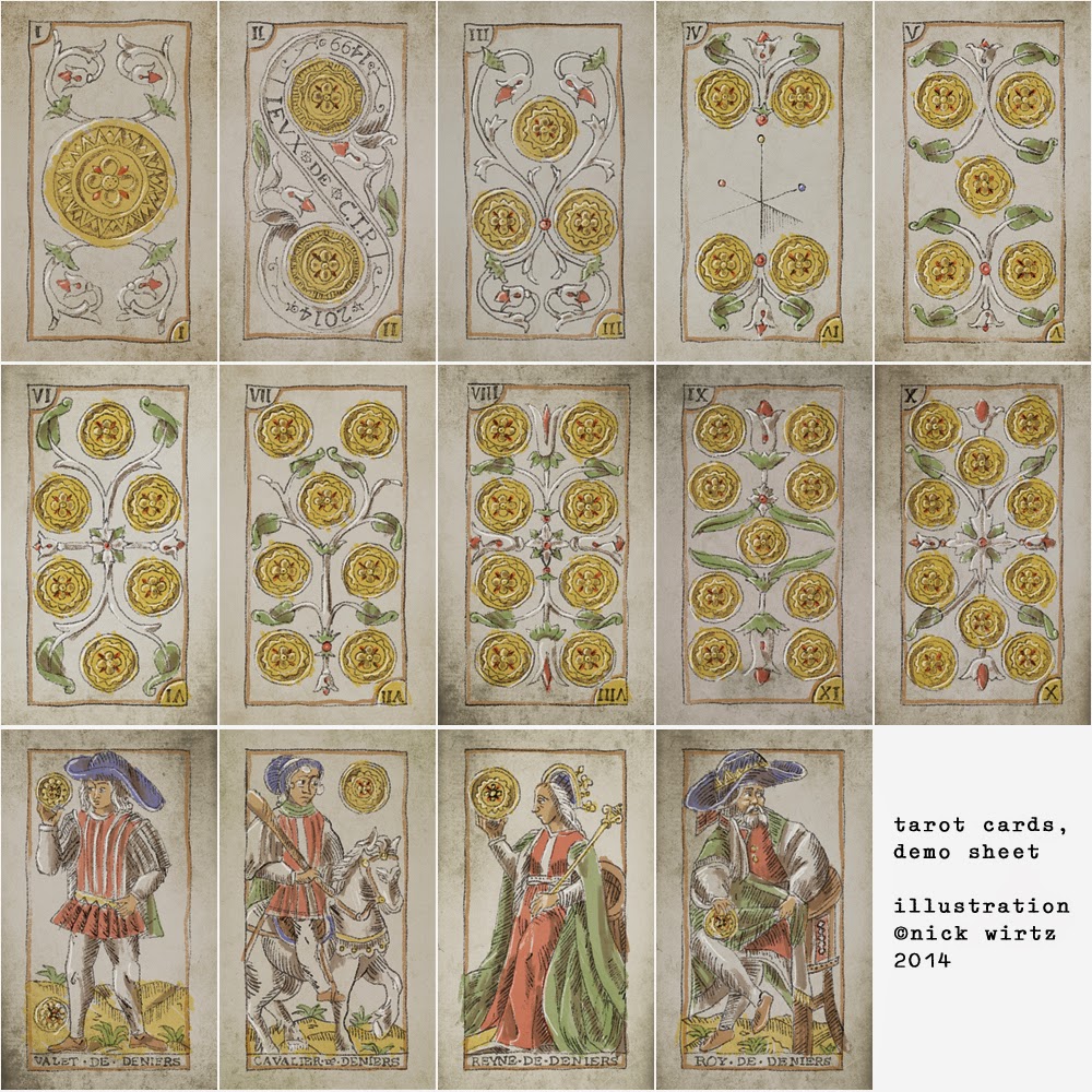
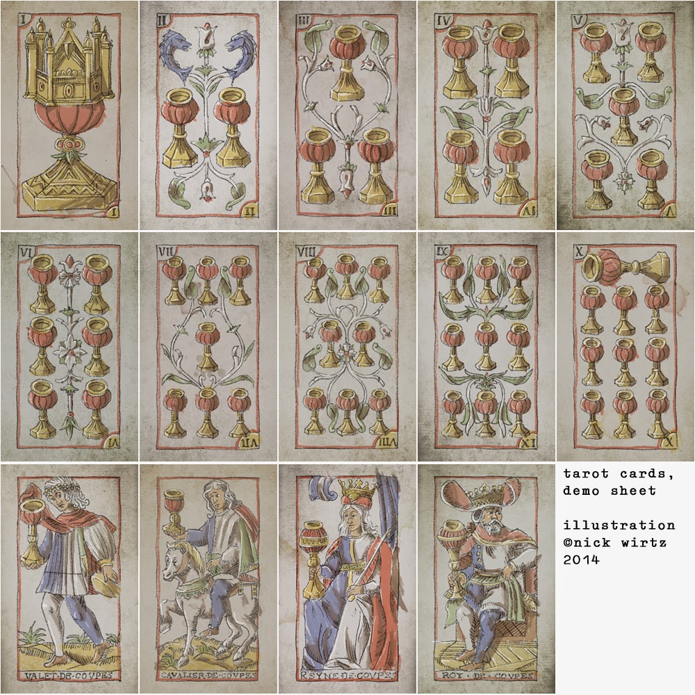
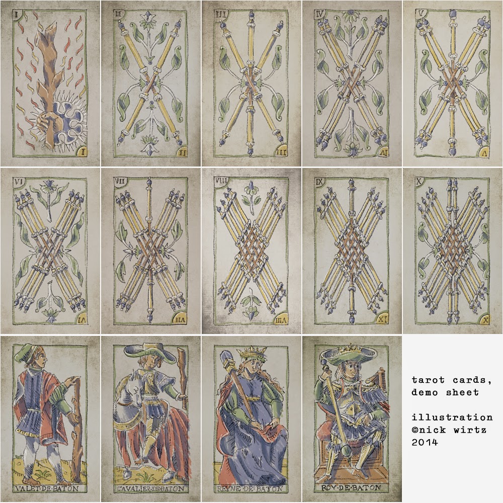
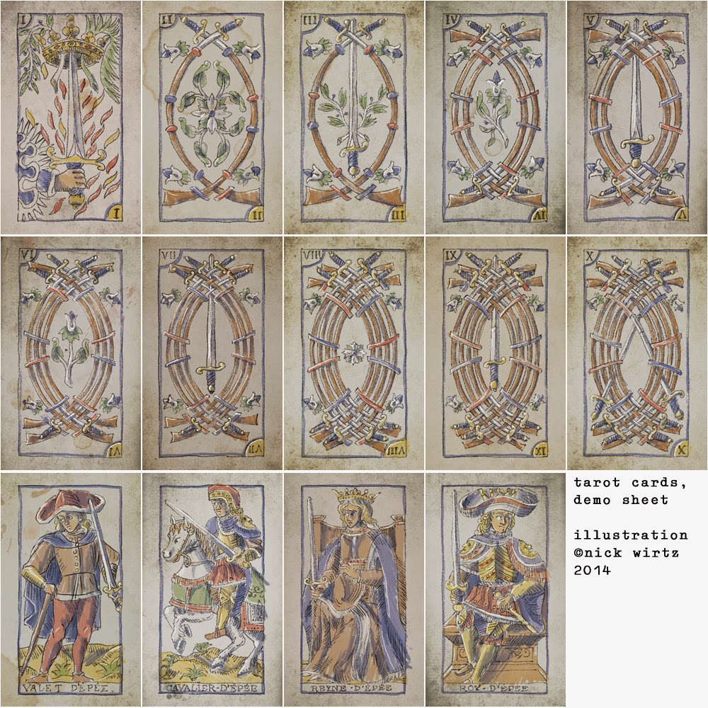
These cards are based on the most popular illustrations of the Marseille imagery, and I tried to keep the sensibility of the original designs, while modernizing some of the graphics for consistency and legibility.
 Design
Other than the illustration style itself, some of the notable design choices I've made, from illustration training/experience, feedback, and testing with existing decks:
• The numbered cards (1-10) have their numbers marked in the corners, per regular playing cards, for ease scanning.
• Numerals have been replaced with the more common variants (for instance, 9 is "IX" instead of "VIIII").
• All shading is from the upper-left corner, making it easier to quickly determine orientation (as occasionally required)
• Each of the basic numbered cards' bottom number is gold, to make the orientation doubly clear
• Each suit is bordered in its respective color. Suits with equivalent French red suits (Hearts and Diamonds, respectively Cups and Coins) are bordered in warm colors, while those with equivalent black suits (Spades and Clubs, respectively Swords and Wands) are in cool colors, while the trump suit is unique but internally consistent.
• The swords and wands (clubs, etc.) were based on the least similar historical variations I could find within the aesthetic sense: Instead of the more traditional flared ends on both, the wands have rounded tips while the swords are partially unsheathed.
• The face cards in each suit feature matching details (such as the capes in the Swords) to repeat visual notes without limiting palate.
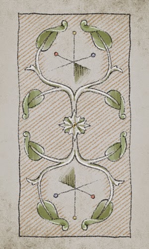
• A number of proportions on the illustrated cards and ornamentations on the numbered cards have been altered remove some of the more distracting proportion issues and open up the graphic space on some of the number cards, while attempting to remain faithful to the style and content of the originals.
 Feedback
So, these are a draft that I consider quite close to done, and I'll be putting up the other suits as they're completed, but I'm looking for feedback. (Note: these include bleed for printing, so the margins will be smaller once printed)
Are there ways I could improve legibility? Are there choices I've made which make cards harder to read?
More generally, I'd gladly welcome constructive criticism on content or style, though obviously it's a bit late to change any major stylistic elements.
Also, if there are any readers who are more versed in the historical/divination end of things, if you've got criticism on accuracy, I tried to remain faithful to the tone and content of the cards, but please let me know if I missed something.[/q]
Note: the swords and cups have had their stains removed in the most recent iteration.
Note 2: the 2 of coins will be getting new text due to a different translation