| Author |
Message |
 |
|
|
|
|
Advert
|
Forum adverts like this one are shown to any user who is not logged in. Join us by filling out a tiny 3 field form and you will get your own, free, dakka user account which gives a good range of benefits to you:
- No adverts like this in the forums anymore.
- Times and dates in your local timezone.
- Full tracking of what you have read so you can skip to your first unread post, easily see what has changed since you last logged in, and easily see what is new at a glance.
- Email notifications for threads you want to watch closely.
- Being a part of the oldest wargaming community on the net.
If you are already a member then feel free to login now. |
|
 |
2014/10/13 01:17:37
Subject: What makes a mini well-painted?
|
|

Dakka Veteran
|
I love painting minis. Its cathartic for me. Problem is, I'm not exactly 'good'. I have my basics covered. I spend time on my minis. But what separates table-top quality from the show-stoppers in the Dakka gallery or CMON and the like and where do I go for guidance with gaining skill for quality like that? If I never got in a game of 40k but was able to paint my army half as well as some of the display-quality pieces I see on the interwebs, I wouldn't complain.
|
I went to Hershey Park in central PA this year, and I have to say I was more than a little disappointed. I fully expected the entire theme park to be make entirely of chocolate, but no. Here in America, we have "building codes," and some other nonsense about chocolate melting if don't store it someplace kept below room temperature. |
|
|
 |
|
2014/10/13 01:54:51
Subject: What makes a mini well-painted?
|
|

Sneaky Lictor
|
High contrast paintjob, composition, special effects, and smooth colour transitions.
In terms of improving, there's nothing to it except learn the concepts behind the pieces you find pleasing then continuous practice until you can replicate the results. It varies from person to person, but, for example, I find wetblending gives me the smoothest transitions I can do, and I have painted 52 models to date when I first came to grips with it (introduced to it beginning of last year), and I find there's still plenty of room for improvement.
|
|
This message was edited 1 time. Last update was at 2014/10/13 02:04:56
|
|
|
|
|
2014/10/13 02:10:33
Subject: What makes a mini well-painted?
|
|
Homicidal Veteran Blood Angel Assault Marine
|
Indeed. I'd just watch lots of youtube videos on painting honestly, it's how I learned, and I still pick stuff up occasionally.
|
|
|
|
|
|
2014/10/13 04:19:11
Subject: What makes a mini well-painted?
|
|

Morphing Obliterator
|
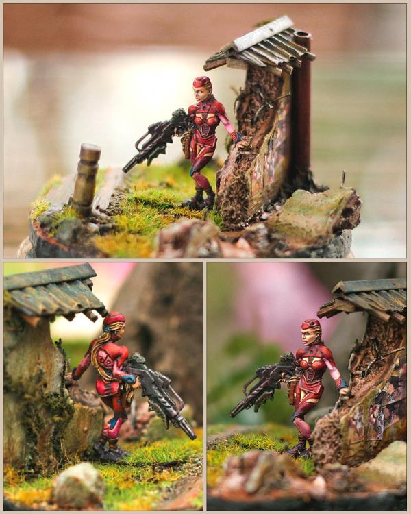
Just practice dude. YouTube tutorials can be useful too, just don't get too hung up on trying to copy other people's style. Find what works for you and run with it. The pic below is a good example of how much you can improve in a relatively short time. The berserker was one of my first minis, the iron warrior was done a year or so later. Its an old pic but you get my point.Lol.
|
|
This message was edited 1 time. Last update was at 2014/10/13 04:20:13
 12000 pts 12000 pts
 5000pts 5000pts |
|
|
|
|
2014/10/13 04:21:49
Subject: Re:What makes a mini well-painted?
|
|

Utilizing Careful Highlighting
|
Nonstop practice is the key.
Maybe you can post photos of your work and we can start from there on what you can do in order to improve?
|
|
|
|
|
|
2014/10/13 12:38:11
Subject: Re:What makes a mini well-painted?
|
|

Dakka Veteran
Eacute cole Militaire (Paris)
|
Preparation and basing... Mold Lines and gaps Ruin eben the best paintjob.
Also a well painted mini can Look better on a good base( no Sand and static gras sprinkles are NOT good).
But a bad base can Ruin even demon Standart
|
Do not kill. Do not rape. Do not steal. These are principles which every man of every faith can embrace.
For if you do, one day you will look behind you and you will see us And on that day, you will reap it,
and we will send you to whatever god you wish. |
|
|
|
|
2014/10/13 14:06:25
Subject: What makes a mini well-painted?
|
|
Grizzled Space Wolves Great Wolf
|
The thing I lack is the artistic ability to pick colours that go together well. It's not something you pick up from video tutorials on painting miniatures and it's something you need to beyond having good technique to having models that make people go "wow" and win awards.
You can know how to blend and all that jazz, but if you can't figure out what colour you're blending from and to and what little variations you need add contrast and visual interest while still having the model nicely tied together, you're going to struggle to get as good as the really good painters.
|
|
This message was edited 1 time. Last update was at 2014/10/13 14:07:00
|
|
|
|
|
2014/10/13 17:05:22
Subject: What makes a mini well-painted?
|
|
Using Inks and Washes
St. George, Utah
|
AllSeeingSkink wrote:The thing I lack is the artistic ability to pick colours that go together well. It's not something you pick up from video tutorials on painting miniatures
-snip-
That's not exactly true. Color theory is not some sort of inherent skill, though some people are more natural with it than others. Your eye will also pick up on it the more you practice.
http://en.wikipedia.org/wiki/Color_theory
It's a fun subject!
Also: NEVER SELL YOURSELF SHORT. I know people who are blind as a bat that paint beautifully. It's a skill; the more you work at it the better you become. It's really that simple. If you keep telling yourself "I lack this ability," you'll stop your own improvement.
|
|
|
|
|
2014/10/13 18:05:45
Subject: Re:What makes a mini well-painted?
|
|
Utilizing Careful Highlighting
|
SRSFACE got it srsly right.
I used to suck at colors. Before I went to art school I just draw things in black and white because I was so afraid of screwing things up with the wrong choice of colors. College basically forced me to learn how to use colors and hey, now I think I'm decent.
And now as an art teacher I'll tell you this: drawing and painting are both skills. Sure, some people learn faster than others but it's not an innate ability that you're born with. It's something you practice over and over to perfect. God knows how many hours I've used to learn how to draw and pait to my level now, and the callouses on my drawing hand is the evidence.
|
|
|
|
|
|
2014/10/13 23:11:24
Subject: What makes a mini well-painted?
|
|
Grizzled Space Wolves Great Wolf
|
 SRSFACE wrote: SRSFACE wrote:AllSeeingSkink wrote:The thing I lack is the artistic ability to pick colours that go together well. It's not something you pick up from video tutorials on painting miniatures
-snip-
That's not exactly true. Color theory is not some sort of inherent skill, though some people are more natural with it than others. Your eye will also pick up on it the more you practice.
http://en.wikipedia.org/wiki/Color_theory
It's a fun subject!
Also: NEVER SELL YOURSELF SHORT. I know people who are blind as a bat that paint beautifully. It's a skill; the more you work at it the better you become. It's really that simple. If you keep telling yourself "I lack this ability," you'll stop your own improvement.
Oh I didn't mean to say it's not something that can be learned... but I think it's a bigger hurdle to producing really well painted, award winning models. Highlighting, blending, glazing, airbrushing, you pick them all up pretty quickly watching youtube videos and if you're willing to put in the time (probably the hardest one for me was paint consistency, after that things fell in to place).
I'm sure if I went to art school or maybe if I picked up some more advanced videos than the typical "how to paint miniatures" you see on youtube I'd improve a lot. I have read a lot of "intro to colour theory" articles like the wikipedia thing and lots of other similar articles... it mainly taught me that an intro to colour theory teaches you nothing that is actually practically useful for painting miniatures 
Teaching someone to blend from a shade to a mid tone to a highlight isn't what makes a really well painted model to me, it's knowing what actual colours to pick to achieve a real depth from it. For example, should this green have a darker green as the shade, should it be black mixed with the original green, or should it actually have a brown as the shade colour, if it's a brown, what brown should it be? It's taken me aggggges of trial and error to find the grey I want for my Space Wolves... it's a purple-grey base, an airbrushed blue-grey mid tone (more on the blue side than the grey side) and then first airbrushed highlight done by mixing in a neutral grey and then airbrush final highlight and swap to hairy brush for edge highlights done by mixing white in. It gives colour contrast without the insane brightness contrast you often see of "I just learned to blend!" models... but I mostly got it through model after model of trial and error  And that was just the grey... I still haven't decided how to do the red, the cream and the gold to tie in with the grey.
That's why people love Devlan Mud, whacking it over an entire painted model shades it, filters it and adds an additional colour which ties all the others together. But it only gets you so far, it's like a shortcut to learning how to tie a model together and add some depth, but only in one way.
Unless you have a lot more artistic flair than me, learning it through unsupervised trial and error and youtube videos (unless there's a pile of videos I haven't seen yet on how to pick colours for miniatures) is going to take you forever. I'm sure if I decided I was never going to paint another army and just painted single models from here on out I'd have a better chance (since I've painted hundreds of models, but realistically only dozens of different schemes).
|
|
|
|
|
2014/10/13 23:48:19
Subject: Re:What makes a mini well-painted?
|
|

Ancient Venerable Black Templar Dreadnought
|
Well, to begin some different means of "complimentary" colouring is important so this wheel will help:
Remember that your models are rarely by themselves so you need to think of a complete scheme for all models:
Vehicles, heavy weapons, aircraft... I have all guns red, combat weapons hazard stripe, plasma green, lascannon / power weapon blue, flamer bronze, bases primarily "snakebite leather"... etc.
Removing all added sprue bit, mold lines, open joins are important since they show up really well on painting.
Primer is no small choice: black: work your way up to light, white: work your way down to dark, grey: work either direction.
Block paint, shade, wash, highlight / drybrush. Many steps of each of these depending on how crazy you are.
|
A revolution is an idea which has found its bayonets.
Napoleon Bonaparte |
|
|
|
|
2014/10/14 00:18:05
Subject: What makes a mini well-painted?
|
|
Grizzled Space Wolves Great Wolf
|
The deceptive thing about the colour wheel though, you never actually use those raw colours on miniatures Then you have the fact that a good painter will pick colours that aren't obviously complimentary/analogous/triadic/etc, but they make them work together by picking the appropriate shades and highlights. The colour wheel is more appropriate for picking colours for signs and advertising than it is for picking colours for models. Here's a more comprehensive description and colour wheel calculator... http://www.sessions.edu/color-calculator Look at the highest rated models on CMON and it's hard to get from introductory colour theory to those models, and even if you can look at the model and link it back to colour theory, to then go the opposite direction and create your own scheme from colour theory, for someone like me who doesn't have an art degree it's a bit beyond "watch some youtube videos and practice" For example, look at this dude.... http://www.coolminiornot.com/98858?browseid=10295932 Even if we ignore the mechanical techniques required to get that, the colours work wonderfully together. The yellow green skin is shaded with darker black areas, brown areas that aren't actually much darker but add contrast, there's a few areas where blue and purple are used on the flesh, there's the leather shirt where the brown ties in remarkably well with the flesh, the axe is shaded with darker greys but also brown mixed in. Even if you can individually create some of those effects, to tie them together like that is beyond me. I know I can get better with practice, but when I look at the really awesome models, for me, it's less about the mechanical techniques and more about "how in the hell did you make those colours work together so brilliantly?".
|
|
This message was edited 1 time. Last update was at 2014/10/14 00:19:35
|
|
|
|
|
2014/10/14 01:22:45
Subject: What makes a mini well-painted?
|
|
Fixture of Dakka
|
AllSeeingSkink wrote:The deceptive thing about the colour wheel though, you never actually use those raw colours on miniatures Then you have the fact that a good painter will pick colours that aren't obviously complimentary/analogous/triadic/etc, but they make them work together by picking the appropriate shades and highlights.
Color wheels actually have gradients showing the shades, so for instance, Khorne Red is close to the bottom-most slot on the Red wedge, and Zandri Dust is in the middle of the Yellow-Orange wedge. Many of the studio-selected (Citadel "official") color schemes use opposing colors of the color wheel for contrast accents. For instance, you see a lot of green to complement red (and vice versa); the trick, of course, is to make it look like Dark Eldar or Dark Angels instead of Christmas. This is why the most studio versions of the Blood Angels have green lens, instead of, for instance, blue, purple, or orange.
Many of the studio versions also use analogous (adjacent) colors for highlights -- that is instead of highlighting red, even a dark red (like Khorne) with brighter reds and eventually white-reds, reds are highlighted by mixing in orange-red, orange, and finally orange yellow (for example, wild ryder, and fire dragon bright). Similarly, you will see studio models with green highlighted with yellow-green, and then finally yellow.
AllSeeingSkink wrote:Even if we ignore the mechanical techniques required to get that, the colours work wonderfully together. The yellow green skin is shaded with darker black areas, brown areas that aren't actually much darker but add contrast, there's a few areas where blue and purple are used on the flesh, there's the leather shirt where the brown ties in remarkably well with the flesh, the axe is shaded with darker greys but also brown mixed in. Even if you can individually create some of those effects, to tie them together like that is beyond me.
One of the easiest ways to create a color scheme and still get professional-looking results (and an original-ish paint scheme) is to take a neutral light tone and contrast it against a colored dark tone; or, a neutral dark tone, and contrast it against a bright color. For example, if you have an armored fellow in a robe, pain the robe a light sand (ushbanti or rakarth are examples of light neutrals), and contrast that by picking almost any dark color (a dark blue, red, purple, green all look great). Or, if the fellow is all armored, paint the inner plates a dark neutral like Eshin Grey (which you can wash to black, and highlight with administration grey or fenrisian grey), and pick a light tone for outer plates -- for example, a light blue, light green, light purple, or bright red. The key is just contrast.
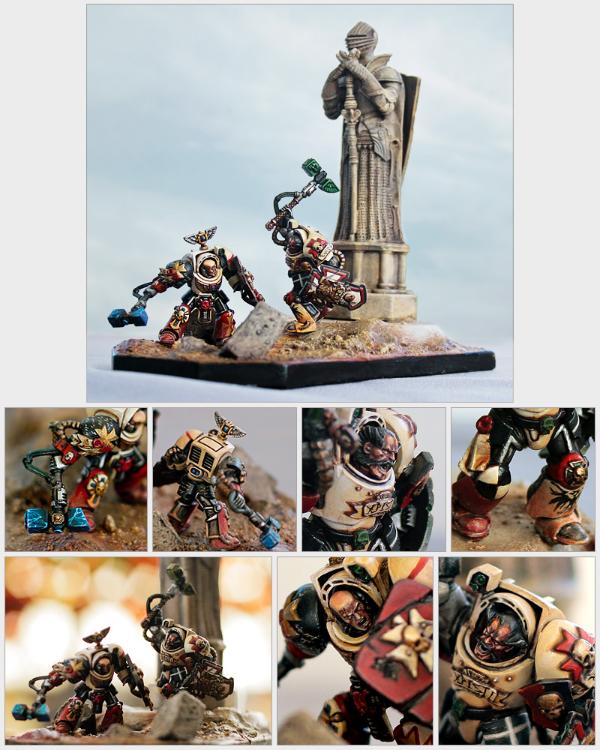
Here is an example of what I mean -- I wanted to paint a Major Victoria Haley just because it's a cool model. I don't play Cyngar, and didn't intend to build an army, so the colors could be unique. At the time, I was painting something else, so I didn't want to spend a lot of time at it, but I think the colors turned out ok, even though there was minimal thought that went into it:
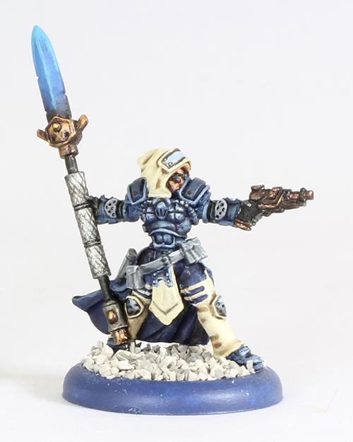
Incidentally, with respect to the original post, the above miniature is sort of the minimum quality of miniature I think of as finished (and barely tabletop). It's finished in a single evening, the base is very simple, and it consists of only base coat, wash, and 1 layer. No edge highlights at all. Incidentally, I have another one of these models that I intend to paint nicely one day 
This would be what I consider as "tabletop" quality. A few miniatures get painted over a couple of nights, a minimal attention is given to highlights and bases, but it's enough that from 2-3 feet away, an army looks great. Incidentally, this is also my custom color scheme for my Protectorate army. I used a triad of colors on the color wheel (purple + green + orange/gold), plus a neutral tone for the cloth.
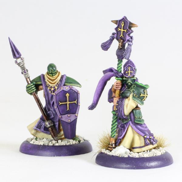
I know that everyone has their own definition of what's tabletop versus display or competition quality, but essentially, in my mind, tabletop quality is stuff that you don't mind actually putting your paws onto when playing, and where they were built with the intent of churning out an army, rather than individually giving your best effort to an individual miniature.
|
|
This message was edited 2 times. Last update was at 2014/10/14 01:25:55
|
|
|
|
|
2014/10/14 06:07:49
Subject: Re:What makes a mini well-painted?
|
|
Utilizing Careful Highlighting
|
I disagree with color theory teaches you nothing on painting miniatures. It teaches you... everything. I think it would be better if I put my works as actual evidence so you know that I know the process of thinking behind it:
That's a complementary color combination (red and green). I added several analogus colors of both green and red: yellow green and red violet. They're both complementary as well on their own. The blues accents and yellow hair goes well with the red because they're a primary color triad.
For this one it's more of an analogous color scheme of red-orange and yellow. Of course it won't fit the theme if I use them as raw colors, but you would notice that the ground is an orange brown and the whites are yellowish tones of white. Even the weathering of the statue is yellow. The solids are the reds (to give emphasis to the two models). I chose blue and green as spot colors because I need two different spot colors for each figure. I chose blue because it interacts well with yellow and red (primary triad) and I chose green because it's a complement of red.
|
|
|
|
|
|
2014/10/14 06:56:38
Subject: Re:What makes a mini well-painted?
|
|
Douglas Bader
|
The most important thing in choosing colors is PRACTICE. Color theory can give you some starting points, but art isn't a step-by-step formula where you can just do what color theory tells you and have an awesome model. There's no substitute for getting some paint on a model (or photoshop or looking at someone else's similar model or whatever) and seeing how a possible color scheme works. If it's a big project use some cheap test models first to see how your chosen colors look together, and adjust appropriately.
|
There is no such thing as a hobby without politics. "Leave politics at the door" is itself a political statement, an endorsement of the status quo and an attempt to silence dissenting voices. |
|
|
|
|
2014/10/14 09:02:24
Subject: Re:What makes a mini well-painted?
|
|
Grizzled Space Wolves Great Wolf
|
 heartserenade wrote: heartserenade wrote:I disagree with color theory teaches you nothing on painting miniatures. It teaches you... everything. I think it would be better if I put my works as actual evidence so you know that I know the process of thinking behind it:
That's a complementary color combination (red and green). I added several analogus colors of both green and red: yellow green and red violet. They're both complementary as well on their own. The blues accents and yellow hair goes well with the red because they're a primary color triad.
For this one it's more of an analogous color scheme of red-orange and yellow. Of course it won't fit the theme if I use them as raw colors, but you would notice that the ground is an orange brown and the whites are yellowish tones of white. Even the weathering of the statue is yellow. The solids are the reds (to give emphasis to the two models). I chose blue and green as spot colors because I need two different spot colors for each figure. I chose blue because it interacts well with yellow and red (primary triad) and I chose green because it's a complement of red.
I guess I didn't mean to say you CAN'T use a colour wheel to pick colours, just that it only gets you a short ways forward and if you decide "oh I'm going to paint red" you still have to figure out what colours you are actually going to use to paint red so that it matches well with the other colours on the model. THAT'S the hard bit.
When it comes to using a colour wheel, I know you can use it, but it seems to me that on miniatures where you're often painting dark colours, muddy colours, lots of browns, weathered models and you frequently are going for a run down look the colour wheel only seems marginally better than throwing darts at a board Of my own models, there's times I've tried to use basic rules from introductory colour theory articles I've read and when I paint them they just look... off. Other models I've just randomly picked colours and they've came out really nice and when I try and shoehorn the colours I chose on to a colour wheel, they don't follow any pattern that I can see, it's just to me they look good together. I look at some of my favourite models on CMON and put them in to GIMP, extract the colours, throw them on a colour wheel and so often I can't see a pattern whether it be complimentary, monochromatic, analogous, triad, split complimentary or tetradic. Sometimes you have historic dioramas where the core colours are already chosen for you, but through a careful selection of shading colours and filters, a skilled artist can turn it from just another diorama in a real show piece and competition winner.
There's probably better language to use but I don't have an art degree so you'll have to forgive me. When I say the challenge is picking good colours, I don't mean "well use blue and green", I mean what colours do you use for the shade, the mid tone, the highlight and what filters do you use and in what order so that you can make that blue and green look good and natural next to each other instead of just looking "painted on". To me, that's the difference between someone who just knows how to shade/highlight/blend and someone who can produce award winning models/dioramas that catch your eye
|
|
|
|
|
2014/10/14 09:51:27
Subject: What makes a mini well-painted?
|
|

Stormin' Stompa
|
Checking the numbers carefully and staying within the lines?
|
|
This message was edited 1 time. Last update was at 2014/10/14 09:52:00
-------------------------------------------------------
"He died because he had no honor. He had no honor and the Emperor was watching."
 18.000 18.000  3.500 8.200 3.500 8.200  3.300 3.300  2.400 2.400  3.100 3.100  5.500 5.500  2.500 2.500  3.200 3.200  3.000 3.000
|
|
|
|
|
2014/10/14 12:37:01
Subject: What makes a mini well-painted?
|
|
Ancient Venerable Black Templar Dreadnought
|
Hehehe you are more right than many would give credit.
I called painting miniatures paint by numbers using a topographical map = raised areas lighter, deeper areas darker. I find painting them easier than a flat painting.
What I find hard to commit to is the direction of lighting: I like to cheat and treat it like the light is directly above so looks fine viewed from any direction.
I agree with the discussions above that miniature painting is not 100% classic colour theory since they are so small contrast becomes even more important or the miniature looks muddy.
Making 3 or 4 miniatures with the same scheme and looking at them together is another good thing to do before committing going farther.
I think a well painted miniature is how "realistic" it looks compared to paintings / pictures / movies of the subject: the more details added, the better painted.
|
A revolution is an idea which has found its bayonets.
Napoleon Bonaparte |
|
|
|
|
|
|
 4500
4500