| Author |
Message |
 |
|
|
|
|
Advert
|
Forum adverts like this one are shown to any user who is not logged in. Join us by filling out a tiny 3 field form and you will get your own, free, dakka user account which gives a good range of benefits to you:
- No adverts like this in the forums anymore.
- Times and dates in your local timezone.
- Full tracking of what you have read so you can skip to your first unread post, easily see what has changed since you last logged in, and easily see what is new at a glance.
- Email notifications for threads you want to watch closely.
- Being a part of the oldest wargaming community on the net.
If you are already a member then feel free to login now. |
|
 |
2014/12/04 08:01:08
Subject: Hand me the tartan paint...
|
|

Longtime Dakkanaut
|
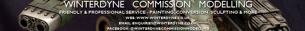
Bit of a practice piece, trying to keep my precision up. Thoughts on the tartan and sword in particular appreciated.
|
|
This message was edited 1 time. Last update was at 2014/12/04 08:01:30
|
|
|
 |
|
2014/12/04 13:31:53
Subject: Hand me the tartan paint...
|
|
Rotting Sorcerer of Nurgle
|
The tartan is great - really subtle. Might have been lifted by using some blue though.
Also I think the sword could do with a really thinned wash / glaze of blue ink - I find that this helps elven weapons look cleaner & newer.
If you did both it would 'pull' the model together, linking the sword, the arms & legs together.
But that's just my opinion.
Great to see a model from my youth as well! Must be around 25 years old.
|
Check out my gallery here
Also I've started taking photos to use as reference for weathering which can be found here. Please send me your photos so they can be found all in one place!! |
|
|
|
|
2014/12/04 13:39:06
Subject: Hand me the tartan paint...
|
|
Longtime Dakkanaut
|
Yeah, think I'll try with the blue on the sword. Good call.
Pretty sure I have some more old-school woodelves (other than 60 old plastic archers) kicking around, so I'll try blue in the tartan too.
|
|
|
|
|
|
2014/12/04 18:06:52
Subject: Hand me the tartan paint...
|
|

Gargantuan Gargant
|
Tartan looks ace. Bubber's unifying blue suggestion sounds great, thinking about the model more generally, but the execution of the pants in a vacuum is damned near flawless.
I think the sword is the weakest element on the whole model. I don't see much differentiation between the various faces of the blade - only between edges and flats. This gives (me, at least) the impression not of a smooth blade catching light, but of a rough blade with a somewhat odd pattern of wear. Correct me if I'm jumping to inappropriate conclusions, but I don't expect that was your intention. Not being familiar with the sculpt and viewing this on a less than optimal screen (computer is dead), I may also be missing contours of the blade that inform the current pattern of shading.
|
The Dreadnote wrote:But the Emperor already has a shrine, in the form of your local Games Workshop. You honour him by sacrificing your money to the plastic effigies of his warriors. In time, your devotion will be rewarded with the gift of having even more effigies to worship.
|
|
|
|
|
2014/12/04 21:52:09
Subject: Hand me the tartan paint...
|
|
Longtime Dakkanaut
|
Nah, it's rough as a badger's arse here (it was not done slowly, lol). Needs to be smoooooooth. :-) I've had a fiddle with it, but I think it still needs more contrast.
Glad the tartan's worked though.
|
|
|
|
|
|
2014/12/04 23:15:58
Subject: Hand me the tartan paint...
|
|

Incorporating Wet-Blending
|
The handle/hilt on the sword could use something, but I am buggered as to what. It just matches the glove too much. Maybe a black wash? A medium gold highlight?
Honestly though, looking at your work makes me want to stop painting 
|
|
|
|
|
2014/12/05 13:41:21
Subject: Hand me the tartan paint...
|
|
Longtime Dakkanaut
|
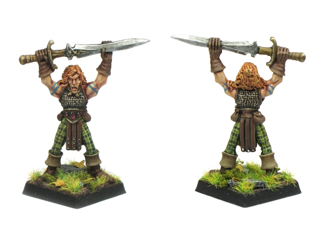
Following on with the feedback, and also trying out some flower tufts (which believe it or not I've never used before):
|
|
|
|
|
|
|
|