Switch Theme:

HH Imperial fist - Improvements?  [RSS] Share on facebook Share on Twitter Submit to Reddit
»
Author Message
Advert


Forum adverts like this one are shown to any user who is not logged in. Join us by filling out a tiny 3 field form and you will get your own, free, dakka user account which gives a good range of benefits to you:
  • No adverts like this in the forums anymore.
  • Times and dates in your local timezone.
  • Full tracking of what you have read so you can skip to your first unread post, easily see what has changed since you last logged in, and easily see what is new at a glance.
  • Email notifications for threads you want to watch closely.
  • Being a part of the oldest wargaming community on the net.
If you are already a member then feel free to login now.


Made in gb
Steady Space Marine Vet Sergeant


United Kingdom

Hi guys,

I'm looking for some advice on improving this IF.
There is no basing because I want to get flight deck resin bases to depict the battle of Phall. And as they are fighting on strike cruisers and such, there is no mud weathering. Just thought I'd clarify that before I get 'base your minis' and 'more mud' comments


Thanks a lot, guys!
Z

This message was edited 1 time. Last update was at 2014/12/24 02:34:58


Made in gb
Poisonous Kroot Headhunter


Manchester uk

I would paint the bolter black the yellow bolter makes the model too yellow in my opinion.

I would also look at painting the eyes but apart from that it's pretty decent buddy.
   
Made in gb
Is 'Eavy Metal Calling?


UK

Yeah, I'd make the bolter casing dark red or black, it will pop a little more against the yellow. Other than that, it's excellent!

Is this a one-off, or a sign of things to come?


Made in ca
Changing Our Legion's Name


Looks sharp. Personally, I enjoy painting my bolters in a way that compliments the main colour choice of the model. A deep red would be great in this case to match that yellow (props for not doing that bright yellow scheme!)
   
Made in us
Did Fulgrim Just Behead Ferrus?


Fort Worth, TX

Looks perfectly fine to me. Like the others said, I would probably go with a different color for the bolter just to break it up a bit.

"Through the darkness of future past, the magician longs to see.
One chants out between two worlds: Fire, walk with me."
- Twin Peaks
"You listen to me. While I will admit to a certain cynicism, the fact is that I am a naysayer and hatchetman in the fight against violence. I pride myself in taking a punch and I'll gladly take another because I choose to live my life in the company of Gandhi and King. My concerns are global. I reject absolutely revenge, aggression, and retaliation. The foundation of such a method... is love. I love you Sheriff Truman." - Twin Peaks 
   
Made in us
Hungry Ghoul


Corning, NY

Id like to see the eyes painted. You put a lot of effort into the weathering, but the eyes seem flat with just the one shade of blue.
   
Made in us
Sagitarius with a Big F'in Gun


Boca Raton, FL

Very cool.

I second that motion for painted eyes. Otherwise, detail is high and clear. Nice job.
   
Made in gb
Steady Space Marine Vet Sergeant


United Kingdom

 Paradigm wrote:
Is this a one-off, or a sign of things to come?


...Who knows...

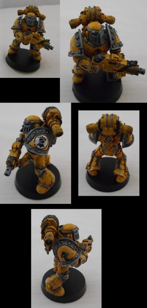
Thanks for all of your comments, they are most appreciated. I've had a really busy week, but I've added a lighter blue, and a spec of white to the centre of the eyes, just to make them pop a bit more. (not really picture worthy...)
I do have another IF working his way over my desk. I'm going to swap the yellow and black around on the bolter (so, black with a yellow stripe), hopefully that will break it up some more.

Also, I'm going to try a slightly different weathering technique. I'll put brighter yellow down, then brown in the centre for the chips (opposed to silver). The silver chips blend a bit with the silver trim, just experimenting with the colours to see what results I can get.

I'm quite excited to do some freehand on the next model. Doing the eagle on the chest of the first marine was great, an enjoyable learning curve. With the exception of the slightly asymmetric lightning bolt, I'm pleased with the result.

Thanks again, and I promise some more pictures of the next one this weekend
Z


Forum Index » Painting & Modeling
Go to: