| Author |
Message |
 |
|
|
|
|
Advert
|
Forum adverts like this one are shown to any user who is not logged in. Join us by filling out a tiny 3 field form and you will get your own, free, dakka user account which gives a good range of benefits to you:
- No adverts like this in the forums anymore.
- Times and dates in your local timezone.
- Full tracking of what you have read so you can skip to your first unread post, easily see what has changed since you last logged in, and easily see what is new at a glance.
- Email notifications for threads you want to watch closely.
- Being a part of the oldest wargaming community on the net.
If you are already a member then feel free to login now. |
|
 |
2014/12/09 18:05:39
Subject: Critique my NMM
|
|

Frater Militia
|
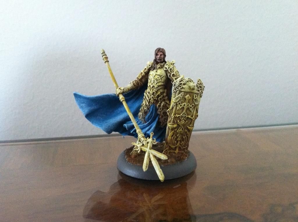
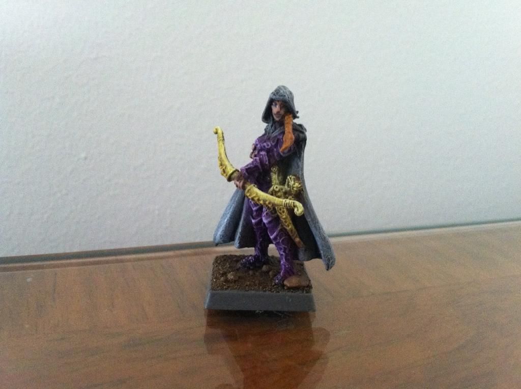
My first truly serious attempt at NMM; for the next project, I want to know what to keep doing, what to stop doing, and new things to try. To that effect, here are two miniatures I'd like to get some feedback on. Thanks!
|
|
|
 |
|
2014/12/09 21:48:11
Subject: Critique my NMM
|
|

Longtime Dakkanaut
|
Well they look like the characters live on a planet with a sun far too bright for human eyes.
So you probably should tone it down with a wash and then use that bright color you put everywhere in much more select spots.
Also, that scimitar on your archer is receiving a lot of light from his armpit, which is a bit unexpected.
I'm not a good painter though, so I would probably struggle to reach that result, can't really tell though because the pictures aren't very detailed.
|
|
|
|
|
2014/12/10 00:05:49
Subject: Critique my NMM
|
|
Frater Militia
|
Yes, I can see that I should be more selective with the lighter layers. These minis are for a game of Exalted, however, and represent heroes of the Sun so a little brightness can hopefully be forgiven.
That being said, I just finished some demigryph knights where the light layers were waaaay overboard. I'm not going to even take pics until I figure out how I want to fix it 
|
|
|
|
|
2014/12/10 00:11:16
Subject: Critique my NMM
|
|

Plastictrees
|
What are you referencing for your gold? Are you looking at other people's NMM or pictures of actual metallic objects.
I'd suggest the latter.
Right now it looks chalky (a result of highlighting too much too soon that you mentioned).
It also looks flat. Getting some purple washes in the shadows and some orange in the mid tones will really help.
That's all pretty vague I know. Right now you haven't created the illusion of metal.
I'm sure there's some good stuff on Youtube that would help you out.
|
|
|
|
|
2014/12/10 04:04:42
Subject: Critique my NMM
|
|
Regular Dakkanaut
|
Looks more like bone or stone then metal. If you are going for a gold NMM you would be better off with browns then the cream colors you went with.
|
|
|
|
|
|
2014/12/10 14:22:43
Subject: Critique my NMM
|
|
Regular Dakkanaut
|
NMM is about 2 things. How great a contrast you can create and where you place your white reflections.
The contrast comes from rapid changes from light to dark in a very small space. On the guy holding the trident you can see a clear gradient from top to bottom. Thats good. Now your objective is to maintain the same light source and create that gradient on every tiny detail on his armor and shield.
Then you place your reflections, pure white on pieces that would get the most sun or would be reflecting light from the opposite side. The light that is bouncing off the ground or the surrounding objects.
|
|
|
|
|
2014/12/10 16:48:27
Subject: Critique my NMM
|
|
Frater Militia
|
Thanks for the replies! Based on your opinions, I've decided what I want to focus on for improvement.
1) Keeping the general tone much darker. It seems there is simply too much bright over the entire surface as a whole.
2) Placing pure white reflections strategically according to the imagined light source.
It's 2) that really seems to be the most different from the painting I've done before. I need to stop thinking about NMM as simply highlighting white like I would on cloth. I think the reflection property will really bring out the illusion of metal.
I'll see if I can get try #2 done and put up here for comparison soon.
|
|
|
|
|
2014/12/11 11:35:21
Subject: Critique my NMM
|
|
Longtime Dakkanaut
|
Actually, you've been doing it wrong on cloth as well.
The main difference between metal and cloth is the contrast, which is much stronger with metal due to its reflective properties.
Both require a color continuum and respecting the light source.
In order to make it a lot easier, you can start with zenithal priming, that will show you where the light lands.
|
|
|
|
|
2014/12/11 11:40:12
Subject: Critique my NMM
|
|
Frater Militia
|
I'd like to get a second opinion on the cloth. I can see the NMM needs a good deal of improvement but I'm very happy with how the capes came out and I don't want to change it without some consensus.
|
|
This message was edited 1 time. Last update was at 2014/12/11 11:42:11
|
|
|
|
|
2014/12/11 11:47:09
Subject: Critique my NMM
|
|
Longtime Dakkanaut
|
I'm not saying it's bad or terrible, I'm just saying you're showing light in places where there couldn't be any 
|
|
|
|
|
|
|
