| Author |
Message |
 |
|
|
|
|
Advert
|
Forum adverts like this one are shown to any user who is not logged in. Join us by filling out a tiny 3 field form and you will get your own, free, dakka user account which gives a good range of benefits to you:
- No adverts like this in the forums anymore.
- Times and dates in your local timezone.
- Full tracking of what you have read so you can skip to your first unread post, easily see what has changed since you last logged in, and easily see what is new at a glance.
- Email notifications for threads you want to watch closely.
- Being a part of the oldest wargaming community on the net.
If you are already a member then feel free to login now. |
|
 |
2015/01/14 16:37:38
Subject: Whats missing from my scheme
|
|

Araqiel
|
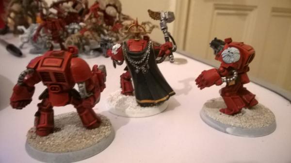
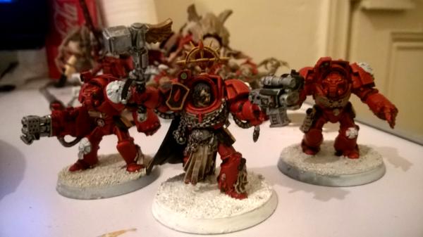
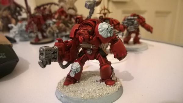
Ive been painting up some tyranids recently which are going fine and got myself some SM stuff along the way. now ive painted some of the models even though they are not totally finished I feel they are lacking something but im not sure what it is. Im hoping someone will be able to tell me from an outside perspective on my scheme, here are some images of what I have so far:
|
|
|
 |
|
2015/01/14 16:47:17
Subject: Whats missing from my scheme
|
|

Regular Dakkanaut
|
You missed some metal areas on the helmets, and the weapons n power fists should be black. If you have nuln oil, I recommend using that on the crux symbols.
heres a reference:
http://www.40korigins.com/pics/newhulk02.jpg
|
|
|
|
|
2015/01/14 17:11:05
Subject: Whats missing from my scheme
|
|
Boosting Space Marine Biker
|
You need some spot colors to make the scheme pop. Things like the various lenses on the models could be done in green or blue. The purity seals should definitely be done in a different color to differentiate them from the armor. Any sort or dark wash on the Crux symbols will definitely help.
|
"If A is a success in life, then A equals x plus y plus z. Work is x; y is play; and z is keeping your mouth shut." - Albert Einstein |
|
|
|
|
2015/01/14 17:15:38
Subject: Whats missing from my scheme
|
|

Ancient Space Wolves Venerable Dreadnought
I... actually don't know. Help?
|
I recommend another colour on the helmet, power fist (Black?), and something more on the shoulderpads.
|
|
|
|
|
|
2015/01/14 17:49:46
Subject: Re:Whats missing from my scheme
|
|
Stalwart Tribune
|
You need black to offset the bright red. I use black for the shoulderpads as a whole then bring up highlights and details. As said above I'd probably also go black for the power fist casing.
|
|
|
|
|
|
2015/01/14 18:07:43
Subject: Whats missing from my scheme
|
|

Changing Our Legion's Name
|
I agree with what has been said about the purity seals. I love red seals, but seeing as your primary colour is red perhaps use some purple or pink to make the seals stand out a bit more and to give them that illusion that they are wax.
The crux could use a wash....and perhaps another colour as well, maybe some bone on the...well...bones haha.
I personally love seeing powerfists, heavy weapons and the like in a contrasting colour, I feel like a muted yellow would be nice on these.
|
|
|
|
|
2015/01/15 03:00:17
Subject: Whats missing from my scheme
|
|
Savage Khorne Berserker Biker
|
Yellow Purity Seals would be a better , Black to offset the red. The bases are missing tuffs or rock, Just looks like gravel right now. Drill out gun barrels. That's just to name a few. IMHO. Though you said they were not done. Highlights/ Glaze/ Wash.
|
|
This message was edited 1 time. Last update was at 2015/01/15 03:00:35

https://www.youtube.com/watch?v=8xqOf-KjdVY
My Hobby Blog:
http://www.dakkadakka.com/dakkaforum/posts/list/594118.page
http://i.imgur.com/yLl7xmu.gif |
|
|
|
|
2015/01/15 10:35:03
Subject: Whats missing from my scheme
|
|
Revving Ravenwing Biker
|
Green purity seals look great on BA
|
|
|
|
|
|
2015/01/15 11:17:57
Subject: Whats missing from my scheme
|
|
Masculine Male Wych
|
Id agree with the above posts.
1. Your missing some metal areas
2. You have a very monotone color scheme (try a wash for a more indepth shading look)
3. Try adding unique markings, hash marks in yellow or black (like a kill tally) or try adding purity seals. Coloring the things that look like buttons a green, blue, yellow and give a glow effect. A white transfer ok the cloak (either a symbol or scripture) along with the chains try color the center of the medallion like a gem or gold.
4. On the flamer, either paint the black circles or drill them out slightly so it looks like it has barrels, try dry brushing a little black to give it a scorch effect, paint the heating element an orange with yellow highlight.
Automatically Appended Next Post:
Oh and also, try adding adding some color to the emblems on the shoulder pads, like the inner cross do the red color or metal or gold.
Just some ideas
|
|
This message was edited 1 time. Last update was at 2015/01/15 11:59:50
|
|
|
|
|
2015/01/17 05:55:30
Subject: Whats missing from my scheme
|
|
Araqiel
|
Ok thanks guys for the tips and advice I should be able to fix the scheme now. Maybe i'll post some finished pics sometime 
|
|
|
|
|
2015/01/17 13:36:57
Subject: Whats missing from my scheme
|
|
Dakka Veteran
|
Karchev the Terrible. J k
It's looking good.
|
\m/ |
|
|
|
|
2015/01/17 19:07:09
Subject: Whats missing from my scheme
|
|
Decrepit Dakkanaut
|
Wait, wait, you can have a monochrome scheme. I mean, look at...

For one of many, many examples of it working well. The problem isn't necessarily that you don't have enough colors, and just adding colors randomly can add more problems that you didn't have before.
If you want to do a more or less single-color theme, that's fine, but you need to have something else to make it pop. single-color schemes are great for OSL, for example. Or instead of it being a "color" model, it could be a "texture" model. Those DE above work well because they have a lot of lines and creases on the model which have all been heavily highlighted. You could easily do something like that.
The problem isn't that you're sort of only doing red, the problem is that the red is very flat the way you've painted it. Bust out some washes or weathering powder, and you'll see a drastic improvement right away.
Actually, a better place to look is at blood angels. They have a nearly all-red scheme with only a bit of black or white thrown in, and it's possible to do them as well:

|
|
This message was edited 2 times. Last update was at 2015/01/17 19:12:54
|
|
|
|
|
2015/01/17 19:49:14
Subject: Whats missing from my scheme
|
|
Morphing Obliterator
|
Ailaros hit the nail on the head, they're nice and neatly painted but look a little flat. Some heavier shading and maybe some weathering (depending on your own personal taste) would work wonders.
|
 12000 pts 12000 pts
 5000pts 5000pts |
|
|
|
|
2015/01/18 00:03:28
Subject: Re:Whats missing from my scheme
|
|

Fresh-Faced New User
|
I'm gonna jump in on this thread, with the same problem. . .
To me, the main thing that pops is the red piping on a single mini. To that end, do I need to paint some more red, maybe lenses on the other models.
Option b) would be what Ailaros mentioned, making the highlighting super bright. best example is top middle mini, the horizontal line along his chest.

With what AtomicEngineer has done, he needs to be brave and mix more orange/yellow with the red to highlight. (I think white would make it too pinky)
|
|
|
|
|
2015/01/18 00:06:37
Subject: Whats missing from my scheme
|
|
Decrepit Dakkanaut
|
In this case, some more highlighting might be in order, certainly. What I'd suggest for these particular models is perhaps to consider chipping or weathering instead.
|
|
|
|
|
|
|
|
 ~2800 points