Forum adverts like this one are shown to any user who is not logged in. Join us by filling out a tiny 3 field form and you will get your own, free, dakka user account which gives a good range of benefits to you:
No adverts like this in the forums anymore.
Times and dates in your local timezone.
Full tracking of what you have read so you can skip to your first unread post, easily see what has changed since you last logged in, and easily see what is new at a glance.
Email notifications for threads you want to watch closely.
Being a part of the oldest wargaming community on the net.
If you are already a member then feel free to login now.
Hello there.
As I quiet enjoy also producing various type of art not related to the table top or war-gaming in general.
I would like to share with my art and hear peoples opinion about it, who knows maybe someone would even like it. I am not any professional it's just hobby and small thing I like to do in free time. It's forum about hobby after all.
I am quiet open for constructive criticism.
Initially I will post some older pieces of work and only one at the time. Most of them will not be war-hammer related.
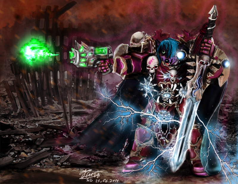
This one was a requested to me. Guy requested from me draw his character in Armour of dark Vangence chaos lord.
This message was edited 1 time. Last update was at 2015/02/25 19:57:27
Hello.
Flesh forge here. A Model designer for hire!
3D print and modelling of all kinds.
twitter.com/Flesh_Forge
www.deviantart.com/flesh-forge
People always say that, but then they often aren't as open to criticism as they made out. Regardless, however, I have lots!
The first thing I would suggest would be to tone the background down and give it more depth. You want the figure to stand out from the background. When everything is bright, that can't happen. Take a look at this photo:
You will notice that the trees in the foreground are very dark, but as the trees get further away they get progressively fainter, disappearing into the atmosphere. The effect is somewhat exaggerated by the mist (thick atmosphere), but it is always there to some degree. This is why distant mountains always look... well... distant. This phenomenon is actually quite important for human depth perception. Without it, astronauts visiting The Moon (no atmosphere) found it very difficult to judge long distances. As an artist you can use this to your advantage to trick people into seeing three dimensional depth in a two dimensional image. It will also help your main figure stand out from the background.
The second thing I would suggest would be to harden up some of your edges. One of the nice things about digital painting is that it makes it easy to do smooth blends between tones and colours (I wish it were so easy with miniature painting). But if everything is soft and blended then the picture becomes blurry, and details are hard to make out. You want to make sure that your objects have good hard edges so that doesn't happen. I scoured my Photobucket for some WIP pictures, to give you and idea of what I mean:
Spoiler:
This is from a Spawn picture I was painting a few years back: I start with a clean crisp outlines (silhouette). No blurry edges.
Then I start to paint in some of the details on the cape. These parts can be murky and soft, but I keep the edges hard so the object remains clear.
This is a small WIP section from another painting. Again, I start with a hard black outline for the arm before I start laying down the tones. The edges of the arm remain sharp the whole way through. I don't want them to blur into the background and become undefined.
The last thing I would suggest (and trust me, this one took me a long time to learn): don't try to "cheat" by cutting corners and being lazy. You should try not to rely too heavily on photos and filters. For example: I can see that the three lightning forks on his sword, are just the same image that has been flipped around and used three times. That's lazy man! You couldn't spare a few seconds to squiggle some original lightning? I can see that you have used the photograph of the chaos lord from Dark Vengeance as the basis of your painting. I can see all the smoke filters on the background, and the cheesey glow effects. But you don't need any of that stuff. What people really like to see (what makes them go WOW!) is hard work and attention to detail. You can't really fake that. Just take your time, paint things properly in your own style (don't let Photoshop dictate). Your pictures will look way better, and I think you'll be much happier with them, and yourself.
Hope that's helpful. Keep up the good work.
This message was edited 1 time. Last update was at 2015/02/26 07:51:11
Thanks mate that is indeed useful.
You are right about the sword but not the smoke effects, that was a custom brushes.
And blending together textures/images is habit dictated by my uni and work . I have to produce bits faster than more accurate, besides I doubt I could make that good looking lightnings and other effects by self.
Still this is very appreciated, and soon I will send up some more stuff.
Automatically Appended Next Post:
So as I said, another piece. Mind this one was just a concept art-piece, and was quiet quickly done. Still opinions welcome.
This message was edited 1 time. Last update was at 2015/02/26 17:59:45
Hello.
Flesh forge here. A Model designer for hire!
3D print and modelling of all kinds.
twitter.com/Flesh_Forge
www.deviantart.com/flesh-forge