Thanks for the reply.

I can kind of see what you are saying....
WarbossDakka wrote:Yea, hungry has a point there, you need a contrasting colour in there, like where there's black replace it with a lighter colour.
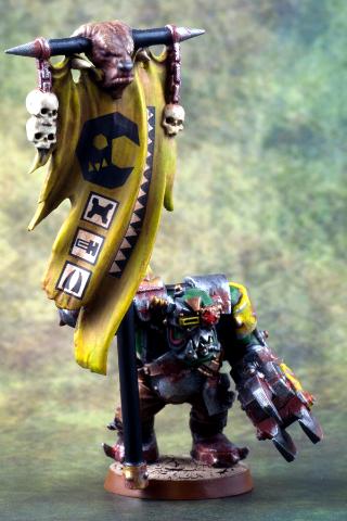
This guy model is probably all about the banner... so that is what should draw you about it... I admit the lighting on the front is inadequate and darkens most of it.
Any suggestions on the weathering, skin or armour?
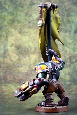
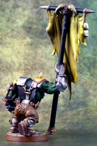
hungryp wrote:The banner looks great, the only potential problem I see is that it's kind of the focal point for the whole model. There's not a lot of tonal difference between the Ork's skin, armour, and clothes so it all just blends together as a mass of colour with nothing in particular to draw the eye.
Not sure how to contrast it... the yellow contrasts to the darker brown/black/green colours. What other lighter colour would you suggest? Bit of Reddy-Orange colour?


 If you can't believe in yourself, believe in me! Believe in the Dakka who believes in you!