| Author |
Message |
 |
|
|
|
|
Advert
|
Forum adverts like this one are shown to any user who is not logged in. Join us by filling out a tiny 3 field form and you will get your own, free, dakka user account which gives a good range of benefits to you:
- No adverts like this in the forums anymore.
- Times and dates in your local timezone.
- Full tracking of what you have read so you can skip to your first unread post, easily see what has changed since you last logged in, and easily see what is new at a glance.
- Email notifications for threads you want to watch closely.
- Being a part of the oldest wargaming community on the net.
If you are already a member then feel free to login now. |
|
 |
2015/05/05 10:00:56
Subject: Looking for Brutal and unbridled honesty
|
|

Wicked Canoptek Wraith
|
Hi folks. I'm hear to ask for unapologetic critique of some of my recent models, for both conversion and paint style. With these miniatures, I was aiming for a dark, distressed, and weather beaten look. The paint jobs are far removed from the perfection of classic model painting.
Ultimately, I'd like to gauge whether or not if I have the potential for commission work. So I'm left to your mercy. Feel free to point out the good, the bad, and the horrendous. If you have any questions, fire away.
Disclaimer: I'm not an artist nor photographer. I apologize for the poor quality photos.
Thanks.
The Convergent (Transcendent C'tan) 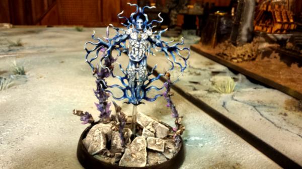 The Maggot King (Scratch-Built Destroyer Lord) 
The Archieotect(Deceiver mod) 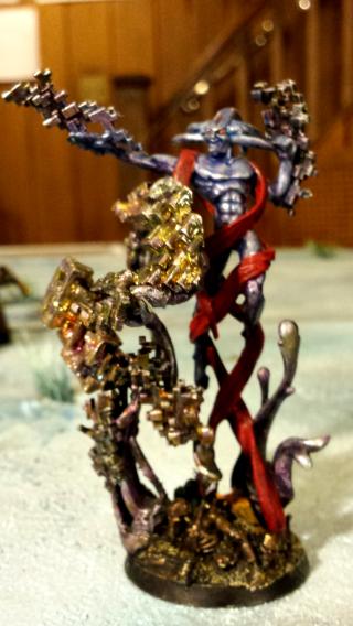 The Big Cheese(Vermin Lord Conversion) 
Justice Incarnate(Hector Rex mod)  Seraph of Blue Flame(Shadow Spectre conversion) 
CryptCrawler(Canoptek Wraith)  The Seculator(Necron conversion) 
The Sentinel(Grey Knight Paladin conversion)  MALICE(Nightbringer mod) 
The Ziggurat(Tomb Citadel mod)  Ancient Alien(Tesseract Vault) 
The Man who could have been King(Kaldor Draigo mod)  Cypher Reborn(cypher conversion) 
Master of Allegory(Archmagos Draykavac) 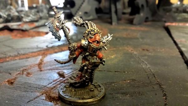 The Drifter(scratch-built conversion) 
Harbinger of the Void(Scratch-built Cryptek)  Beetle(Tau Crisis suit)  Scinge(Sub Commander Torchstar)  Vesthian(Grand Master Grey Knight conversion) 
Marduk(Anrakyr the Traveler mod)  Relic(Gerantius the Green) 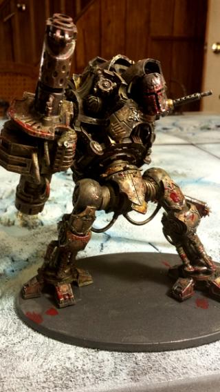
|
|
This message was edited 3 times. Last update was at 2015/05/06 00:28:02
|
|
|
 |
|
2015/05/05 10:15:39
Subject: Looking for Brutal and unbridled honesty
|
|
Repentia Mistress
|
The biggest critique that I can give you is to stop using cyan text. It spooks the kids and makes the dogs bark (on a more serious note, from a design standpoint, it's usually best to stay clear of eye-searing neon text unless a headache is what you're going for).
Other than that, your paintjobs look pretty solid. They're better than anything I could pull off.
If you're going to start a commission service, I seriously recommend getting some sort of photo box set up. There are plenty of tutorials online that can give you high-quality photos of your minis for pretty cheap. The detail of your work will come through a lot more clearly, and create a more professional look.
I think that you've got potential as a commission painter, assuming that you can turn these out relatively quickly and on a schedule. Don't let a hobby and a joy become a chore, though. This sort of stuff doesn't yield much profit, so the reward will largely be knowing that you brought hours of fun to a customer, and had fun painting up some kickass models in the process.
|
|
This message was edited 1 time. Last update was at 2015/05/05 10:16:22
|
|
|
|
|
2015/05/05 10:32:27
Subject: Looking for Brutal and unbridled honesty
|
|
Tunneling Trygon
|
Opinion of someone that would only buy and has no painting talent whatsoever:
A lot of the dark models look muddy. The Vault is really the only exception on brightness, but Cypher in particular looks like someone dragged him through a sewer. The conversion, all of the conversions really, are friggin awesome, but even the gold on Hector Rex is muddy.
I would add some more brightly colored models to your showcase. Individually, they all have a very gritty feel but all together like this, no bright blue (Ultramarines/Alaitoc), red (Blood Angels) or green (Orks/Biel-Tan), it doesn't lend itself well to 'alternate styles' other than the dark and gritty. It actually dulled my excitement the further down the list I got. Some Bad Moon Boyz and Blood Angels would really spice up the visuals.
Will also say though, the Seraph is incredible.
|
|
This message was edited 1 time. Last update was at 2015/05/05 10:33:31
|
|
|
|
|
2015/05/05 13:16:28
Subject: Looking for Brutal and unbridled honesty
|
|

Tunneling Trygon
|
Honestly, the photos aren't doing you any favours. That's probably the most immediate thing I'd consider fixing, if only so that we can give better, more in-depth critiques.
I'm not overly sure if I'm understanding what your goal is based on the text, but in my mind I'm conjuring a bit of a Blanchesque vibe (tortured and weathered in appearance). That involves a very earthy palette, lots of muted colours and sepia tones, rather than actual dirt (although that can be added after as appropriate). The best examples I can see of this are the Ancient Alien and the Crypt Crawler (again, the photos are pretty poor, so you may well have done it with others and I'm just not seeing it). I'd try to avoid using overly saturated colours, as that can throw off what would otherwise be a pretty decent paintjob; the spectres around Malice are a bit too vibrant and limey, and The Big Cheese is aptly named as it looks a lot more cartoonish than the rest of them with the bright red horns and hands (tentacle?).
Other than that, some more focus on general shading and highlighting via layering and blending as opposed to relying mostly on shading is the way to go if you want to paint commercially. Again (for the third time) it might be the photos, but Cypher, The Archieotect's red ribbon, Hector, and the Sentinel, to name the ringleaders, don't look like much more than a base colour/wash combo. They don't look bad, but they're not good enough to be commissioned works.
|
|
|
|
|
2015/05/05 14:01:40
Subject: Re:Looking for Brutal and unbridled honesty
|
|
Furious Fire Dragon
|
I'm a huge fan of being invited to give my opinion where I have no business giving it!
1) Please drill out the Storm Bolter barrels.
2) You have magic effects (Drifter and Seculator) that look odd because magic effects aren't really supposed to be muddy. I think if you brightened/sharpened them up and did some OSL (a bright purpley glow on the Seculator would be sweet), it would enhance the GrimDark you have going on in the rest of the model.
3) Your color scheme(s) for your bases could stand to be looked at. I read an article (From The Warp, I think) about using the colors/brightness of a base to compliment/contrast the scheme on a model.
4) It is not easy to tell whether or not some things are glossy intentionally or not (the Seraph of Blue Flame).
Your conversion work is consistent (the bits/overall coherency) and definitely has a GrimDark vibe.
Keep it up, you're on the right track (and much further down that track than a lot of hobbyists).
|
|
|
|
|
2015/05/05 17:11:09
Subject: Looking for Brutal and unbridled honesty
|
|
Regular Dakkanaut
|
I would work on your pictures as well really hard to get a good look at the details, black or white backdrops and sun light make a big difference, if I was looking for a person to paint my stuff I'd be a bit worried by those pics because I would not be sure how it would actually look. Good pix very important if your looking to not only show off your work but inspire others to hire you.
|
|
|
|
|
2015/05/05 17:11:24
Subject: Re:Looking for Brutal and unbridled honesty
|
|

Dakka Veteran
Eacute cole Militaire (Paris)
|
do you use oil colours for most of your work? looks good so far ...
|
Do not kill. Do not rape. Do not steal. These are principles which every man of every faith can embrace.
For if you do, one day you will look behind you and you will see us And on that day, you will reap it,
and we will send you to whatever god you wish. |
|
|
|
|
2015/05/05 18:39:31
Subject: Looking for Brutal and unbridled honesty
|
|

Powerful Spawning Champion
|
I can't critique the painting because I'm a 3/10 painter myself, but I will tell you the conversions are fantastic.
Also to +1 what was said, set up a better lighting/photo game. Again I can't speak much to it, but the models would look much better if they were presented properly.
|
|
|
|
|
2015/05/05 20:59:42
Subject: Re:Looking for Brutal and unbridled honesty
|
|
Sneaky Striking Scorpion
|
The only point I can make with any honesty at the moment is that your photos need to be significantly improved for any sort of commission work.
I am sure there are some people out there that seek commission work based on nothing more than their own inability to paint or lack of time/interest.
However I would put forth the notion that most people looking for commission work are doing so because they want a particularly well-crafted army. That being said, the only way for a potential customer to see what they would potentially be paying for is to ... see it? If you have talent as a painter (which, at this point I just plain can't tell through the poor quality photos), than your first point of business should be to showcase that talent, since it is the service you'll be selling.
invest in a simple setup... lighting and framing can be done very affordably. The lighting and framing are will help compensate for less than spectacular photos... even simple smartphones can take decent photos if the lighting conditions are right. (they will never eclipse dedicated tools such as DSLRs, but they are more than adequate for this).
Find something steady to place you camera or phone on... unsteady hands are the primary cause of blurred photos.
With a stand for the camera / phone, and a decent lighting setup, I would suggest you repost and ask your question again at a later time.
best of luck
|
|
|
|
|
2015/05/05 21:15:29
Subject: Re:Looking for Brutal and unbridled honesty
|
|
Wicked Canoptek Wraith
|
Some really good feed back here. Thanks guys.
Yeah, I took some quick snaps with my phone, hence the poor visuals. I will definitely research some solutions based on the suggestions here. More or less, I wanted the knee-jerk reactions to my stuff, to see whether or not I'm delusional, lol.
And yes, Blachesque and GrimDark do sum up what direction I aim, quite articulately. A experimented with shade-heavy contrast to blended effects on various models to develop a sound kinesthesia.
|
|
This message was edited 4 times. Last update was at 2015/05/06 00:25:33
|
|
|
|
|
2015/05/05 22:06:59
Subject: Looking for Brutal and unbridled honesty
|
|

Violent Enforcer
|
For your photos, take a sheet of white paper and put it half up against a wall so you have a nice curving transition between the "floor" and the wall behind. I sometimes just use a brown cardboard box as well. Just the fact of having something behind will help your camera focus on the mini.
Also think about investing in a decent lamp with a white light bulb. At the moment your lighting setup looks very very yellow and that doesn't help do your mini's justice.
Your conversions are awesome and the style is cool. I would suggest trying to do some minis that contrast your style a bit as well to show potential clients that you have a range of skills.
Good luck!
|
|
|
|
|
2015/05/05 22:28:15
Subject: Looking for Brutal and unbridled honesty
|
|
Legendary Master of the Chapter
|
Only Major cqrituqe is the photography. Having a bunch of different light sources and things bouncing around changes the color a bit. try to take a picture in a neutral white room with like the back of a poster taped to the table and up the wall in an arch. try to get some neutral light bulbs to take the photograph with. no flash. Basing and pose wise its fantastic. very cool use of bismuth. Paint wise. its a bit on the dark side, kinda heavy on the wash it seems its great on the c tans but a bit dirtier on other models. i think you could use more contrasting colors and or just brighten things up a little more. also da feth is that imperial knight doing? break dancing?  the photo makes him look like he is trying to do a neo bullet dodge.
|
|
This message was edited 2 times. Last update was at 2015/05/05 22:48:00
 Unit1126PLL wrote: Unit1126PLL wrote: Scott-S6 wrote: Scott-S6 wrote:And yet another thread is hijacked for Unit to ask for the same advice, receive the same answers and make the same excuses.
Oh my god I'm becoming martel.
Send help!
|
|
|
|
|
2015/05/05 22:47:28
Subject: Looking for Brutal and unbridled honesty
|
|

Regular Dakkanaut
North Coast, NSW, Australia
|
The wings on the Shadow Spectre conversion...
Are they:
1) Simply the Flame Phoenix Fire (or perhaps 'frost') version stock standard
2) or have they been cut and repositioned
3) I'm completely wrong...
Just asking because I plan on doing the same, but for a marine and wanted to double check...
Some very nice conversions there!
|
'Anyone can win, but it takes a good man to lose.'
-Louis Guzman |
|
|
|
|
2015/05/05 22:52:07
Subject: Looking for Brutal and unbridled honesty
|
|
Fresh-Faced New User
|
Love the rusty grimy look
|
|
|
|
|
2015/05/05 23:15:22
Subject: Re:Looking for Brutal and unbridled honesty
|
|
Regular Dakkanaut
Grand Forks, ND, USA
|
I think your work shows great skill and I don't think you will have problems finding commissions if you have a right to do so. I encourage you to read any intellectual property policies which may apply. There is one I found on the Games Workshop website. I am not a lawyer. I just think it is worth your time to review.
|
"They don't know us. Robot tanks are no match for space marines." Sergeant Knox from Star Blazers
Jesus Christ is the Resurrection and the Life |
|
|
|
|
2015/05/06 00:24:31
Subject: Re:Looking for Brutal and unbridled honesty
|
|
Wicked Canoptek Wraith
|
do you use oil colours for most of your work? looks good so far ...
I use oil paint only for the models Trans C'tan and Seraph. The oil filled in the colors for the crackle effects, since crackle is water soluble. Oil works as a good medium. Afterwards I seal the oil.
4) It is not easy to tell whether or not some things are glossy intentionally or not (the Seraph of Blue Flame).
Yes. The blue flames were intended to be glossy. Unfortunately, it looks like I caught a bit too much light off of them in the shot.
also da feth is that imperial knight doing? break dancing? the photo makes him look like he is trying to do a neo bullet dodge.
Hahaha, you hit it on the nose! That's probably not the most flattering angle I took the shot at. I take another one to better illustrate the pose.
Are they:
1) Simply the Flame Phoenix Fire (or perhaps 'frost') version stock standard
2) or have they been cut and repositioned
3) I'm completely wrong...
#2. They are bits from the fantasy fire phoenix, cut and repositioned. The feathered tails that drape the wings didn't fit correctly. The wings in general didn't fit for that matter either. All of the wing assembly was heavily modified to accommodate the spectre's frame. I can send you a pm with a photo for his back if you like.
I encourage you to read any intellectual property policies which may apply. There is one I found on the Games Workshop website. I am not a lawyer. I just think it is worth your time to review.
Hmmm, I didn't consider that. Can you elaborate on this? Is it over selling a painted model? Or the conversions? As far as the titles, they're just added personal fluff.
Once again a lot of excellent advise on lighting, photo sets, and backdrops. A phone/camera stand would be neat too. Any specific camera type recommended? In addition, is there was a specific paint style represented in the images that is more favorable? I get the impression that the "muddied" look is a no-go. Or would I be better of just sticking to conversions, and let the professionals handle the paint? For me this venture would be just some supplemental cash to further the hobby, and tap into other people's imaginations for some wild scratch-builds and conversions.
|
|
|
|
|
|
2015/05/06 08:30:40
Subject: Looking for Brutal and unbridled honesty
|
|
Violent Enforcer
|
I don't think the "muddied" look in itself is a problem, it's more to avoid using it everywhere to have a bit of contrast. You do this already with the Tau battlesuit- his missiles are bright blue compared to his dirty armour and it looks great.
However for example on Draigo's sword, the Speculator's lightning or the spirit hosts around Malice it looks a bit too dark and could benefit from employing a different technique from a wash.
|
|
|
|
|
2015/05/21 13:08:38
Subject: Looking for Brutal and unbridled honesty
|
|
Basecoated Black
|
Comments re: photography speak for themselves.
I think many of the models lack contrast - they are well shaded but the highlights are too subtle. Are you painting under a close spotlight? That is usually the cause of well painted models tending to "disappear" under normal lighting. I think most of the models in your showcase would appear as brown blobs at tabletop viewing distance.
|
|
|
|
|
2015/05/21 13:25:47
Subject: Re:Looking for Brutal and unbridled honesty
|
|
Grim Dark Angels Interrogator-Chaplain
|
Check out this thread with a WD tutorial on how to take pics of models properly, cause I'll be honest the pics you posted don't really come up all that well.
http://www.dakkadakka.com/dakkaforum/posts/list/640699.page
|
|
|
|
|
|
2015/05/22 13:00:21
Subject: Looking for Brutal and unbridled honesty
|
|
Been Around the Block
|
Some customers will want you to paint elaborate and detailed characters, but a lot of people will want to see that you can do hordes and large blobs of troops. You don't show any of this kind of thing. Batch painting troops can be arduous and monotonous. I would need to see that you can do this before I would commission any work from you.
The work you do show is pretty impressive however, I think you have enough ability to commission paint.
|
|
This message was edited 1 time. Last update was at 2015/05/22 13:02:06
|
|
|
|
|
2015/05/22 13:12:33
Subject: Looking for Brutal and unbridled honesty
|
|
Regular Dakkanaut
|
How about I send you all my minis, you can paint them up for me and then we'll definitely be able to determine if you are skilled enough to do commission work 
|
|
|
|
|
|
2015/05/22 13:40:32
Subject: Looking for Brutal and unbridled honesty
|
|
Ship's Officer
|
The crypt crawler- energy from hand looks off due to lack of contrast, need some light and dark areas to make it pop.
Lens- you need to work on those, then add gloss varnish over it.
vermin lord- you did a great job on the sword, the horns could use some work.
As mentioned already, getting a actual camera that is not a point and click is essential, a photoshop of some sort to brighten up the image; a good photo goes a long way.
As far as commission: try doing it in your local group first to get some income to buy the necessity, then branch out.
|
|
|
|
|
2015/05/22 14:47:27
Subject: Looking for Brutal and unbridled honesty
|
|
Road-Raging Blood Angel Biker
|
Very impressive.
I really like the grim-dark style that they have been painted to. They look dark, gritty and dirty, just as futuristic warfare would look like. I think that style would also work really well with the Forgeworld Heresy era models and I can see you doing a really good Death Guard army in that style.
They look more than good enough for commission to me, excellently done from what I can tell by the photos. I guess if you did another style or two that would open up the door for more customers, whereas sticking with just the darker style (which does look amazing!) limits the number of potential clients to just those that like the darker/grimier style.
In terms of Photography, if you are looking at doing commission work, you need to be making those photos as polished as you can. Here is a really good article on it by DakkaDakka member LutherMax's blog where he goes through the type of lighting, environment etc for photographing miniatures: http://www.themightybrush.com/?p=514
|
|
This message was edited 2 times. Last update was at 2015/05/22 14:55:56
"For The Emperor and Sanguinius!"
My Armies:
 Blood Angels, Blood Angels,  Ultramarines, Ultramarines,
Astra Militarum,
Mechanicus |
|
|
|
|
2015/05/22 18:39:25
Subject: Looking for Brutal and unbridled honesty
|
|
Sure Space Wolves Land Raider Pilot
Schaumburg, IL
|
Ok, brutal and unbridled honesty. It looks like crap! I mean c'mon, wood paneling on the walls? That is sooo from the 70's.
As for the models, they look very good - the only criticism that I can see is that they seem almost too dark. I get that it is supposed to be dingy metal and then you have the near white highlights, but I'd try and make the lighter ares stand out more - it really seems like you are losing some of the detail because it is too dark. That or maybe it's just needing to add more light when taking the picture.
|
I'm not prejudiced, I hate everyone equally |
|
|
|
|
2015/05/22 20:36:31
Subject: Looking for Brutal and unbridled honesty
|
|
Regular Dakkanaut
|
It looks like you rely on realistic effects, and thats kind of bad because at the scale and at table height a lot of that detail becomes mushy.
You might want to practice trying some serious edge highlights and other exaggerated things and see how you like looking at them from gaming height.
|
|
|
|
|
2015/05/22 21:18:37
Subject: Looking for Brutal and unbridled honesty
|
|
Norn Queen
|
Conversions are excellent. The paint jobs are top notch. But as others have noted your colors are coming across almost monotone. It's all variations on the same orange muddiness. I would love to see more green, blue and silver in there to give some diversity to the models and your showcase. The angel and the tesseract vault are the only exceptions to this critique.
|
These are my opinions. This is how I feel. Others may feel differently. This needs to be stated for some reason.
|
|
|
|
|
2015/05/22 22:49:27
Subject: Re:Looking for Brutal and unbridled honesty
|
|
Insect-Infested Nurgle Chaos Lord
|
These are very cool.
You need to take more pictures of each one.
Perhaps do a post about each one? Describe the inspiration and the thought process?
I'm particularly interested in seeing the maggot king.
|
|
|
|
|
|
2015/05/23 04:23:31
Subject: Looking for Brutal and unbridled honesty
|
|
Tail-spinning Tomb Blade Pilot
In a chair, staring at a screen
|
Very good stuff! Its so good there can be no other improvements to be made apart from retake the photos.
|
 1500 pts 1500 pts
 2000pts 2000pts |
|
|
|
|
2015/05/23 09:15:42
Subject: Re:Looking for Brutal and unbridled honesty
|
|
Infiltrating Broodlord
|
Honestly, I like the more weathered and drab colors. I would probably want something like that done for my army if it was comission painted, although it probably never will be.
I'm seeing 3 things that really jump out at me to sell your services. Two have already been mentioned.
1) Get a neutral tone backdrop so that the only thing in the photo is the model
2) Showcase other art styles besides your gritty dark style just to show people that you can
and 3) my suggestion: don't use conversions. You are showcasing technical skill. Not creativity. A commission painter is a professional paid to recreate someone else's idea on a canvas that they also provided you. So instead of creating something new and unprecedented and applying your personal painting to, take standardized models and show that you can make them look amazing. In your style and others.
|
Proud supporter of

It is human nature to seek culpability in a time of tragedy. It is a sign of strength to cry out against fate, rather than to bow one's head and succumb.
-Gabriel Angelos |
|
|
|
|
2015/05/23 17:01:27
Subject: Looking for Brutal and unbridled honesty
|
|
Been Around the Block
|
I'm a firm believer in the gritty, grim dark battle scarred look. I wan't my miniatures to look like they're been in the fight of their life, not like they're freshly out of a Mechanicus salon.
You've captured that look magnificently IMO. I especially like the Grey Knights.
Only real feedback I would offer are the actual pics. I would be nice to be able to see the miniatures a bit closer with a little better lighting. I understand though that's quite difficult on some of your mini's because of their size. I'd love to see that Vesthian Grey Knight mini in focus and from several different angles.
Thanks for the pics. The Grey Knights minis are very inspiring.
|
|
This message was edited 1 time. Last update was at 2015/05/23 17:04:00
|
|
|
|
|
|
|


 Legion: Dark Angels
  6400 pts+ 8th