 Peregrine wrote:
Actually, that second one is exactly the kind of Blanche art I hate. It's just a pile of space marines
without any thought given to artistic composition or pesky details like what the marines are supposed to be standing on or how far away they are.
I think that's a bit unkind (emboldened section in particular). Remember that the image had to work in a number of ways...
As a landscape box cover with a large logo:

As a portrait rulebook cover with the (then-standard) frame:

...as well as a standalone background.
In fact, I think that image is a pretty good example of what JB does very well; and that's effectively communicate the mood of the setting. From the colour palette to tonal contrast to the multiple-triangle composition (look how the central 'cone' of figures leads the eye up into the logo, for example), there's a huge amount of work gone into communicating the pseudo-dark age feel of the
40k galaxy, as well as harking back to the desperate last stand feel of John Sibbick's original
Rogue Trader art.
Compare it with the
Warzone box cover from roughly the same period:
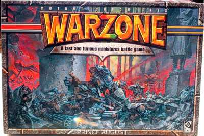
Whether you like the style or not, there's a lot of technical points in favour of Blanche's composition, colour choice and tonal structure.
Les Edwards'
Heroquest's box cover is an iconic piece; and here the styles are hugely different. I highlight it because it's a good example of a similar colour palette to that 3rd ed
40k cover. While it's a fantastic painting, I don't think it communicates the chaotic mood of the Warhammer universe – these figures, while beautifully rendered, could easily be from another setting; which is at the heart of why I like Blanche's art so much – it is indivisible from the Warhammer worlds in a way few other artists were. As an aside, I always felt Gary Harrod's, Wayne England's and (to a lesser extent) Paul Bonner's work always felt 'properly Warhammer' in a way that Ian Miller's (as an example) did not (though I also like Miller's work a great deal).

The
Heroquest could of course be argued that it's not in the Warhammer world at all, so on the same theme, Jim Burns'
Space Crusade box art is similar to my objections to
Heroquest's box art – that while it's beautifully executed, it doesn't 'feel
40k'.

In both, the composition is very carefully – classically – structured by master artists; but it doesn't communicate the universe like Blanche's art does.
Anyway, that was giant wall o'text! Sorry. Just wanted to point out that the 3rd ed. cover has had a
lot of thought and experience poured into its composition.


 [/spoiler]