| Author |
Message |
 |
|
|
|
|
Advert
|
Forum adverts like this one are shown to any user who is not logged in. Join us by filling out a tiny 3 field form and you will get your own, free, dakka user account which gives a good range of benefits to you:
- No adverts like this in the forums anymore.
- Times and dates in your local timezone.
- Full tracking of what you have read so you can skip to your first unread post, easily see what has changed since you last logged in, and easily see what is new at a glance.
- Email notifications for threads you want to watch closely.
- Being a part of the oldest wargaming community on the net.
If you are already a member then feel free to login now. |
|
 |
2016/02/08 14:20:31
Subject: My tau scheme test, not so satisfied...Where did I go wrong?
|
|

Apprehensive Inquisitorial Apprentice
|
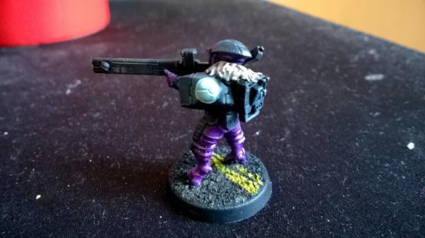
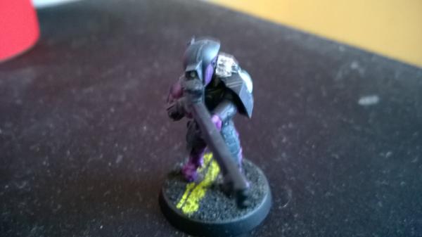
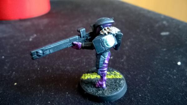
I could use input and advice on this ive been going at different tau schemes now for two weeks painting and repainting and nothings working. My latest example of a scheme is here and I need advice on it because I can't keep repainting these models and I just want it to work.
|
|
This message was edited 1 time. Last update was at 2016/02/08 14:52:13
Ask of me, and I will make the nations your heritage,
and the ends of the earth your possession. You shall break them with a rod of iron and dash them in pieces like a potter’s vessel. Now therefore, O kings, be wise; be warned, O rulers of the earth. Serve the Lord with fear, and rejoice with trembling. Kiss the Son,
lest he be angry, and you perish in the way,
for his wrath is quickly kindled. Blessed are all who take refuge in him. |
|
|
 |
|
2016/02/08 15:15:09
Subject: My tau scheme test, not so satisfied...Where did I go wrong?
|
|

Furious Fire Dragon
|
Well depending on what you want to achieve you need to see the color wheel. The colors seem nice a smooth but they are too close on the color wheel to pop on the eye.
http://paletton.com/#uid=a4N1Z0kllllaFw0g0qFqFg0w0aF
Getting the turquoise parts painted on an okra, snakebite leather kind of color will work much much better.
On the other hand adding some red will break up the model nicely according to this.
http://paletton.com/#uid=54G100kllllaFw0g0qFqFg0w0aF
|
Got milk?
All I can say about painting is that VMC tastes much better than VMA... especially black... 
PM me if you are interested in Commission work.
|
|
|
|
|
2016/02/08 19:04:18
Subject: My tau scheme test, not so satisfied...Where did I go wrong?
|
|
Veteran Wolf Guard Squad Leader
|
Second for consulting the color wheel for some contrast. Another trick is that if you're going darker on the model, go lighter on the base so it doesn't get lost.
|
|
|
|
|
|
2016/02/08 23:00:16
Subject: My tau scheme test, not so satisfied...Where did I go wrong?
|
|
Norn Queen
|
So there are 4 scales used to describe color.
Hue is the rainbow scale.
Tints add white.
Tones add grey.
Shades add black.
If you picture a 10 step scale, white at 1 black at 10 and 8 shades of grey between you need to make, at minimum a 2 step jump to build enough contrast that the colors stand out as distinctly different colors. The farther you go the more the colors polarize and become much more distinct. The more scales you make that jump on the same thing happens.
With hue the scale is represented as a color wheel. The opposite end of the color wheel from purple is yellow and thus it is your direct compliment. Your purples will get more purple, your yellows more yellow and everything will pop.
For a really deep purple with dark grey secondary I would throw in some splashes of a gold to accent. Or just some rustic yellow accent lines on the armor.
|
|
This message was edited 2 times. Last update was at 2016/02/08 23:04:03
These are my opinions. This is how I feel. Others may feel differently. This needs to be stated for some reason.
|
|
|
|
|
|
|