Forum adverts like this one are shown to any user who is not logged in. Join us by filling out a tiny 3 field form and you will get your own, free, dakka user account which gives a good range of benefits to you:
No adverts like this in the forums anymore.
Times and dates in your local timezone.
Full tracking of what you have read so you can skip to your first unread post, easily see what has changed since you last logged in, and easily see what is new at a glance.
Email notifications for threads you want to watch closely.
Being a part of the oldest wargaming community on the net.
If you are already a member then feel free to login now.
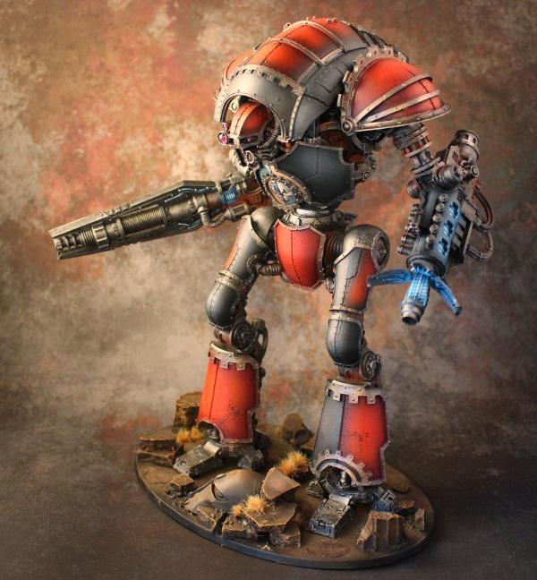
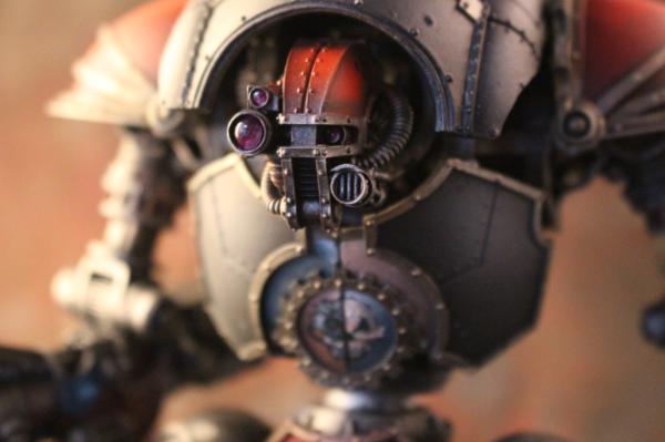
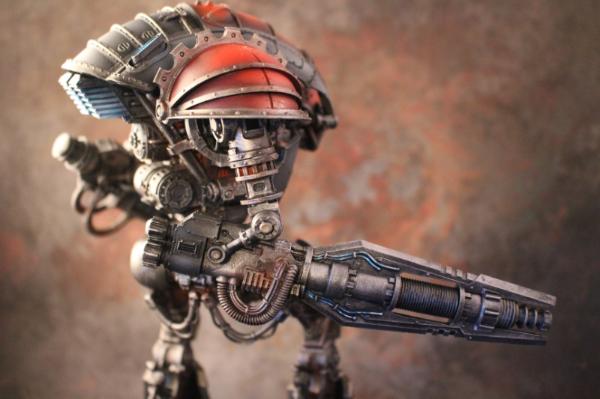
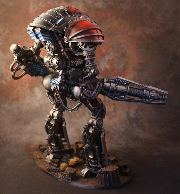
This is my favorite Knight to come out, one I would be tempted to own myself.
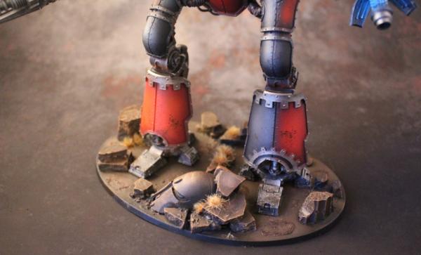
I wanted to do a simple and clean scheme this time and Im happy with the result. I could have done a lot of freehand but on this guy I think less is more.
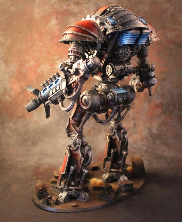
Great paint job. The pose leaves a lot to be desired...reminds me of the B@C contemptor pose which is a same given the poseability options you have with the FW knight kits.
Less IS more here. Absolutely. This isn't the ultra flamboyant Knight of a prissy House, this is the metal faced malice of the Mechanicum come to deliver hurt.
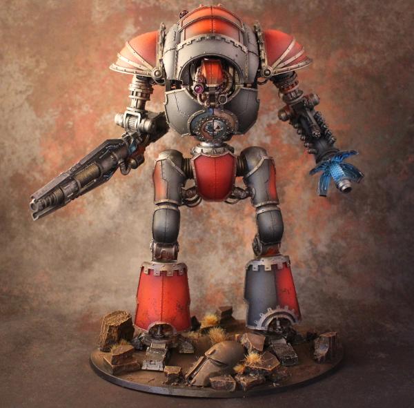
That lense is mind blowing. I rarely get excited these days but that artistry had me leaning in for a better look. OSL still doesn't work for me, but I can appreciate the cleanliness with which you delivered it.


 [Eggroll's Blood Angels WIP Log]