| Author |
Message |
 |
|
|
|
|
Advert
|
Forum adverts like this one are shown to any user who is not logged in. Join us by filling out a tiny 3 field form and you will get your own, free, dakka user account which gives a good range of benefits to you:
- No adverts like this in the forums anymore.
- Times and dates in your local timezone.
- Full tracking of what you have read so you can skip to your first unread post, easily see what has changed since you last logged in, and easily see what is new at a glance.
- Email notifications for threads you want to watch closely.
- Being a part of the oldest wargaming community on the net.
If you are already a member then feel free to login now. |
|
 |
2016/06/03 21:28:24
Subject: Black problems
|
|

Longtime Dakkanaut
|
Hey guys I am having one hell of a problem here.
Ok so I started my ork army and have a warboss on foot. He is part of the ash boyz, red black white and green of course.
now when I painted the colours it looked good highlighted them and from a distance the black looked good... But up close the change from black to a light grey is to annoying. Then I decided to darken up the red and white to help the black some..... Now I still hate the black....
Is there a way to paint the black with out it being so eye catching? Like look he has a black foot! I am trying os hard to avoid bright highlights and I am using GW darkest grey and still looks to bright to me.
Help me 
|
|
This message was edited 1 time. Last update was at 2016/06/03 21:29:27
I need to go to work every day.
Millions of people on welfare depend on me. |
|
|
 |
|
2016/06/03 21:59:05
Subject: Re:Black problems
|
|

Mekboy Hammerin' Somethin'
|
Black can be deceptively tricky to highlight well...I'm sure there'll be plenty of more experienced painters around here that can give you some better instructions/advice, but here's my 2cents...
try putting some grey on your pallet, mix a bit of water into it, then add tiny bits of black into it until it looks dark enough for you 
...or, try a layer of nuln oil over it, that might darken the highlights and blend them into the black a little better?
|
    ...it's good to be green! ...it's good to be green! |
|
|
|
|
2016/06/03 22:08:29
Subject: Re:Black problems
|
|

Fixture of Dakka
|
P3 paints has a color called "Coal Black". It's basically a really really really really dark blue, so dark it looks black unless you have black right next to it. That should work for your purposes.
Or use dark-to-medium greys and glaze with Nuln Oil.
But in the end, so long as it looks good from three feet away it's plenty fine for the tabletop. Remember, "perfect" is often the enemy of 'good enough'.
|
CHAOS! PANIC! DISORDER!
My job here is done. |
|
|
|
|
2016/06/03 23:32:52
Subject: Black problems
|
|

Thane of Dol Guldur
|
Dont use greys to highlight black, use colours like blue or red
|
  Heresy World Eaters/Emperors Children Heresy World Eaters/Emperors Children 
Instagram: nagrakali_love_songs |
|
|
|
|
2016/06/03 23:52:37
Subject: Re:Black problems
|
|
Speedy Swiftclaw Biker
|
Search for videos on painting Ulthwe eldar. They are mostly black and I've seen some good tutorials.
|
Do I have something in my teeth?
|
|
|
|
|
2016/06/04 00:20:27
Subject: Black problems
|
|
Blood-Raging Khorne Berserker
|
I recommend GWs Dark Reaper for highlighting black. It's seen much use.
|
|
|
|
|
2016/06/04 09:04:55
Subject: Black problems
|
|
Blood-Drenched Death Company Marine
|
There's nothing wrong with using greys to highlight black if that's what you want to do. You've just got to pick the right one.
For a really muted highlight on my Deathwatch I use Vallejo Model Colour German Grey:
For something a bit brighter on my chapter I used VMC Neutral Grey:

|
|
|
|
|
|
2016/06/04 14:37:52
Subject: Black problems
|
|
Fixture of Dakka
|
OgreChubbs wrote:
Is there a way to paint the black with out it being so eye catching? Like look he has a black foot! I am trying os hard to avoid bright highlights and I am using GW darkest grey and still looks to bright to me.
Help me
I think part of the problem is that you're running into a bit of a contradiction.
Infantry-sized miniatures on 40k scale look great on the tabletop -- or photography -- when you can actually see all the cool details, and contrasty edges help do that. Without the brightly contrasting highlights, you can't see the details on the shootas or the belts or the muscles.
So, either your model's colors look more muted or you display more contrast and pop. Can't really have both.
One thing that you CAN do to have a less jarring highlight that is no less bright is to soften it by doing a bigger, fatter, darker highlight under it. So, instead of black -> light grey, go black -> medium grey -> light grey. Also, some of the dark slightly off-greys are nice for that intermediate step. For example, Abbadon Black -> Skavenblight Dinge -> Dawnstone looks good.
|
|
|
|
|
2016/06/05 20:01:13
Subject: Re:Black problems
|
|
Colonel
This Is Where the Fish Lives
|
The key to painting something black is to not use black paint. I know it's tempting to just grab some black paint off the shelf and slap it on your model, but as you've pointed out, it can be very eye catching. Using varying shades of grey can trick your eyes into seeing something as black
For instance, this is Poe Dameron's Black One X-wing that I'm currently working on:

This was accomplished using various shades of grey. The base color is Tamiya German Grey mixed with a little bit of Flat Blue to give it a cooler tone. On top of that is a thin, splotchy coat of Tamiya NATO Black, which despite its name is actually a very dark with a hint of green-blue. I added some liquid mask with a sponge for the paint chipping and then gave everything a thin coat of Flat Black mixed 2:1 with German Grey (again, not using any actual straight black paint). The final effect is a something the registers as "black" to the eye, but isn't (you can also see some actual black items in the picture, such as the bottle of Vallejo paint, the caps to the Vallejo Model Air paint, and the top of the dropper on the green Styrofoam).
|
 d-usa wrote: d-usa wrote:"When the Internet sends its people, they're not sending their best. They're not sending you. They're not sending you. They're sending posters that have lots of problems, and they're bringing those problems with us. They're bringing strawmen. They're bringing spam. They're trolls. And some, I assume, are good people."
|
|
|
|
|
2016/06/06 17:23:14
Subject: Re:Black problems
|
|
Longtime Dakkanaut
|
Vulcan already mentioned P3 Coal black which,as he mentioned is a dark blue. The other you should have a look at is Tamiya 'Nato Black'. It is kind of hard to describe but the closest I can describe it is 'faded black'.
|
|
|
|
|
|
2016/06/06 17:35:58
Subject: Black problems
|
|
Buttons Should Be Brass, Not Gold!
|
+1 to this.
I recently started using a mix of colors to highlight black. Its fun to experiment. I second the use of blue. I have not tried red, but I don't see why it wouldn't work. I've also had good success with green and purple.
There is a pretty good tutorial on massive voodoo.
http://massivevoodoo.blogspot.ca/2014/05/tutorial-painting-colour-black.html
|
|
|
|
|
2016/06/07 20:05:56
Subject: Re:Black problems
|
|
Colonel
This Is Where the Fish Lives
|
Slipstream wrote: The other you should have a look at is Tamiya 'Nato Black'. It is kind of hard to describe but the closest I can describe it is 'faded black'.
Tamiya NATO Black is a very dark grey with a hint of green in it.
|
d-usa wrote:"When the Internet sends its people, they're not sending their best. They're not sending you. They're not sending you. They're sending posters that have lots of problems, and they're bringing those problems with us. They're bringing strawmen. They're bringing spam. They're trolls. And some, I assume, are good people."
|
|
|
|
|
2016/06/07 01:37:45
Subject: Black problems
|
|
Longtime Dakkanaut
|
Massive Voodoo's tutorial is excellent, but it's very technical.
A simpler approach is to use similar rules to white:
Select warm, cold, or neutral tone. Cold is blue to green, warm is purple / pink / brown, yellow. Neutral is through greys.
Sometimes this is a result of material (cloth tends to be 'warm', hard surfaces 'cool'), sometimes it's a choice through colour theory to contrast other details. (Warm tones contrast well with cool ones, even if the brightness is similar).
Whereas white needs soft gradients to a bright tone (less contrast on the extreme) black needs sharp highlights to exaggerate the contrast and make the base appear darker to the eye. Pushing the highlight tight and extreme - up to white for spot highlights or close to it - can make the black look blacker.
|
|
This message was edited 1 time. Last update was at 2016/06/07 20:38:00
|
|
|
|
|
2016/06/07 20:39:27
Subject: Black problems
|
|

Regular Dakkanaut
|
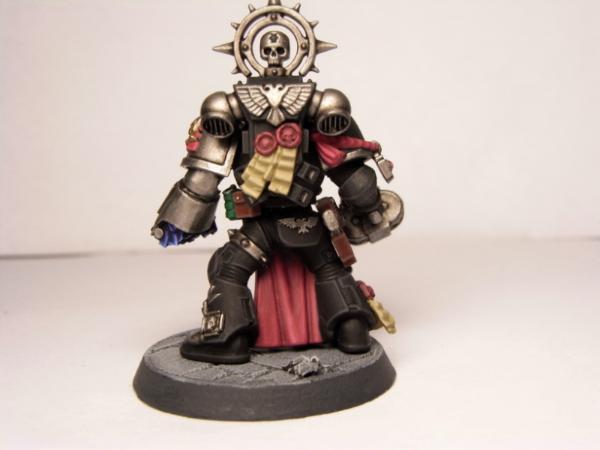
Maybe post a (high quality) picture of your warboss, this might give people a better understanding. Maybe the problem isn't in your choice of colors but more where/how much you apply the highlight
|
|
|
|
|
|
|