| Author |
Message |
 |
|
|
|
|
Advert
|
Forum adverts like this one are shown to any user who is not logged in. Join us by filling out a tiny 3 field form and you will get your own, free, dakka user account which gives a good range of benefits to you:
- No adverts like this in the forums anymore.
- Times and dates in your local timezone.
- Full tracking of what you have read so you can skip to your first unread post, easily see what has changed since you last logged in, and easily see what is new at a glance.
- Email notifications for threads you want to watch closely.
- Being a part of the oldest wargaming community on the net.
If you are already a member then feel free to login now. |
|
 |
2016/06/21 07:53:38
Subject: Necron Overlord Critique
|
|

Battle-tested Knight Castellan Pilot
|
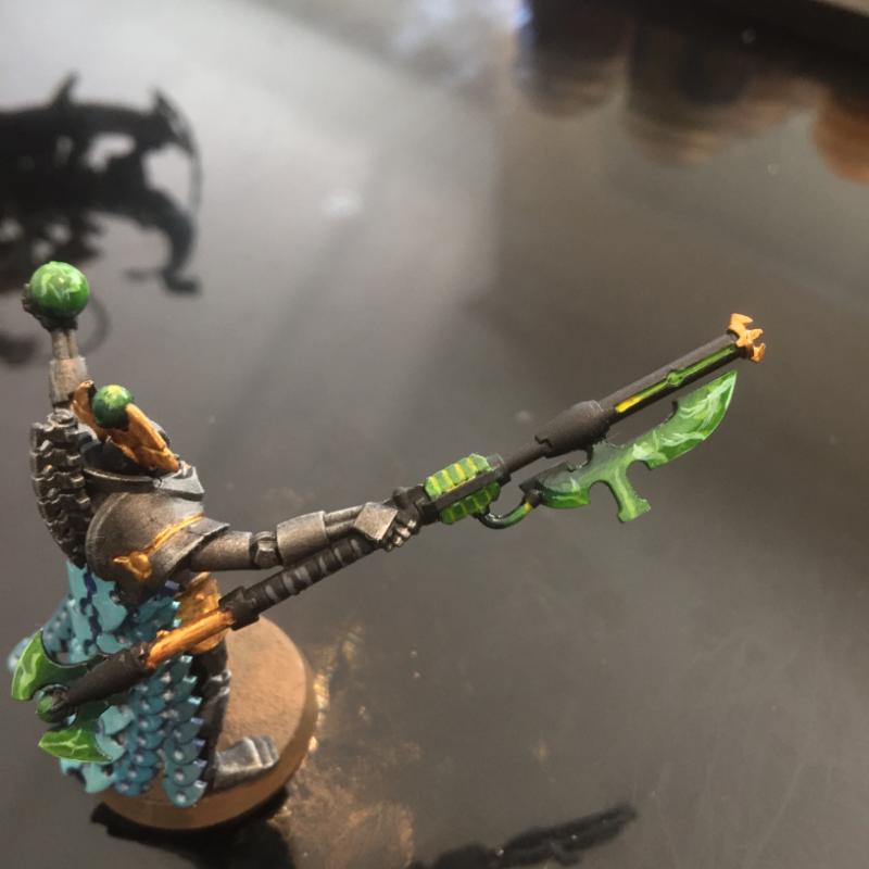
Hi guys,
So this dude isn't finished yet, still needs to be cleaned up and fully based and touched up in a few areas. But basically, my blending hasn't been the greatest at all, I rush it to a tabletop standard as I still have thousands of points worth of space robots to get to. Sometimes there are obvious lines between the colours, not blended at all pretty much 
But I am going to assemble my C'tan's very soon and needed to up my game as I want them looking a bit better than tabletop standard. So I sat down when it came time to do the greens on this chappy and told myself "you are going to practice and attempt to do fairly smooth blends". So this is what I have come up with, I'm pretty stoked with how it came out, and adding the lightning made it coolerererererer.
Anyhow, please have a look and tell me how I can improve on it in the future. It seems its just time and patience with blending, lots of small very thin layers?
|
|
This message was edited 3 times. Last update was at 2016/06/21 07:55:12
 12,000 12,000
|
|
|
 |
|
2016/06/21 09:08:58
Subject: Necron Overlord Critique
|
|
Veteran Wolf Guard Squad Leader
|
From what I can see of the blends they are pretty smooth, but they are largely obscured by the lightning you added. Do you have any images of the spear/staff prior to the lightning?
My major criticism would be the lightning is pretty messy, and doesn't really follow any pattern, being a little tidier with it and planning a pattern would help.
Also when you are blending, you should try to consider the shape that you are painting on. At the moment your layers don't really follow the shape of blade. The top flat part should have separate blended layers, to the sloped blade part.
|
|
|
|
|
|
2016/06/21 12:25:23
Subject: Necron Overlord Critique
|
|
Battle-tested Knight Castellan Pilot
|
No I don't unfortunately.
Yes I agree with the Lightning being messy, it was a spur of the moment thing. I like the look and am going to do it better next time hopefully.
With the seperate blending, do you do it along the same angle or change up where it goes from dark to light? Automatically Appended Next Post: Thanks though 
|
|
This message was edited 1 time. Last update was at 2016/06/21 12:25:32
12,000
|
|
|
|
|
2016/06/21 13:12:28
Subject: Necron Overlord Critique
|
|

Ollanius Pius - Savior of the Emperor
Gathering the Informations.
|
I don't think the lightning is messy, personally. It looks less like lightning and more like a coruscation of energy on the blade.
It all looks good, Klowny. Keep at it!
|
|
|
|
|
2016/06/21 14:29:33
Subject: Necron Overlord Critique
|
|
Veteran Wolf Guard Squad Leader
|
Klowny wrote:
Yes I agree with the Lightning being messy, it was a spur of the moment thing. I like the look and am going to do it better next time hopefully.
With the seperate blending, do you do it along the same angle or change up where it goes from dark to light?
Its just practice, I imagine next time around you will get an even better lightning effect.
As for the blending, I did a quick paintjob on your image.

Typically, I would probably paint the section in red with a few focal spots, so light to dark maybe twice along the blade. As for the section in blue, I would be blending the highlights towards the edges of the shape (basically where I have the blue), leaving the middle a darker colour. That way the shape, and the curve of the blade would be accentuated.
|
|
|
|
|
|
2016/06/21 17:51:08
Subject: Necron Overlord Critique
|
|
Battle-tested Knight Castellan Pilot
|
Winter wrote:Klowny wrote:
Yes I agree with the Lightning being messy, it was a spur of the moment thing. I like the look and am going to do it better next time hopefully.
With the seperate blending, do you do it along the same angle or change up where it goes from dark to light?
Its just practice, I imagine next time around you will get an even better lightning effect.
As for the blending, I did a quick paintjob on your image.
Typically, I would probably paint the section in red with a few focal spots, so light to dark maybe twice along the blade. As for the section in blue, I would be blending the highlights towards the edges of the shape (basically where I have the blue), leaving the middle a darker colour. That way the shape, and the curve of the blade would be accentuated.
Mate,
Thank you so much, I never seem to be able to visualise how things turn out in my head so I just dive headfirst into it. This makes a lot of sense, will try it on my next blade.
Blending question:
Is it better to build up with consecutive thin layers or wet blend?
|
12,000
|
|
|
|
|
|
|