Switch Theme:

SM Blood Raven Chaplain with Powerfist  [RSS] Share on facebook Share on Twitter Submit to Reddit
»
Author Message
Advert


Forum adverts like this one are shown to any user who is not logged in. Join us by filling out a tiny 3 field form and you will get your own, free, dakka user account which gives a good range of benefits to you:
  • No adverts like this in the forums anymore.
  • Times and dates in your local timezone.
  • Full tracking of what you have read so you can skip to your first unread post, easily see what has changed since you last logged in, and easily see what is new at a glance.
  • Email notifications for threads you want to watch closely.
  • Being a part of the oldest wargaming community on the net.
If you are already a member then feel free to login now.


Made in us
Last Remaining Whole C'Tan


Pleasant Valley, Iowa

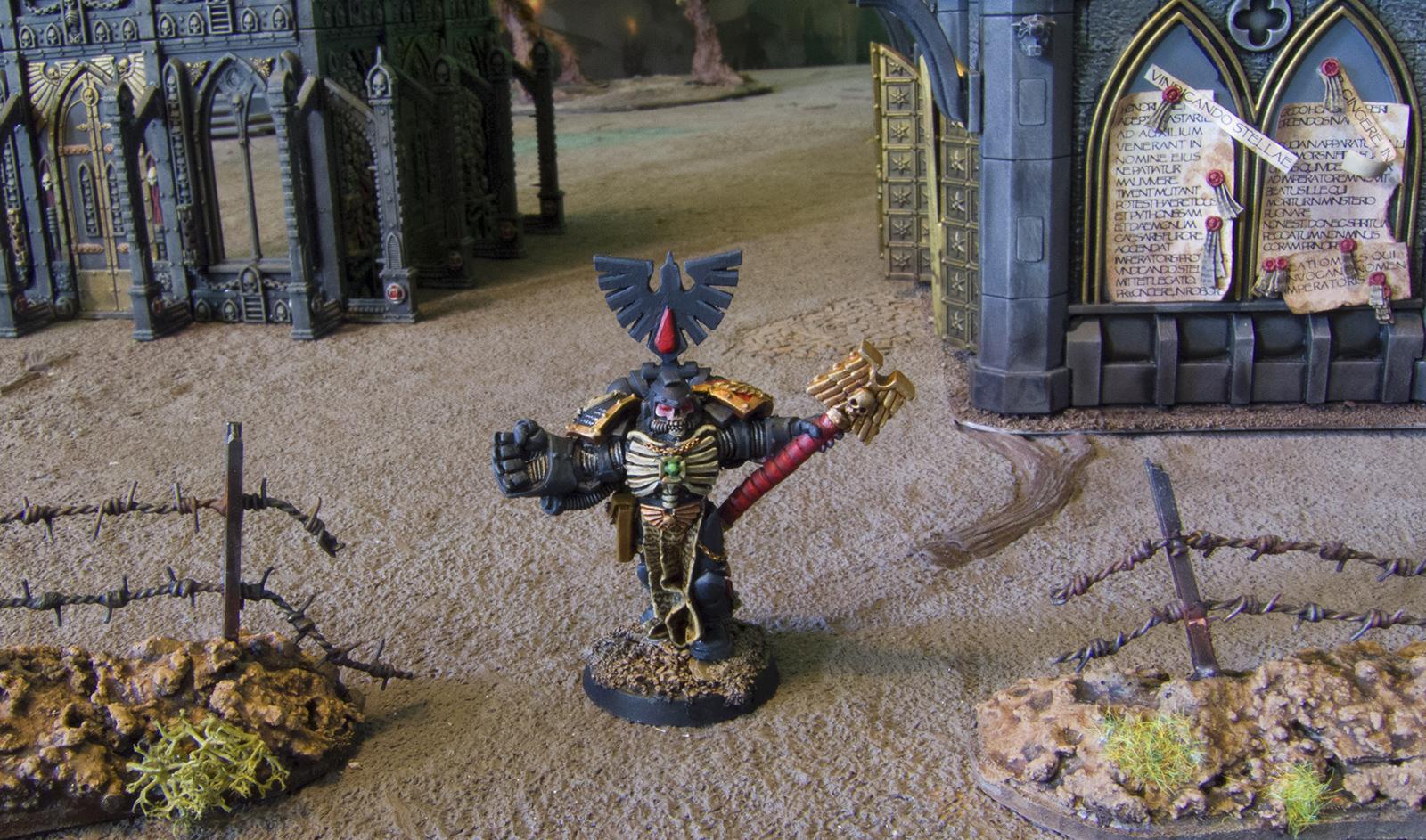
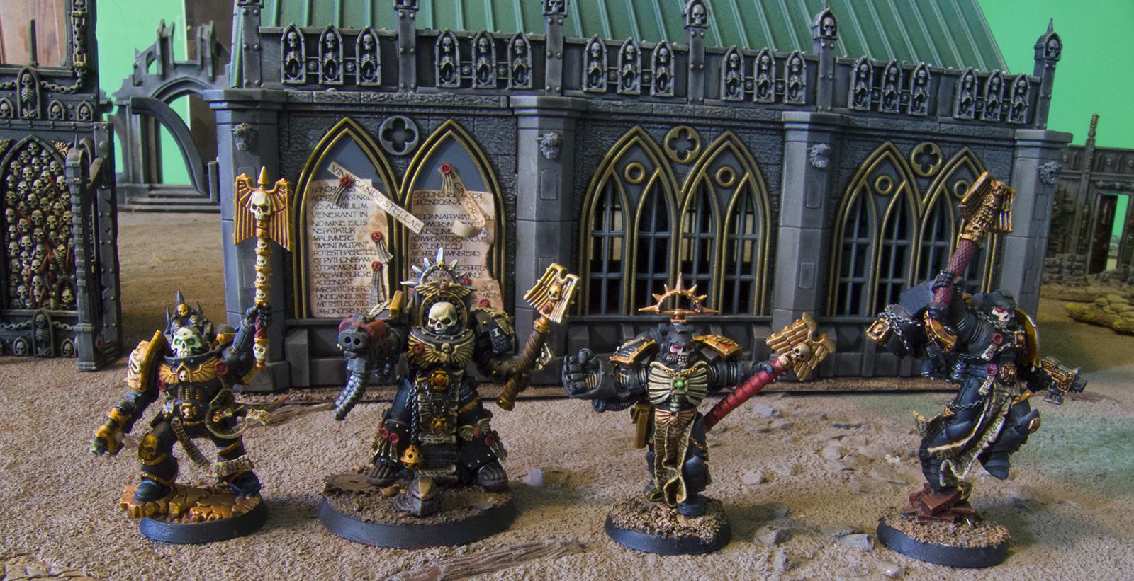
I think I'm almost as good as I was before I took that super long break from painting. Here's another dude that spent almost a decade primed in a box.
Spoiler:


Spoiler:


He's now my third favorite chaplain, right after Power Armor Chaplain and Terminator Chaplain. I do like him more than Jump Pack Chaplain, who, by the way, I apologize for not dusting before I took this picture.

Spoiler:


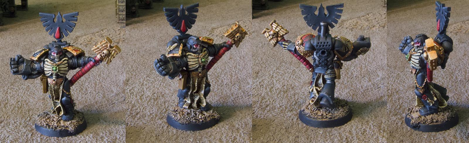
I kind of wish I had done his eyes in green. My friend said that red eyes are the best fit and green eyes are for Necrons but imo the green eyed one came out the best.

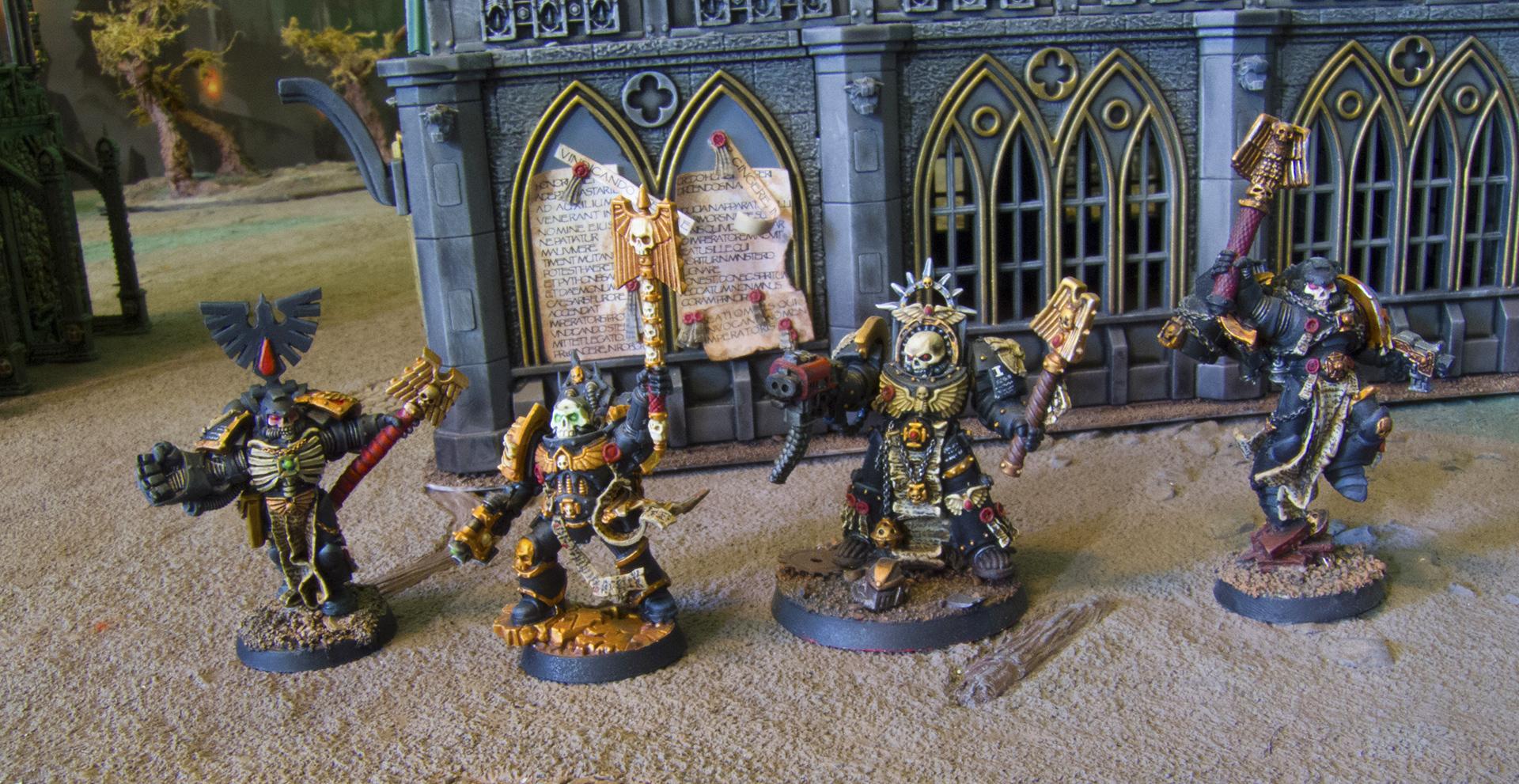
Anyway, those are my chaplains and I don't think I am doing any more of them: finally ready to move on to Librarians.

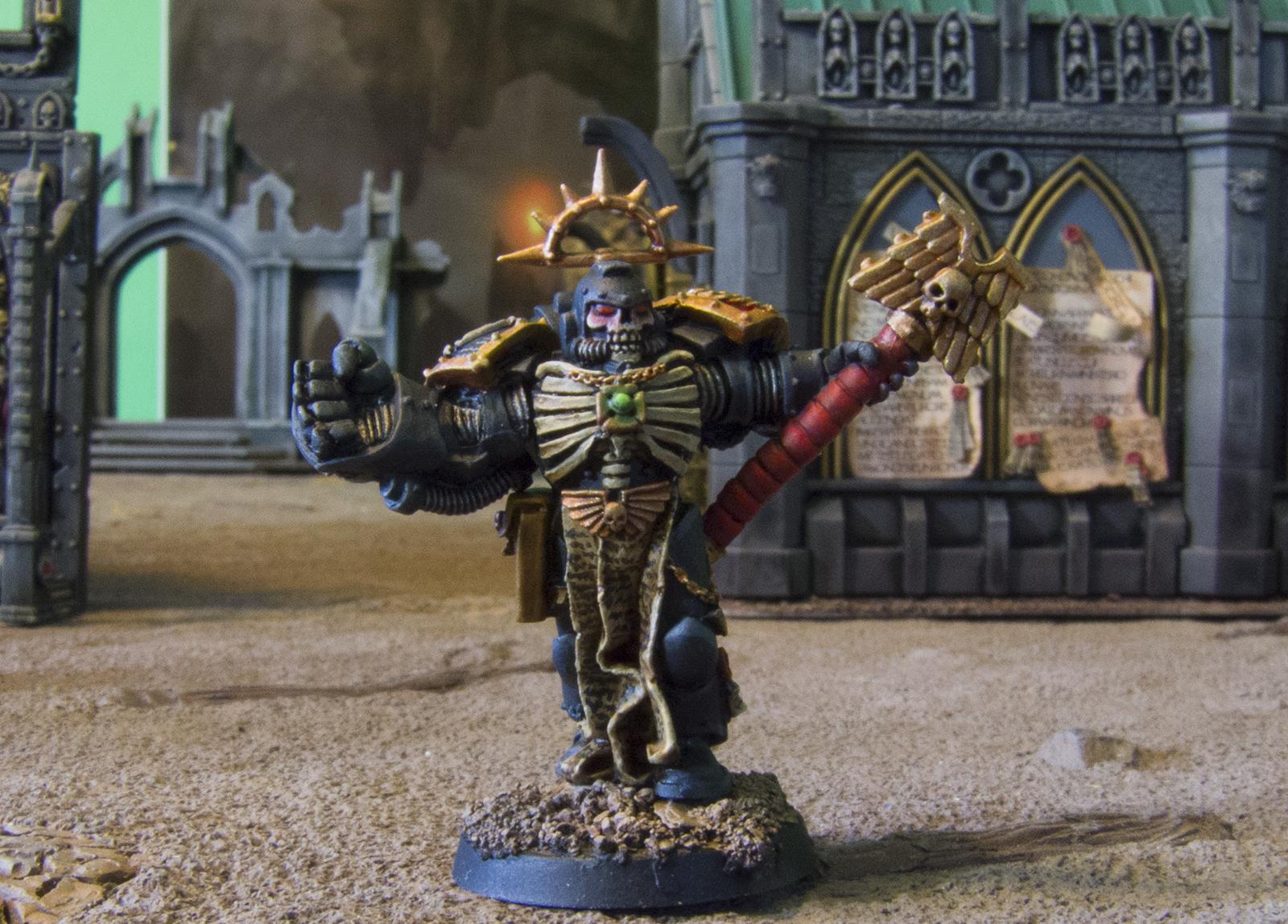
(Although I am thinking about replacing the Blood Raven banner with an Iron Halo backpack topper instead, you guys think that banner is a little too much?)

This message was edited 2 times. Last update was at 2017/08/04 22:35:49


 lord_blackfang wrote:
Respect to the guy who subscribed just to post a massive ASCII dong in the chat and immediately get banned.

 Flinty wrote:
The benefit of slate is that its.actually a.rock with rock like properties. The downside is that it's a rock
 
   
Made in us
Blood-Drenched Death Company Marine


I like the red eyes, but I think you need a black outline on them like the Terminator. His look the best of the four.

For the banner it would depend on context. Will the rest of your characters have something like it? It looks fine in isolation, it only seems too much when next to the others.

Overall very nice work!
   
Made in us
Last Remaining Whole C'Tan


Pleasant Valley, Iowa

You know, maybe you're right, I think my beef is there is no clear division between the glow and the eyes themselves. Maybe a little wash line would fix that up. Thanks!


Automatically Appended Next Post:
OK, I did some very minor touchups and now I'm a lot happier with him.

Spoiler:


I touched up the eyes and changed the banner.

This guy's in the case and done.

Still my third favorite though, as depicted in preference:

Spoiler:

This message was edited 1 time. Last update was at 2017/08/07 00:35:04


 lord_blackfang wrote:
Respect to the guy who subscribed just to post a massive ASCII dong in the chat and immediately get banned.

 Flinty wrote:
The benefit of slate is that its.actually a.rock with rock like properties. The downside is that it's a rock
 
   
Made in us
Blood-Drenched Death Company Marine


Yeah, I like it a lot better now.

I'd put the termie as number one personally.
   
 
Forum Index » Painting & Modeling Showcase
Go to: