Forum adverts like this one are shown to any user who is not logged in. Join us by filling out a tiny 3 field form and you will get your own, free, dakka user account which gives a good range of benefits to you:
No adverts like this in the forums anymore.
Times and dates in your local timezone.
Full tracking of what you have read so you can skip to your first unread post, easily see what has changed since you last logged in, and easily see what is new at a glance.
Email notifications for threads you want to watch closely.
Being a part of the oldest wargaming community on the net.
If you are already a member then feel free to login now.
2017/09/04 00:03:41
Subject: Bronze Verdigris for Sister's of Steel scheme (updated 9/10)
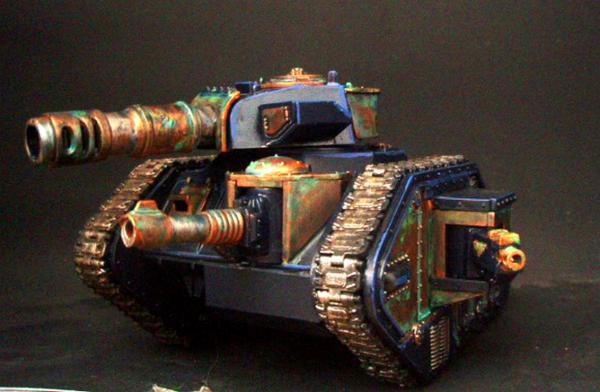
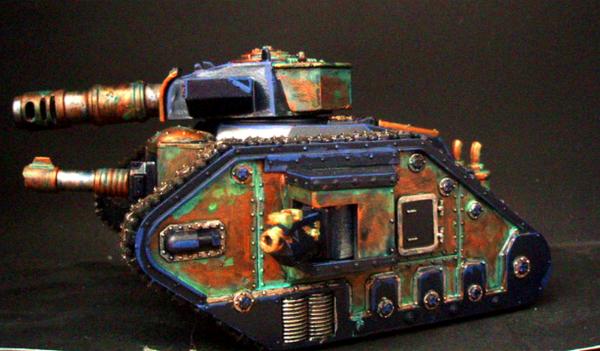
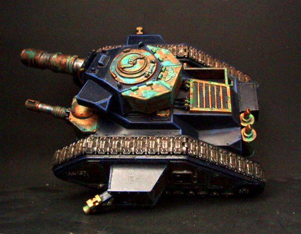
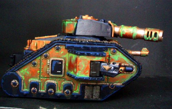
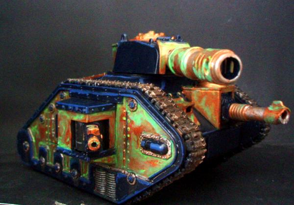
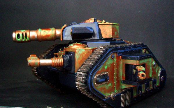
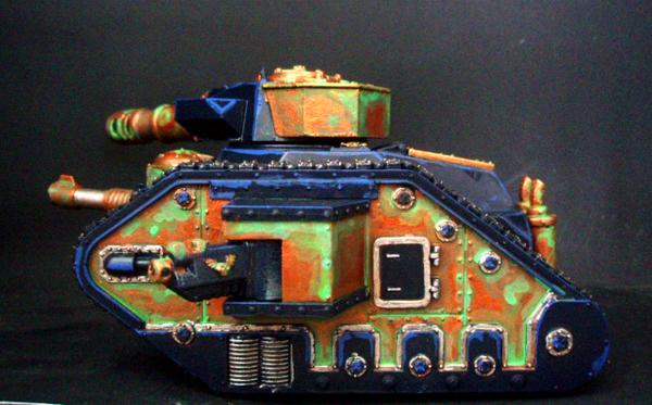
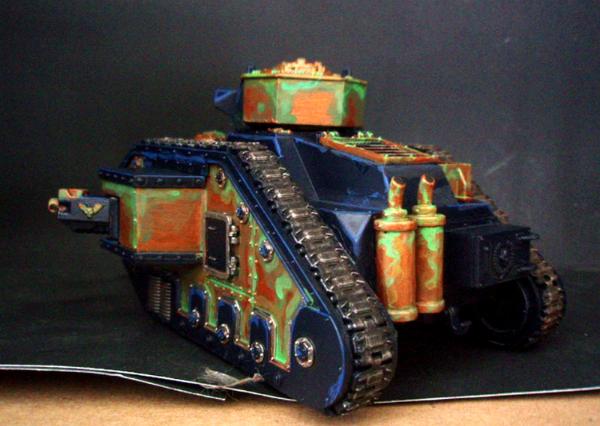
Finally found time to work on my new Sister's of Steel IG army. (Am I a really deranged person for having two separate IG army schemes? See there was this idea of two separate companies pulled from different planets, back in the edition where you got to build your own doctrines...)
Anyway, my Sister's of Steel is a Greek/amazon scheme so bronze armor etc. The idea behind them was a planet that had some chemical compound inherent in its soil that made all births female, therefore the armed forces recruited from it would also be all female. I didn't say it was a great idea... It is an assault company designed to break through the line and exploit, so included Roughriders, mortar tanks, Ogrynns, and heavy armor all mobile, no footsloggers.
Anyway, here is the first Leman Russ painted up in dark blue and bronze.
I did a verdigris effect to show age etc. Yes, my painting skills were never top notch, and have degraded with age and loss of impetous, so bear with me. I also do not own an airbrush, so this is a sprayed undercoat and hand work. My camera is mediocre at best so in person it is a bit more subtle in gradient than these show. I did rust on all the steel etc, but now realize I need to weather the blue. If the bronze is so old...Now the real issue, do I go back and put Verdigris on all the breastplates and shoulder pauldrons of my roughriders and Ogrynns? If you check out the gallery they're about, so maybe some thoughts?
Pictures:
This message was edited 1 time. Last update was at 2017/09/10 16:17:35
Keeping the hobby side alive!
I never forget the Dakka unit scale is binary: Units are either OP or Garbage.
2017/09/04 01:23:51
Subject: Bronze Verdigris for Sister's of Steel scheme
I'd defer to Elbows, but i think keeping the green to edges and creases might help, How you have the seam by the rear door is about what would look right i think, keeping the panels mostly bronze, and possibly consider using another bronze or brass for some highlight.
2017/09/04 03:31:40
Subject: Bronze Verdigris for Sister's of Steel scheme
I think the best advice for verdigris is "Less is More". You have used it almost like a highlight.
In all honesty, if there was 90% LESS verdigris on the model it would look 100x better.
Current Project: Random quaratine models!
Most Recently Completed: Stormcast Nightvault Warband
On the Desk: Looking into 3D Printing!
Instagram Updates: @joyous_oblivion
2017/09/04 05:02:25
Subject: Re:Bronze Verdigris for Sister's of Steel scheme
Verdigris is too heavy; treat it more like a wash.
Also as Elbows mentioned, it looks too much like acid/biohazard green. Try something like cyan or seafoam, it'll look more natural and fit the metal better.
2017/09/04 09:18:15
Subject: Bronze Verdigris for Sister's of Steel scheme
I'd have to agree with all of the above. Also, what colour did you use? Nihilakh Oxide? That is pretty much the verdigris colour. I'm sure there's a YouTube tutorial from GW on how its used effectively (check under Technical Paints).
The Rough Riders and Ogryn conversions you've done look terrific by the way. I think it would look good recreating verdigris on their armour too. I just, again, really would agree that less is more here. It'll all look a whole lot better and more convincing.
2017/09/04 14:41:51
Subject: Re:Bronze Verdigris for Sister's of Steel scheme
Good advice! I used washes from ork flesh up to lime green/sky blue mixes. Again the pictures seem to completely ignore the darker washes, probably my lighting. The issue I found on most tutorials/real pictures is that verdigris tends to completely overtake the bronze and leave it a dark un-shiny color where the verdigris is. I didn't want to go to that extreme and completely lose the bronze.I probably do need more blue in it, but when I had it it was far too bright. I'll try to re-work it. Thanks all.
Keeping the hobby side alive!
I never forget the Dakka unit scale is binary: Units are either OP or Garbage.
2017/09/04 15:05:31
Subject: Bronze Verdigris for Sister's of Steel scheme
Oppl wrote: I'd have to agree with all of the above. Also, what colour did you use? Nihilakh Oxide? That is pretty much the verdigris colour. I'm sure there's a YouTube tutorial from GW on how its used effectively (check under Technical Paints).
'It is a source of constant consternation that my opponents cannot correlate their innate inferiority with their inevitable defeat. It would seem that stupidity is as eternal as war.'
- Nemesor Zahndrekh of the Sautekh Dynasty Overlord of the Crownworld of Gidrim
2017/09/04 15:23:51
Subject: Re:Bronze Verdigris for Sister's of Steel scheme
edwardmyst wrote: Good advice! I used washes from ork flesh up to lime green/sky blue mixes. Again the pictures seem to completely ignore the darker washes, probably my lighting. The issue I found on most tutorials/real pictures is that verdigris tends to completely overtake the bronze and leave it a dark un-shiny color where the verdigris is. I didn't want to go to that extreme and completely lose the bronze.I probably do need more blue in it, but when I had it it was far too bright. I'll try to re-work it. Thanks all.
Verdigris will be more matte, as it is removing the shine from the metal by its nature. One of the things I try to do in my quest for the perfect weathering look (which I freely admit is ongoing) is to put it in places where it would really actually weather. That can be hard of course, but I try to pick a source and go, ok, this is where the weathering occurred. Almost like a story, so you can follow along and it works together.
What really works best is reference pictures. Maybe not a bronze tank but something that is bronze, about the right size and weathered.
The GW verdigris paint is really nice, but can be overwhelming in places sometimes, you really want to use it in slow build up stages imo. Unless you're going for the ancient all weathered bronze statue look of course.
The last thing I've found that helps is the actual application. It's not even the colours so much, as it is how you put it on. That is, stippling it on with a brush or a sponge bit, or both. Then you get the layers you really want, building up slowly, less where the weathering just started, more where it's been ongoing for a while. A bit of the sponge that comes in many mini packages, and a pair of tweezers, is really useful in this.
That is a great idea Guildenstein. I am going to try and work it with the bit of foam stipling idea. Part of my struggle was the washes "running" too much, or at points, not running but globbing. Most of my reference pics show a dappled effect and your idea seems dead on for that. Appreciate the help and conversation from all.
Keeping the hobby side alive!
I never forget the Dakka unit scale is binary: Units are either OP or Garbage.
2017/09/10 16:19:32
Subject: Re:Bronze Verdigris for Sister's of Steel scheme (updated 9/10)
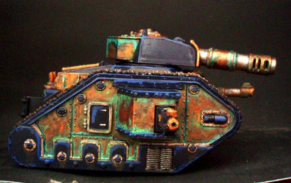
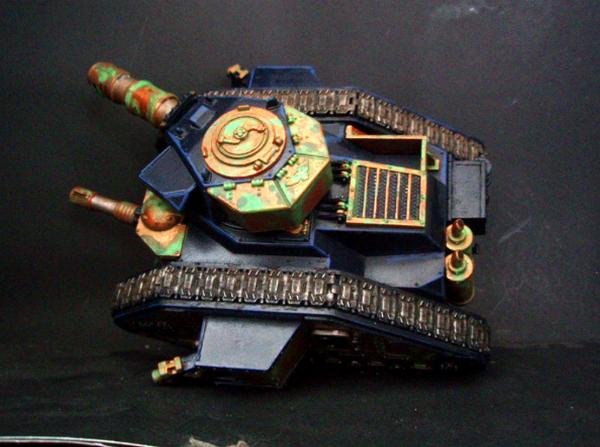
Finally had time to try and redo this. I went through and used more blue in the green, and then covered it with a wash of Asurman. I tried to swirl the wash a bit so it created patterns. Not great but less acid wash I think. Really looks worn to me which is good. I may be at the edge of my skill here, so doubt it is getting better. Thanks all for the advice and comments! Pics below.
Keeping the hobby side alive!
I never forget the Dakka unit scale is binary: Units are either OP or Garbage.
2017/09/10 20:44:50
Subject: Bronze Verdigris for Sister's of Steel scheme (updated 9/10)
Overall it does look a bit better but I think you still have waaaaaaay too much verdigris on the model. I stick by my original comment of about a tenth of what you currently have on the model.
Current Project: Random quaratine models!
Most Recently Completed: Stormcast Nightvault Warband
On the Desk: Looking into 3D Printing!
Instagram Updates: @joyous_oblivion
2017/09/11 06:40:38
Subject: Bronze Verdigris for Sister's of Steel scheme (updated 9/10)
If you look up references for Verdigris it's mostly caused by liquid exposure, so you need to remember that most verdigris is in recesses but focuses into Downward points. Some of the panel lines are a bit heavy, still. Verdigris isn't normally something instant, it builds up over time, so remember it's not really heavy corrosion in motion, but mostly settles in when at rest.


 but something that is bronze, about the right size and weathered.