| Author |
Message |
 |
|
|
|
|
Advert
|
Forum adverts like this one are shown to any user who is not logged in. Join us by filling out a tiny 3 field form and you will get your own, free, dakka user account which gives a good range of benefits to you:
- No adverts like this in the forums anymore.
- Times and dates in your local timezone.
- Full tracking of what you have read so you can skip to your first unread post, easily see what has changed since you last logged in, and easily see what is new at a glance.
- Email notifications for threads you want to watch closely.
- Being a part of the oldest wargaming community on the net.
If you are already a member then feel free to login now. |
|
 |
2017/11/12 12:59:19
Subject: 30k Emperors children test colours (TT standard )
|
|

Towering Hierophant Bio-Titan
|
Hi all.
Due to changes in life I had to get rid of my 30k army.
Now everything is sorted though I wanted to start building up again.
Picked EC but wanted to do them slightly different.
I did however want to keep it quick and simple so I could get through them in decent time.
The bases aren't finished and I'm not settled on them yet (want to add rocks and snow effect) but those will just be trial and error.
Here's where I'm at with the colour scheme so far:
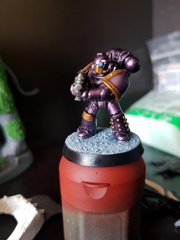
So that's where I'm at so far.
Just wanted a quick and simple table top standard that would help me get them done quickly.
Just wanted to see if there's a way I can either improve these or speed it up.
Just please keep in mind I want to keep them able to be speed painted (as I'm insanely slow at painting)
|
|
|
|
 |
|
2017/11/12 13:06:47
Subject: 30k Emperors children test colours (TT standard )
|
|

Regular Dakkanaut
|
They look pretty good to me.
|
|
|
|
|
2017/11/16 06:01:49
Subject: 30k Emperors children test colours (TT standard )
|
|

Nurgle Chosen Marine on a Palanquin
|
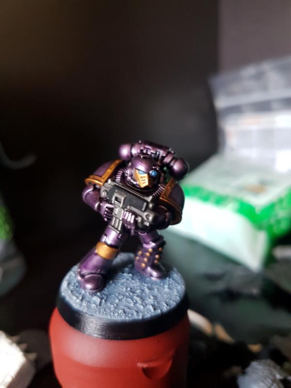
Would consider making the metallic parts a brighter gold rather than the bronzy color. Not sure the red works with the purple and bronze/gold.
T
|
|
|
|
|
2017/11/17 04:45:06
Subject: Re:30k Emperors children test colours (TT standard )
|
|
Been Around the Block
|
I like them. Am I correct in thinking that the purple parts have a bit of metallic sheen to them also, or is that just the lighting?
My only suggestion would be to come back in on the "dots" of the armor with some silver to break up the large areas of color a bit and give them some accent areas.
|
Check our "How to Paint" tutorials on Youtube at:
http://www.youtube.com/AGProductionsInc
God bless you! |
|
|
|
|
2017/11/29 16:49:49
Subject: 30k Emperors children test colours (TT standard )
|
|
Whiteshield Conscript Trooper
|
 Jackal wrote: Jackal wrote:Hi all.
Due to changes in life I had to get rid of my 30k army.
Now everything is sorted though I wanted to start building up again.
Picked EC but wanted to do them slightly different.
I did however want to keep it quick and simple so I could get through them in decent time.
The bases aren't finished and I'm not settled on them yet (want to add rocks and snow effect) but those will just be trial and error.
Here's where I'm at with the colour scheme so far:
So that's where I'm at so far.
Just wanted a quick and simple table top standard that would help me get them done quickly.
Just wanted to see if there's a way I can either improve these or speed it up.
Just please keep in mind I want to keep them able to be speed painted (as I'm insanely slow at painting)
These minis are actually pretty good i'd recommend making the trim brighter i didnt think the red looked good at first but i actually liked it the more i looked at it.javascript:emoticon('  ');
|
|
|
|
|
2017/11/29 16:58:04
Subject: 30k Emperors children test colours (TT standard )
|
|
Powerful Phoenix Lord
|
I like them, except the inclusion of the red - doesn't work great with the purple/gold in my opinion. Nice start and a very nice table top standard.
|
|
|
|
|
2017/11/29 17:18:32
Subject: 30k Emperors children test colours (TT standard )
|
|
Dakka Veteran
|
Simple and effective has always worked best for me. I think they look great, and will look better as an army.
Agree with Elbows however that the red clashes a bit with the purple.
|
|
|
|
|
2017/11/29 17:22:18
Subject: 30k Emperors children test colours (TT standard )
|
|
Grovelin' Grot
|
Really like them, don't wanna be a broken record, I don't like the red, the rest of can get behind though, how did you achieve the metalicness of them on the purple?
|
From Endor to Hoth, Ripley to Spock, I'll get what you want but there's Gunna be a cost
|
|
|
|
|
2017/11/29 21:39:16
Subject: 30k Emperors children test colours (TT standard )
|
|

Nasty Nob
|
I think you’ve got the purple nailed down! The devil is in the details though. I agree the red looks a little out of place but not bad per se. For me, the blue eyes really stick out on the Mk. IV. Possibly just the shade of blue used. Maybe a little darker would be less standout-ish?
|
Current Project: Random quaratine models!
Most Recently Completed: Stormcast Nightvault Warband
On the Desk: Looking into 3D Printing!
Instagram Updates: @joyous_oblivion |
|
|
|
|
2017/11/29 21:42:17
Subject: 30k Emperors children test colours (TT standard )
|
|
Longtime Dakkanaut
|
I like them, if thats TT where you are then your tables are something I envy.
Love the purple
|
|
|
|
|
2017/11/30 01:16:40
Subject: 30k Emperors children test colours (TT standard )
|
|
Dakka Veteran
|
I think the blue eyes are fine. But the red is definitely a bit dodgy. Lighten, or darken it up a bit
|
|
|
|
|
|
2017/11/30 04:52:34
Subject: 30k Emperors children test colours (TT standard )
|
|
Nurgle Chosen Marine on a Palanquin
|
If folks want him to change the red, what would you suggest instead?
Darkening it as craggy suggests might work.
Dark yellow/goldish color?
Deep purple?
Some of the forge world product pics show the tabard in dark gray/black.
There is often a fair amount of white on EC figs, so white or off white?
T
|
|
This message was edited 1 time. Last update was at 2017/11/30 04:52:47
|
|
|
|
|
2017/12/03 22:37:39
Subject: 30k Emperors children test colours (TT standard )
|
|
Towering Hierophant Bio-Titan
|
Ok, seems to be a running theme about the red haha.
I wanted to paint it to stand out a little, but not too much.
After having a look again though I agree, it doesn't look right there.
I may try a dark grey to begin with to make it a bit more subtle.
As for armour colour, it's a metallic purple, so it does have a nice shine to it lol.
I'll get some changes done to them and then update again.
May also darken the eyes a bit too.
|
|
|
|
|
|
2017/12/04 09:56:01
Subject: 30k Emperors children test colours (TT standard )
|
|
Fixture of Dakka
|
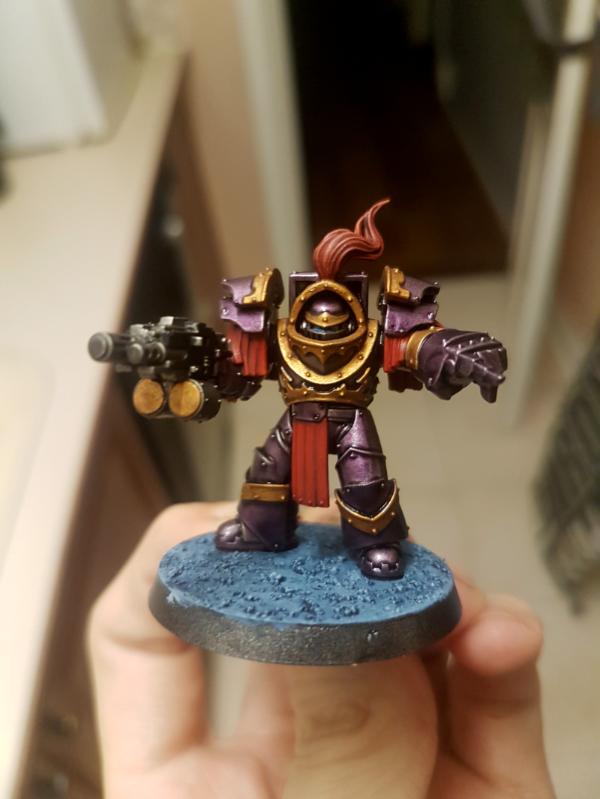
The colours look good, but I don't think you've assembled that terminator correctly. There shouldn't be that gap between the torso and the shoulder pads. The upper shoulder pads should overlap the lower ones to fill that gap, not flush like you've built them (see the pics on GW's website).
The purple is just the purple wash over silver/gunmetal, isn't it? That's how I did my Phoenix Terminators, anyway.
|
|
|
|
|
2017/12/06 10:36:28
Subject: 30k Emperors children test colours (TT standard )
|
|
Nurgle Predator Driver with an Infestation
|
Looks great! But yeah definitely the red is waaaaay too clashing. I suggest going white or cream color for those in a traditional EC fashion, though dark grey or black could look pretty sweet too!
|
Blistered Be.
40k:  : 6500 : 6500
 2000(GK allies -Sons of Opet) 2000(GK allies -Sons of Opet)
3000 Sons of Malice( played as primaris Salamanders)
AoS:  5500 5500 |
|
|
|
|
2017/12/08 02:57:20
Subject: 30k Emperors children test colours (TT standard )
|
|
Slaanesh Veteran Marine with Tentacles
|
Brighten up the gold, trade red cloth for white. Otherwise it looks great, you are a skilled painter.
|
|
|
|
|
2017/12/08 18:21:05
Subject: 30k Emperors children test colours (TT standard )
|
|
Death-Dealing Devastator
|
Also think that red should be replaced with another color.
Love the purple and the gold parts though!
|
|
|
|
|
2017/12/08 19:08:15
Subject: 30k Emperors children test colours (TT standard )
|
|
Legendary Master of the Chapter
|
timd wrote:If folks want him to change the red, what would you suggest instead?
Darkening it as craggy suggests might work.
Dark yellow/goldish color?
Deep purple?
Some of the forge world product pics show the tabard in dark gray/black.
There is often a fair amount of white on EC figs, so white or off white?
T
Well Naturally it has to be lepord print 
But really.
to keep a little red in he could do the leather shoulder parts in a dark redish leather brown.
The cloth i think it was classic for it to be white or beige. but black grey could be nice too if a little dark.
|
 Unit1126PLL wrote: Unit1126PLL wrote: Scott-S6 wrote: Scott-S6 wrote:And yet another thread is hijacked for Unit to ask for the same advice, receive the same answers and make the same excuses.
Oh my god I'm becoming martel.
Send help!
|
|
|
|
|
|
|