| Author |
Message |
 |
|
|
|
|
Advert
|
Forum adverts like this one are shown to any user who is not logged in. Join us by filling out a tiny 3 field form and you will get your own, free, dakka user account which gives a good range of benefits to you:
- No adverts like this in the forums anymore.
- Times and dates in your local timezone.
- Full tracking of what you have read so you can skip to your first unread post, easily see what has changed since you last logged in, and easily see what is new at a glance.
- Email notifications for threads you want to watch closely.
- Being a part of the oldest wargaming community on the net.
If you are already a member then feel free to login now. |
|
 |
2018/07/05 02:06:47
Subject: Im looking at trying to get better!
|
|

Splattered With Acrylic Paint
|
I’m striving on getting better at painting, I’ve been enjoying painting tyranids mainly the past while.
All I’m doing is looking for is feedback. Just by viewing the latest model of a termagant, I’m hoping
That this can be viewed and hoping you fellow painters can spot anything I could do better perhaps,
or what I’m doing correctly.
Also, I would love it if you can rate my paint job on it! Let me know if you rate it, and I’ll rate a pic of yours in return!
Here is the pic - 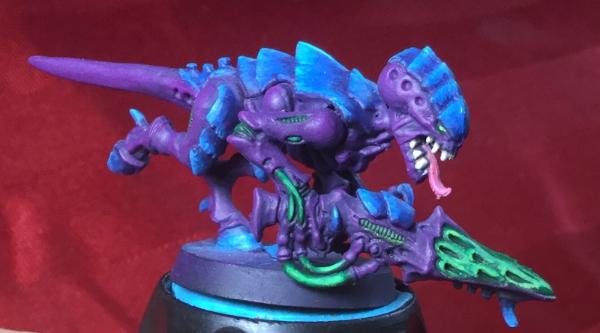
|
|
|
 |
|
2018/07/05 02:42:07
Subject: Re:Im looking at trying to get better!
|
|
Fireknife Shas'el
|
This is a pretty good standard for a Termagaunt, given how many most 'Nid armies need painted. Maybe the purple needs more definition (a wash and a bit of highlights) and the green of the weapon mouth needs a bit of cleaning up, but with gaunts you want to keep it relatively simple or it will take forever.
|
|
|
|
|
|
2018/07/05 02:49:01
Subject: Im looking at trying to get better!
|
|

Blood-Raging Khorne Berserker
|
If you showed up with an entire army painted to this standard, I’d be thrilled to play against you. Even if it was the most cheesy list you could come up with. Rated you as well
|
|
This message was edited 1 time. Last update was at 2018/07/05 02:50:05
|
|
|
|
|
2018/07/05 02:50:31
Subject: Im looking at trying to get better!
|
|
Splattered With Acrylic Paint
|
Thanks for the feedback, very much appreciated.
Yes I do agree the green does need cleaning up. Lol it was the last bit I was doing and rushed it.
Do all painters recommend washing the model?
I used a very minor wash, but I think a bit heavier would have looked better. And yes, I do need to highlight the purple a bit more for a better result!
Again, thanks for the feedback.
Automatically Appended Next Post:
Awesome, thanks for the good feedback, I’ll rate one or more of yours in return!
|
|
This message was edited 1 time. Last update was at 2018/07/05 02:52:01
|
|
|
|
|
2018/07/05 03:30:24
Subject: Re:Im looking at trying to get better!
|
|
Fireknife Shas'el
|
It doesn't need an all over wash, maybe just some Druchii Violet in the joints and divots of the head and some light highlights at the edges of armor plates to make it pop a bit more. Maybe a black wash at the edges between the blue armor plates as well to make them seem more separated.
|
|
|
|
|
|
2018/07/05 04:02:20
Subject: Im looking at trying to get better!
|
|
Regular Dakkanaut
|
Perhaps I can assist?
I'm very fond of constructive, brutally honest critique.
What do you personally feel is your weakest points on this model compared to other models you have seen?
Can you identify your weakest points your self?
What point did you get lazy with your painting or lose paitents.
|
|
This message was edited 1 time. Last update was at 2018/07/05 04:05:15
|
|
|
|
|
2018/07/06 04:40:39
Subject: Im looking at trying to get better!
|
|
Splattered With Acrylic Paint
|
Awesome thanks for the replies!
I do think I agree with everything you said “John prins” lol
I feel my weakest point would be where I should be highlighting and shading. I have light source and all, but I just struggle most of deciding where I shoul build up highlights and what I should keep the darkest etc.
But yes I got lazy near the end because I was just excited to be completed. I was pretty much trying to hard to speed up.
I know it’s a termagant, but I like the model and is one of my best paint jobs. I’m happy with the result but I’m trying to see what I can do better, so that the next one is even better! 
Again, thanks for the replies, I’m having a good time painting these!
|
|
|
|
|
2018/07/06 05:38:33
Subject: Im looking at trying to get better!
|
|
Regular Dakkanaut
|
mitchelldixon1588 wrote:Awesome thanks for the replies!
I do think I agree with everything you said “John prins” lol
I feel my weakest point would be where I should be highlighting and shading. I have light source and all, but I just struggle most of deciding where I shoul build up highlights and what I should keep the darkest etc.
But yes I got lazy near the end because I was just excited to be completed. I was pretty much trying to hard to speed up.
I know it’s a termagant, but I like the model and is one of my best paint jobs. I’m happy with the result but I’m trying to see what I can do better, so that the next one is even better!
Again, thanks for the replies, I’m having a good time painting these!
Would you be comfortable with run down of what I feel needs work? And some suggestions for improvement?
I don't want to offend anyone, and only wish to help.
|
|
|
|
|
2018/07/06 05:41:19
Subject: Im looking at trying to get better!
|
|
Splattered With Acrylic Paint
|
I wouldn’t take anything personal at all, I would love the help I can get, I won’t get much better unless I know what can be done better
Let’s hear everything I can!
|
|
|
|
|
2018/07/06 16:03:58
Subject: Re:Im looking at trying to get better!
|
|
Deathwing Terminator with Assault Cannon
|
As far as painting technique goes, your job is 6.5/10 overall, but given that it's a gaunt, 8.5/10 since they need to be speed painted.
Few pointers from the given picture - you need to shade the crevices a lot darker. a brown ink will provide nice contrast to the given purple tone on the skin.
What I would focus on is maybe developing a color scheme/accents that compliments the model. Miniature painting is all about contrast - more contrast, more it pops when you look at it despite the colors "not being realistic".
|
|
|
|
|
2018/07/06 17:10:44
Subject: Re:Im looking at trying to get better!
|
|

Longtime Dakkanaut
|
I like the scheme. The green is a great spot colour and it looks natural but alien. The purple could be shaded more, before highlighting. The green looks untidy in a pic like that but in real life and as part of a unit I think it’d look fine. A green glaze might smooth the highlight but might change the hue and you don’t want that. The bright green looks good.
A shade to separate the armour chitin from the flesh and delineate that difference would make it look a lot tidier too. As said above an army painted to those standards would look great.
Patience and thin layers on highlights will be more important on bigger models where roughness will be more obvious.
Well done. I like trying new techniques on different armies as a theme and to push my self. Some stick others not. Like wet palettes, don’t like airbrushes ( they are ok tools but not the be all and end all some would have you believe). Keep pushing your self and it’d be great see some more bids. 
|
|
|
|
|
|
|