| Poll |
 |
| Which Entries Are Your Favourites? |
| Nevelon |

|
1% |
[ 2 ] |
| Vejut |
|
1% |
[ 4 ] |
| lipsdapips |
|
12% |
[ 35 ] |
| Rybrook |
|
2% |
[ 6 ] |
| Deadshot |
|
3% |
[ 9 ] |
| ssisal |
|
2% |
[ 5 ] |
| Kustomer D |
|
2% |
[ 7 ] |
| Zergsmasher |
|
1% |
[ 2 ] |
| SirOllox |
|
5% |
[ 15 ] |
| Modock |
|
13% |
[ 39 ] |
| DV8 |
|
10% |
[ 29 ] |
| Midget Gems |
|
2% |
[ 6 ] |
| SmallChanges |
|
1% |
[ 2 ] |
| LordRahl |
|
1% |
[ 4 ] |
| Suzuteo |
|
2% |
[ 7 ] |
| Tim 121RVC |
|
3% |
[ 10 ] |
| queen_annes_revenge |
|
10% |
[ 30 ] |
| Power Elephant |
|
5% |
[ 15 ] |
| Chris56 |
|
8% |
[ 25 ] |
| Feltmonkey |
|
8% |
[ 24 ] |
| Jadenim |
|
1% |
[ 3 ] |
| Paradigm |
|
7% |
[ 20 ] |
| Total Votes : 299 |
|
|
| Author |
Message |
|
|
|
|
|
Advert
|
Forum adverts like this one are shown to any user who is not logged in. Join us by filling out a tiny 3 field form and you will get your own, free, dakka user account which gives a good range of benefits to you:
- No adverts like this in the forums anymore.
- Times and dates in your local timezone.
- Full tracking of what you have read so you can skip to your first unread post, easily see what has changed since you last logged in, and easily see what is new at a glance.
- Email notifications for threads you want to watch closely.
- Being a part of the oldest wargaming community on the net.
If you are already a member then feel free to login now. |
|
|
2018/09/02 19:49:45
Subject: VOTE For the winner of the 42nd Unofficial Painting Challenge: Above and Beyond
|
|

Is 'Eavy Metal Calling?
|
It's that time again! This August, the entrants were given the theme Above and Beyond, their entries set up to represent the brightest and best, the most dedicated and most fearsome of their collections.
As always, feel free to vote for as many entries as you like, and for whatever reason you feel worth recognising, be it the paintjob, conversion, effort, approach to the theme or anything else that catches your eye. You are also encouraged to leave some feedback for the entrants if you wish, and many of the images link to the Dakka gallery, where they can be voted on.
The entrants:
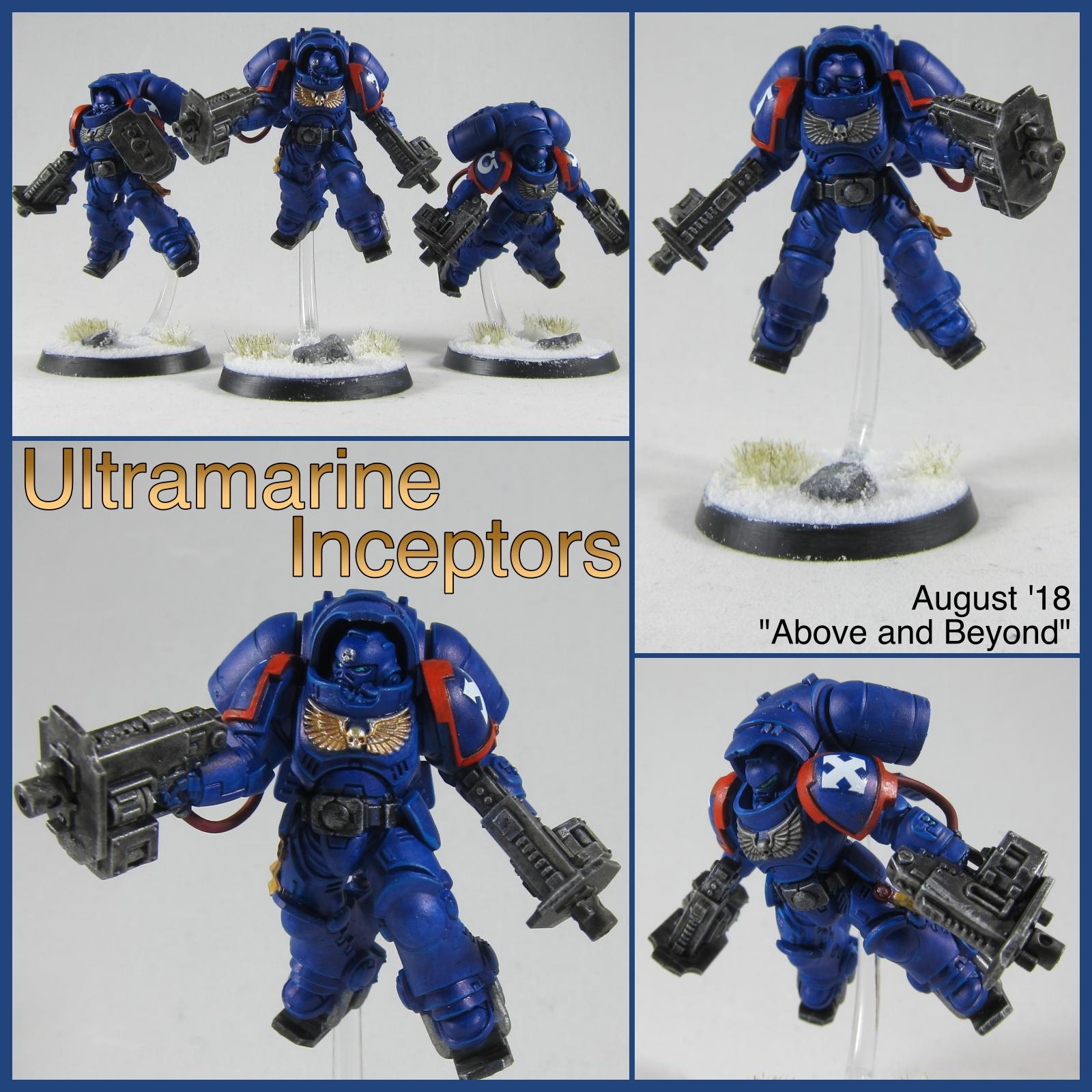
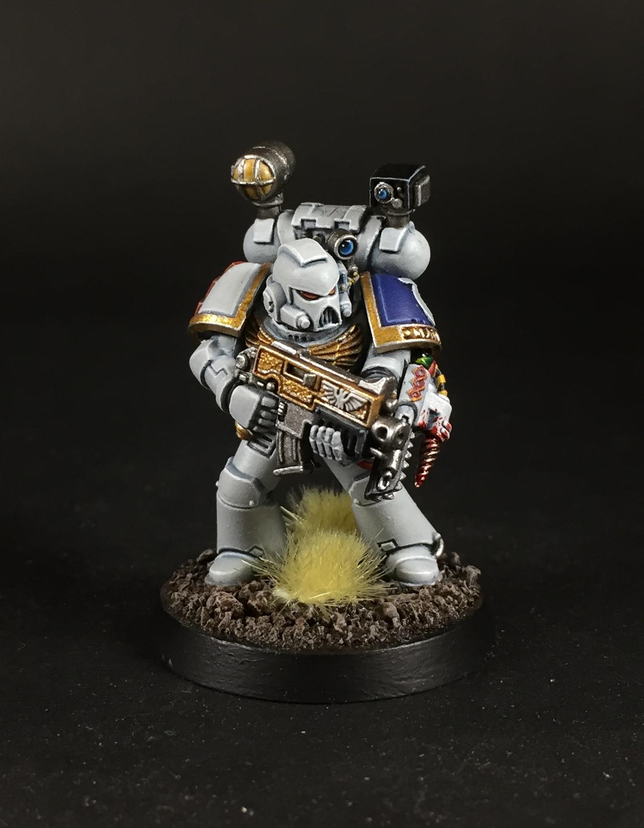
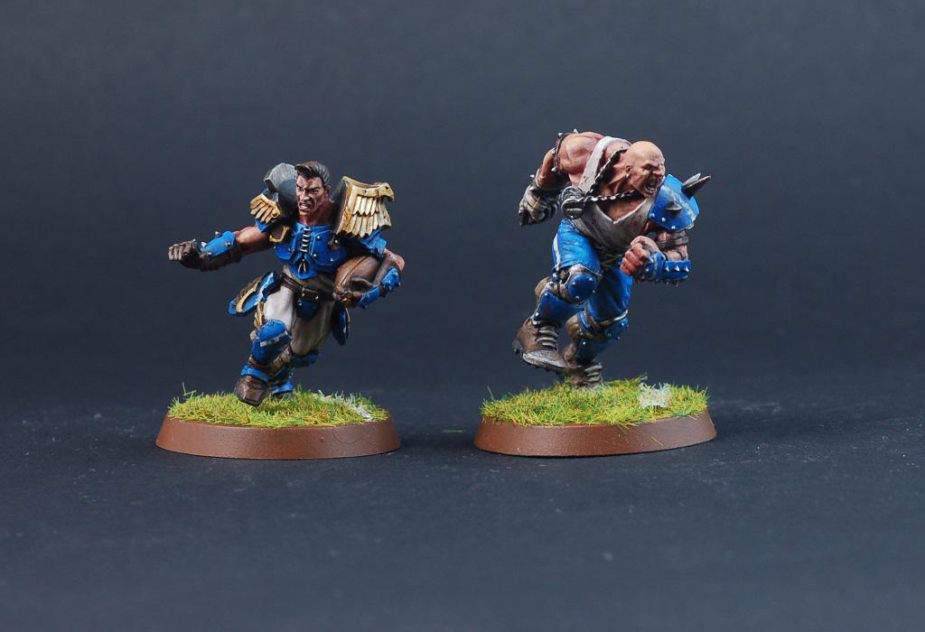
Nevelon: Ultramarines Aggressors
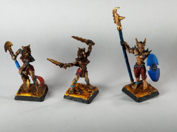
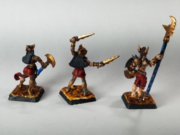
Vejut: Basti hero and duellists
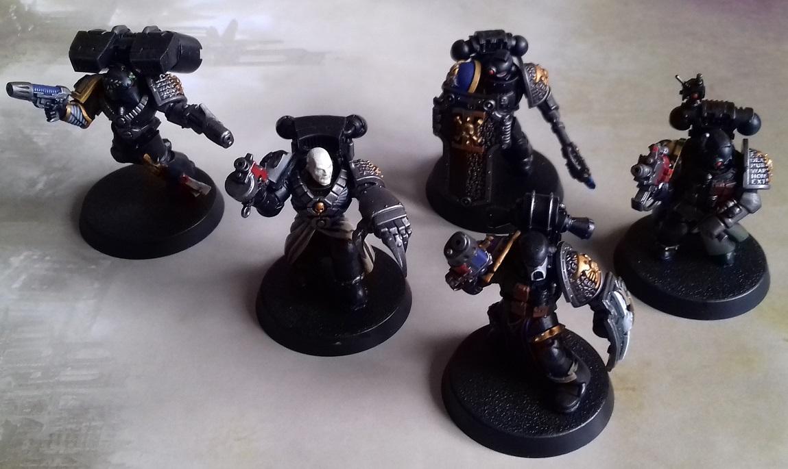
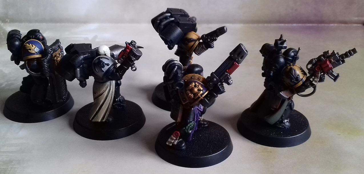
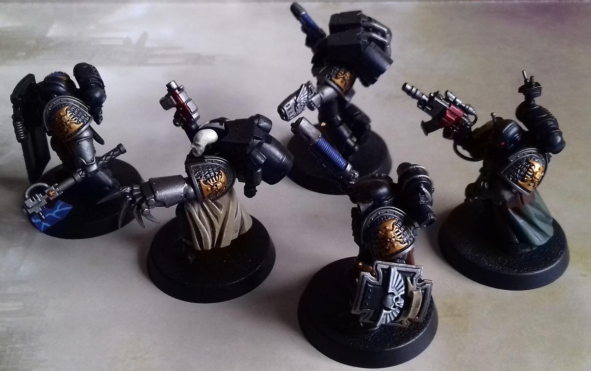
lipsdapips: Ultramarines Command Squad
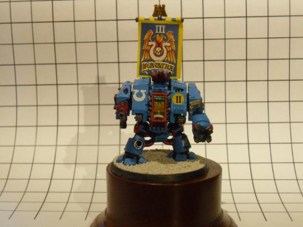
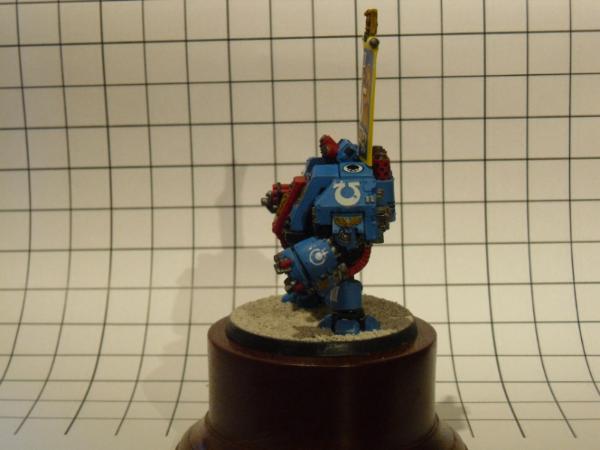
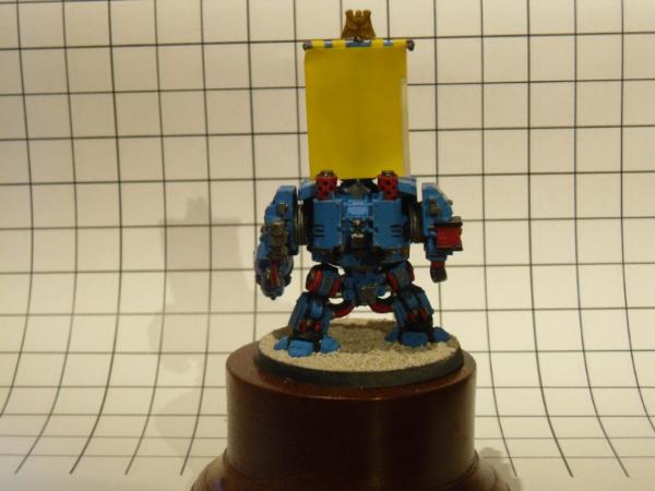
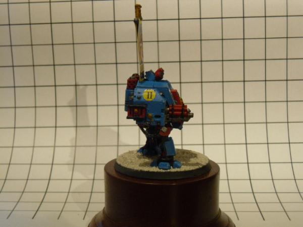
Rybrook: Ultramarines Dreadnought
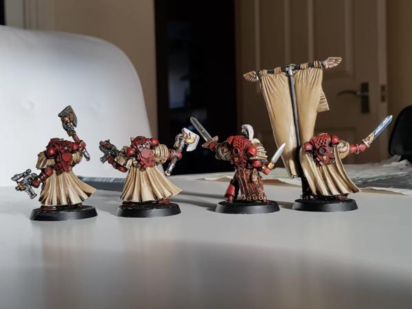
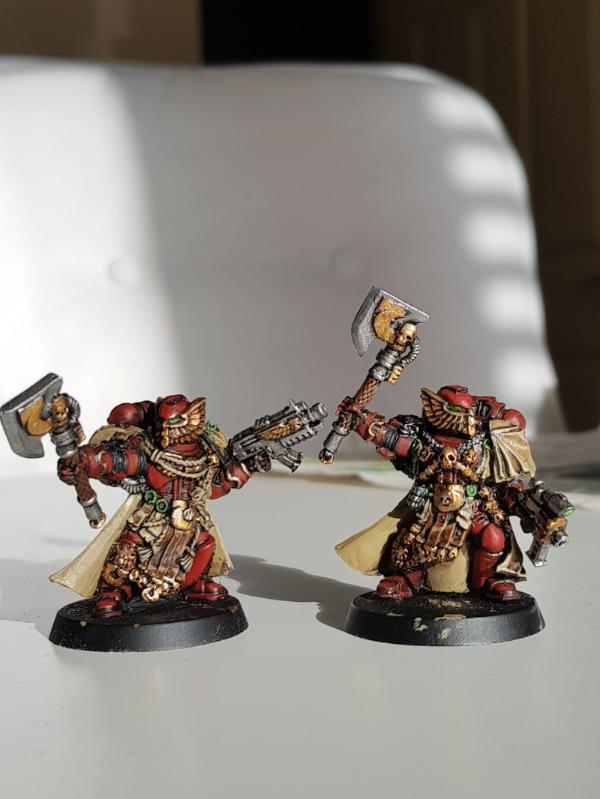
Deadshot: Blood Ravens Honour Guard
ssisal: Kurnoth Hunters
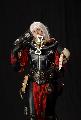
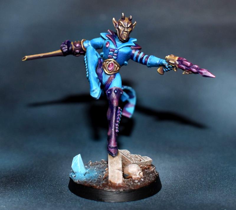
Kustomer D: Red Hood
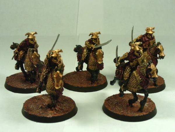
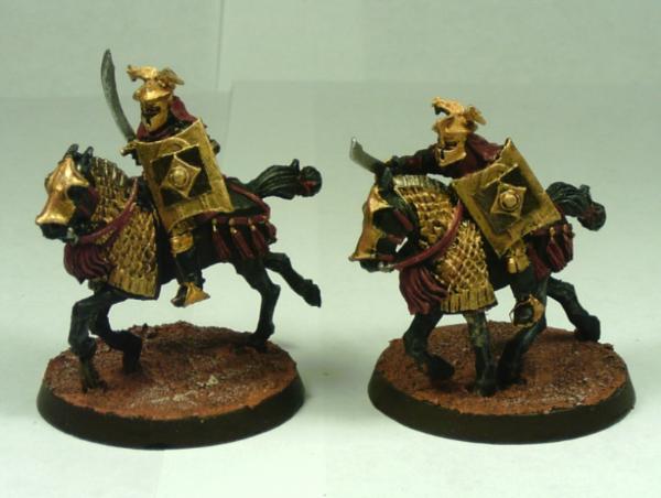
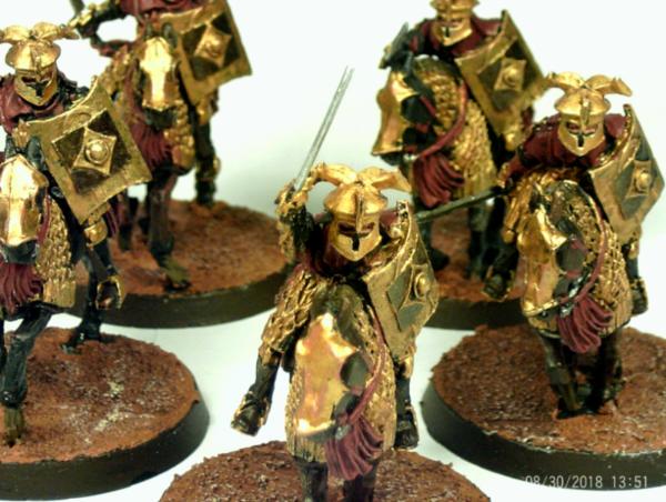
Zergsmasher: Easterling Cataphracts
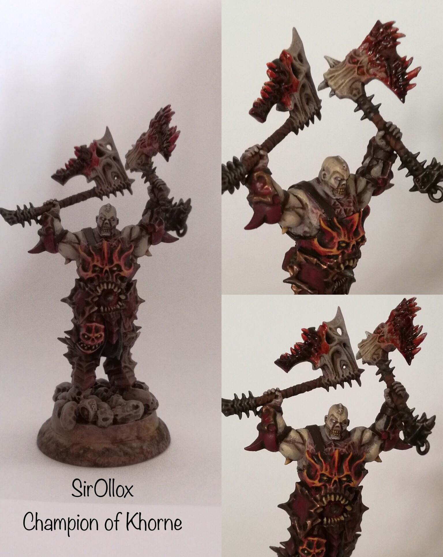
SirOllox: Champion of Khorne
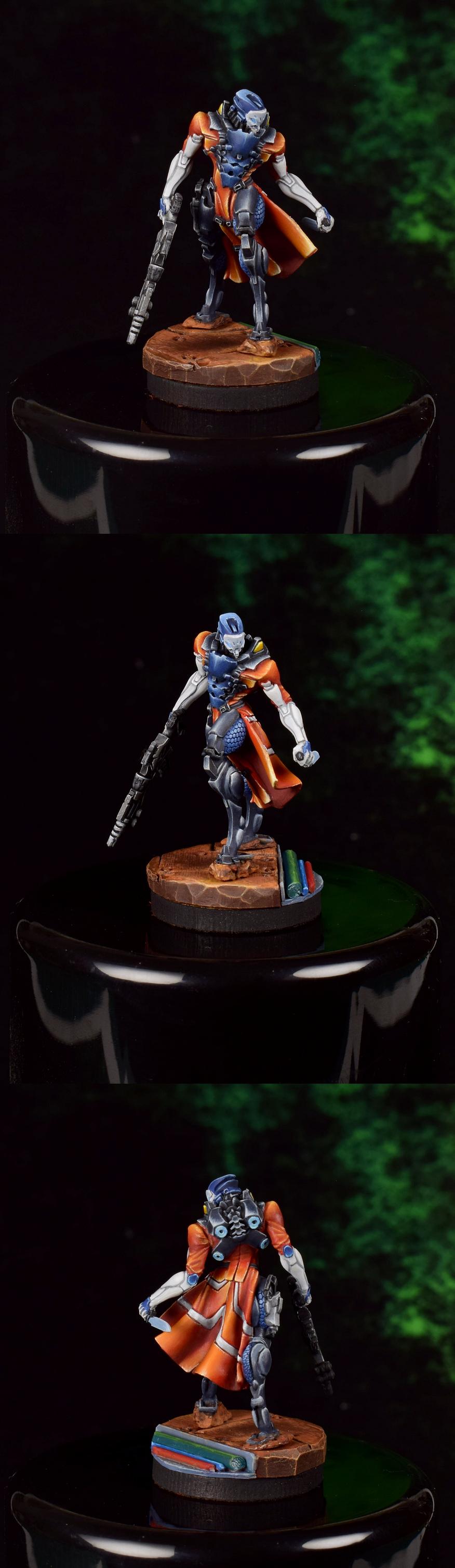
Modock: Tunguska Heckler and Hollow Man
DV8: Necron Tomb Sentinel
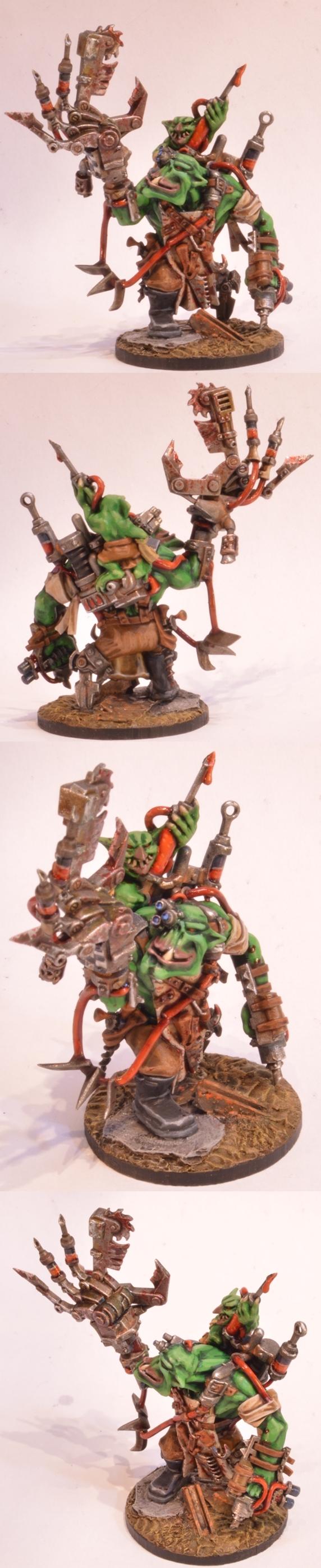
Midget Gems: Ork Painboy
SmallChanges: Deathwatch Kill Team
LordRahl: Winged Demons
Suzuteo: Death Company
Tim 121RVC: Centaur Skeleton
queen_annes_revenge: Caterpillar D9r
Power Elephant: Strider
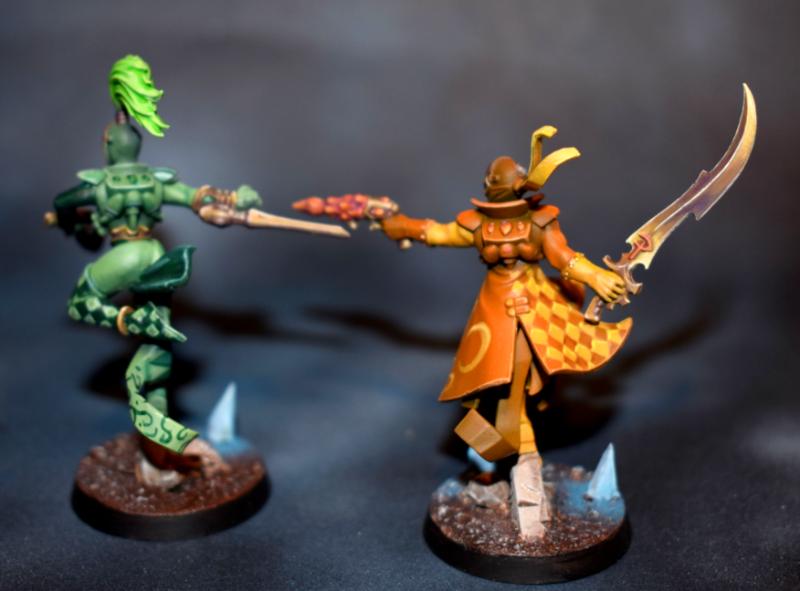
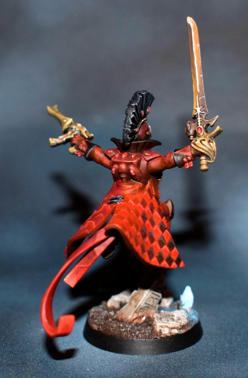
Chris56: Harlequin Kill Team
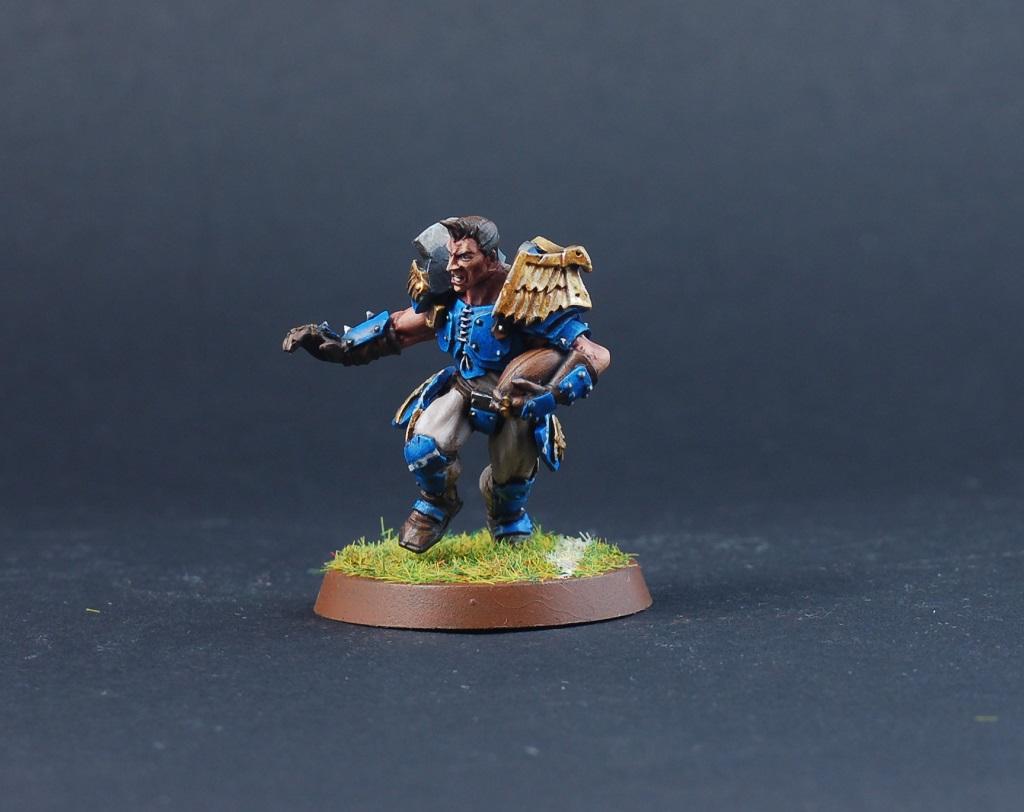
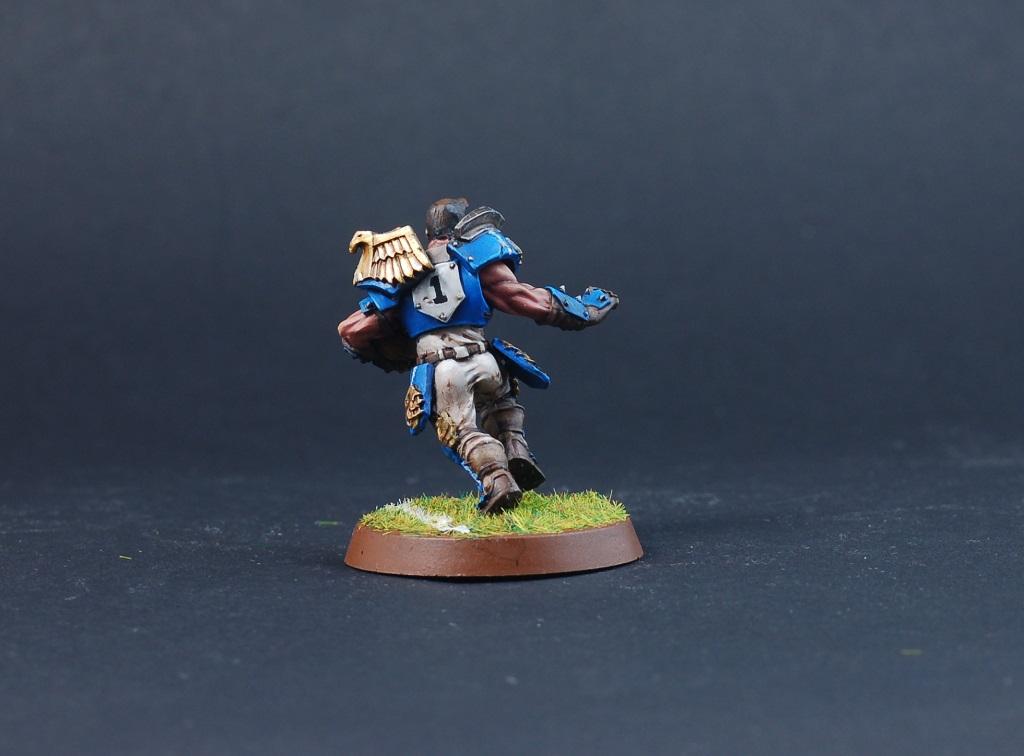
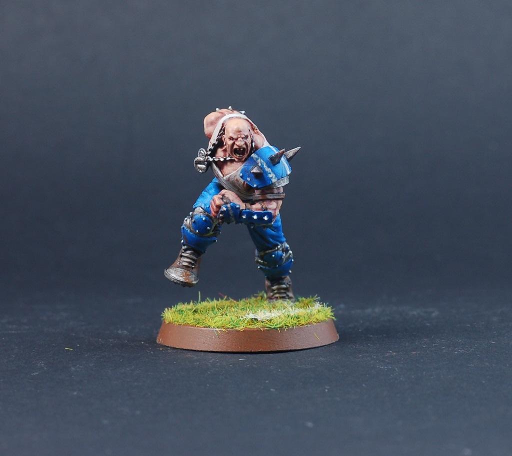
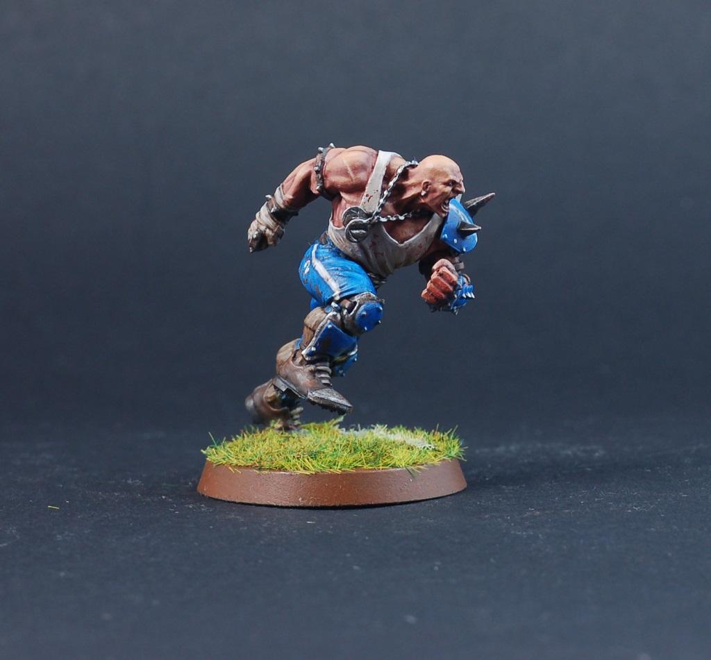
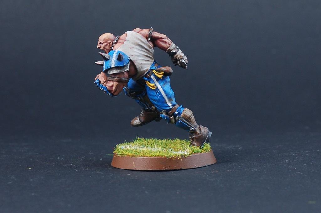
Feltmonkey: Griff Oberwald and Zug
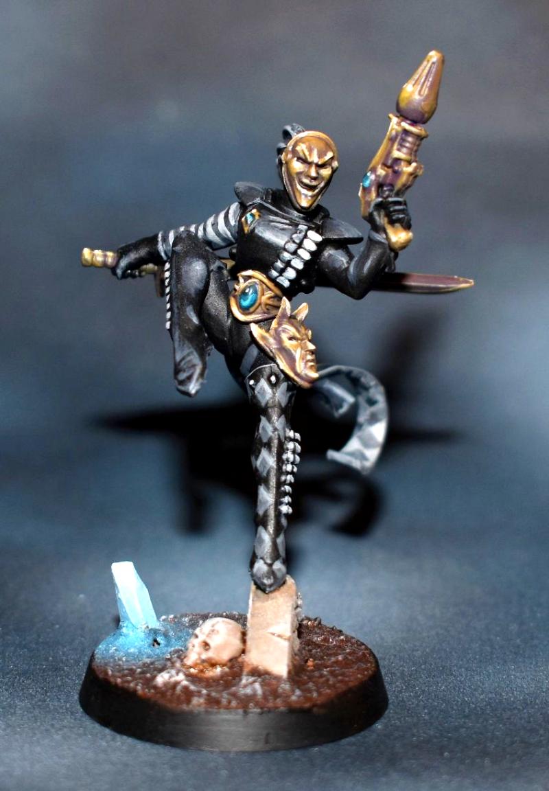
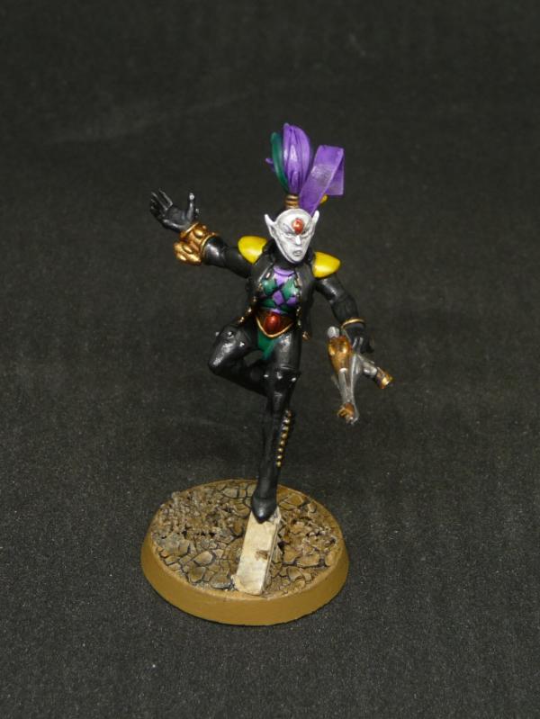
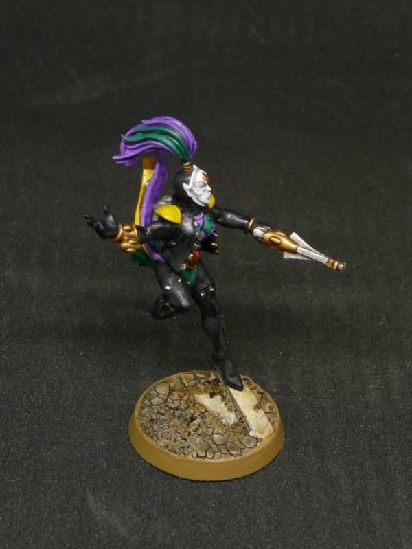
Jadenim: Eldar Harlequin
Paradigm: Freeblade Knight Gerantius
|
|
|
|
 |
|
2018/09/02 22:00:20
Subject: VOTE For the winner of the 42nd Unofficial Painting Challenge: Above and Beyond
|
|

Dakka Veteran
|
My votes go to Modock, DV8, queen_annes_revenge and Chris56. I think that Paradigm also probably deserves a vote, but the picture is so small I can't properly evaluate. I would vote on for your entry every month in fact, if only the pictures were bigger.
|
|
|
|
|
|
2018/09/03 01:30:20
Subject: Re:VOTE For the winner of the 42nd Unofficial Painting Challenge: Above and Beyond
|
|

Grim Dark Angels Interrogator-Chaplain
|
Not too many entries this time around compared to past challenges, but the quality of the finished entries is quite good. I voted for, in no particular order:
Chris56: You managed to make 5 different color schemes look great, so you definitely deserve some votes for that!
feltmonkey: Those are very characterful models, and your paintjob really made the details pop!
DV8: The Tomb Sentinel might be my favorite Necron model of all time, and yours looks amazing!
Modock: Once again, you earned my vote for yet more awesome Infinity models!
lipsdapips: Some very clean Smurfs, err, I mean Ultramarines! Seriously, they look great!
I had a lot of fun doing my entry. It was nice to paint something that wasn't Warhammer-related, in true 28mm scale rather than heroic. I still need to learn to make metallics look interesting, but I'm working on it, and that's the whole point of these things for me. Shout out as always to Paradigm for taking the time to organize these little challenges. See you all in the September one!
|
|
|
|
|
|
2018/09/03 19:56:04
Subject: Re:VOTE For the winner of the 42nd Unofficial Painting Challenge: Above and Beyond
|
|

Regular Dakkanaut
|
Lipsdapips: Nice power sword! I like how you painted the gold as well.
SirOllox: The flaming faces really pop, cool!
Modock: Superclean paintjob with the primary colours, well done. Anyone else noticed the scary eyes underneath the base? Yikes!
DV8: Creepy thing, like those mechanical bugs from the Matrix. Wouldn't expect it to be painted in bone colour, but it works.
Queen_annes_revenge: I love the weathering, it's so realistic!
Power Elephant: The landscape reflecting in the visor is visually incredibly interesting. Like you're looking at a small painting. Awesome!
Chris56: All five of them are beautiful, but the red one is my favorite. Do you have front/back pics of all of them individually? They're inspiring.
Feltmonkey: Both look great, but Zug stands out for me. Great paintjob, the skin in particular.
Paradigm: Yeah, we really need bigger pics. These don't do your work justice at all, that's a shame compared to all the work you put into it!
My Undead Centaur: had to cut, reposition and pin all the legs to make it work. Changed the horns for ones that represent a deer, I think that looks better. Weapons are supposed to be a combination that works: pulling an enemy with the hook, killing it with a blow from the flail. I'm not that satisfied with the bone, I should give it another layer of paint, but not by drybrushing. I kinda both like and dislike the magic light from the mouth and eyes. The brightness is quite striking, but the blending isn't so "flowing", especially in the mouth. Would a watered down layer of the blue help?
Also thought of painting a chaos symbol on the raised stone in that same blue magic, but I didn't have enough time.
|
|
This message was edited 1 time. Last update was at 2018/09/03 20:01:54
|
|
|
|
|
2018/09/04 19:17:51
Subject: Re:VOTE For the winner of the 42nd Unofficial Painting Challenge: Above and Beyond
|
|
Dakka Veteran
|
A fun month, with some tremendous entries as usual. Everyone made the effort to paint something, so everyone gets a comment! 
Nevelon - A neat, detailed job with some well-applied transfers. That Ultramarines army must be more of a chapter than a company by now.
Vejut - More fun, unusual miniatures from you. I think the guy with the shield is my favorite. You've done an excellent job on the shield itself and on his skin, particularly the chest. One thing to think about is what colours you put next to each other. For example, you've got slightly golden skin on the two female models, and they then have golden armour and weapons, which gets a little bit lost. Overall though, they're great!
lipsdapips - An extremely well-executed GW-style paint scheme. Super neat, with excellent edge highlights worthy of the sainted Duncan, and just a classic paint scheme. I love the way you've photographed their heroic pose.
Rybrook - A simple but effective paintjob. It shows how much things like transfers and the printed-out banner can add to a miniature.
Deadshot - That's a pretty eye-catching squad. Loads of detail and a cool banner. It's a shame you didn't manage to finish the bases.
ssisal - Very colourful, and an interesting idea to glue some of the wyldwood leaves to the squad leader. The snow looks nice, although you maybe need a touch more on the base rather than the miniatures, but that's just my personal opinion.
Kustomer D - Quite nice and understated paintjob, with a strong red for the hood. Is there some kind of filter on the photo? It looks sort of grainy in places.
Zergsmasher - Good tabletop painting, and it must be quite a bit of work to paint that many mounted miniatures in a month. The white balance problem with your photographs is kind of leeching the colour our of them though. As an example, the top right pic looks better than the top left, as the white is whiter, so all the colours look brighter than in the top left one. It's a shame because there's obviously some nice painting there, and I like your scheme of gold, red, and black.
SirOllox - Tremendous blood effects, and the firey bits on the armour are great. Some of your stuff tends to suffer a little bit from being a bit monochrome though. A few spot colours might help add interest to what are some well-painted miniatures.
Modock - Great stuff. You must have an incredible-looking Infinity force by now! I particularly like the second of the two miniatures. How on earth have you got those hexagons on the legs looking so neat? Have you edge highlighted some of the hexagons? Crazy stuff.
DV8 - I really love this. It's just gorgeous. The subtle weathering is perfectly-judged, and I'd love to know how you got those metallics both on the armour and the mechanical parts looking so good. Even the base, which is simple at first glance, has got a nice amount of contrast in there. Fantastic work.
Midget Gems - Nice work on the ork skin, and the weathering is really good too. My only criticism (and this is meant to be constructive) is that apart from the skin, with the rust on the metal, and the brownish tint to the red cables, everything ends up looking a bit brown. That might well be what you were going for of course, and as I say it does look good overall, and the painting is skilfully done.
SmallChanges - Some good painting here, neat and tidy with nice highlighting on the cloaks and stuff. Am I right in thinking you didn't finish though? It's a shame they're not based, and your eye is drawn to the sergeant's unpainted face. You can get away with a lot by having well painted faces as it's the first thing anyone looks at, so if you ran out of time I can see why you wouldn't want to rush that part. Make sure you post them when you get them finished, as what you've done looks good so far!
LordRahl - The paintjobs look interesting, but unfortunately the photograph is killing them. You've focused on the DVDs behind them, so I can read every word on the DVD sleeve, but I can't really see what's going on with the miniatures, sorry. It's worth taking the time to put a sheet of plain paper behind them, and just zooming in on the photo after you've taken it to check that the it is in focus. You've taken the time to paint them, so it's worth taking the time to make sure you're showing off your miniatures well also. Again, I don't mean to be harsh. I reckon the paintjobs are worth seeing properly too - the one bit I can see clearly, the golden wings on the demon on the left looks really cool.
Suzuteo - Was it you that made Sigmarite marines last month? Whether it was or not, these are nice conversions again. They look kind of flawless how you've put them together. The paintjob is decent tabletop stuff. A few highlights around the face would make them pop even more.
Tim 121RVC - A nice, fun miniature in an eyecatching pose. I like the blue glow in the skull, and the base.
queen_annes_revenge - I think this is my favorite this month. It's just incredible work, on the weathering in particular. I keep zooming in on it to see how you've done it, and it just looks incredibly realistic, even then. It's not just the techniques you've used, it's the thought behind the placement that's fantastic. Little touches like all the handles being worn where the soldiers would put their hands. Well done for creating such a fine piece of art.
Power Elephant - Really nice work. The way you've done the gun, and the weathering on the armour, are very nice. I don't think the base you've made is quite up to the standard of the miniature itself, but it's still pretty good. I'm not sure the reflection on the visor quite works, but those sorts of things are incredibly difficult to pull off (I certainly couldn't manage it) and overall the paintjob is very good. Great work.
Chris56 - Really high-quality stuff. The idea of making each harlequin a different colour is inspired - these will look so amazing on the table! Well done on freehanding the diamonds, and the swords (especially on the yellow harlequin) are stunning. Also, you're really good at painting gems. Sickening. 
Jadenim - Another harlequin and a pretty cool paintjob too. I like that she's a suffragette!
Paradigm - Really nice work on this lonely Imperial Knight, apparently stranded on a rock in the middle of the sea. Can he swim? I'm worried about the poor feller. You've really managed to capture a sense of scale in a tiny knight, which is impressive.
As for my own effort, thanks to everyone who voted for me, and ZergSmasher and Tim 121RVC for the kind comments. I agree with Tim that Zug came out quite a bit better than Griff, the latter being a bit of a curate's egg of a paintjob. Zug is also a much better sculpt, a far better miniature generally. The Forge World Blood Bowl miniatures are a bit hit and miss, with Zug being the best of the ones I've had a good look at, Griff here having legs that are too short, Varag Ghoul-Chewer who looks a bit fat and roughly-sculpted, and the Rat Ogre who looks as if he's tripped over. Other ones are pretty good - I like Grombrindal and Edril Sidewinder. They were fun to paint (although Griff was a nightmare to put back together - I painted him unassembled) and as has happened before I found myself in debt to Duncan's choices of paints on the Warhammer painting videos on youtube. The blue armour is a slightly adapted version of the official GW recipe of Caledor Sky, washed with Agrax Earthshade and highlighted with Teclis Blue. It's an amazingly eye-catching combination of blues, and I can't take any credit for it.
Congrats to everyone, and see you next month!
|
|
This message was edited 2 times. Last update was at 2018/09/04 19:21:36
|
|
|
|
|
2018/09/04 20:36:21
Subject: VOTE For the winner of the 42nd Unofficial Painting Challenge: Above and Beyond
|
|

Speed Drybrushing
|
Great effort from everyone who participated.
For the ones I voted for:
lipsdapips
Clean and crisp paintjobs, and the red helmet of the sergeant is phenomenal, particularly the eye lenses. I love how well the models photograph, and are very reminiscint of 'Eavy Metal's box-art paint jobs.
I don't want to call it improvement, because it's very clear that you have a defined style that works for you, but my only critique is on the cloth treatment. The flat colors with sharp edges works well for hard materials like armor, but I feel that more organic elements like the cloth could be handled with a little more subtlety. It works for these models because the sculpting has the hard edges you can highlight, but I'd be curious to see what you do with more organic elements.
Modock
Very clean, and fitting in with the Angel Giraldez aesthetic of Infinity. I think the blends between light and shadow are handled wonderfully, and the color choices are very distinct and make the models pop.
There's always a balance between how much and how little to light a figure, and I get a lot of it is down to personal preference. I try to take a page from the Renaissance Masters and usually try pushing the focus a bit more, that is, stronger lighting on the face and top of the chest/shoulders, and maybe pushing back some of the contrast in the extremities (like the feet).
The yellow on the Tunguska Heckler works because it immediately draws my attention, but I fear if you knock the image into grayscale, every element would kind of fight for attention.
The issue becomes apparent to me in the Hollowman, where the thing I focus on first are his forearms. That white draws a lot of attention, and I'll be honest, I don't even look at the head/chest (typically where you want to draw attention to).
queen_annes_revenge
I love how realistic this thing looks, especially in your diorama shot. The rusting and damage on the shovel, and the weathering on the tracks really sell this for me, and there is beauty in the simplicity of the color choices that really allows the technique to sell through.
The only real criticism I have is on the uniformity of color on the upper panels; it feels to be missing a textural quality in subtle color and lighting shifts that make it look too perfect, which funnily enough, makes it feel less real.
Chris56
Strong, vibrant colors, and I love how well-executed the freehand is. Plus the colors on the blade on the orange-yellow Harlequin is just baller.
I think that cleaning up the technique (sharper highlight lines, smoother blend transitions, etc.) would definitely make these models pop more at up-close inspection. But there's also the balance between tabletop and showcase, an painting for that purpose, so take this with a grain of salt. I know I'm much sloppier when I paint models for tabletop as well!
Automatically Appended Next Post:
 feltmonkey wrote: feltmonkey wrote:
DV8 - I really love this. It's just gorgeous. The subtle weathering is perfectly-judged, and I'd love to know how you got those metallics both on the armour and the mechanical parts looking so good. Even the base, which is simple at first glance, has got a nice amount of contrast in there. Fantastic work.
There's really no secret to it. It's basically a dark metallic color blended up to a bright metallic color. In this case, Scale75 Dark Metal up to Heavy Metal, and then Vallejo Air Chrome for the final highlights.
I made sure to consider the zenithal light source to place my lights and shadows, and then just painted each panel and segment individually (no drybrushing!)
|
|
This message was edited 3 times. Last update was at 2018/09/04 20:40:56
|
|
|
|
|
2018/09/05 02:42:40
Subject: Re:VOTE For the winner of the 42nd Unofficial Painting Challenge: Above and Beyond
|
|
Quick-fingered Warlord Moderatus
|
feltmonkey wrote:Suzuteo - Was it you that made Sigmarite marines last month? Whether it was or not, these are nice conversions again. They look kind of flawless how you've put them together. The paintjob is decent tabletop stuff. A few highlights around the face would make them pop even more.
Yeah, I've been making these true scale Sigmarines for my Blood Angels. Got another 10 Death Company planned.
I actually did not get a chance to finish highlighting them. (Only the one on the right has any highlights.) It's not too far off though. I don't really do line highlights on dark colors anyway. Looks too cartoony for my tastes. Though you might be right; I should consider making an exception for black helmets. In any case, I am much better at building than I am at painting. I do mostly tabletop quality stuff.
Here's some pictures I took to show a friend how I did these Sigmarines, if anyone is curious:

Started with some botched Stormcast Eternals that I bought for $1 each. Cut the arms, head, and shoulders off. Less is more; I clean up in the next step.

With a lot of patient knife work, I remove all the extra plastic and clean up the primer as well.

Attach Blood Angels bits.
|
|
This message was edited 1 time. Last update was at 2018/09/05 02:44:22
|
|
|
|
|
2018/09/05 02:48:54
Subject: Re:VOTE For the winner of the 42nd Unofficial Painting Challenge: Above and Beyond
|
|
Three Color Minimum
|
Not a huge number of entries this month but some really great quality.
I loved many models but my top 5 were:
lipsdapips - for your really clean and smooth paint;
modock - for your top transitions as always - you must have a pretty awesome Nomad force by now!
DV8 - for those great armour panels on the tomb sentinel;
queen_annes_revenge - for how super realistic and authentic your model looks; and
felt - for your brilliant faces.
Thanks to all for kind comments and advice.
See everyone in 'Pick up the Pace'!
|
Skirr and Skiver, Fancyman of Cornwall and Best Friend of your Mother's. |
|
|
|
|
2018/09/05 06:31:10
Subject: VOTE For the winner of the 42nd Unofficial Painting Challenge: Above and Beyond
|
|
Thane of Dol Guldur
|
 DV8 wrote: DV8 wrote:Great effort from everyone who participated.
.
queen_annes_revenge
I love how realistic this thing looks, especially in your diorama shot. The rusting and damage on the shovel, and the weathering on the tracks really sell this for me, and there is beauty in the simplicity of the color choices that really allows the technique to sell through.
The only real criticism I have is on the uniformity of color on the upper panels; it feels to be missing a textural quality in subtle color and lighting shifts that make it look too perfect, which funnily enough, makes it feel less real.
)
Thanks. Yeah what I didn't realise was that in vehicle scale modelling you get depth using pre shading on panel lines rather than lot s of layered highlights. Going to take that into consideration on my next scale model.
|
  Heresy World Eaters/Emperors Children Heresy World Eaters/Emperors Children 
Instagram: nagrakali_love_songs |
|
|
|
|
2018/09/05 15:25:36
Subject: Re:VOTE For the winner of the 42nd Unofficial Painting Challenge: Above and Beyond
|
|
Road-Raging Blood Angel Biker
|
feltmonkey wrote:A fun month, with some tremendous entries as usual. Everyone made the effort to paint something, so everyone gets a comment!
LordRahl - The paintjobs look interesting, but unfortunately the photograph is killing them. You've focused on the DVDs behind them, so I can read every word on the DVD sleeve, but I can't really see what's going on with the miniatures, sorry. It's worth taking the time to put a sheet of plain paper behind them, and just zooming in on the photo after you've taken it to check that the it is in focus. You've taken the time to paint them, so it's worth taking the time to make sure you're showing off your miniatures well also. Again, I don't mean to be harsh. I reckon the paintjobs are worth seeing properly too - the one bit I can see clearly, the golden wings on the demon on the left looks really cool
i was gonna take the picture on my gaming table, but...... my brothers have kinda taken it over, one set up his hobby stuff, and the other has been playing the same game against himself for the past 2 weeks 1 move a day smh
i probably should have put a blank book or something tho
|
|
|
|
|
|
2018/09/05 15:32:50
Subject: VOTE For the winner of the 42nd Unofficial Painting Challenge: Above and Beyond
|
|
Powerful Phoenix Lord
|
Sorry I missed this month (made an attempt and failed).
I tossed votes at the old school dread (because dreads NEED banners), the great Caterpillar, Felt's really characterful Bloodbowl types, and the crisp and clean Marine command squad.
Nice work all around. One of these days I'll get back into painting for the monthlies...(wistful sigh)
|
|
|
|
|
2018/09/05 19:24:17
Subject: Re:VOTE For the winner of the 42nd Unofficial Painting Challenge: Above and Beyond
|
|
Dakka Veteran
|
 LordRahl wrote: LordRahl wrote:
i was gonna take the picture on my gaming table, but...... my brothers have kinda taken it over, one set up his hobby stuff, and the other has been playing the same game against himself for the past 2 weeks 1 move a day smh
i probably should have put a blank book or something tho
Haha how does he even remember what's going on in his game? "Hmm, now this guy can't move and shoot, but did I move him? I initially actuvated him last thursday..."
The shelf itself isn't a bad idea for photos. All you need is a blank bit of paper as a backdrop, or anything that's a solid colour. A shirt would do. I've entered minis photographed on shirts into this challenge before, standing topless in my living room while the photos are taken. Don't tell anyone that.
|
|
|
|
|
2018/09/05 19:34:47
Subject: VOTE For the winner of the 42nd Unofficial Painting Challenge: Above and Beyond
|
|
Utilizing Careful Highlighting
|
Honestly, the pictures I took above were taken on a sheet of printer paper held up by paint bottles on my desk, with three 100W daylight LEDs in desk lamps pointed at them. Granted, probably shows in quality of picture.
Thanks for the compliment feltmonkey--was trying to seperate the weapons and skin with the handles and jeweling on the daggers, but I think I needed it brighter, and possibly wider (and to go back over it after washing). Really like the bronzed/copper weapons look, especially given they're supposed to be ancient secret Conan-style history bronze age models, but it does seem to not play well with skin tones.
|
|
|
|
|
2018/09/07 08:27:03
Subject: Re:VOTE For the winner of the 42nd Unofficial Painting Challenge: Above and Beyond
|
|
Mekboy Hammerin' Somethin'
|
Hi all been away for a few days with work, I saw the start was very close between the top and theres still a good spread of votes at the top
feltmonkey wrote:
Midget Gems - Nice work on the ork skin, and the weathering is really good too. My only criticism (and this is meant to be constructive) is that apart from the skin, with the rust on the metal, and the brownish tint to the red cables, everything ends up looking a bit brown. That might well be what you were going for of course, and as I say it does look good overall, and the painting is skilfully done.
Thanks Felt, more than happy to take some constructive criticism. I can't say this is my best work and the photos aren't a good representation. In RL the red stands out a bit more and doesn't have any brown tones, also the blood splatter stands out more against the white apron and metal on the weapon. The red was meant to be the contrasting colour that drew the eye. Think its my light set up, I will change the yellow blub for a daylight one, been meaning to do it for ages.
Stand outs this month were lipsdapips, Modock, DV8, queen_annes_revenge, Chris56, Feltmonkey + some other votes for interpretation of the theme, most imporved and trying new things.
As always League table will be updated over the weekend.
|
|
This message was edited 1 time. Last update was at 2018/09/07 08:27:18
|
|
|
|
|
2018/09/07 16:49:37
Subject: Re:VOTE For the winner of the 42nd Unofficial Painting Challenge: Above and Beyond
|
|

Camouflaged Zero
|
A shy month in terms of entries but the quality didn't suffer.
Thanks to Power Elephant, ZergSmasher, Tim 121RVC, Feltmonkey, DV8, Chris and MG for the comments and votes.
Feltmonkey
You must have an incredible-looking Infinity force by now! I particularly like the second of the two miniatures. How on earth have you got those hexagons on the legs looking so neat?
Have you edge highlighted some of the hexagons? Crazy stuff.
Yeah the force is getting bigger. I need to take a family photo someday. The top hexagons are highlighted with minimal paint quantitiy on a tiny brush.
Also I use magnifying glasses, I couldn't do it without them.
DV8
Thanks for the constructive comment. You're right, the focus should be on the upper part of the mini. It's just that I don't give that much attention to that.
On to votes.
lipsdapips - very clean and crisp paint job. 101 GW painting technique. Cool lightning effect on the sword.
DV8 - the bone color is painted very well, but the chipping and rust effects steal the show, amazing. The one thing is that I would like to see is
some weathering on the legs, they are a bit too clean.
queen_annes_revenge - monster of a mini! Very realistic painting, I like it. The rust is on point. Great job.
Power Elephant - very cool scratch build base. The blends are quite clean especially on the weapon. The sky-earth NMM on the canopy is missing some finese
but it's very hard pull off. Nonetheless, great piece.
Chris - did you really finish them in one weak?!... that's nuts! Very cool idea to paint them differently, it makes them so unique.
Also the blends and checkered patterns are masterfuly done.
Feltmonkey - very characterful minis. The subtle weathering works perfectly. The freehand is great as well and the photos are sharper and clearer...excellent Felt!
Thanks again to all and to Para for the effort.
|
|
This message was edited 3 times. Last update was at 2018/09/07 16:53:53
|
|
|
|
|
2018/09/07 20:04:03
Subject: Re:VOTE For the winner of the 42nd Unofficial Painting Challenge: Above and Beyond
|
|
Road-Raging Blood Angel Biker
|
feltmonkey wrote:
Haha how does he even remember what's going on in his game? "Hmm, now this guy can't move and shoot, but did I move him? I initially actuvated him last thursday..."
The shelf itself isn't a bad idea for photos. All you need is a blank bit of paper as a backdrop, or anything that's a solid colour. A shirt would do. I've entered minis photographed on shirts into this challenge before, standing topless in my living room while the photos are taken. Don't tell anyone that.
hes 8 so he ignores 80% of the rules, and apparently the chaos forces died and came back as zombies for round 2... lmao
the model im doing for next month is gonna be a pain her wings dont wanna stay glued on, and im mixing metallic paints for her scales 
|
|
|
|
|
|
2018/09/09 16:10:58
Subject: VOTE For the winner of the 42nd Unofficial Painting Challenge: Above and Beyond
|
|
Is 'Eavy Metal Calling?
|
|
|
|
|
|
|
2018/09/09 16:38:16
Subject: VOTE For the winner of the 42nd Unofficial Painting Challenge: Above and Beyond
|
|
The Marine Standing Behind Marneus Calgar
|
Grats to the winners. Very nice work!
|
|
|
|
|
|
2018/09/10 20:50:09
Subject: VOTE For the winner of the 42nd Unofficial Painting Challenge: Above and Beyond
|
|
Dakka Veteran
|
Congrats to the winners. Excellent work, guys!
|
|
|
|
|
2018/09/11 00:50:43
Subject: Re:VOTE For the winner of the 42nd Unofficial Painting Challenge: Above and Beyond
|
|
Camouflaged Zero
|
Woohoo, I wasn't expecting this. Thanks guys for the support. Great work everybody and congrats to other winners!
|
|
|
|
|
2018/09/11 21:59:36
Subject: Re:VOTE For the winner of the 42nd Unofficial Painting Challenge: Above and Beyond
|
|
Mekboy Hammerin' Somethin'
|
Well done guys great work and some well deserving winners, was a close vote for the tops spots.
League table updated now
https://www.dakkadakka.com/dakkaforum/posts/list/732117.page#9481149
|
|
|
|
|
|
2018/09/11 23:38:36
Subject: Re:VOTE For the winner of the 42nd Unofficial Painting Challenge: Above and Beyond
|
|
Camouflaged Zero
|
|
|
This message was edited 1 time. Last update was at 2018/09/11 23:39:06
|
|
|
|
|
|
|
|


 ~16000 Astra Militarum:
  ~1200 | Imperial Knights:
  ~2300 | Leagues of Votann:
  ~1300 | Tyranids:
  ~3400 | Stormcast Eternals:
  ~5000 | Kruleboyz:
  ~3500 | Lumineth Realm-Lords:
  ~700
~700


 Ultramarines, 3rd Co. and friends, 16k+
  4k
4k