| Author |
Message |
 |
|
|
 |
|
Advert
|
Forum adverts like this one are shown to any user who is not logged in. Join us by filling out a tiny 3 field form and you will get your own, free, dakka user account which gives a good range of benefits to you:
- No adverts like this in the forums anymore.
- Times and dates in your local timezone.
- Full tracking of what you have read so you can skip to your first unread post, easily see what has changed since you last logged in, and easily see what is new at a glance.
- Email notifications for threads you want to watch closely.
- Being a part of the oldest wargaming community on the net.
If you are already a member then feel free to login now. |
|
 |
![[Post New]](/s/i/i.gif) 2019/06/30 00:52:40
Subject: Taking a stab at Contrast Paints, with Death Eagles (old scheme)
|
 |

Fireknife Shas'el
|
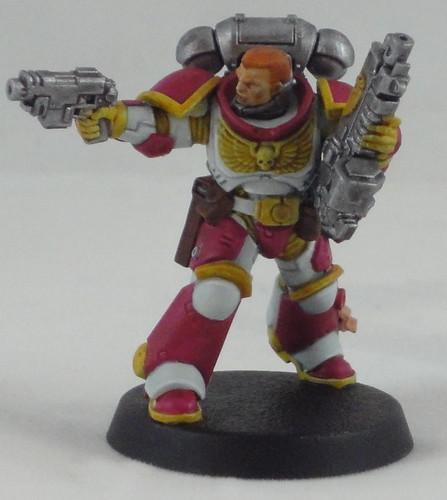
So I went to GW on Warhammer Day and got some of these fancy new contrast paints. I decided to try the old Death Eagles scheme as I painted some of those way back when, and magenta over white was a screaming pain in the behind back then. Maybe easier with Contrast?
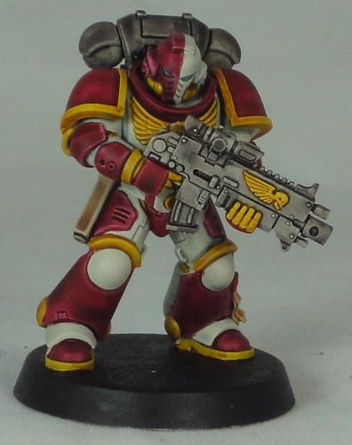
Okay, so not perfect, but I feel that the paints live up to their purpose - they're slightly better paint-by-wash paints with higher pigment amounts. Nazdrag Yellow is pretty good as a dirt easy MNM gold and Basilcanum Grey does much the same for MNM silver/steel. I couldn't get a non mottled coat of magenta out of Volupus Pink even after 2 coats, but I didn't use any Contrast Medium either. Apothecary White does the job of shading white but does need cleaning up if you want it to look halfway neat. I really feel that GW has misrepresented these paints as 'for beginners' or to 'shade the grey tide' but I think that only really applies to armies with really simple paint schemes. The nature of the contrast paint is such that if you get it somewhere you don't want, you have to paint over it with the primer again, because it's hard to remove with just a quick, wet brush like you could a regular paint. The above model took about 2 hours including dry times, though to be fair it's a test model and I always take longer on that then when cranking out an established scheme.
I will say that Wraithbone spray is definitely very stank as far as spray bombs go and I would advise against any kind of indoors-ish spraying (garages or similar), you want to be outdoors and upwind from the results. It does come out noticeably smoother than regular white primer.
|
|
|
|
 |
 |
![[Post New]](/s/i/i.gif) 2019/07/13 17:24:54
Subject: Re:Taking a stab at Contrast Paints, with Death Eagles (old scheme)
|
 |

Fireknife Shas'el
|
So I tried using Contrast Medium to reduce the mottling. 2 coats of Volupus Pink on both minis, one coat of other colors. Mini with contrast medium on the left.
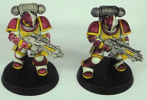

Using medium definitely reduces the surface mottling on large surfaces. Doesn't eliminate it, but it's much less obvious. I used 1 drop of Medium to 2 drops Contrast. It really worked quite well for Apothecary White and Basilicanum Grey in getting low mottling. Didn't see much difference in Nazdreg Yellow, but Volupus Pink is much more washed out.
|
|
|
|
 |
 |
![[Post New]](/s/i/i.gif) 2019/07/13 17:31:17
Subject: Taking a stab at Contrast Paints, with Death Eagles (old scheme)
|
 |

Powerful Phoenix Lord
|
Looks pretty good. They definitely fall on the side of "looks like they were painted with Contrast", but that's about 85% of the stuff I've seen.
It has the wash-style "light" look to it. As long as it's fast and effective I'm sure they look good on the tabletop.
|
|
|
 |
 |
![[Post New]](/s/i/i.gif) 2019/07/13 17:50:28
Subject: Re:Taking a stab at Contrast Paints, with Death Eagles (old scheme)
|
 |

Huge Bone Giant
|
Looks nice. I didn't think I'd like diluted Contrast paint, but it seems to work well enough on flat surfaces. That said, purely for style I prefer the dark pink.
How does Apothecary White work out for you? I've only been able to test mine a little bit, but it seemed to be very grey with not much white happening around the edges.
|
Nehekhara lives! Sort of!
Why is the rum always gone? |
|
|
 |
 |
![[Post New]](/s/i/i.gif) 2019/07/13 17:56:36
Subject: Taking a stab at Contrast Paints, with Death Eagles (old scheme)
|
 |

Fireknife Shas'el
|
 Elbows wrote: Elbows wrote:Looks pretty good. They definitely fall on the side of "looks like they were painted with Contrast", but that's about 85% of the stuff I've seen.
It has the wash-style "light" look to it. As long as it's fast and effective I'm sure they look good on the tabletop.
Yeah, it was about an hour to do the left miniature, which is pretty good considering that it's a white armored mini with lots of other colored panels. I really can't see using Contrast paints on armors that aren't predominantly white, especially since I own an airbrush so can turn any paint into a spray coat.
Automatically Appended Next Post:
 Geifer wrote: Geifer wrote:Looks nice. I didn't think I'd like diluted Contrast paint, but it seems to work well enough on flat surfaces. That said, purely for style I prefer the dark pink.
How does Apothecary White work out for you? I've only been able to test mine a little bit, but it seemed to be very grey with not much white happening around the edges.
With 1:2 Medium/Apothecary White, it goes on quite evenly and settles well in crevices. I do plan on highlighting for the final project (these are trial minis), and the slight grey cast it gives over Wraithbone should make for good white highlights with White Scar or similar. You're right that you don't get strong white highlights on the edges, though.
Automatically Appended Next Post:
Tried contrast over some regular paints - in this case, Basilicanum Grey over silver (2:1 Contrast/Medium) and Volupus Pink (again, 2:1) over Vajello Warlord Purple, plus some manual highlights on the purple and whites.
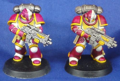
Original undiluted contrast paints on the right.
The main impression I'm getting of Contrast Paints is that they make good washes - nice rich pigmentation in crevices without the frosting of some washes, and they can offer natural highlights over regular paints, but for large armor panels they mottle to easily to be applied straight over contrast primers.
|
|
This message was edited 3 times. Last update was at 2019/07/13 20:47:05
|
|
|
 |
 |
![[Post New]](/s/i/i.gif) 2019/07/19 18:15:29
Subject: Re:Taking a stab at Contrast Paints, with Death Eagles (old scheme)
|
 |

Fireknife Shas'el
|
So I decided to try using some of the contrast paints without GW's bespoke primers. In this case, I primed (brush) with Vajello Surface Primer Grey, then basecoated with GW's Ulthuan Grey. Then I used a Contrast Medium/Apothecary White 1:2 mix to coat the whole model. From there I proceeded as per the previous model, only I backfilled the raised grey areas with Ulthuan Grey and Scar white highlights.
The next image is of all my current trial models. Original (just straight contrast paints) on the right, contrast primers, diluted contrast paints with Scar White overlay on left, current model in the middle.
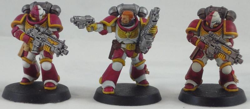
Now, it's not a huge difference overall. From a tabletop distance, straight contrast paints are certainly good enough. OTOH, if you plan on doing cleaner paint work with highlights that pop, contrast paints can still work well as washes and tints.
|
|
|
|
 |
 |
![[Post New]](/s/i/i.gif) 2019/09/23 22:37:13
Subject: Re:Taking a stab at Contrast Paints, with Death Eagles (old scheme)
|
 |

Fireknife Shas'el
|
And now I've basically moved on to using Contrast Paints as tints/washes over regular colors.
For example, Vajello Ghost Grey followed by 50/50 Medium/Apothecary White, building up Ghost Grey again with Dead White highlights.
I've also switched to using actual gold paints.
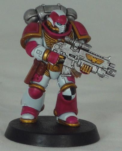
Went for a different helmet on this guy, along with some leg asymmetry and an element I had forgotten, the knee checkers. One nice thing about the original Death Eagles scheme is that no two marines had the same heraldry, they just drew from the same palette of colors. So each marine can be fairly unique.
I don't have a good solution for the mottling on the purple. I know it can be reduced with careful application, but I like the color it gives the magenta enough that I can ignore it.
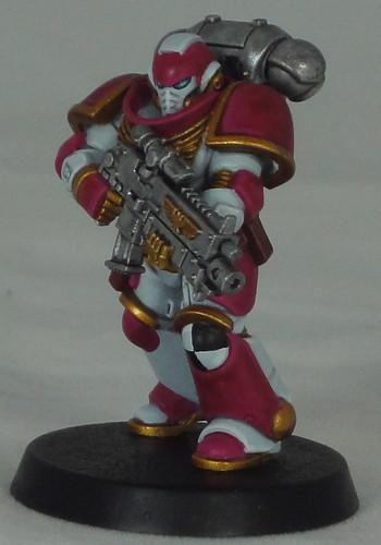
Technically I think the hands are supposed to be black, but I like the gold hands.
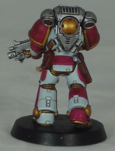
I went with a brighter silver on the gun and pack, and added the gold circle and vents to break it up a bit.
Pretty happy with this scheme and the procedure of painting it. Not nearly as fast as pure contrast painting but well worth the extra effort.
|
|
|
|
 |
 |
|
|