Hi Folks,
(Click the pictures to see larger, zoomable versions)
I've got a small project on the go. Mostly just for fun, but will also result in a playable Kill Team. One internet high-five if you can guess the inspiration for the team.
I started out trying Athonian Camoshade over Silver, and just didn't like it. Looked dirty. More Nurgley than Shiny and Bright.
But, once upon a time, I bought 12 cans of Gold Laquor spray paint, for $10, off a clearance shelf. I normally don't like priming my models in anything but white... and I
really wasn't sure about this paint as any kind of suitable primer / sticking to plastic... but it seems to be ok so far. The silver equivalent didn't come off very well in a sonic cleaner.

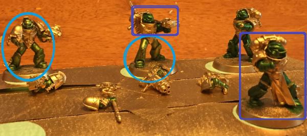
So, I sprayed them in gold, let them dry for a couple hours, and got to it. You can see the original gold on the bases, and guns. The first thing I noticed, is that contrast paint doesn't go on like I'm used to using washes. I usually use a thin layer of washes to add depth and shadow to my models, but that's really not the way Contrast paint works. In the light blue circles, you can see how using Contrast like a wash turned out...
If I were to compare a wash to contrast, I would compare it like a normal ink pen, to a gel pen. Contrast is, perhaps obviously, thicker, and stickier for lack of a better term. You really don't want to play with it much once you've put it down. It kind of turns into an almost gel-like consistency very quickly. An Ink pen more or less instantly absorbs into the paper, settling in right away. Contrast is like a gel pen. You can sort of see a layer of the gel ink on top of the paper before it settles in and dries. I didn't want to overdo it on the first try, but on the second pass I put it on like a candy-apple coating, for lack of a better term. If you've ever seen the real thick gloss look, that a candy-apple red paint job has on a vehicle? It reminded me of that.
Knowing what I know now, I would have gone with a lighter (whiter) gold as the base. The colour I used is, as far as I can tell, close to Retributor gold. Has a bit of a darker, coppery colour to it than "Shining Gold", for example. I would start with the lighter gold, and put a heavy, candy-apple coat on right from the get-go. The darker and slightly red-ish gold I used is not quite what I'd have had in mind, though I am happy with the final result.
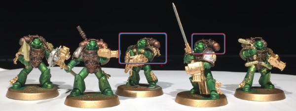
Truthfully, I'm *very* pleased with the effect that contrast has over metallic paint. I've circled in red, some of the best examples of the transition / highlight this paint gives with no real effort whatsoever.
The green has some beautiful transitions into the gold, with nice sharp gold highlights on the edges. The helmets and arms look ace, and the legs on the right show how the "exposed to light" fading to darker under the model's body. The highlights on the side of the helmets are just tasty. I really like that effect, and essentially no real effort. Just changing a technique a bit. It really does go on thick!
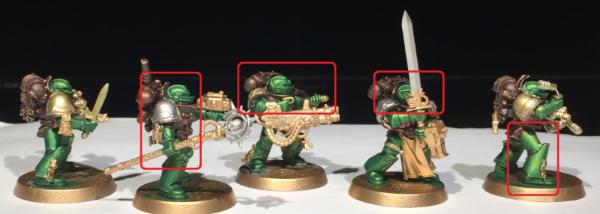
Since I started with a slightly darker gold, I decided to go for the darkest brown, Cygor Brown.
They could have called this, "Chocolate Syrup" because that's pretty damned close to colour and texture of this paint. Not fudge, but like, chocolate milk syrup.
To say that things wound up darker than I expected / planned is an understatement. I looks like 70% dark chocolate when you put it over the gold. You can still kind of see it in the recesses, but what you're seeing here is a solid drybrush of Balthazar Gold over top.
That said, I really like the burnished, antique copper / bronze vibe I wound up with.
I circled a couple of the "best" examples where you can see the burnt, charred copper... brightened up with a solid drybrush of Balthazar. If you look to the left, at the antenna-looking thing over the Staff guy's shoulder, I don't think I drybrushed that, and you can really see the dark chocolate, almost black colour that Cygor turned the underlying gold.
The fire-kissed copper colour I wound up with is something I, personally, like. Reminds me of my Great-Grandmother's cookware... and her cooking. I plan to go back and even up the drybrushing. Some of them are noticeably darker than the others, but oh well.
I will be buying more contrast paints, probably one of each colour, at least. For me, the closest painting comes to being fun is when it's easy.


