Switch Theme:

Painting WW2-era german camo patterns "Platanenmuster"?  [RSS] Share on facebook Share on Twitter Submit to Reddit
»
Author Message
Advert


Forum adverts like this one are shown to any user who is not logged in. Join us by filling out a tiny 3 field form and you will get your own, free, dakka user account which gives a good range of benefits to you:
  • No adverts like this in the forums anymore.
  • Times and dates in your local timezone.
  • Full tracking of what you have read so you can skip to your first unread post, easily see what has changed since you last logged in, and easily see what is new at a glance.
  • Email notifications for threads you want to watch closely.
  • Being a part of the oldest wargaming community on the net.
If you are already a member then feel free to login now.


Made in de
Liche Priest Hierophant


I painted my Bolt Action SS in the fall version of that pattern. Not particularly well since my painting skills at the time weren't thrilling, but I can share the lessons I learned.

First off, I did what you're thinking of doing, painting the pattern and then giving it a wash. I don't like the lack of depth camo patterns that are done without shading end up with. I don't think washing at the end is the way to go, though, since it tones down the whole pattern. You'll have your shades but will be lacking the highlights. Depending on your painting style and the non-camo parts of the models, that may end up looking off.

So if you paint with both shaded recesses and highlights, I'd suggest applying any wash somewhere in the middle. If you follow the steps in the article, I'd wash between steps 4 and 5. Do step 4, wash with either brown or green depending on which tint you're looking for, then pick out all the raised areas with the paints you used up until step for. That should give you a nicely shaded base that can be then wrapped up with the remaining colors.

Why do that between steps 4 and 5? The dots in steps 6 and 7 will be so small you won't be able to highlight them in any meaningful way, so there's no reason to apply them more than once in the exact color you want. I'd also argue that dark olive is a muted, dark color that won't meaningfully benefit from either a brown or green wash, whereas tinting black a little in the direction of the other colors used will prevent it from standing out and presenting too stark a contrast.

That's how I'd do it.
Made in de
Liche Priest Hierophant


Picture time:


That's the last 
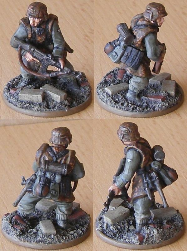
SS Grenadier I painted before I dedicated my time to my Italian army, and the one that came out the best. The model in my opinion suffers from my simplistic approach to Bolt Action models (never mind that they're quite small and it's not easy fitting a camo pattern on them) that was a basecoat, a simple coat of the relevant color and a wash to finish it. It's not a bad tabletop standard especially if you plan on painting a whole army in a camo pattern, but for show the model simply lacks depth. I couldn't tell you anymore how many or which browns I used, but they all got blended together by the wash. That's the reason why I wouldn't advise applying the wash in the end. Dark to light contrast is simply not there on camo patterns because the differently colored spots don't stand out enough.

As far as washes are concerned, if you want to do the summer variant of plane tree. I don't think you can go wrong with either Athonian Camoshade or Agrax Earthshade. On a camo pattern its main purpose is to darken the base layer and provide contrast to the highlight layers. Both washes will do that and the only real difference you should see is in the recesses. Since the camo pattern uses greens and browns, there's really no reason to favor one over the other aside from personal taste. And, full disclosure incoming, green isn't really my color, so if you asked me for recommendations, the answer would always be brown.

I painted his pants in the same simple fashion as anything else for Bolt Action. Codex Grey (the modern equivalent of which is Dawnstone) with a wash of Athonian Camoshade. Like I said, I'm not big on green and never owned many green paints, so that was a good way to get feldgraugrün at the time. No idea what I'd do these days to add highlights without taking the green out of the grey, though. I've not given that any thought.

Any yeah, these camo patterns were never applied to pants (not industrially anyway). Only the late war pea dot pattern got manufactured pants. Plane tree, if I recall, was only used on overshirts (thus you get the grey collar from your normal shirt), jackets and zeltbahn ponchos. So if you want to stick to the historical look, grey pants are the way to go. I like the look myself because it gives the model a little bit of variety. Uniforms, both mono-color and with camo patterns, can look pretty samey.

That said, the Ratlings of course don't wear German uniforms and with the large backpack and the chest plate you may want to consider painting camo pants after all since the shirts don't offer a lot of surface area. There's also nothing to stop you from doing one with camo pants and the other with grey pants.

Leather, be it natural or blackened, works fine for the appropriate bits and I don't think there's anything on the models you want to paint garishly. If you want to stick with drawing from WW2 German colors, consider that not just tanks but Afrikakorps helmets made use of plain ocher. You could paint the little fridge like that, for instance. Or the mine that one of them has. And if you're feeling extra funny, you could paint the bedroll on one of them like a... borrowed rolled up Italian three color camo poncho (that's beige, olive and brown).

This message was edited 1 time. Last update was at 2019/10/03 13:41:35


Made in de
Liche Priest Hierophant


Looks good to me.

First thing I'd suggest is thinking about how that will look on the actual models. The test patterns is on a flat surface and you may want to consider using darker colors in the recesses of the clothes to create depth. You have what, five different colors there? Once you figure in shades and highlights, I don't know if you want to add another color for little spots on top of that.

That said, if you do I'd advise against black. Black dots have a way of standing out against muted colors like brown and olive. I'd only use that if you absolutely want to draw attention to them, which probably goes counter to what kind of effect you want to achieve when painting camouflage.

Grey I'm not sure about. Grey works nicely with brown and olive, but personally I wouldn't throw it in there because of the number of different colors you already have. That's decidedly personal taste and I don't have anything objective to back that up with. Also, if you decide to go with the real life examples of mixed camo and uniform look, having grey as the uniform color and grey spots as part of the camouflage, you'll lose contrast. Which may not be so great.

Of the options you gave, if you absolutely want to darken it a little, dark olive would be the way to go in my opinion. Now to be honest, I wouldn't do that either. Unless you see such small models in perfect light conditions, they will naturally appear darker than they actually are. Having lighter colors on them makes the paintjob easier to see and appreciate, and if that is ever in question I myself err on the side of caution and use lighter shades. Something to consider.
 
Forum Index » Painting & Modeling
Go to: