| Author |
Message |
 |
|
|
|
|
Advert
|
Forum adverts like this one are shown to any user who is not logged in. Join us by filling out a tiny 3 field form and you will get your own, free, dakka user account which gives a good range of benefits to you:
- No adverts like this in the forums anymore.
- Times and dates in your local timezone.
- Full tracking of what you have read so you can skip to your first unread post, easily see what has changed since you last logged in, and easily see what is new at a glance.
- Email notifications for threads you want to watch closely.
- Being a part of the oldest wargaming community on the net.
If you are already a member then feel free to login now. |
|
 |
2020/08/28 22:09:20
Subject: Harlequin Colour Scheme Tester - what colour plait?
|
|

Regular Dakkanaut
|
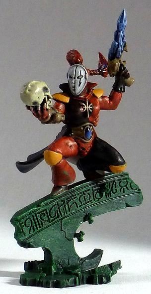
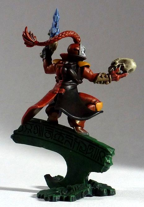
I've not had time to paint much lately, but was very happy with this conversion so I knocked a paint job out in record (for me) time over a few evenings. I'm mostly done, but I can't decide what colour to go for on the plait. I could leave it as is, but that seems lazy. Orange might work within the existing scheme, or perhaps a dark grey with a black wash, but as I've stretched my colour theory about as far as I can just with the purple base/shadows for the red and blues, I thought I'd see what else you think might work well...
|
|
|
|
 |
|
2020/08/28 22:27:07
Subject: Re:Harlequin Colour Scheme Tester - what colour plait?
|
|
Dakka Veteran
|
"Alas, poor Yorick..." 
Cool model, cool pose. I'd suggest a contrasting colour, maybe green? As blue has already been used in the pistol and the gem... Then again, maybe the green would make the model look a bit too busy, colour-wise.
|
|
|
|
|
2020/08/29 07:43:49
Subject: Re:Harlequin Colour Scheme Tester - what colour plait?
|
|

Been Around the Block
|
Love the model!
Here's my list of suggestions, which one would work best depends on the colours you have on hand and personal preference:
- Blue (could take away from the blue on the pistol and gem)
- Green (as mentioned previously, could be a bit busy)
- Grey
- Some variant of brown (steel legion drab or rhinox hide?)
Personally I would go for a warm grey
|
|
|
|
|
2020/08/29 20:39:01
Subject: Harlequin Colour Scheme Tester - what colour plait?
|
|
Regular Dakkanaut
|
Thanks both, glad you like the model - the pose was intentionally Hamlet, but that plus CancelledApocalypse's laughing ork icon makes me think that someone needs to do a Ghazkul version "alas poor Yarrick"...
I'd wondered about green myself, but I also thought it would be a bit busy (not to mention stepping on the basing scheme's toes a bit), and I'm trying to keep the amount of blue small while also providing an easy visual reference for the crystal elements.
Grey or brown hadn't occurred to me though, and they're often considered fairly neutral or natural colours to have on a model. Warm grey I had to look up, but it might fit the bill. What I can't tell (being colour blind and reasonably insensitive to subtle/pastel variations) is I already own a warm grey, or if I'm going to need to mix one. What I've got already is Eshin Grey, Grey Seer, Mechanicus Standard Grey, Adeptus Battlegrey, Dawnstone, Adminstratum Grey, The Fang, and a reasonably ancient pot of Space Wolf Grey, which from the names I'm guessing mostly aren't warm greys (except possibly Dawnstone). Oh, and a bunch of blues and browns, so mixing a warm grey wouldn't be too much bother.
|
|
This message was edited 1 time. Last update was at 2020/08/29 20:40:35
|
|
|
|
|
2020/08/29 21:21:11
Subject: Re:Harlequin Colour Scheme Tester - what colour plait?
|
|
Dakka Veteran
|
Yes! Definitely someone needs to do that Yarrick mod!
Generally, the Skaven themed GW paints are considered the 'warm' greys. Eshin, Skavenblight Dinge, Stormvermin fur. They have a slightly brownish tint, hence the 'warm' description. The space wolf themed greys are slightly blueish, so they're considered cold. Mechanicus, Dawnstone, Administratum, etc. are pretty much neutral greys. To be honest, any of them could work for different reasons. I'm interested to see the results.
|
|
|
|
|
2020/09/05 13:28:46
Subject: Harlequin Colour Scheme Tester - what colour plait?
|
|
Regular Dakkanaut
|
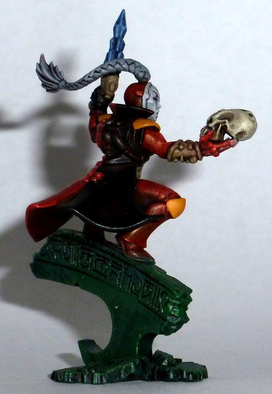
Ok, good call on the grey. I went with a neutral grey because it seemed easier to try one I had to hand than mix something up and then hope it matched a GW colour if I had to do it for more models. I like the way that as there's already grey on the model, it doesn't seem to make it too busy, while still letting the paler mask stay the focus of the model.
|
|
|
|
|
|
2020/09/06 06:24:20
Subject: Re:Harlequin Colour Scheme Tester - what colour plait?
|
|
Been Around the Block
|
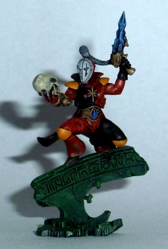
That looks great! I love the pose, and the gem on the waist looks amazing. The white and yellow also look great, they're not easy colours to paint.
If I could offer one last piece of feedback, I think that the red, black and gold/tan parts could maybe do with a little edge highlighting. It definitely looks great as it is, but I find that bright highlights can really make a miniature stand out, which is great for HQ models. But if you're happy with the model (If it were mine, I would be very happy with it), then by all means leave it as it is.
|
|
|
|
|
|
|