| Author |
Message |
 |
|
|
|
|
Advert
|
Forum adverts like this one are shown to any user who is not logged in. Join us by filling out a tiny 3 field form and you will get your own, free, dakka user account which gives a good range of benefits to you:
- No adverts like this in the forums anymore.
- Times and dates in your local timezone.
- Full tracking of what you have read so you can skip to your first unread post, easily see what has changed since you last logged in, and easily see what is new at a glance.
- Email notifications for threads you want to watch closely.
- Being a part of the oldest wargaming community on the net.
If you are already a member then feel free to login now. |
|
 |
2021/02/09 00:01:35
Subject: [Advice/Tips/Tricks] Painted a Priest
|
|

Fresh-Faced New User
|
Greetings!
I am looking for a lot of advice and suggestions to improve. I painted a model of a priest, and want to get better.
Here is my equipment:
1. Synthetic brushes
2. Acrylic paints, with 1x Cygnar Base Coat Blue & p3 Gold
3. p3 primer
Here is my process (the steps overlap quite a bit):
1. I used a base coat of blue for the dress and shoulders. I used red for the midriff, sleeves and collar. I used yellow for the face. I also used gold for the tassels / belt and his holy book.
2. I used a citadel nightshade wash to get that dark undertone. I think I might have used too much.
3. I wanted to do a layer of shadow / highlight, which is why the shoulders look light blue and the dress is a darker blue at the bottom. Unfortunately, I don't think I did it well - the light blue and dark blue, in their respective zones stick out quite a bit and do not blend naturally into the base coat blue.
A few notes / questions:
1. I was told that applying brown underneath the gold makes the gold better. Unfortunately, I completely forgot about that trick when doing this model.
2. On such a tiny model, how do I get the eyes and mouth?
3. The "darker" blue on the priest's robe at the hem....looks splotchy at best. Should I have thinned more, or less? I wanted to make the fold / crease in the back darker because I felt that would be the case in real life.
I feel like I improved, but there is always room for improvement  .
Thank you so much for reading, and for commenting. I appreciate your time 
Sincerely,
OneFabric
p.s. - Links are not allowed the first time I post, and as this is my first post, will post the images in a response to this thread!
Automatically Appended Next Post:
https://ibb.co/h7qf7Tp
https://ibb.co/N6YmMH4
https://ibb.co/QdBkzqk
|
|
This message was edited 2 times. Last update was at 2021/02/12 03:07:31
|
|
|
 |
|
2021/02/09 03:58:25
Subject: Re:[Advice/Tips/Tricks] Painted a Priest
|
|
Crazy Marauder Horseman
|
The biggest thing that will improve your painting at this point is higher quality models. The techniques are solid, but the model has very little detail for the washes to accent. If you want the wash to be less splotchy, thin it a lot and apply it in many thin layers. You don't need GW level miniatures, but anything with more details will allow washes to pick out the depths of the model and add definition.
|
|
|
|
|
|
2021/02/09 13:52:06
Subject: [Advice/Tips/Tricks] Painted a Priest
|
|

Frenzied Berserker Terminator
|
Yeah it's quite a blocky model. The shade isn't going to just sit in the recesses of the model because in many places there just aren't any recesses.
Once the shade has dried you can go back over with the base coat on all the areas you don't want shaded. This will help bring back the grimy effect of the dark wash.
You may also find a brown wash works better on the red (and the skin and book) - but depends on the effect you're after, and obviously if you're just starting out it's another colour to go and buy...
Regarding eyes etc, I can't really see how much detail there is on the face. You might find just a dark wash into the eye sockets is enough. Lie the model on its back though, so it pools into the eye sockets instead of just running down the face!
|
|
|
|
|
2021/02/09 18:12:38
Subject: [Advice/Tips/Tricks] Painted a Priest
|
|

Shrieking Guardian Jetbiker
|
Do you have a pic of the unpainted mini, or a link to a website where we could see it? This would help to understand if some of the detail got kinda lost & you might want thin your paints more, etc.
|
~~~ I Love The Power Glove. It's So Bad. ~~~ |
|
|
|
|
2021/02/11 00:59:33
Subject: Re:[Advice/Tips/Tricks] Painted a Priest
|
|
Fresh-Faced New User
|
E3DD wrote:The biggest thing that will improve your painting at this point is higher quality models. The techniques are solid, but the model has very little detail for the washes to accent. If you want the wash to be less splotchy, thin it a lot and apply it in many thin layers. You don't need GW level miniatures, but anything with more details will allow washes to pick out the depths of the model and add definition.
Thank you for posting!
I appreciate your advice. One thing I wanted to clarify, and pardon me for my ignorance, but isn't a wash different from paint that's just darker? I ask because the priest's robes have a wash, but when I said splotchiness I meant the base coat blue which I darkened with a little blue to get a 'shadow' where the robe creases. Automatically Appended Next Post: Crispy78 wrote:Yeah it's quite a blocky model. The shade isn't going to just sit in the recesses of the model because in many places there just aren't any recesses.
Once the shade has dried you can go back over with the base coat on all the areas you don't want shaded. This will help bring back the grimy effect of the dark wash.
You may also find a brown wash works better on the red (and the skin and book) - but depends on the effect you're after, and obviously if you're just starting out it's another colour to go and buy...
Regarding eyes etc, I can't really see how much detail there is on the face. You might find just a dark wash into the eye sockets is enough. Lie the model on its back though, so it pools into the eye sockets instead of just running down the face!
Thanks so much for commenting. It didn't occur to me to use different washes for the skin and book, so thank you for that. Automatically Appended Next Post:  MobileSuitRandom wrote: MobileSuitRandom wrote:Do you have a pic of the unpainted mini, or a link to a website where we could see it? This would help to understand if some of the detail got kinda lost & you might want thin your paints more, etc.
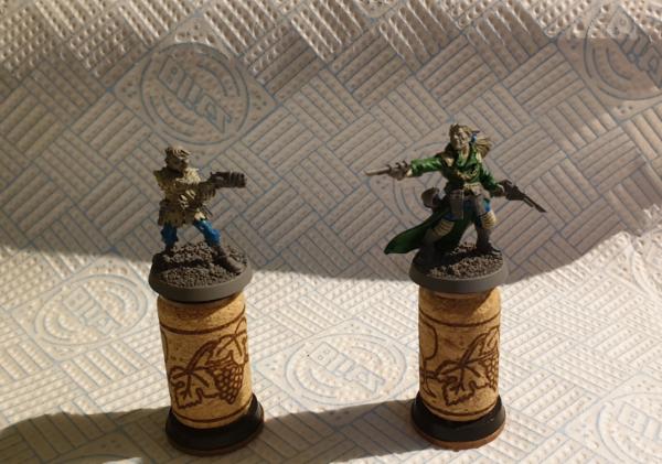
Yes! So I purchased these minis to practice painting and see if I like it. You can spot him in the middle, a little right and up off center.
|
|
This message was edited 2 times. Last update was at 2021/02/11 01:04:52
|
|
|
|
|
2021/02/11 12:35:16
Subject: [Advice/Tips/Tricks] Painted a Priest
|
|
Shrieking Guardian Jetbiker
|
Ah, alright! These are fun sculpts but the detail looks rather 'soft' indeed, so maybe these aren't the best to practice things like painting faces - with minis like GW's, you'll get much sharper details on faces etc, so its much easier to just have a base layer of the skin colour you'd like, paint the lips pink/brown & eyes white and then give it a darker wash that goes into the recesses around the eyes and maybe pick out the iris with black again. With your minis, it looks more like you have define the shape and size of the eyes & lips yourself, which is of course much tougher!!
|
~~~ I Love The Power Glove. It's So Bad. ~~~ |
|
|
|
|
2021/02/19 08:16:31
Subject: [Advice/Tips/Tricks] Painted a Priest
|
|

Longtime Dakkanaut
|
I'm a little confused; how many different blue paints did you use? Did you paint a darker blue manually where you wanted it, or did you apply a wash all over, or did you apply a wash in specific areas?
To be honest those minis look severely lacking in detail, especially that priest. What makes it worse is that they are full of organic forms (cloth and flesh) which are harder to paint than stuff like armour, especially when they are low on detail. That priest model for example has almost no detail at all; I don't even know how I would make something like that look good! Trying to paint eyes on a model like that would be extremely challenging!
Can I suggest that you paint another model, preferably a more detailed one, and this time take photos after every stage, and post them here with a description of exactly what you did? So put down your basecoats and take a photo, apply a wash and take a photo, add highlights and take a photo etc. Post the photos with a description of exactly which paints you used and how at each stage.
|
--Lord of the Sentinels Eternal-- |
|
|
|
|
2021/02/21 21:50:39
Subject: [Advice/Tips/Tricks] Painted a Priest
|
|
Fresh-Faced New User
|
Thanks for commenting Soul Samurai!
I *think* I used just one blue, but I can't be 100% certain. I believe I used lighter and darker shades of that cygnar base coat blue.
I like your suggestion. I will paint one more and take notes and pictures. Looking forward to it.
|
|
|
|
|
2021/02/28 21:32:17
Subject: [Advice/Tips/Tricks] Painted a Priest
|
|
Fresh-Faced New User
|
 Soul Samurai wrote: Soul Samurai wrote:I'm a little confused; how many different blue paints did you use? Did you paint a darker blue manually where you wanted it, or did you apply a wash all over, or did you apply a wash in specific areas?
To be honest those minis look severely lacking in detail, especially that priest. What makes it worse is that they are full of organic forms (cloth and flesh) which are harder to paint than stuff like armour, especially when they are low on detail. That priest model for example has almost no detail at all; I don't even know how I would make something like that look good! Trying to paint eyes on a model like that would be extremely challenging!
Can I suggest that you paint another model, preferably a more detailed one, and this time take photos after every stage, and post them here with a description of exactly what you did? So put down your basecoats and take a photo, apply a wash and take a photo, add highlights and take a photo etc. Post the photos with a description of exactly which paints you used and how at each stage.
Done! I painted a FireFly model from Warmachine. I wasn't sure how to order the images in the gallery, so here is the order I followed?:
1. Priming
2. Base Coats
3. Wash
4. Highlights
Thoughts?
p.s. - Got some new p3 paints. Excited!!
|
|
|
|
|
2021/03/01 05:08:10
Subject: [Advice/Tips/Tricks] Painted a Priest
|
|
Longtime Dakkanaut
|
Great! OK, let me take a look.
1. Priming:
Looks fine to me. There's a little more texturing on the primed model than I would expect. It's not a big deal, and is probably just because the plastic is not terribly smooth. Just to be sure: you're not touching the model while the primer is still not completely dry right? How long do you wait between priming and painting?
Also, just FYI: I personally don't touch the model with my bare skin once I've given it a pre-prime wash (to remove dirt and manufacturing oils that interfere with primer adhesion), not until after the final varnish is dry. I attach the base to a holder so I don't need to touch it.
2. Base coats:
The blue base coat is ALMOST there; as you can see in the photo it's not QUITE got perfect coverage, especially towards the lower parts of the model. I think you need another coat at least.
The red needs a lot more work though. Bright red paints don't, in my experience at least, have great coverage, so it's usually easier to start with a couple of layers of a dark red that will build up a solid colour more easily, and then start layering on the brighter red.
3. Wash
That's... not what a model is supposed to look like after being washed. A wash is supposed to pool into recesses to darken them; that doesn't seem to have happened here at all, instead it seems to have just left the entire surface splotchy. What kind of wash are you using? How are you applying it? I think I see finger prints: are you touching the washed areas before they are completely dry? I feel like there's something wrong with your wash, maybe it's a bad batch or just needs to be shaken up better?
4. Highlights:
Your highlights just sort of seem to be all over the place? How are you applying them? I strongly recommend that you get started by just painting a thin line of the bright highlight colour along the edges of every surface, rather than trying to apply highlights across actual surfaces.
You seem to be applying a light blue colour as a glow, and the paint seems to be rather thin as it's running into the recesses like a wash would. That's actually fine; I often use very thinned paint as part of my glows precisely because I want wash-like behaviour. You just need to be a bit more precise in where you apply it; it's looking a little random and messy on this firefly.
I think this has been very useful as we're narrowing down on the problem areas. The biggest issue I'm seeing right now is that wash. I suggest taking one of those cheap Amazon models, hopefully one with a bit more detail like that armoured knight, and just painting it in one colour. Once you have a REALLY solid and smooth coat of colour (and after letting it fully dry and taking photos), apply your wash. Just stop there and share photos so we can try to figure out this wash problem.
A couple of suggestions:
1. Glue or blue-tack your models to something you can use as a painting handle so you don't need to touch them while painting.
2. Maybe look into picking up some Army Painter Quickshade Dip. This is different from a regular wash (their washes come in dropper bottles while their dip comes in a metal tin), and is a great way to wash an entire model in one go. I'm not saying it's better than regular washes, but in some ways it's easier as it goes over most colours quite nicely so you can just throw it on the whole model, whereas with normal washes you will probably want to use a different wash for each colour on the model.
I'm going to try to find some time to paint a demo model in your colours and take photos, so you can get an idea of what each stage should look like. I'm afraid I'm extremely busy these days so I'm not sure when I'll be able to though. I'll try tonight, fingers crossed.
EDIT:
I've highlighted some areas of the "washed" image to try to explain what I mean:
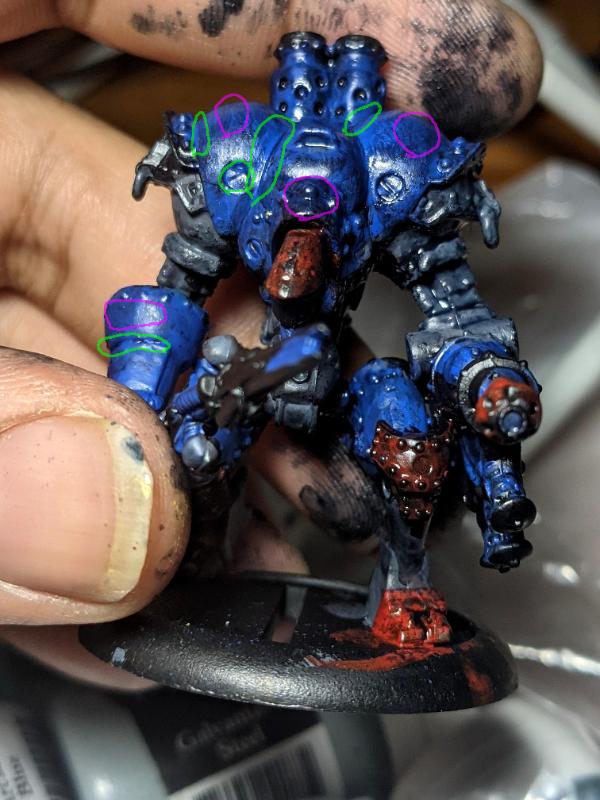
The green circled areas are some places where I would expect a wash to pool and darken, but where it clearly didn't. The purple circled areas a few places where I wouldn't expect a wash to darken very much, but seem to have been darkened or left splotchy here.
|
|
This message was edited 1 time. Last update was at 2021/03/01 05:21:17
--Lord of the Sentinels Eternal-- |
|
|
|
|
2021/03/01 06:06:06
Subject: [Advice/Tips/Tricks] Painted a Priest
|
|
Fresh-Faced New User
|
you're not touching the model while the primer is still not completely dry right? How long do you wait between priming and painting?
Unfortunately, I did...I was using gloved fingers to move the mini to coat different sides. Will use a holder of some sort going forward!! As for between priming and painting, I think I had to do 2 coats on separate days, as the first coat didn't get a few important areas. The painting happened after 2-3 hours after the final primer coat.
Also, just FYI: I personally don't touch the model with my bare skin once I've given it a pre-prime wash (to remove dirt and manufacturing oils that interfere with primer adhesion), not until after the final varnish is dry. I attach the base to a holder so I don't need to touch it.
Roger, roger. I didn't wash these models before priming. Another lesson for me.
The blue base coat is ALMOST there; as you can see in the photo it's not QUITE got perfect coverage, especially towards the lower parts of the model. I think you need another coat at least.
Yes. If you are talking about the thighs, I found it really hard to paint the thighs without also dabbing blue on the surrounding nearby areas.
The red needs a lot more work though. Bright red paints don't, in my experience at least, have great coverage, so it's usually easier to start with a couple of layers of a dark red that will build up a solid colour more easily, and then start layering on the brighter red.
Gotcha.
What kind of wash are you using? How are you applying it? I think I see finger prints: are you touching the washed areas before they are completely dry?
1. Citadel Drakenhof nightshade
2. I did not thin it. I applied the shade directly with the brush from the top of the model.
3. Perhaps; finger prints may have come on the model.
I feel like there's something wrong with your wash, maybe it's a bad batch or just needs to be shaken up better?
I may have to shake it harder.
Your highlights just sort of seem to be all over the place? How are you applying them?
For the highlight on the shoulders:
1. I took a small amount of cygnar blue highlight
2. Thinned it
3. applied the highlight on the shoulders
It was too runny, and when it dried the splotchy-ness was obvious. Thereupon I used p3 frostbite, and that paint was just smack dab white.
I strongly recommend that you get started by just painting a thin line of the bright highlight colour along the edges of every surface, rather than trying to apply highlights across actual surfaces.
Is that what is referred to as edge highlighting?
The biggest issue I'm seeing right now is that wash. I suggest taking one of those cheap Amazon models, hopefully one with a bit more detail like that armoured knight, and just painting it in one colour. Once you have a REALLY solid and smooth coat of colour (and after letting it fully dry and taking photos), apply your wash. Just stop there and share photos so we can try to figure out this wash problem.
I don't think that's a bad idea, but it could just be that I am not thinning / shaking / applying the wash correctly. It usually pools; this is my first wash, so all the models you've seen so far have been with this wash.
whereas with normal washes you will probably want to use a different wash for each colour on the model.
Ah...I've been using the citadel wash for every part of the model.
I'm going to try to find some time to paint a demo model in your colours and take photos, so you can get an idea of what each stage should look like. I'm afraid I'm extremely busy these days so I'm not sure when I'll be able to though. I'll try tonight, fingers crossed.
That's very kind :') I feel like I will get where I want to be (eventually XD) so if you're busy it's quite allright. This kind of feedback / pointers already goes a long way, as you probably shaved off months of my reaching where I want to be.
Thank you so much,
Sincerely,
OneFabric
P.s. - I think my next step is probably to do a lot more research, and watch more videos.
|
|
|
|
|
2021/03/01 09:21:47
Subject: [Advice/Tips/Tricks] Painted a Priest
|
|
Longtime Dakkanaut
|
OneFabric wrote:Roger, roger. I didn't wash these models before priming. Another lesson for me.
Sorry, I should have mentioned it earlier. Miniatures will often have mold release residue and that sort of thing that can interfere with primer and paint adhesion. I like to soak my models for a few minutes in water with a bit of dishwashing detergent, and then scrub lightly with an old soft toothbrush before rinsing with clean water. After that I leave them to dry for a while before priming. And while some people don't have a problem with this, I've found that the oil from my hands can also prevent paint from gripping a model, which is why I try to avoid touching models mid-painting. I even cut the thumb/index/middle finger bits off a cotton glove so I can hold a paintbrush with skin contact but still shield the miniature from my painting hand (you can get artist gloves that already have the three fingers cut off).
OneFabric wrote:
For the highlight on the shoulders:
1. I took a small amount of cygnar blue highlight
2. Thinned it
3. applied the highlight on the shoulders
It was too runny, and when it dried the splotchy-ness was obvious. Thereupon I used p3 frostbite, and that paint was just smack dab white.
If paint ends up too runny, then try to adjust by adding a touch more paint from the pot. Also, you can paint with very thin paints, you just need to make sure to dab the brush on a tissue to remove most of the paint, so the brush deposits a controllable amount. The splotchy-ness was probably just because of insufficient coverage; another layer or two of the same colour probably would have fixed the issue.
Yes. I will try to demonstrate on a test model.
OneFabric wrote:Ah...I've been using the citadel wash for every part of the model.
That can work depending on the colours involved and the effect you're going for. Drakenhoff Nightshade might be a bit too blue for shading red; I'm not really sure, but you would usually use black or brown washes if you wanted to cover the whole model in a single wash. Personally, I find that Army Painter Dip is slightly better at shading the recesses without darkening the rest of the model too much. You do need to watch it to make sure it doesn't pool too much, although you usually need to do that with normal washes as well. Well, it's something to think about in the future I guess, for now let's see if we can get the Drakenhoff Nightshade to work.
OneFabric wrote:That's very kind :') I feel like I will get where I want to be (eventually XD) so if you're busy it's quite allright. This kind of feedback / pointers already goes a long way, as you probably shaved off months of my reaching where I want to be.
Thank you so much,
Sincerely,
OneFabric
Happy to help - hopefully that is what I'm doing...
OneFabric wrote:I think my next step is probably to do a lot more research, and watch more videos.
To be honest I think what you need now is less research and more experience - it's the best teacher right?
|
--Lord of the Sentinels Eternal-- |
|
|
|
|
2021/03/01 10:15:00
Subject: [Advice/Tips/Tricks] Painted a Priest
|
|
Blood Angel Terminator with Lightning Claws
|
Definitly get a holder of some sort, I use wine corks that I have weighted with pennies and blue tack to stick the base of the model on.
|
|
This message was edited 1 time. Last update was at 2021/03/01 10:16:16
 DV8 wrote: DV8 wrote:Blood Angels Furioso Dreadnought should also be double-fisted.
|
|
|
|
|
2021/03/02 11:57:14
Subject: [Advice/Tips/Tricks] Painted a Priest
|
|

Calculating Commissar
|
Good luck on your painting journey, OneFabric. I wanted to congratulate on your very sharp photography, a lot of experienced painters don't take WIP photos half as clear as your Firefly there.
|
The supply does not get to make the demands. |
|
|
|
|
2021/03/03 03:14:00
Subject: [Advice/Tips/Tricks] Painted a Priest
|
|
Fresh-Faced New User
|
Soul Samurai wrote:OneFabric wrote:Roger, roger. I didn't wash these models before priming. Another lesson for me.
Sorry, I should have mentioned it earlier. Miniatures will often have mold release residue and that sort of thing that can interfere with primer and paint adhesion. I like to soak my models for a few minutes in water with a bit of dishwashing detergent, and then scrub lightly with an old soft toothbrush before rinsing with clean water. After that I leave them to dry for a while before priming. And while some people don't have a problem with this, I've found that the oil from my hands can also prevent paint from gripping a model, which is why I try to avoid touching models mid-painting. I even cut the thumb/index/middle finger bits off a cotton glove so I can hold a paintbrush with skin contact but still shield the miniature from my painting hand (you can get artist gloves that already have the three fingers cut off).
Got you! I think I read that on the primer spray can, but I didn't realize I had to go to that extent. Thank you for the clear explanation!!
OneFabric wrote:
For the highlight on the shoulders:
1. I took a small amount of cygnar blue highlight
2. Thinned it
3. applied the highlight on the shoulders
It was too runny, and when it dried the splotchy-ness was obvious. Thereupon I used p3 frostbite, and that paint was just smack dab white. If paint ends up too runny, then try to adjust by adding a touch more paint from the pot. Also, you can paint with very thin paints, you just need to make sure to dab the brush on a tissue to remove most of the paint, so the brush deposits a controllable amount. The splotchy-ness was probably just because of insufficient coverage; another layer or two of the same colour probably would have fixed the issue.
Gotcha.
OneFabric wrote:Is that what is referred to as edge highlighting? Yes. I will try to demonstrate on a test model.
Thank you! I've seen some videos if that makes it easier for you.
OneFabric wrote:That's very kind :') I feel like I will get where I want to be (eventually XD) so if you're busy it's quite allright. This kind of feedback / pointers already goes a long way, as you probably shaved off months of my reaching where I want to be.
Thank you so much,
Sincerely,
OneFabric Happy to help - hopefully that is what I'm doing...
Yep! Definitely.
OneFabric wrote:I think my next step is probably to do a lot more research, and watch more videos. To be honest I think what you need now is less research and more experience - it's the best teacher right?
Yes
Automatically Appended Next Post:
 Rybrook wrote: Rybrook wrote:Definitly get a holder of some sort, I use wine corks that I have weighted with pennies and blue tack to stick the base of the model on.
Will do. Thanks for commenting Rybrook!!
Automatically Appended Next Post:
 Agamemnon2 wrote: Agamemnon2 wrote:Good luck on your painting journey, OneFabric. I wanted to congratulate on your very sharp photography, a lot of experienced painters don't take WIP photos half as clear as your Firefly there.
Thank you so much! Appreciate the good will
|
|
This message was edited 3 times. Last update was at 2021/03/03 03:16:22
|
|
|
|
|
2021/03/04 22:09:23
Subject: Re:[Advice/Tips/Tricks] Painted a Priest
|
|
Fresh-Faced New User
|
Did a Hunter. I made notes in the Gallery as well. Any additional thoughts?
Some questions as well:
1. When applying washes, does it matter how much you apply at once? I assume you have to apply a medium size amount?
2. My Cygnar gold has become a little funky - I think the gold paint and the glitter have separated. Any way I can repair that?
Thank you
|
|
|
|
|
2021/03/04 23:53:46
Subject: [Advice/Tips/Tricks] Painted a Priest
|
|
Utilizing Careful Highlighting
|
1) It does. Too much causes splotchy blobby colors where larger amounts settles and/or changes the main color, not just the recesses--the second can also be used intentionally for shading.
2) Shake the pot, fairly vigourously for several minutes from different angles and directions, possibly with a glass, ceramic, or stainless steel/other non-reactive bead in it.
|
|
|
|
|
2021/03/05 17:22:32
Subject: Re:[Advice/Tips/Tricks] Painted a Priest
|
|
Longtime Dakkanaut
|
OK, your basecoats are looking better; you're building up to solid smooth coverage. However the boundries between colours are a touch messy, and it looks like you might be painting the raised areas (blue) before the recessed areas (greys and blacks), resulting in accidentally getting the recess colours onto the raised areas? It's usually better to paint recessed areas first because you'll usually end up getting paint onto surrounding raised areas while painting the recesses, so better to just paint the raised areas later.
Your wash is still not acting like a wash at all. Perhaps there might be something wrong with the paint? My preferred way of applying washes is to apply them reasonably heavily, and then use the brush to mop up the excess as it pools. This does require some work as you need to keep looking over the model for trouble spots as the wash dries, but it helps to get the wash where it needs to be while preventing rings that can form from a wash not drying properly.
I finally found time to put together a bit of a demo model. It's a Monpoc model that would be about equivalent to a 25mm human model. It's a rush job so doesn't look great, especially with my lazy photos, but hopefully it will help a little:
Base coats:

Hopefully you can see that the colours are smooth and solid. I painted the grey first because it goes in the recesses, and it took two or three coats (grey has decent coverage).
The blue followed as it's the most prevalent colour, and it also took about three coats.
The red came last, and I lost count of how many coats I used. Partly the fault of the red paint I'm using at the moments; it's very thing. Still, in my experience red takes a lot of coats.
After finished the main colours, I went back with each and fixed up most of my mistakes - of which there were many.
As you can see, with only the basecoats the model looks very flat and the shapes don't really stand out.
Wash:

I've run out of my usual blue wash, so I was trying a new one that was very very light; you can barely see it against the blue areas. Still, if you compare the panel lines and recesses in the blue areas with the basecoats photo, you will see the shadows seem deeper, while the flat surfaces still look smooth and fairly bright. It did have more effect against the red, acting like a fairly dark black wash; pay attention to the hands and head. I don't like how it looked against the grey though; the grey is a neutral colour and so the blue stands out by tinting it in a cool shade.
I actually used a red wash on his left hand (which is on our right); you might notice a slight difference in that the blue wash creates cooler, purplish shadows, while the red wash keeps the warm tone of the red.
I also used GW Nuln Oil black wash on the left leg (on our right); it's not obvious in the photos but it came out much darker, and maintained the neutral tone rather than shading to cool blue.
Hopefully you can see how the wash has started to add contrast and make the details and shapes stand out more.
Edge Highlights:

I was a little lazy and didn't bother to highlight the grey areas as they are mostly recessed. But you can see in the blue and red areas how I put down lighter blue and red just along the edges. This works quite well for geometric shapes and therefore for armour and machines. Part of why it looks good is because it makes the individual details and forms more readable, making models look much nicer from a little bit farther away as the forms and details still pop enough to be visible.
Hopefully that helps?
|
|
This message was edited 1 time. Last update was at 2021/03/05 17:26:16
--Lord of the Sentinels Eternal-- |
|
|
|
|
2021/03/11 01:11:35
Subject: Re:[Advice/Tips/Tricks] Painted a Priest
|
|
Fresh-Faced New User
|
1) It does. Too much causes splotchy blobby colors where larger amounts settles and/or changes the main color, not just the recesses--the second can also be used intentionally for shading.
2) Shake the pot, fairly vigourously for several minutes from different angles and directions, possibly with a glass, ceramic, or stainless steel/other non-reactive bead in it.
Thank you @Vejut! I think I may have been dabbing too much on.
It's usually better to paint recessed areas first because you'll usually end up getting paint onto surrounding raised areas while painting the recesses, so better to just paint the raised areas later.
Gotcha!
This does require some work as you need to keep looking over the model for trouble spots as the wash dries, but it helps to get the wash where it needs to be while preventing rings that can form from a wash not drying properly.
I completely get you....In fact, I remember a splotchy spot that arose on the shoulder which dried up because I couldn't get to it fast enough.
Regarding the demo model:
1. First, thank you! It's really kind of you.
2. It does help a lot; mainly it puts a lot of issues into perspective.
3. I have been doing some self review, and these are some issues that my painting is facing:
a. I don't stick to the paint scheme well enough.
b. I don't dry brush well enough.
4. Something that confounds me is your monpoc model looks so much better than mine (which makes sense), but I can' tell why. I followed the same steps, so I am wondering what to do different next time. I suppose its the small things that add up .
And a few questions for Soul Samurai and the community:
1. I really like the heft and feel of metal minis. Any suggestions for metal minis / brands? I really liked the hunter I did, but would prefer to not spend more than 7-10 $ each as I end up messing them up anyway . Any genre is fine.
2. Any thoughts on how to make the already painted Hunter a bit better? I was thinking I could dry brush the gun better.
Thanks again,
OneFabric
|
|
|
|
|
2021/03/11 04:11:59
Subject: [Advice/Tips/Tricks] Painted a Priest
|
|
Longtime Dakkanaut
|
For now I think you should just focus on getting your washes to settle in the recessed areas to darken them while leaving the rest of the model smooth and relatively bright (the whole model will of course still be darkened slightly); I would even suggest you don't even bother with highlights for now. Make sure the basecoats are fully dry before applying the wash, I've actually been in too much of a rush and applied washes too soon in the past. Also make sure your work area is very well lit; it really does make a huge difference.
Hasslefree minis still sell metal miniatures. Mainly fantasy and modern-day stuff. They have a lot of characterful stuff, as well as some.... homages to popular characters.
|
--Lord of the Sentinels Eternal-- |
|
|
|
|
2021/03/11 08:59:08
Subject: [Advice/Tips/Tricks] Painted a Priest
|
|
Shrieking Guardian Jetbiker
|
Reaper also make fun 'classic' metal minis - very much a mixed bag design-wise but the range covers basically every fantasy trope possible ^^ https://www.reapermini.com/
Re: your Hunter mini, why not try cleaning it up a bit first - re-check if the blue armour panels are completely covered with blue, if there's no blue on the metallic part etc. Minis are tiny yet intricate, so if colours spill over from one part onto another they become somehow 'unreadable'.
|
~~~ I Love The Power Glove. It's So Bad. ~~~ |
|
|
|
|
2021/03/20 21:18:59
Subject: [Advice/Tips/Tricks] Painted a Priest
|
|
Fresh-Faced New User
|
Hi!
Sorry for the late reply.
I did check out both hassle free minis and Reaper minis, and they look interesting / viable.
Thank you for your tips and feedback, Soul Samurai, MobileSuitRandom and others!! I really appreciate it. Looking forward to more painting.
Will stay in touch.
Sincerely,
OneFabric
|
|
|
|
|
|
|