| Author |
Message |
 |
|
|
|
|
Advert
|
Forum adverts like this one are shown to any user who is not logged in. Join us by filling out a tiny 3 field form and you will get your own, free, dakka user account which gives a good range of benefits to you:
- No adverts like this in the forums anymore.
- Times and dates in your local timezone.
- Full tracking of what you have read so you can skip to your first unread post, easily see what has changed since you last logged in, and easily see what is new at a glance.
- Email notifications for threads you want to watch closely.
- Being a part of the oldest wargaming community on the net.
If you are already a member then feel free to login now. |
|
 |
2022/01/04 13:26:42
Subject: Craftworld paint jobs are dull
|
|

Longtime Dakkanaut
|
Looking at the new guardian defender models and I can’t help but think they have been painted a bit boring by GW, which is surprised as these are marketing images. But there’s 3/4 colours per model and 1 colour covering most of the model, it’s like space marines but without the detail on the power armour to add extra colour.
I think you could glam up these models these models with more colours I’m just surprised GW didn’t do that
What do you think?
|
|
|
 |
|
2022/01/04 13:38:11
Subject: Craftworld paint jobs are dull
|
|

Battleship Captain
|
They're painted to "achievable" standards. The studio painters could absolutely do all kinds crazy freehand and blending but they stick to layers and edge highlighting so that it doesn't alienate people who can't paint to that standard. It also means if people aren't bothering to paint because they won't reach that standard they aren't selling those people paints or brushes.
|
|
This message was edited 2 times. Last update was at 2022/01/04 13:42:49
|
|
|
|
|
2022/01/04 13:39:24
Subject: Craftworld paint jobs are dull
|
|

[DCM]
Moustache-twirling Princeps
Gone-to-ground in the craters of Coventry
|
Also, with CWE, you don't want too many colours on each unit. The Aspect Warriors take care of any missing colours.
|
|
|
|
|
|
2022/01/04 13:47:12
Subject: Craftworld paint jobs are dull
|
|
Arch Magos w/ 4 Meg of RAM
|
lolwut?
most of GW's SM paintjobs are 3 colors too, just like guardians
|
|
|
|
|
2022/01/04 13:56:57
Subject: Re:Craftworld paint jobs are dull
|
|
Preparing the Invasion of Terra
|
It's the marketing material, it has to be shown in a way that the average consumer will be able to replicate.
If GW was marketing its models with a high level of painting skill like these:
I can guarantee you people would be hugely put off on getting said models.
|
|
|
|
|
2022/01/04 14:06:02
Subject: Craftworld paint jobs are dull
|
|
Ridin' on a Snotling Pump Wagon
|
It’s also a legacy of Rogue Trader, where fancy paint jobs were solely for Golden Daemon. Everything was big and bold primary colours.
|
|
|
|
|
|
2022/01/04 14:19:59
Subject: Craftworld paint jobs are dull
|
|
Grim Dark Angels Interrogator-Chaplain
|
Given most people love the look of the models from what I’ve read, I’d say the paint jobs have done the trick. And they’re a basic troop with less detail so going to town on them wouldn’t be the norm. They look great to me!
|
 Stormonu wrote: Stormonu wrote:For me, the joy is in putting some good-looking models on the board and playing out a fantasy battle - not arguing over the poorly-made rules of some 3rd party who neither has any power over my play nor will be visiting me (and my opponent) to ensure we are "playing by the rules"
|
|
|
|
|
2022/01/04 14:28:10
Subject: Craftworld paint jobs are dull
|
|
Growlin' Guntrukk Driver with Killacannon
|
 Skinnereal wrote: Skinnereal wrote:Also, with CWE, you don't want too many colours on each unit. The Aspect Warriors take care of any missing colours.
My thoughts exactly.
|
|
|
|
|
2022/01/04 15:11:41
Subject: Craftworld paint jobs are dull
|
|

Wicked Warp Spider
|
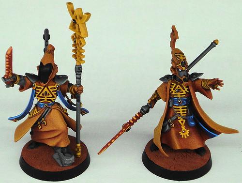
The main problem with CWE paintjobs is the common interpretation of how wraithbone has to look like a dull, flat plastic. But then most of official GW paintjobs are horrible, because of the very philosophy behind GW color palettes - that you should be able to discern every subfaction in the game from 10 meters away and do that by using 3 colors and basic painting skills. Long gone are the days when Harlequins actually looked like murder clowns, nowadays half of the mask schemes look like sad elfs, because someone stained their goth trench coats with a bad, rhombus graffiti.
|
|
|
|
|
2022/01/05 12:23:11
Subject: Craftworld paint jobs are dull
|
|
Fixture of Dakka
|
mrFickle wrote:Looking at the new guardian defender models and I can’t help but think they have been painted a bit boring by GW, which is surprised as these are marketing images. But there’s 3/4 colours per model and 1 colour covering most of the model, it’s like space marines but without the detail on the power armour to add extra colour.
I think you could glam up these models these models with more colours I’m just surprised GW didn’t do that
What do you think?
All armies are painted now to fit the "Battle Ready" they are pushing. They started painting their minis like this awhile ago, some special models will get the better treatment like normal.
|
|
|
|
|
|
2022/01/05 12:45:59
Subject: Craftworld paint jobs are dull
|
|
Preparing the Invasion of Terra
|
 Amishprn86 wrote: Amishprn86 wrote:All armies are painted now to fit the "Battle Ready" they are pushing. They started painting their minis like this awhile ago, some special models will get the better treatment like normal.
That's not "battle-ready", that's "parade-ready" for GW classification.
Battle-ready is 3 colours and one of the basing materials. That's it. No highlights, no dry brushing, no special details.
Those Guardians have highlights, the bases are detailed and I suspect the soul stones may even be using the gemstone paints. They are objectively not "battle-ready" standard.
|
|
|
|
|
2022/01/05 14:18:32
Subject: Re:Craftworld paint jobs are dull
|
|
Arch Magos w/ 4 Meg of RAM
|
Pretty much all GW paintjobs are dull IMO. The ones that arent is because of the amount of details the sculpts have (Plague marines, Bladeguard vets, etc.) Their minis barely have any contrast and its a edge highlight party that just makes it all look bland. Shadows are almost as bright as light spots, this is the main reason they look dull.
|
|
|
|
|
2022/01/05 18:01:25
Subject: Craftworld paint jobs are dull
|
|
Fixture of Dakka
|
The better question is "Why Saim-Hann?" - maybe less so for the Guardians, but definitely for the battlebox.
It isn't like there's a Ranger-themed Craftworld whose colours could've been used for that instead, rather than the Speed Freak equivalent Craftworld...
|
2021-4 Plog - Here we go again... - my fifth attempt at a Dakka PLOG
My Pile of Potential - updates ongoing...
Gamgee on Tau Players wrote:we all kill cats and sell our own families to the devil and eat live puppies.
 Kanluwen wrote: Kanluwen wrote:This is, emphatically, why I will continue suggesting nuking Guard and starting over again. It's a legacy army that needs to be rebooted with a new focal point.
Confirmation of why no-one should listen to Kanluwen when it comes to the IG - he doesn't want the IG, he want's Kan's New Model Army...
tneva82 wrote:You aren't even trying ty pretend for honest arqument. Open bad faith trolling.
- No reason to keep this here, unless people want to use it for something... |
|
|
|
|
2022/01/05 18:15:18
Subject: Craftworld paint jobs are dull
|
|
The Marine Standing Behind Marneus Calgar
|
 Dysartes wrote: Dysartes wrote:The better question is "Why Saim-Hann?" - maybe less so for the Guardians, but definitely for the battlebox.
It isn't like there's a Ranger-themed Craftworld whose colours could've been used for that instead, rather than the Speed Freak equivalent Craftworld...
They are visually striking and easy to paint. All the others are only one or the other.
Thematically they are a bad choice as the poster child for the faction, as the typical Saim-Hann list is a skew one.
|
|
|
|
|
|
2022/01/05 18:51:47
Subject: Re:Craftworld paint jobs are dull
|
|

Regular Dakkanaut
|
|
|
|
|
|
2022/01/05 20:07:40
Subject: Craftworld paint jobs are dull
|
|
Terrifying Doombull
|
mrFickle wrote:Looking at the new guardian defender models and I can’t help but think they have been painted a bit boring by GW, which is surprised as these are marketing images. But there’s 3/4 colours per model and 1 colour covering most of the model, it’s like space marines but without the detail on the power armour to add extra colour.
I think you could glam up these models these models with more colours I’m just surprised GW didn’t do that
What do you think?
That 'glam' paint jobs look awful. I don't want a random mishmash riot of colors ever.
Personally, I like craftworld armies best when they purely (including aspects) in a craftworld or simple custom color scheme. I've seen good results with terracotta or bone as the main armor color, with hair, cloth and weapons in good contrasting colors, and a few gems and hoses picked out for detail in accent colors. Automatically Appended Next Post: nou wrote:The main problem with CWE paintjobs is the common interpretation of how wraithbone has to look like a dull, flat plastic.
Never heard that one before. Wratihbone has historically been 'bone' colored. And that's still current, considering the 'bone' basecoat is literally called Wraithbone now.
|
|
This message was edited 1 time. Last update was at 2022/01/05 20:09:35
Efficiency is the highest virtue. |
|
|
|
|
2022/01/05 20:24:00
Subject: Craftworld paint jobs are dull
|
|

Slaanesh Chosen Marine Riding a Fiend
Australia
|
I don't see a problem with their paintjobs. 'Eavy metal style is far from my favourite and on some models I'd argue it is actively detrimental, but for Eldar? Looks good to me.
|
The Circle of Iniquity 
The Fourth Seal 
|
|
|
|
|
2022/01/05 22:59:58
Subject: Craftworld paint jobs are dull
|
|
Ollanius Pius - Savior of the Emperor
Gathering the Informations.
|
Dysartes wrote:The better question is "Why Saim-Hann?" - maybe less so for the Guardians, but definitely for the battlebox.
It isn't like there's a Ranger-themed Craftworld whose colours could've been used for that instead, rather than the Speed Freak equivalent Craftworld...
Saim-Hann was the Craftworld involved with Vigilus' story arc. Started with "Wake the Dead" box even.
|
|
|
|
|
2022/01/05 23:33:14
Subject: Re:Craftworld paint jobs are dull
|
|

Courageous Space Marine Captain
|
I mean if the goal was to get people to appreciate the GW paint schemes more, than that certainly worked!
|
|
|
|
|
|
2022/01/05 23:41:04
Subject: Craftworld paint jobs are dull
|
|
Wicked Warp Spider
|
Voss wrote:
nou wrote:The main problem with CWE paintjobs is the common interpretation of how wraithbone has to look like a dull, flat plastic.
Never heard that one before. Wratihbone has historically been 'bone' colored. And that's still current, considering the 'bone' basecoat is literally called Wraithbone now.
A flat, dull plastic in bone color is dull, flat plastic nevertheless. Just to clear things out - I wrote about wraithbone because this is what CWE stuff is made from. You rarely see metalics used on CWE, mostly on runes and rune armour. You see quite a lot metalic/weathered DE schemes but you rarely see any kind of weathering on CWE and it's extremely rare to see CWE done in grimdark style.
|
|
|
|
|
2022/01/06 00:20:17
Subject: Re:Craftworld paint jobs are dull
|
|
Stabbin' Skarboy
|
Craftworlds are kinda supposed to be about perfection right?, they're going to have that reflected in their sort of minimalist armor I'd think. Craftworld armies look pretty amazing at the moment I think, though maybe some freehand could spice them up. Nothing crazy though, maybe just a few stripes painted across things.
|
"Us Blood Axes hav lernt' a lot from da humies. How best ta kill 'em, fer example."
— Korporal Snagbrat of the Dreadblade Kommandos |
|
|
|
|
2022/01/06 00:30:19
Subject: Re:Craftworld paint jobs are dull
|
|
Fixture of Dakka
|
Ok, I actually like that. My Iyandin might need some new Guardians.....
It'd show up really well on the table top. And it'd be funny to see it facing off against the Buzz Lightyear Primaris the one guy at the local shop has been painting up.
|
|
|
|
|
2022/01/06 01:04:19
Subject: Craftworld paint jobs are dull
|
|
Ollanius Pius - Savior of the Emperor
Gathering the Informations.
|
Voss wrote: nou wrote:The main problem with CWE paintjobs is the common interpretation of how wraithbone has to look like a dull, flat plastic.
Never heard that one before. Wratihbone has historically been 'bone' colored. And that's still current, considering the 'bone' basecoat is literally called Wraithbone now.
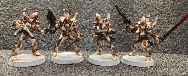
I get what Nou is saying, I think? Wraithbone is a material. It's supposed to be the most common material that the Aeldari use. It has a basic color (the "wraithbone" basecoat you mentioned seems to be the default, like Mechanicus Standard Grey is supposed to be the color of Power Armour before given its Chapter livery) but it also can apparently be dyed or altered--since we have whole armies with different colors. With that said, the models can look extremely boring because you have large unbroken surfaces of Wraithbone. Stormcast and Marines tend to suffer from a similar issue. To use a model from the new Guardian set as an example: 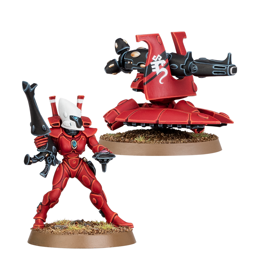 The Operator for the Support Platform here has three or four colors really going on. Her armor is red, helm is white, and the gun, faceplate, and doohicky for the platform are all black. Extending the black or white to the "interior" of the bodysuit would break up the red a bit and make a more interesting visual aesthetic. They don't need to look garish or anything but it would definitely be doable as a concept. Plus the different Craftworlds are supposed to have variances in wargear. There's a really spiffy Biel-Tan scheme that uses grey for the bodysuits that the wraithbone plates are attached to for example.
|
|
This message was edited 1 time. Last update was at 2022/01/06 01:05:42
|
|
|
|
|
2022/01/06 01:48:08
Subject: Craftworld paint jobs are dull
|
|
Wicked Warp Spider
|
 Kanluwen wrote: Kanluwen wrote:Voss wrote:
nou wrote:The main problem with CWE paintjobs is the common interpretation of how wraithbone has to look like a dull, flat plastic.
Never heard that one before. Wratihbone has historically been 'bone' colored. And that's still current, considering the 'bone' basecoat is literally called Wraithbone now.
I get what Nou is saying, I think?
Wraithbone is a material. It's supposed to be the most common material that the Aeldari use. It has a basic color (the "wraithbone" basecoat you mentioned seems to be the default, like Mechanicus Standard Grey is supposed to be the color of Power Armour before given its Chapter livery) but it also can apparently be dyed or altered--since we have whole armies with different colors.
With that said, the models can look extremely boring because you have large unbroken surfaces of Wraithbone. Stormcast and Marines tend to suffer from a similar issue.
To use a model from the new Guardian set as an example:
The Operator for the Support Platform here has three or four colors really going on. Her armor is red, helm is white, and the gun, faceplate, and doohicky for the platform are all black.
Extending the black or white to the "interior" of the bodysuit would break up the red a bit and make a more interesting visual aesthetic.
They don't need to look garish or anything but it would definitely be doable as a concept. Plus the different Craftworlds are supposed to have variances in wargear. There's a really spiffy Biel-Tan scheme that uses grey for the bodysuits that the wraithbone plates are attached to for example.
Exactly.
Go and have a look at the 2nd Codex ed 'Eavy Metal section - half of the weapons are golden, Guardians have a literal chainmail under the plating, there is a lot going on. Or a 3rd ed codex, when GW pushed Biel-Tan thorns as the face of the Eldar. Saim Hann is flat and boring as hell. Even when GW tries to "go crazy" and spice things up for the Eldar, the only thing they come up with is a Mymeara gradient, which breaks the flat, dull and separated look of CWE schemes just a little bit - it still looks flat, but now requires an airbrush to do. Great.
Now why "separated" - every CWE scheme has the same construction of large, separated swathes of flat colour and half of the craftworlds have a scheme that is just direct application of the most basic colour wheel rule. There are very few repetitions, completely no variations and god forbid going for some depth in the colours. There is enough detail on CWE models to do way better, even sticking to GW basic techniques. CWE don't look flat because they can't look better, but because GW chose such look.
|
|
|
|
|
2022/01/06 02:40:02
Subject: Re:Craftworld paint jobs are dull
|
|
Dakka Veteran
|
I'm not a particularly great painter, and the images below are from my Eldar army, which I painted mostly more than 20-years ago. The eldar is all metal and goes back to what was available in second edition.
But even with limited skills you can come up with a much more "popping" paint scheme than what GW usually rolls out for the Eldar.
Key to a good eldar scheme in my mind is painting the mesh armor "plates" in one color (with basic/crude edge highlights) and the undersuit below it a different color or at least a much different shade. Some examples below:
Fire dragons where yellow plates over a green undersuit.
My guardian / craft world scheme was "blue helmet" with "orange" plate armor. Orange plates had highlighting and the under suit was a dark red. The aspect warriors all pulled in one of these color groups (the orange or the blue)
Banshees had darker brown undersuit with the bone color armor on top.
Warp spiders used a two tone approach with blue and purple
|
|
This message was edited 2 times. Last update was at 2022/01/06 02:42:34
|
|
|
|
|
2022/01/06 06:15:00
Subject: Re:Craftworld paint jobs are dull
|
|

Fireknife Shas'el
|
Also don't forget that Eldar are crammed full of spirit stones and if you paint them in fabulous colors then the fancy gems don't stand out so much. But by and large the canon craftworlds are pretty boring. So make your own! I can't wait to do some rangers like I did my Farseer and Spiritseer.
|
|
|
|
|
|
2022/01/06 07:14:40
Subject: Craftworld paint jobs are dull
|
|
Owns Whole Set of Skullz Techpriests
Versteckt in den Schatten deines Geistes.
|
They look great to me too.
There are nice CW themes out there, like the people who paint their tanks to look like nebulae or whatever, but I don't think there are any standard Craftworld patterns that look bad.
|
|
|
|
|
|
2022/01/06 07:54:57
Subject: Craftworld paint jobs are dull
|
|

Waaagh! Ork Warboss
Italy
|
I think the paintjob on the posted new red guardians is awesome. They're dudes in full armour, they shouldn't have more than 3-4 colours total. Even painting the helmet with a different colour than the armour already seems an exaggeration to me, an excuse to add another colour to the model.
|
|
This message was edited 1 time. Last update was at 2022/01/06 07:56:27
|
|
|
|
|
2022/01/06 08:29:02
Subject: Craftworld paint jobs are dull
|
|
Longtime Dakkanaut
|
I think the reason they look even more plain than a marine is that they are wearing bodysuits with armoured plates over the top, so there's not much differentiation on them.
Marines at least have separate segments and the flex joints that can be different colours.
The best you could do I think is painting the unfersuit and plates different colours.
You could do shoulder pads as different colours as well as back vanes.
|
|
|
|
|
|
2022/01/06 18:09:18
Subject: Re:Craftworld paint jobs are dull
|
|
Wicked Warp Spider
|
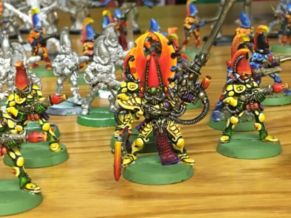
So, since we are sharing, this is my basic scheme. At it's core it is simple two colour harmony of... orange and violet. Yes, that is right. But then orange is split across off-white, orange, bronze and brown and violet is split between cold silver, violet and burgundy, with dominance of orange part and just a drop of secondary colour.
This was done purely with GW acrylics and apart from heavy weathering, which might not be to everyones liking, this sort of scheme can be done with straight GW base/wash/highlight method with single spray can and nine pots of paint in - Pallid Witch, Driad Bark, Balthasar Gold, Seraphim Sepia, Agrax Earthshade, Nuln Oil, any of the lighter steel/silver, Jokaero Orange and Barak-Nar Burgundy. Plus, if you fancy, 'ard Coat for gems shine, any turquoise and Khorne Red for squad markings, and Blood for the Blood God for blood. At it's barest minimum it's one can, five paints and two washes, so nothing really above the GW's entry level scheme.
The clou of breaking the dull nature of Guardian armour here is the asymmetric shoulder pad, specular contrast of flat colour vs metalic, high contrast of all the belts, scarfs and those little boot I-don't-know-whats and then texture differences and further contrasts of weathering.
|
|
|
|
|
|
|


 6000 pts -
  4000 pts - Harlies: 1000 pts -


 15k+
15k+
 Emperor's Spears 2500
 Ultramarines, 3rd Co. and friends, 16k+
  4k
4k  Competition Index