| Author |
Message |
 |
|
|
|
|
Advert
|
Forum adverts like this one are shown to any user who is not logged in. Join us by filling out a tiny 3 field form and you will get your own, free, dakka user account which gives a good range of benefits to you:
- No adverts like this in the forums anymore.
- Times and dates in your local timezone.
- Full tracking of what you have read so you can skip to your first unread post, easily see what has changed since you last logged in, and easily see what is new at a glance.
- Email notifications for threads you want to watch closely.
- Being a part of the oldest wargaming community on the net.
If you are already a member then feel free to login now. |
|
 |
2013/07/22 05:21:04
Subject: [Infinity] Kestril paints the MRRF with the internet!
|
|

Battleship Captain
|
I think he should be pulling a giant teddy bear a long. Nothing says bad ass like storing your gear inside a giant teddy bear.
|
|
|
 |
|
2013/07/22 06:48:30
Subject: [Infinity] Kestril paints the MRRF with the internet!
|
|
Leaping Dog Warrior
|
 cormadepanda wrote: cormadepanda wrote:I think he should be pulling a giant teddy bear a long. Nothing says bad ass like storing your gear inside a giant teddy bear.
I'd actually do that. You got a miniature teddy bear I can replace the backpack with?
|
 MRRF 300pts MRRF 300pts
 Adeptus Custodes: 2250pts Adeptus Custodes: 2250pts |
|
|
|
|
2013/07/23 22:19:52
Subject: [Infinity] Kestril paints the MRRF with the internet!
|
|
Battleship Captain
|
 kestril wrote: kestril wrote: cormadepanda wrote:I think he should be pulling a giant teddy bear a long. Nothing says bad ass like storing your gear inside a giant teddy bear.
I'd actually do that. You got a miniature teddy bear I can replace the backpack with?
Nope, perhaps sculpting one out of greenstuff.
|
|
|
|
|
2013/07/24 10:39:10
Subject: [Infinity] Kestril paints the MRRF with the internet!
|
|

Fixture of Dakka
|
That miniature is really growing on me since the competition. A very characterful little fella. Nice conversion although you might want to tidy up the joins with greenstuff.
|
|
|
|
|
|
2013/07/25 00:26:07
Subject: Re:[Infinity] Kestril paints the MRRF with the internet!
|
|
Leaping Dog Warrior
|
Okay, internet! We're going to paint this guy in this specific order:
1) Cloak/helmet
2)Pants/visor
3)Pads and boots
4) Hands, face, and gun
I applied the primer and then some averland sunset.

So far so good? The sepia wash is next right?
Anyways, I've also finished the paracommando. I apologize in advance for the lighting. a storm rolled in, so it's a bit dark.


|
MRRF 300pts
Adeptus Custodes: 2250pts |
|
|
|
|
2013/07/25 02:30:20
Subject: Re:[Infinity] Kestril paints the MRRF with the internet!
|
|

Zealous Knight
|
Personally I'd layer it up to the "main" yellow color first: Yriel yellow in this case, I believe. paint most of the cape, just not the creases/other recesses. I could break out MS paint and mark it out on the model but... actually I think I will. 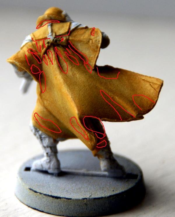 Don't be too harsh on me, my skills with graphics software aren't what they should be  (using a mouse instead of something with a shiny wacom logo on it doesn't help either!) still, this should give you a good start. layer yriel over everything not marked, maybe even put some lines of whatever brighter yellow you have (or just 2 yriel to 1 white!) on the really brightest parts (I could mark it out but that would probably be overkill ) **Then** apply sepia. thin coat - make sure you don't get pooling where it shouldn't pool (e.g. anywhere but the recesses!) but don't make it too thin either: it's a wash, not a glaze after all. Oh just one thing: my techniques will never win you any serious painting competition but they're quicker than they're dirty and tend to look pretty much decent (from any sane distance for viewing gaming minis!). Added advantage is that it's all quite easy - the trick is learning to do it *fast*. Either that or making it more complicated. But really, this stuff will do for the basics. If OTOH someone feels like taking you through blending a cloak through 28346 distinct layers of color feel free to paint along with that - I've never had either the skill or patience but respect those who do very much - however it's nowhere near as practical for just getting decent-looking minis onto the table. Just throwing in this preface-after-the-fact (lolwut?) so you know where I'm trying to steer you - might avoid disappointment later on! Seems that loup is one from the box set? I was looking through the ariadna stuff at the FLGS today, had it been one in blister I wouldn't have had to make an example in MS paint now shame, but it's a much cooler model than that blister loup for sure.
|
|
This message was edited 1 time. Last update was at 2013/07/25 02:35:38
|
|
|
|
|
2013/07/25 03:33:13
Subject: Re:[Infinity] Kestril paints the MRRF with the internet!
|
|
Leaping Dog Warrior
|
That's very helpful  I'm fine with faster techniques. I still need to get the basics down, after all. I'm not seeking do win any painting tournaments. I just want to improve my skills.
Actually this IS the loup from the blister pack. (it should say loup garou with sniper rifle). A link to the full model is here: http://www.infinitythegame.com/infinity/en/2011/miniatures/loup-garous/. The four I painted previously are the ones from the boxed set. Better double back to the FLGS and pick it up!
|
MRRF 300pts
Adeptus Custodes: 2250pts |
|
|
|
|
2013/07/25 03:41:59
Subject: [Infinity] Kestril paints the MRRF with the internet!
|
|
Zealous Knight
|
lol, my bad. I'll see if it's still there when I'm in the neighborhood next friday
I just really, really thought it was the viral rifle loup. Weird.
|
|
This message was edited 1 time. Last update was at 2013/07/25 03:42:54
|
|
|
|
|
2013/07/25 16:57:08
Subject: Re:[Infinity] Kestril paints the MRRF with the internet!
|
|
Leaping Dog Warrior
|

Progress! I've just done layering so far. I haven't applied the wash as of yet. I'm going to wait until I get the frontside done.

Now we can do the front?
|
MRRF 300pts
Adeptus Custodes: 2250pts |
|
|
|
|
2013/07/25 17:26:59
Subject: Re:[Infinity] Kestril paints the MRRF with the internet!
|
|
Zealous Knight
|
Funny, I had expected it to get a little bit brighter. No matter, I think this might actually work out for the best. Looks good, I'd say go ahead and do the front in a similar manner. ...Actually I have a small suggestion, which I will now proceed to visualize using my terribad MSPaint skillz: 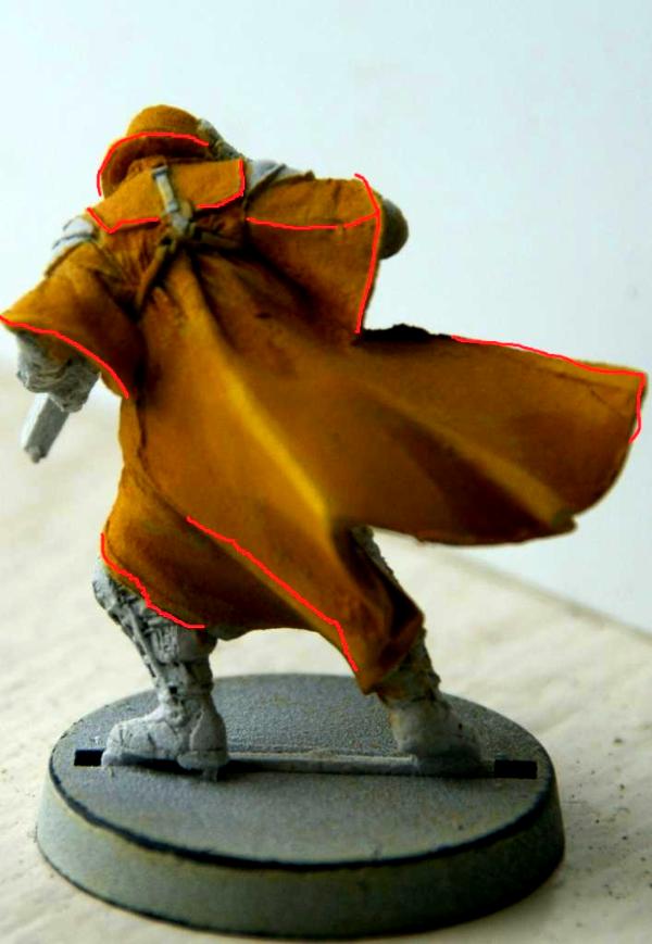 (I omitted some lines where I think your layering did a pretty decent job already: middle fold for example. Those are also the places which can be a bit of a pain to get this right; it's probably best to keep it simple for now anyway. Once you have the basics down comfortably you can always experiment a bit, after all!) Some (relatively!) stark edge highlights along those lines would not be a bad idea. Keep in mind you don't want them to get all too bright, but the wash will dull them significantly. e.g. they *have* to look "too bright to be right" before the wash is applied; I edge-highlight the red color with some orange layering with pure flash gitz yellow for the results in some of my pics in the infinity pledging thread, for example see http://www.dakkadakka.com/gallery/520031-.html . Do keep in mind those are *supposed* to be extreme and a bit contrastey, much more so than you'd ever want on a cloak. OTOH, you're already painting fething yellow, you don't go up to a really bright contrasting color from there anymore. you might just use flash gitz with some white mixed in, make it look just a wee bit too bright and apply only thin lines. Oh, if you want me to MSpaint some more horrible red lines on that front pic, just say so 
|
|
This message was edited 1 time. Last update was at 2013/07/25 17:28:37
|
|
|
|
|
2013/07/25 19:09:11
Subject: Re:[Infinity] Kestril paints the MRRF with the internet!
|
|
Leaping Dog Warrior
|
Alrighty. Re-highlighting down I'll post a picture after I start on the front as well.
Also, I would love it if you broke out the paint SKILLZ to mark up the front of the mini.
|
MRRF 300pts
Adeptus Custodes: 2250pts |
|
|
|
|
2013/07/26 02:12:56
Subject: Re:[Infinity] Kestril paints the MRRF with the internet!
|
|
Zealous Knight
|
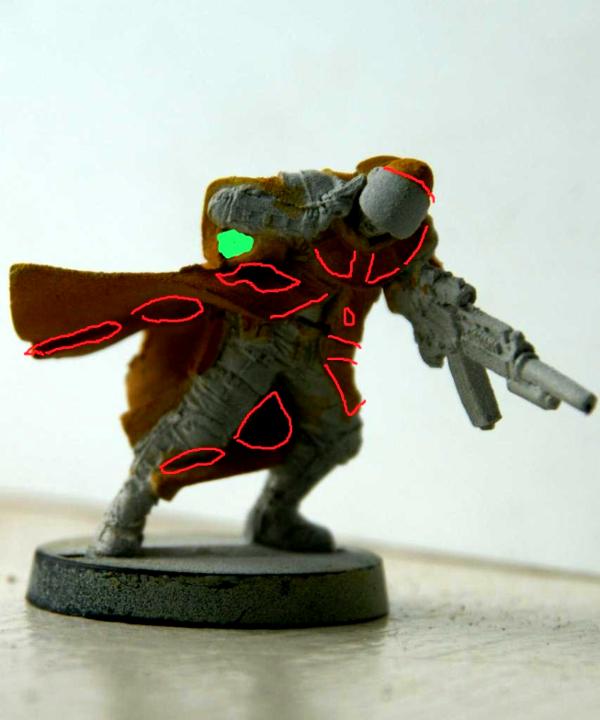
Green area will either be tactfully filled in with a drop or two of sepia wash, or just painted black. it's supposed to be hollow, after all, more or less.
Well, this was a hard one, not so much to actually highlight as it is to draw that on a photo. Basically, the idea is to leave any sculpted recesses (such as by the edge of the cape, or when one piece overlaps another) the darkest color (basic shading 101), as well as anything which looks as if it's somewhat recessed or would be in a shadow of sorts. There's multiple ways to go about this: if you decide to light a model from one angle and paint it like that, it's generally going to look extremely good from a limited number of angles (as well as being a pain in the rear to pull off believably!); therefore what we are going to do is somewhat unrealistic, in the sense that the absolute bottom of the cape between his legs will get quite a bright highlight (while still leaving most of it shaded!), by which we'll be going for what I'm told is a bit of a comic book look. Fun thing is that, however unrealistic it might be if you think about it/approach this scientifically, it tends to look more natural on this scale, IMO.
Certainly if you're going for a tabletop standard. Scale does funny things. (In the same spirit, do NOT try to replicate shading from either 15mm or 54mm models on 28mm stuff - it often doesn't quite 'work' in the flesh IME! ...and this concludes clippy's random tooltip 3463 )
Short version: everything not lowered/recessed/in shadows will be highlighted (and really, this is more of a first layer, we'll move on to some hard edge highlights before applying a wash after this).
|
|
|
|
|
2013/07/26 03:08:12
Subject: Re:[Infinity] Kestril paints the MRRF with the internet!
|
|
Battleship Captain
|
You sir are learning to layer. Congratz. Your cloak looks better already.
|
|
|
|
|
2013/07/26 10:56:55
Subject: [Infinity] Kestril paints the MRRF with the internet!
|
|
Fixture of Dakka
|
Nice work, kes! Keep it up and this'll be your best work yet. 
|
|
|
|
|
|
2013/07/26 19:01:04
Subject: Re:[Infinity] Kestril paints the MRRF with the internet!
|
|
Leaping Dog Warrior
|

Time to apply some sepia wash to the cloak, right?
So far, so good. I'm liking the way this guy is turning out
|
MRRF 300pts
Adeptus Custodes: 2250pts |
|
|
|
|
2013/07/26 20:21:27
Subject: [Infinity] Kestril paints the MRRF with the internet!
|
|
Zealous Knight
|
Yup. Make sure to apply with moderation so that it doesn't pool where it shouldn't, but does where it should. Not my most helpful hint ever I know
Well, stuff like the creases in the rear, near the top, should take a relatively large amount of the wash; the flat areas just a thin coat. apply just so much that a little starts to pool in the lowest parts of the mini, then keep draining that away carefully with a small brush until it stops pooling. Rather a labour-intensive method but it works, especially until you get some more feeling for how much to apply!
two things to watch out for:
1) do the whole area in one go. I know it's more to keep from unduly pooling, but it's nigh impossible to make a seam between two individual coats invisible. Keep in mind it's transparent so both gaps and overlap show, and since borders tend to gather a bit of a thicker line of pigment anyway you'd have to start carefully wiping that away/blending it with isopropyl alcohole or somesuch and that's a lesson for another day!
2) get reasonably thick, dark lines of wash in all the borders with 'other' coloured areas. That makes shadow and distinguishes different colours, giving definition to the model above and beyond just the colours, so to say.
Remember what I said about of a "comics" look? this is another of those things that smells a bit like that and really, really helps at 28mm.
...Then again by the time you hit 54mm or 72mm etc that seems to be much, much less of an issue (even looking way overdone/cartoony).
Funny thing to add is that however much a TAG for example is that other size, it certainly isn't that other scale and because of that (and to keep consistent with the rest of the army!) you simply use the same kind of blacklining etc
Well, I swung by the FLGS today and it seems the loup blister had sold :( no point ordering it, by the time it comes in I will have talked you through the entire model so no point in that.
Anyway, have fun. Oh, you might as well use whatever dark blue you have available to start with on the clothing I'd start with something really dark but then again, I work from black primer most of the time; working from white you might as well use something which looks like the kind of colour you'd want the textile to look like if it were scale 1:1. We'll then proceed to layer/highlight that and apply a wash.
As to straps/etc well, I'm not sure what colours you'd want everywhere (in hindsight I should've had you block out basic colours over the entire model! No matter now, and don't bother, we'll work it out this way!) but since you have decent covering paints for most stuff and will be finishing off with a boatload of different washes anyway I don't think it matters all too much; however, we will paint (and wash!) the blue uniform parts before bothering about the straps, especially since washes tend to leak unto such details as well. Do you have a dark blue wash colour available? Also, are you dead set on the yellow on the weapon? I know for sure that would turn me nutty, but I can talk you through it if you really must
|
|
|
|
|
2013/07/26 22:02:10
Subject: [Infinity] Kestril paints the MRRF with the internet!
|
|
Leaping Dog Warrior
|
 Bolognesus wrote: Bolognesus wrote:
. Do you have a dark blue wash colour available? Also, are you dead set on the yellow on the weapon? I know for sure that would turn me nutty, but I can talk you through it if you really must
I've got a sepia wash, and a black wash. I figure I'd use the sepia for the cape and the black for the blue stuff.
As for the weapon I'd rather try to make it look "realistic"--like the black metal-y look. I've just been experimenting around with each of my mini's weapons because I want to find something that looks decent.
|
MRRF 300pts
Adeptus Custodes: 2250pts |
|
|
|
|
2013/07/26 23:04:59
Subject: [Infinity] Kestril paints the MRRF with the internet!
|
|
Zealous Knight
|
Black will work! Even better IMO, actually - it'll just be a bit less of a "bright" looking mini. Not a bad thing, generally - the yellow hits that ticket already
There's black metal paints around for things like that, personally I'm going to experiment with a vallejo metal medium somewhere this weekend (will let you know how that goes) or you could paint a weapon black and drybrush/highlight carefully with metallic colors, or paint metallic and wash black several times... I suspect a mix of metallic medium/black with some metallic highlights, followed by a black wash to blend them in and some matte varnish will go a long way. I'll experiment a bit with that and see how close we can come to the standard assault rifle look, so to say (that is what you mean, right? )
anyway, that black wash could be good for carefully filling in some shadows, (even on the cloak!) as well as just painting in the blacklining (the one point where starting with white primer really suffers as opposed to black.
did you get gloss varnish by the way? I personally rather like using that on metallics (though again, that goes for the cartoony look rather a bit!) and of course some shiny stuff like visors/gems/lenses here and there.
By the way, have you considered using some bits of wood-look in the weapon the way the stock model was painted? it breaks up the monotony of a weapon a bit and it does look rather striking IMO. Also, we could try to paint the lens of the scope something fancy (but again, bit cartoony!) if you fancy a go at that
|
|
|
|
|
2013/07/26 23:42:54
Subject: Re:[Infinity] Kestril paints the MRRF with the internet!
|
|
Leaping Dog Warrior
|
I'm all for cartoony! After painting 70+ brown. desert. guardsmen., I really do want something bright and colorful (I do say that it drew me to infinity as well, with its brightly-colored anime asthetics).
In fact, the cloak seems a little dark after that wash (but pretty marvelous, as well.) in any case I'm going to re-go over it with the medium yellow and the highlights (on the non-shadowy places, at least) to bump up the contrast more and provide a brighter look. I realize that the colors won't "transition" as well, but it's the dynamic look I think I've been after all this time.
I DO have gloss varnish, and my other soldier's visors look great because of it in fact, I was thinking of a glowy green scope on the rifle, but since that color doesn't appear anywhere else on the mini, I may have to settle for blue or yellow.
It's funny, when I walk into the store, I'm not the best painter, but people are blown away from the improvement between minis.
|
MRRF 300pts
Adeptus Custodes: 2250pts |
|
|
|
|
2013/07/27 00:02:42
Subject: [Infinity] Kestril paints the MRRF with the internet!
|
|
Zealous Knight
|
Actually such a contrasting green would be great. I thin Iknow a good and laughably simple way to pull it off, but I'm going to try that first before I make you buy useless paints...
As for the re-payering and highlighting:go for it! Maybe highlight it a bit too far then apply another wash of 1 sepia, 1 thinner medium and 2 water but the idea is fine and since yellow paint is so transparent in general it'll be easy enough to pull off
Which blue paint(s) do you have? That would be good information to have rather than me taking a shot in the dark Automatically Appended Next Post: Actually such a contrasting green would be great. I thin Iknow a good and laughably simple way to pull it off, but I'm going to try that first before I make you buy useless paints...
As for the re-layering and highlighting:go for it! Maybe highlight it a bit too far then apply another wash of 1 sepia, 1 thinner medium and 2 water but the idea is fine and since yellow paint is so transparent in general it'll be easy enough to pull off
Which blue paint(s) do you have? That would be good information to have rather than me taking a shot in the dark Automatically Appended Next Post: Oh and if you can use very, very thin black paint to get the weapon all the way to black that will certainly be useful as well, later on
|
|
This message was edited 2 times. Last update was at 2013/07/27 00:04:42
|
|
|
|
|
2013/07/27 00:33:20
Subject: Re:[Infinity] Kestril paints the MRRF with the internet!
|
|
Leaping Dog Warrior
|
As far as blue goes, I've got Caledor Sky and Lothern Blue. (previously known as Ice blue, I think)
They've worked well together so far, IMO.
I thought I'd get the green by *GASP* mixing some blue and yellow.
|
|
This message was edited 2 times. Last update was at 2013/07/27 00:34:17
MRRF 300pts
Adeptus Custodes: 2250pts |
|
|
|
|
2013/07/27 00:49:24
Subject: [Infinity] Kestril paints the MRRF with the internet!
|
|
Zealous Knight
|
yup, that'll work. Caledor sky basecoat on the blue bits it is
mixing is fine but hardly a good way to attain consistent results. it'll be fine for a visor, though
Oh, maybe just leave the scope lens part of the weapon white, that way all we'll have to do is apply some really very thinned down green, mix that with some white for a few accents (more on that by that time ) and apply gloss varnish to the whole thing after the matte varnish spray has gone on
|
|
|
|
|
2013/07/27 01:02:38
Subject: Re:[Infinity] Kestril paints the MRRF with the internet!
|
|
Leaping Dog Warrior
|
Now that you bring it up, I could see a green visor looking pretty badass. However, all my other visors are blue so far. 
Don't touch that remote! Internal conflict over which color to paint a small bit on a toy soldier ensues!
|
MRRF 300pts
Adeptus Custodes: 2250pts |
|
|
|
|
2013/07/27 03:12:57
Subject: [Infinity] Kestril paints the MRRF with the internet!
|
|
Zealous Knight
|
Hmm, that might be a good time to just get some nice 15-step painting scheme/tricks out for the visor
|
|
|
|
|
2013/07/27 15:25:34
Subject: Re:[Infinity] Kestril paints the MRRF with the internet!
|
|
Leaping Dog Warrior
|
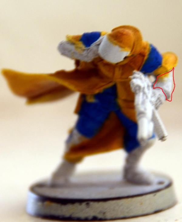
Update I went ahead and enhanced the picture to give a more clear idea of where the details and color are.

|
MRRF 300pts
Adeptus Custodes: 2250pts |
|
|
|
|
2013/07/27 19:03:48
Subject: [Infinity] Kestril paints the MRRF with the internet!
|
|
Zealous Knight
|
ah, that cloth area on the left arm isn't supposed to be blue?
I'd need a sharper pic of the current blue areas to indicate where to highlight, sorry!
|
|
|
|
|
2013/07/27 20:26:28
Subject: [Infinity] Kestril paints the MRRF with the internet!
|
|
Leaping Dog Warrior
|
Bolognesus wrote:ah, that cloth area on the left arm isn't supposed to be blue?
I'd need a sharper pic of the current blue areas to indicate where to highlight, sorry!
I'll do my best to get some better pictures. Right now my camera just ran out of batteries 
|
MRRF 300pts
Adeptus Custodes: 2250pts |
|
|
|
|
2013/07/27 22:54:52
Subject: Re:[Infinity] Kestril paints the MRRF with the internet!
|
|

Parachuting Para-Commando
|
I like the minis nice and striking colour scheme and you have really improved from the first minis. I like what you have done with the yellow cape on the loup garou a tip if you haven't tried it is to mix purple with your yellow for shading it would be useful for the deepest shadows and to create some delineation for the rest of the miniature.
Another suggestion would be to look at you undercoat because the paint looks a bit grainy it might be that you are holding the paint can a bit to far from the mini so the paint is to dry when it hits the mini to much heat or moisture in the air can also affect the result. Another factor can be if you place the mini in a cardboard box and spray it is that there is dust in the box that will be mixed with the paint and cause graininess.
|
|
|
|
|
2013/07/28 00:19:33
Subject: Re:[Infinity] Kestril paints the MRRF with the internet!
|
|
Leaping Dog Warrior
|
Thanks for the praise and advice! It means a lot
That makes sense. I've been thinking that I've been holding the can a little far away.

I think that picture is a bit sharper. What cloth area are you referring to Bolognesus?
|
|
This message was edited 1 time. Last update was at 2013/07/28 00:20:26
MRRF 300pts
Adeptus Custodes: 2250pts |
|
|
|
|
2013/07/28 01:53:19
Subject: Re:[Infinity] Kestril paints the MRRF with the internet!
|
|
Zealous Knight
|
This one.
Hmmm, I'm thinking you might be best off just drybrushing the lightest blue tone ( I keep thinking sky blue as that's the VMC equivalent of what you've got that I use, but you'll know what I mean!) and drybrush (not especially lightly, but certainly with some subtlety!) the blue with that with the smallest flatbrush or something like that you have, then applying the wash. Some more careful layering (this would require a 2:1 mix of your basecoat to that light blue color I'd say!) followed by an extreme highlight of sky blue/equiv. on the blue around the shoulders could work, and will probably yield a better result. do the drybrushing first; it's easier to make the layering look like the drybrushing than the other way around You'll see what I mean.
Mixing some purple with the yellow is a good suggestion; I think perhaps that would be more suited to a non-wash approach though! (you seem to be getting the layering/highlighting down pretty well; just using a somewhat darker base color and doing everything manually is something you could probably figure out for yourself in one or two tries once this model is done!).
How to make it play nice with the sepia wash I wouldn't dare to say
|
|
|
|
|
|
|


