| Author |
Message |
 |
|
|
|
|
Advert
|
Forum adverts like this one are shown to any user who is not logged in. Join us by filling out a tiny 3 field form and you will get your own, free, dakka user account which gives a good range of benefits to you:
- No adverts like this in the forums anymore.
- Times and dates in your local timezone.
- Full tracking of what you have read so you can skip to your first unread post, easily see what has changed since you last logged in, and easily see what is new at a glance.
- Email notifications for threads you want to watch closely.
- Being a part of the oldest wargaming community on the net.
If you are already a member then feel free to login now. |
|
 |
2013/07/28 23:09:08
Subject: Re:[Infinity] Kestril paints the MRRF with the internet!
|
|

Leaping Dog Warrior
|
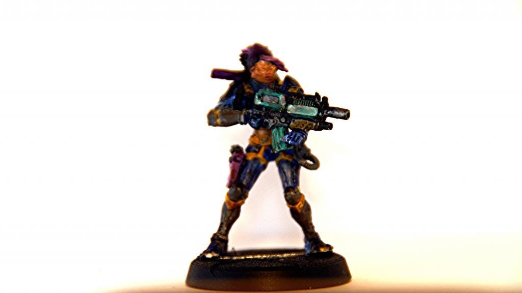
aaaaand update!

I really have a hard time with all those little details. You can see that I missed some strokes and hit his gun holster with the blue.
Ahhh that area, that's not a cloth area. It's like a forearm/elbow pad. . .thing. I'd totally try the dark purple trick, but I don't have any purple, sadly.
In other news, I think I've decided on a green visor (because I need to make this mini more complicated, obviously.)
|
|
This message was edited 1 time. Last update was at 2013/07/28 23:17:16
 MRRF 300pts MRRF 300pts
 Adeptus Custodes: 2250pts Adeptus Custodes: 2250pts |
|
|
 |
|
2013/07/28 23:37:00
Subject: [Infinity] Kestril paints the MRRF with the internet!
|
|

Zealous Knight
|
Meh, you need to paint the visor separately anyway so using a contrast color for that hardly makes it more complicated, only giving you a bit more variety.
I'd really go with something brownish on the straps and holster - blue and yellow give a striking contrast but having a few bits of dark stuff/drab boringness on the mini only brings out the color that much more.
As for both purple and green: both are colors you will use a lot of, especially if you want bright, colorful models. I'd get a dark and a light tone of each just pure (as well as doing the same with red, perhaps) - mixing is good but has it's limits 
I see what you mean about the elbow pad, my bad! any idea what color those should be?
As for colour selection, have a read through this page:
http://blog.brushthralls.com/?page_id=1203
as well as some of the other tuts under their prep/colours section. Great stuff in coming up with paint schemes.
It'll confirm a lot of what you already do intuitively but there's always a few things it can teach you of which you might not have thought yourself.
(Basically, it points towards what I said before a bit: it's generally a good idea to have not only the brightest of colours, especially if you want them to stand out!)
Blue looks nice, spot on IMO.
As a final thought, you might consider taking out a really, really fine brush and using it with some of the black wash to carefully darken the lines between yellow and blue (there's some green to be seen now, and not all the areas are precisely correctly defined. not a gamebreaker, but it's dead simple to solve!)
|
|
|
|
|
2013/07/28 23:50:16
Subject: [Infinity] Kestril paints the MRRF with the internet!
|
|
Leaping Dog Warrior
|
 Bolognesus wrote: Bolognesus wrote:
I see what you mean about the elbow pad, my bad! any idea what color those should be?
Unfortunately, I have no idea. I was thinking a light or dark gray. Kinda so it looks like some protective plastic, like a a shin guard for football player.
As for colour selection, have a read through this page:
http://blog.brushthralls.com/?page_id=1203
as well as some of the other tuts under their prep/colours section. Great stuff in coming up with paint schemes.
It'll confirm a lot of what you already do intuitively but there's always a few things it can teach you of which you might not have thought yourself.
Will do!
Also, i don't have any browns Atm. maybe if I just leave the straps as an averland sunset color to help bring out the cape?
Blue looks nice, spot on IMO.
Thanks!
As a final thought, you might consider taking out a really, really fine brush and using it with some of the black wash to carefully darken the lines between yellow and blue (there's some green to be seen now, and not all the areas are precisely correctly defined. not a gamebreaker, but it's dead simple to solve!)
O.o I don't think I have a brush with a good enough tip with the moment. Perhaps with a lot of patience, I'll be able to manage.
|
MRRF 300pts
Adeptus Custodes: 2250pts |
|
|
|
|
2013/07/29 13:13:21
Subject: [Infinity] Kestril paints the MRRF with the internet!
|
|

Fixture of Dakka
|
Looking promising! Make sure you go back and fix the overlaps after each stage. It's harder to fix the further you go along the process.
|
|
|
|
|
|
2013/07/29 19:20:07
Subject: [Infinity] Kestril paints the MRRF with the internet!
|
|
Zealous Knight
|
actually you could just get the wash on as subtly as you can manage, then wipe off the excess. it's lovely stuff to work with (just make sure you wipe it off of the yellow right quick; the blue it'll hardly show on but the yellow is another matter!)
As for the straps, have another look at that article I linked. You'll easily be able to mix up a brown colour with just the knowledge from that (actually mixing up brown is not exactly a hard thing to do ^^ ).
mix a light brown color then apply a 2:1 sepia:black wash mixture over that - should work just fine.
Another option would be painting them white, then applying two or three sepia washes (white plus sepia makes sepia with lighter highlights, sepia is brown ) Would be a wee bit on the bright side but I think it'll still make for a nice contrast! again, just wipe off excess wash from the blue in a swift fashion right after application of the wash and it should be just fine.
Whether there's a dark brown line or a dark black line between colours isn't that much of an issue at good tabletop plus and lower standards
The worst thing you can do to "bring out" the cape is paint more yellow onto the mini. To "bring out" the cape you need contrast if anything! using some darker, or at least "NOT YELLOW" colours does that 
Sounds weird, but using a few dark colours on a mini predominantly painted very brightly actually makes it look brighter.
Works the other way around too: the red on my drones looked pretty bright until I painted some blueish-white surfaces right next to it. Now it's downright dark and grimy - as intended - which goes to show that the best thing to bring out something you want to show is to make it contrast with some other details.
With CB's level of detail on most minis this isn't a hard thing to do - most Infinity stuff gives me a headache trying to decide which of the eleventy billion panels of armour will be what colour. Once the decision is made however, the amount of detail (just as those straps!) actually 'helps' you with painting the model. Yes, it's a boatload of work but those things are really in all the best places to break up large surfaces nicely.
...Okay, of course only now I think to ask: you *do* have white paint, don't you? 
|
|
|
|
|
2013/07/29 21:34:04
Subject: [Infinity] Kestril paints the MRRF with the internet!
|
|
Fixture of Dakka
|
Your doing really well so far kestril, its like watching a Jedi train his padawan
Keep up the great work.
|
|
This message was edited 1 time. Last update was at 2013/07/29 21:35:00
|
|
|
|
|
0001/07/30 18:11:16
Subject: Re:[Infinity] Kestril paints the MRRF with the internet!
|
|
Leaping Dog Warrior
|
I am the best padawan.

I went ahead and did the visor, along with the straps. I was trying to make the visor have a smooth buildup, so that's about 5 layers of green there. While it could be brighter, I'm still happy with the end result. While not pictured, I painted the straps on his back that dark brown color too. It really works wonders. Now that I see it up close, I think that circle on his collar could look good green.
I've still got a little spot of blue to go over on the cloak, but I figure I'll get to that once I do the shinpads and elbowpads.
I'm still at a loss as to what color to paint them. I'm thinking a grey?
O.o all these bright colors makes the mini look a little psychedelic, but at the same time I think it looks great as well--it's definitely unique, and I can see this guy being a riot police to some wacky-colored 80's scifi flick. The problem is, now I have to go back and paint all my dudes to this standard 
|
|
This message was edited 3 times. Last update was at 2013/07/30 18:18:42
MRRF 300pts
Adeptus Custodes: 2250pts |
|
|
|
|
2013/07/30 19:19:18
Subject: Re:[Infinity] Kestril Starts Ariadian Metros! (Hungry like the wolf-2/11/2013)
|
|
Fixture of Dakka
|
Huge improvements! Good man!
Things that need work next:
Overlaps and cleaning them up. - Neatness will come with time clean up takes time. This is why this sort of colour scheme is so difficult, painting yellow over blue requires many layers, as does blue over brown. Tidying up those overlaps is going to require more luck.
Photography. - Really important in the modern hobby, better images are better.
Seriously, you are doing a top job, well done. This is how far you've come in just 5 and a half months. 
Before: After:
|
|
This message was edited 1 time. Last update was at 2013/07/30 20:18:22
|
|
|
|
|
2013/07/30 19:42:27
Subject: Re:[Infinity] Kestril paints the MRRF with the internet!
|
|
Leaping Dog Warrior
|
So, Casy, if you hear a weird sound through your speakers, that's probably my jaw hitting the floor. 
Thanks to all you guys! I wouldn't have come this far without your support
|
MRRF 300pts
Adeptus Custodes: 2250pts |
|
|
|
|
2013/07/31 01:56:06
Subject: [Infinity] Kestril paints the MRRF with the internet!
|
|
Zealous Knight
|
That works pretty well, good going!
Note particularly how both brown and black wash 'spillage' mostly just looks like shadow if you don't look too hard - don't hesitate for a moment to grotesquely abuse this in the "whoopsies cleanup" department; all of us do
pads in black/grey tones would be good. Basically blacks/greys and a couple of browns while you're at it always work well enough (take care what *kind* of brown you use though - again, colour theory articles! ) and provide a "calm" and functional looking component to a miniature which is often overlooked in colour scheme selection, but can really make a model stand out that much more for very, very little effort!
As to the grey: just slap on two or three (thin!!!) layers of black wash to the white pads until it gets dark enough, then mix a grey tone light enough to highlight an edge or two with (not **too** bright again, keep it somewhat subtle!) and do so and you're basically done.
An alternative would be two thin coats of black, stark white highlights, another coat of wash. That will *probably* look a bit grimy for the overall look you seem to be going for though so if you're feeling up to it, stick with method one!
Do the boots the same colour as the straps: you want them dark, trust me on that! Also, they shouldn't be the same colour as the pads since that would be dull. This way you alternate brown/grey/brown from the hips downward, all over the much brighter tones they all help bring out without getting too monotonous (I believe one of the paint scheme selection articles on that site goes over stuff like this in some detail as well; read it, live by it! I wish I'd've had those few pages when I was just starting to really learn to paint a bit!).
Next up will be the gun. You mentioned 'realistic' gunmetal-esque black looks. This is doable, though I'd advise thoroughly against painting black and highlighting it. either paint black/drybrush/wash and call it a day (perhaps a coat of gloss varnish, I've really taken to that on my own stuff of late, it's quite nice) or start with a dark metallic (but still 'iron' look, no brownish stuff - we have washes for that!) then drybrush - or get a pot of vallejo metallic medium, mix some into your black, paint the gun that then add some white to the mixture and drybrush the lot with that, finishing off with gloss varnish again.
Up to you, really
...And I understand the 'paint stripping tutorial' will be up next?
|
|
|
|
|
2013/07/31 17:24:04
Subject: Re:[Infinity] Kestril paints the MRRF with the internet!
|
|
Battleship Captain
|
 kestril wrote: kestril wrote:So, Casy, if you hear a weird sound through your speakers, that's probably my jaw hitting the floor.
Thanks to all you guys! I wouldn't have come this far without your support
You have made leaps and bounds by doing two things.
Taking your time.
Trying.
That is how it gets done. The rest is just technique. Well done! I am impressed to see you come along like this with layering and things. You are really using the 3 tone theory well and also splitting up your work. Finishing a section moving on. It looks great.
the visor while good still lacks one thing that is critical. A reflective sheen. You have the what i call "glow" where the plastic/material would light up differently from a light angle, but now you need the glare. a small amount of white down the middle and bottom lip towards the face, a top with a gloss varnish should be all it takes to push that.
|
|
|
|
|
2013/09/24 01:20:26
Subject: Re:[Infinity] Kestril paints the MRRF with the internet!
|
|
Battleship Captain
|
HAHA I STOLE YOUR MODEL
GREAT WORK BY ME AND BY ME i mean you..
|
|
|
|
|
2013/09/24 02:48:32
Subject: Re:[Infinity] Kestril paints the MRRF with the internet!
|
|
Leaping Dog Warrior
|
Curses! I've been commisioning you this whole time! And I would have gotten away with it too if it weren't for that dog and those mettleing kids!!!
Jk, anyways. . .
A few other things have happened since I last posted. A) school started again so my spare time is rapidly approaching zero. B) I won a local infinity tourney and won two more models, the male molblot and the limited max scorpio, official bounty hunter. I'm painting those as we type and I'll be able to post something whenever.
Don't expect regular updates because school, but I'll post when I have the chance!
|
MRRF 300pts
Adeptus Custodes: 2250pts |
|
|
|
|
2013/09/28 12:11:31
Subject: [Infinity] Kestril paints the MRRF with the internet!
|
|
Fixture of Dakka
|
Looks like you finished him off really nicely, great job. No rush on the updates but I'm looking forward to them.
|
|
|
|
|
|
2013/09/29 15:35:21
Subject: [Infinity] Kestril paints the MRRF with the internet!
|
|

Infiltrating Naga
|
Nice, looks like a solid paintjob. Waiting for more.
One word of advice, your mini would look even better, if you took a bit more time with the picture next time. With just the cam of a mobile phone with the closeup program activated you can make nice photos. Going the extra mile of using a dark backdrop and cutting the picture to size pays of too.
|
Visit my I-munda/Necromunda P&M Blog:  Eye for Detail Eye for Detail
Visit my Infinity P&M Blog:  Reckless Abandon Reckless Abandon
Scarper: "That is incredibly detailed...shows an attention to detail that goes beyond anyone you'll fight."
The Good Green: "Ok, That is incredible. Such attention to detail... I'm convinced you would benefit from a straight jacket ;~P Thanks for raising the bar."
PDH: "Yeah Bloody Baiyuan's Bloody eye for detail . Bet he doesn't sig that one"
PDH: "I'm not saying anything that you might sig against me. Made that mistake before!"
PDH: "Thanks for joining Dakka and spoiling us with your work. " |
|
|
|
|
2013/10/08 01:43:13
Subject: Re:[Infinity] Kestril paints the MRRF with the internet!
|
|
Leaping Dog Warrior
|
|
MRRF 300pts
Adeptus Custodes: 2250pts |
|
|
|
|
2013/10/08 21:19:35
Subject: [Infinity] Kestril paints the MRRF with the internet!
|
|
Infiltrating Naga
|
I don't want to pick at you, but well it's really hard to tell anything from the blurry pictures, sorry.
I can only tell, that there are several different colors relatively neatly applied to the miniatures. I cannot discern light from shadow or anything.
What do you use to take the pictures? Even with just a smart phone, by switching to makro (flower icon in most cases) you should get much clearer pictures.
|
Visit my I-munda/Necromunda P&M Blog: Eye for Detail
Visit my Infinity P&M Blog: Reckless Abandon
Scarper: "That is incredibly detailed...shows an attention to detail that goes beyond anyone you'll fight."
The Good Green: "Ok, That is incredible. Such attention to detail... I'm convinced you would benefit from a straight jacket ;~P Thanks for raising the bar."
PDH: "Yeah Bloody Baiyuan's Bloody eye for detail . Bet he doesn't sig that one"
PDH: "I'm not saying anything that you might sig against me. Made that mistake before!"
PDH: "Thanks for joining Dakka and spoiling us with your work. " |
|
|
|
|
2013/10/18 01:45:45
Subject: [Infinity] Kestril paints the MRRF with the internet!
|
|
Battleship Captain
|
Looks fuzzy.. try again?
|
|
|
|
|
|
|