Forum adverts like this one are shown to any user who is not logged in. Join us by filling out a tiny 3 field form and you will get your own, free, dakka user account which gives a good range of benefits to you:
No adverts like this in the forums anymore.
Times and dates in your local timezone.
Full tracking of what you have read so you can skip to your first unread post, easily see what has changed since you last logged in, and easily see what is new at a glance.
Email notifications for threads you want to watch closely.
Being a part of the oldest wargaming community on the net.
If you are already a member then feel free to login now.
Anyone here do his Patreon and can vouch for the quality of the files? For the biggest scale option it says they're posable, does that mean the printed parts can be posed for assembly, or they are designed to be posed in the STL before printing? I'd love to print out a massive HG kit, but you can never be sure with these things.
warboss wrote: Did anything ever come of that larger scale HGRPG model that was mentioned and/or previewed? What is the status of the most recent iteration of the RPG?
No clue on the first, but I believe the last round of text edits and layout finished up yesterday. Editor hopes to get approval from Rob for a couple test prints, then once those are received, if there's no major fuckups or surprises, it's either approval for a full run or a second set of edits and then the final run.
Cool. I fully admit that I didn't follow it too closely so might confuse the various projects with each other.
This message was edited 1 time. Last update was at 2023/10/09 17:27:35
Prometheum5 wrote: Anyone here do his Patreon and can vouch for the quality of the files? For the biggest scale option it says they're posable, does that mean the printed parts can be posed for assembly, or they are designed to be posed in the STL before printing? I'd love to print out a massive HG kit, but you can never be sure with these things.
I bought his Scopedog, and it's pretty cool. Quite modular, very poseable (default scale a bit big for "28mm", but not too much):
This message was edited 1 time. Last update was at 2023/10/09 17:00:28
A good samaritan helped me getting hold of the book to take a quick look...
...and I have to say that first impression is not great, just from a visual point.
The layout is very amateurish, most of the new illustrations are... well, competent but not really any good (a lot of the single character archetypes and the like are pretty good, though), and on the whole, coupled with the poor image placement on the document it has made the game lose any sense of visual cohesiveness.
On the readability side, it feels like all the text has just been thrown on the pages without much of a sense for text density or eye flow movement, so it doesn't make for the greatest read... kind of bothersome and makes me tire easy.
I was just yesterday doing layout on a fan translation I've done of Outgunned, an italian action movie RPG, and the difference is very stark on that regard. not only the layout on that one is really great (clean, easy to follow, not too much text just thrown on a page but designed to ease of use and readability) but the cohesiveness of the illustrations and the whole visual aspect of the game is great, and it makes this one looks so much the worse in comparison.
The worst thing? My 2nd edition book looks much better in both regards, and it is a damn shame.
And at the end of the day, there's the change in focus on the game, from "a scifi game in a new, 'realistic' world, wich incidentally has mecha" to "a mecha RPG game in the vein of Mechwarrior or Lancer".
Which really begs the question: how would you sell me this game to use it instead of the Lancer RPG? Because at this moment, that is kind of the gold standard on mecha RPG games.
This message was edited 5 times. Last update was at 2023/10/24 07:27:02
That's sad to hear about the layout. I know it won't seem noteworthy nowadays but it was a refreshingly modern digital layout for the 90s that was unlike anything I had ever seen from Palladium or TSR at the time. Regarding the focus of the game, for us it was always a mecha rpg game but admittedly we were coming into it from the wargaming side and got into the game specifically for the gears.
Will you be looking at the rules too? I've never played Lancer but I did download it at your recommendation but unfortuantely only found one other person locally interested in trying it out.
No, I don't think I'm the rules have managed to catch my attention, but it might have everything to do with the book being actively unfun to look at.
...and the 160+ pages of table after table of vehicle stats, seemingly lifted straight from the minis game. That feels soul sucking boring to look at,
It is clear I'm not the target for this game. 2nd edition sucked me in with Ghislain's incredible cover art and the setting pages set the deal. This game has not.
But I'm still open to be convinced, so if anyone actually gives it a good read and is familiar with Lancer or even Mechwarrior (this seems much closer to that one), why would you recommend this one over those?
This message was edited 2 times. Last update was at 2023/10/24 18:05:16
It is clear I'm not the target for this game. 2nd edition sucked me in with Ghislain's incredible cover art and the setting pages set the deal.
I didn't realize you were so new to the fandom as I always had you pegged as a 1st edition guy. Of course, the caveat is that only about two years separated them and that was part of the problem so...
Hehe, yeah, one day I found the spanish edition, just newly released, at my FLGS. I knew nothing about it and bought it just on the strength of the book's presentation (cover/perusing it a bit).
I would not have done that this time around, unfortunately. 2nd edition was sleek, sexy and alluring. 4th looks amateurish, overdone and overstuffed.
This message was edited 1 time. Last update was at 2023/10/24 18:36:34
I was in the same boat with 1st. I saw the DP9 Gencon advertisement for HG with a hunter in some jungle plants and was hooked. I had seen their prior MechaPress magazines so had high hopes and was impressed when I saw/played it with a friend who also got into it at the same time.
2023/10/25 16:05:54
Subject: Re:[Heavy Gear] General Discussion Thread
Albertorius wrote: The layout is very amateurish, most of the new illustrations are... well, competent but not really any good
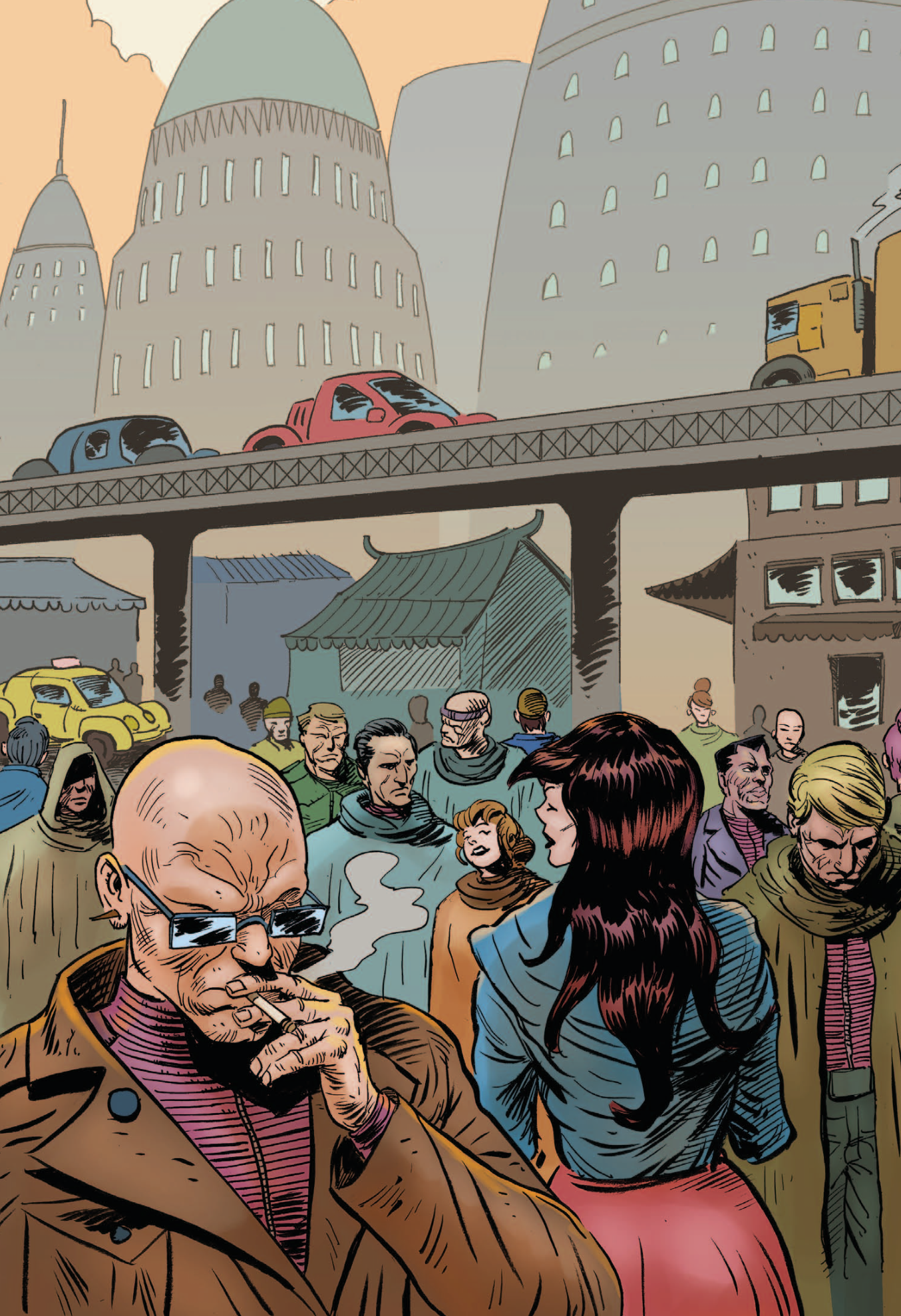
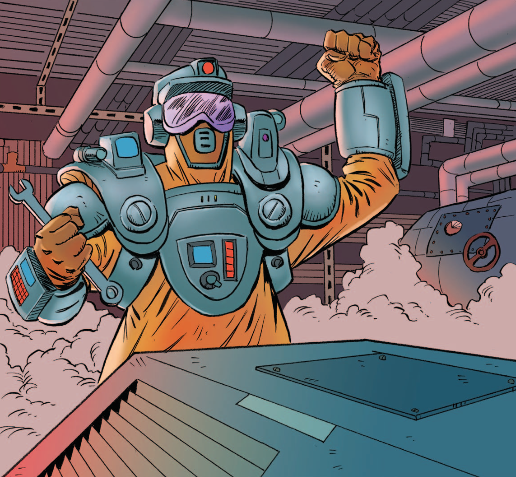
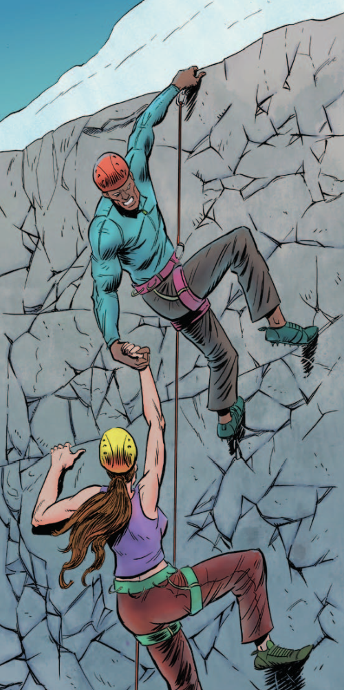
Did we look at the same book? I thought the new art was fantastic. My favorite pieces so far:
Spoiler:
And as for comparing the layout to Lancer, wut? They're both two column lists with sprinkled art. They're the exact same.
Spoiler:
Albertorius wrote: and the 160+ pages of table after table of vehicle stats, seemingly lifted straight from the minis game. That feels soul sucking boring to look at
As opposed to Lancer's 149 pages of table after table of vehicle stats? I'm not saying you're wrong to dislike it or anything like that, but your examination of the individual components feels colored by an overall impression.
I don't think I've seen the inside of a Battletech book in ages, I know that game more from decades of random games and word-of-mouth and quick ref sheets. So no opinion on how it compares there. However, in terms of RPG layout and design I have still never found anything as both readable and usable at the table as the Swordfish Island books by Jacob Hurst & Gabriel Hernandez from 2017
Spoiler:
Lancer leans HARD on comp/con, which sucks at an actual table with a bunch of humans in the same room. It's probably great for online play, which I hate.
2023/10/25 18:00:44
Subject: Re:[Heavy Gear] General Discussion Thread
Albertorius wrote: The layout is very amateurish, most of the new illustrations are... well, competent but not really any good
Did we look at the same book? I thought the new art was fantastic. My favorite pieces so far:
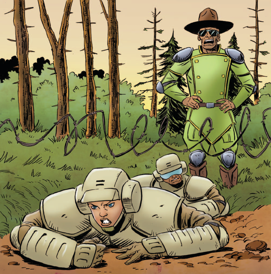
I'm pretty sure we did, and some cool pics does not a good layout make . Those are decent images in and of themselves, but many clash harshly with the old Ghislain's art, which it retains.
Also, you have a lot like these:
Spoiler:
which, to quote myself:
are... well, competent but not really any good
and I stand by it. They're... ok? But these ones clash even more harshly with Ghislain's art, which is still the majority, and makes for a very disjointed art style overall.
Albertorius wrote: and the 160+ pages of table after table of vehicle stats, seemingly lifted straight from the minis game. That feels soul sucking boring to look at
As opposed to Lancer's 149 pages of table after table of vehicle stats? I'm not saying you're wrong to dislike it or anything like that, but your examination of the individual components feels colored by an overall impression.
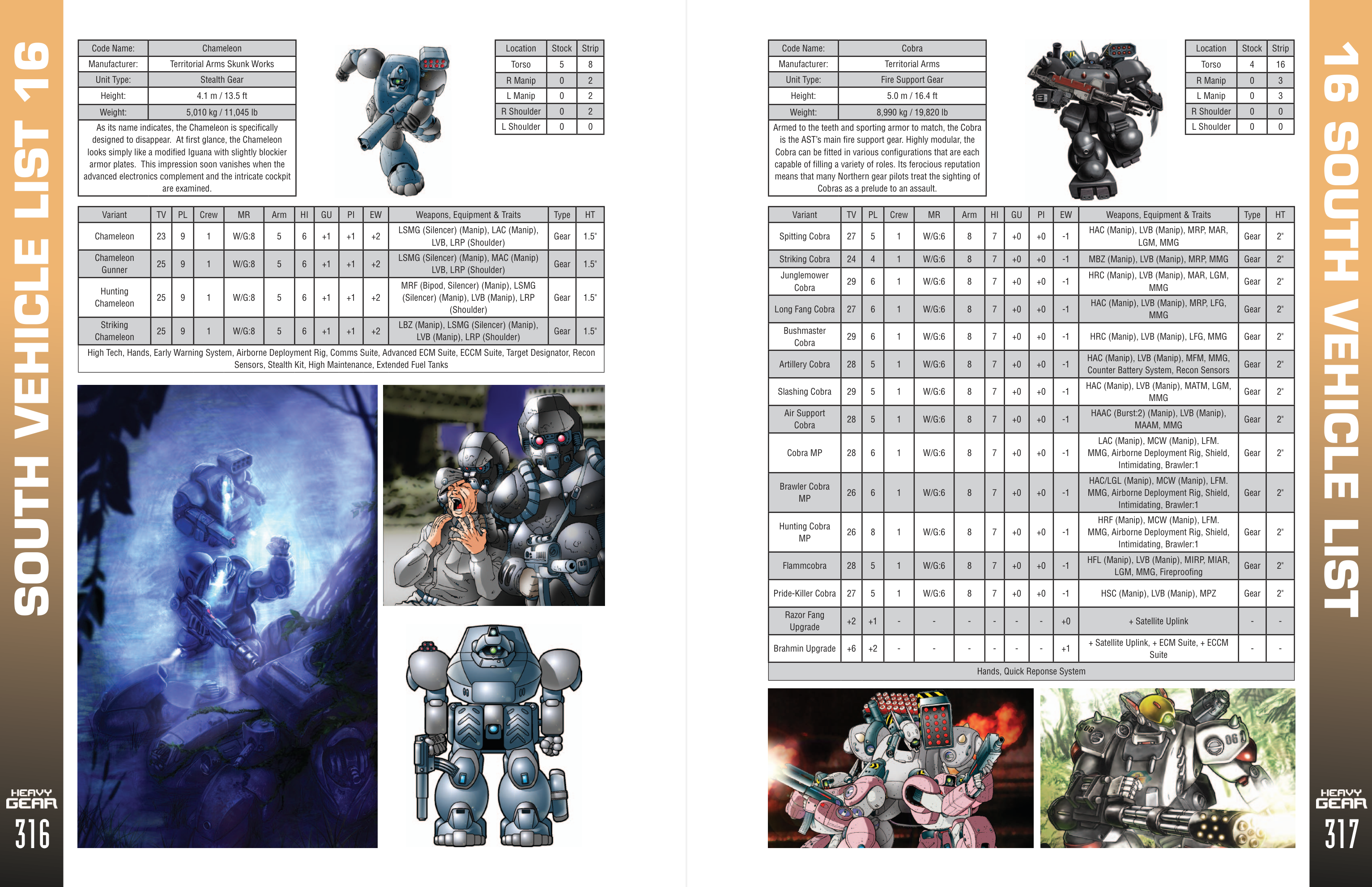
Important difference here? All of those pages are meant for the player, and are for the player, meaning that a) they are not useable as GM opponents, because the game is designed specifically for GM stuff to use GM rules, and 2) they look like this:
(player side)
Spoiler:
(GM side)
Spoiler:
...instead of this (both GM and player side):
Spoiler:
So, not only they're providing information tailored for the target (player or GM), with actually useful information there, clearly color-coded for ease of reference, they also provide with a whole lot more of setting information... instead of being, you know, tables of just stats directly lifted from the wargame that, being as far as I know free already, could just have been referenced as "go check this free book with all the stats".
And as for comparing the layout to Lancer, wut? They're both two column lists with sprinkled art. They're the exact same.
Spoiler:
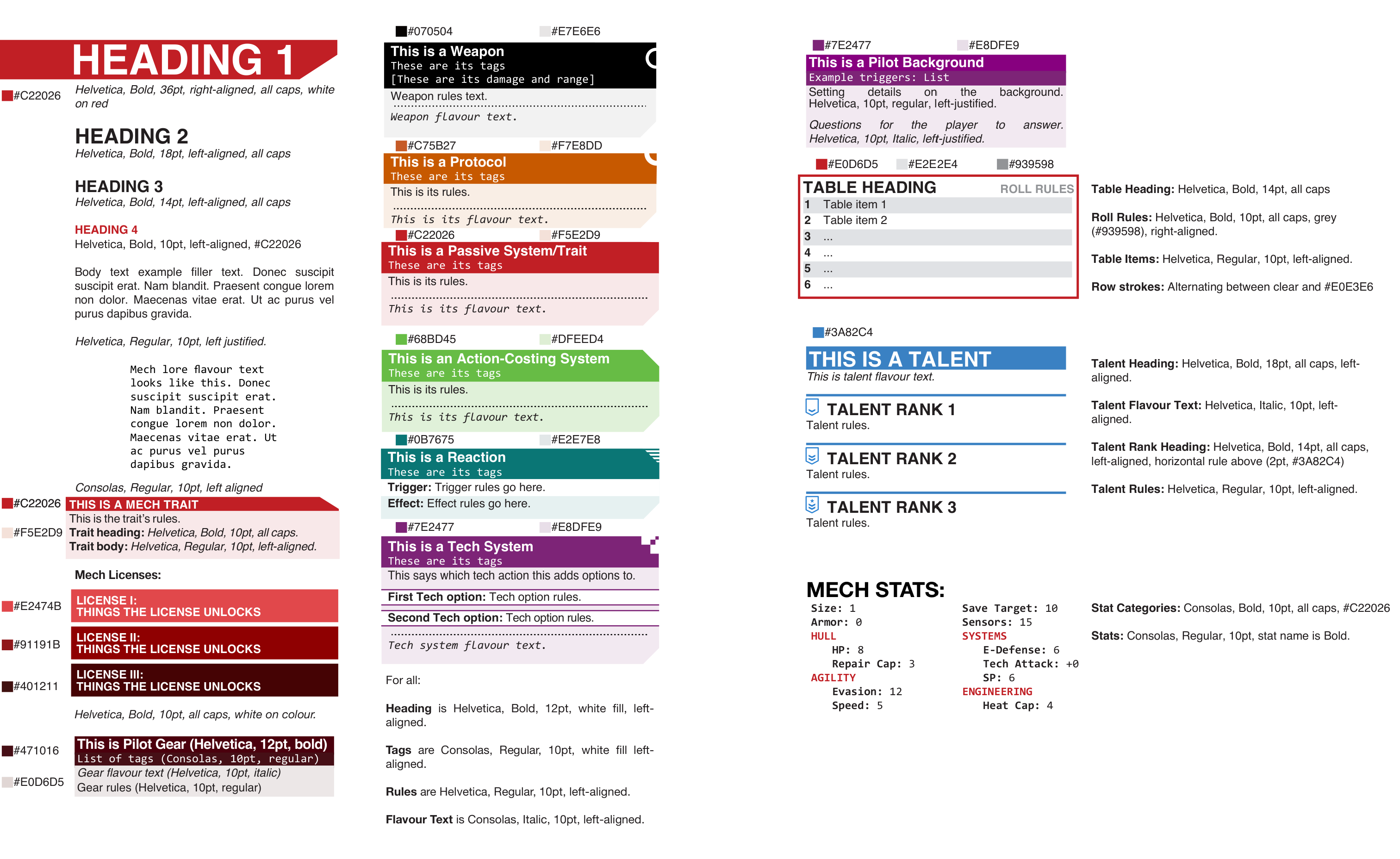
No, sorry, they're absolutely not, and what you've just said is just about the only thing they have in common. Lancer has a very thorough "lay it out for ease of reference" ethos on the book, with stuff like color-coded rules parts, very clearly diferentiated titling and page flow, all the while making sure the pages have whitespace enough so that the text "breathes" and don't make the book lok cluttered, and a strict style guide so that everything is always done the same way and looks the same way, different from all other things:
Spoiler:
I know this because I have actually translated the whole book into spanish and have had to lay it out, using the above style guide.
The one good thing I can say about HG's layout is the chapter colored pages for ease of reference. That's a nice point, slightly devalued by having 17 different chapters ^^.
I don't think I've seen the inside of a Battletech book in ages, I know that game more from decades of random games and word-of-mouth and quick ref sheets. So no opinion on how it compares there. However, in terms of RPG layout and design I have still never found anything as both readable and usable at the table as the Swordfish Island books by Jacob Hurst & Gabriel Hernandez from 2017
Spoiler:
Lancer leans HARD on comp/con, which sucks at an actual table with a bunch of humans in the same room. It's probably great for online play, which I hate.
Can't say that I have seen those books, so I have nothing to say about them one way or another ^^.
Comp/con is pretty nice, yes, and we (I) actually use it to run combats on the table (I don't play online but I've been GMing a live campaign for a year and a half now), and it's a great help... but the book is absolutely a godsend to reference information in game, and I'd have no problems not using it (I mostly keep track of damage and the like, the rest is as easily referencable in the book as on comp/con)
This message was edited 1 time. Last update was at 2023/10/25 18:08:28
Let's leave it at two layers of spaghetti posting, but I'm up to talk more.
Color doesn't inherently make anything easier to use, and the amount in Lancer I think actually detracts from its usability. Far too noisy. The different GM and player views are a system choice, which yeah, these two games are very differently designed. There's no good reason HG should have a different entry for the GM than the player. The reason it has the list of units instead of just saying "go buy use a PDF or buy another book" is because it's meant to be a single volume reference.
And the vast majority of the Lancer rules are absolutely 2 column basic ass text, which you should know.
I detest any electronics at the table, I find they ruin the whole roleplaying experience one and all. I have not run Lancer, but I played in a couple games without CompCon, and was not very impressed with it.
HudsonD wrote:You know the ironic thing there ?
DP9's HG layout was excellent when it was first released, and quite above what people were used to at the time.
Still is! Readability is fantastic in the 2nd edition books:
Spoiler:
They're also really stylish, and have a really good, coherent overall look. I think the B/W actually helps the book.
IMHO, the new book is some steps down from that, which makes sense on the whole, as I understand they have lost all their old institutional knowledge (the colored page ends for ease of finding the chapter in the new book are a nice addition, though):
Spoiler:
slyphic wrote:Let's leave it at two layers of spaghetti posting, but I'm up to talk more.
Color doesn't inherently make anything easier to use, and the amount in Lancer I think actually detracts from its usability. Far too noisy. The different GM and player views are a system choice, which yeah, these two games are very differently designed. There's no good reason HG should have a different entry for the GM than the player. The reason it has the list of units instead of just saying "go buy use a PDF or buy another book" is because it's meant to be a single volume reference.
And the vast majority of the Lancer rules are absolutely 2 column basic ass text, which you should know.
I detest any electronics at the table, I find they ruin the whole roleplaying experience one and all. I have not run Lancer, but I played in a couple games without CompCon, and was not very impressed with it.
Colors, well used, absolutely help with readability for most people. Colors, used consistently, very much more so.
There's no good reason for HG to have separate player and GM entries because the game has decided it so... but there's also no need whatsoever to have all the vehicles of the game in the corebook, including full on landships or stratospheric bombers either. Lack of vehicles in the core book was not any kind of problem with HG, with just the five basic polar models. We did have the VCS, though, which meant it was infinitely more versatile. And as far as I understand, those stats are in the free wargame rules anyway, are they not?
Half the Lancer book is 2 columns "basic ass" text... the difference is how it uses it, and how much of the page leaves free, and the spacing, and the actual differentiation between text sections. As I should know.
I'd say the manage to use those 2 basic ass text columns to give an airier, easier to read spread, without too much text per page, with enough white space, without the need to cram multiple images per page spread and with better defined sections:
Spoiler:
I hae GMed Lancer with and without comp/con, and it runs perfectly well in both cases, each combat a little puzzle that the players have to beat.
This message was edited 5 times. Last update was at 2023/10/25 19:00:27
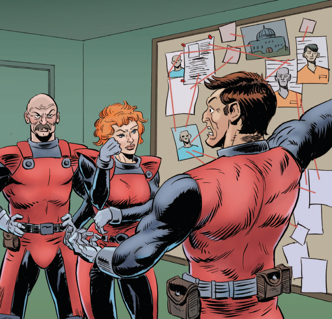
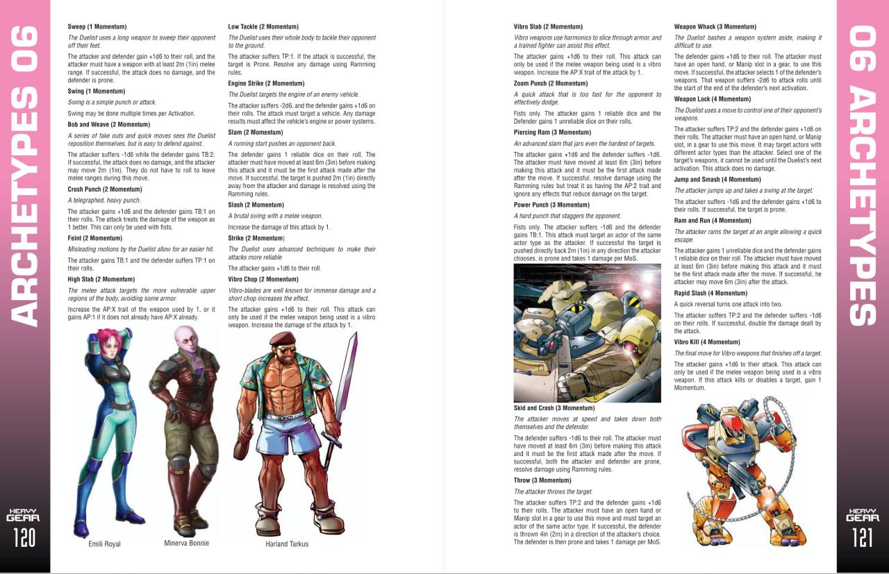
It's not like the new art is bad, some of it is actually quite good, the mixing of styles on a single section is quite jarring however, as seen on pages 120-121.
There's no question the 2023 layout is pretty basic compared to original HG.
HudsonD wrote: It's not like the new art is bad, some of it is actually quite good, the mixing of styles on a single section is quite jarring however, as seen on pages 120-121.
There's no question the 2023 layout is pretty basic compared to original HG.
Five separate images and three different drawing styles on that spread ^^
2023/10/25 19:10:01
Subject: Re:[Heavy Gear] General Discussion Thread
The 2e book is a better layout for sure. Excellent books. They understood the benefit of a restrained use of color.
The vehicle entries are not 1:1 copies from the wargame. They share many stats, but they are not the same. Different levels of abstraction.
Spoiler:
I don't know how else to say it, but lancer and the 4e book, the actual sections explaining rules, the minor differences in textual layout I'm not finding impactful at all. They have more commonality than differences.
2023/10/25 19:12:02
Subject: Re:[Heavy Gear] General Discussion Thread
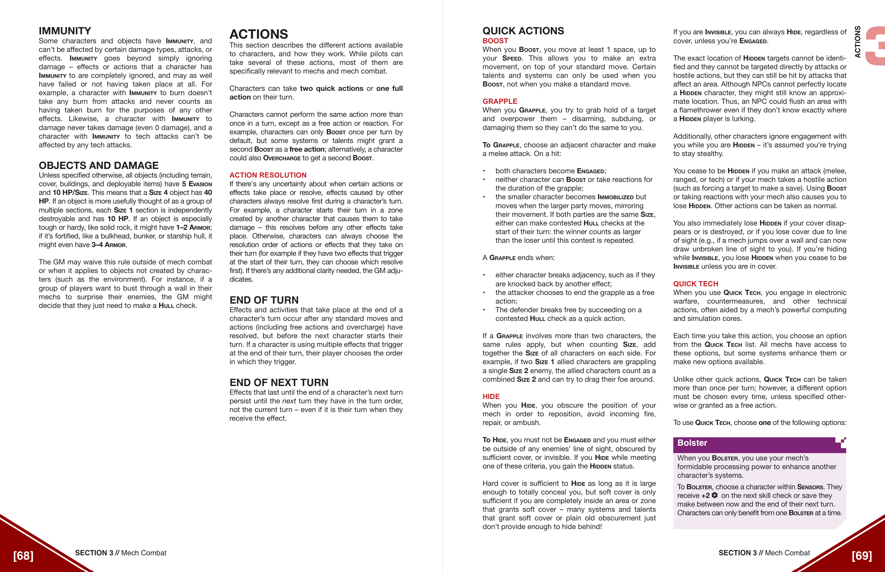
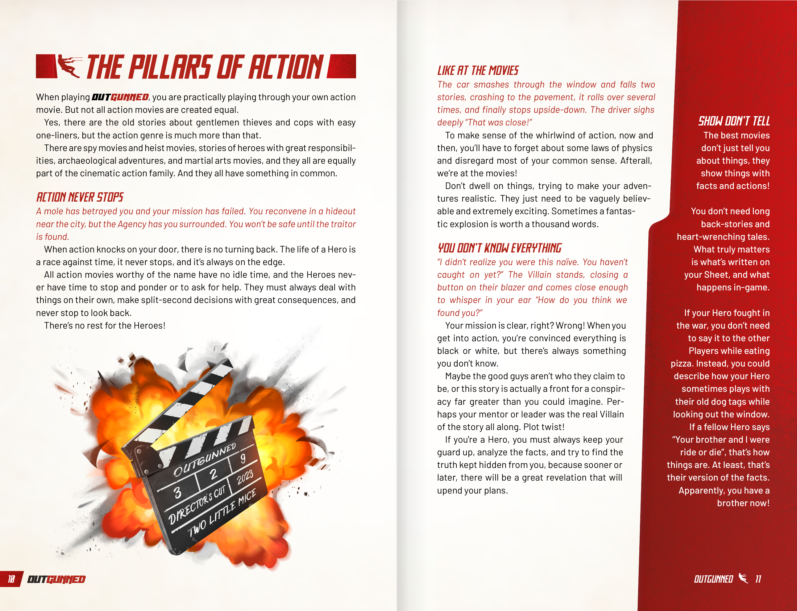
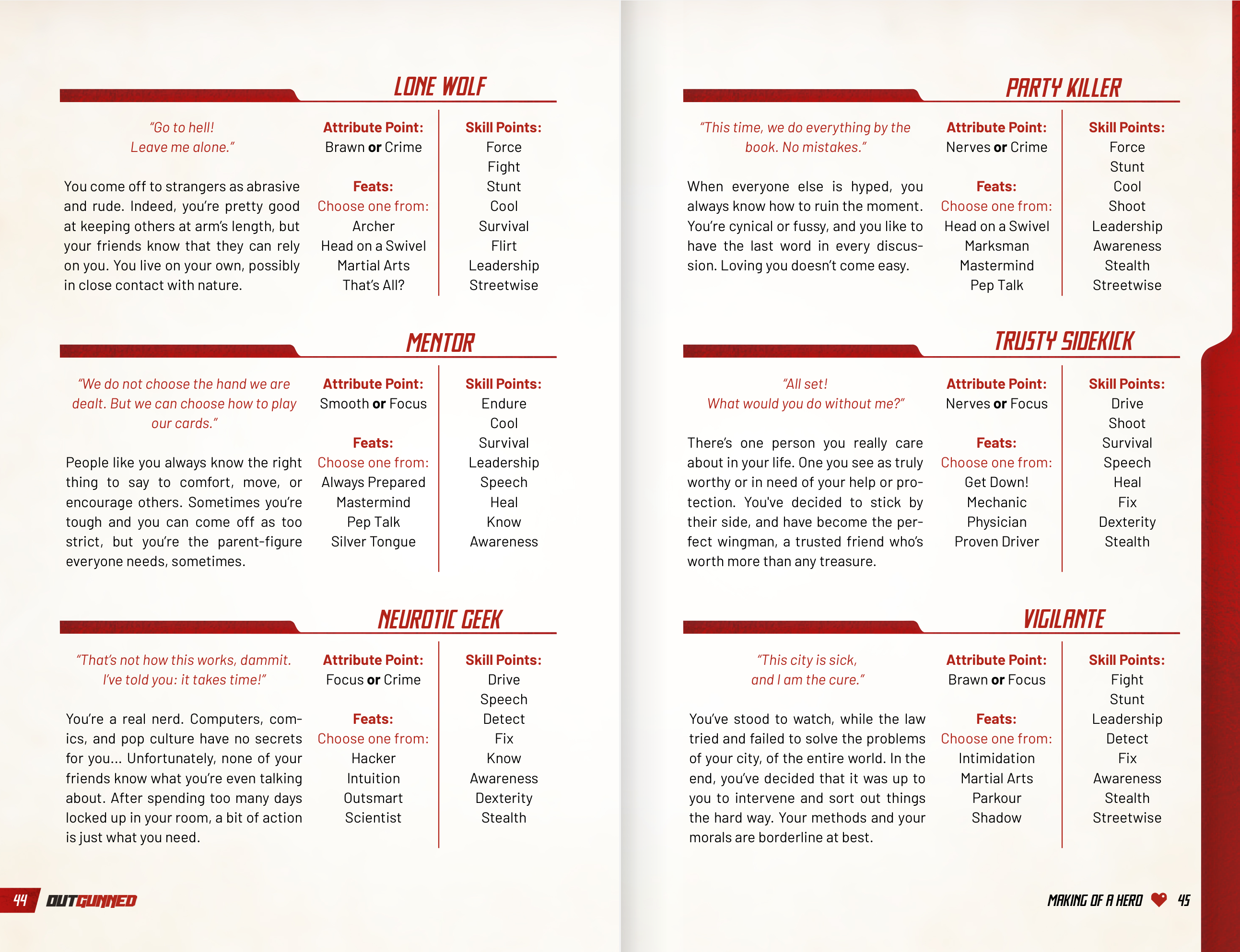
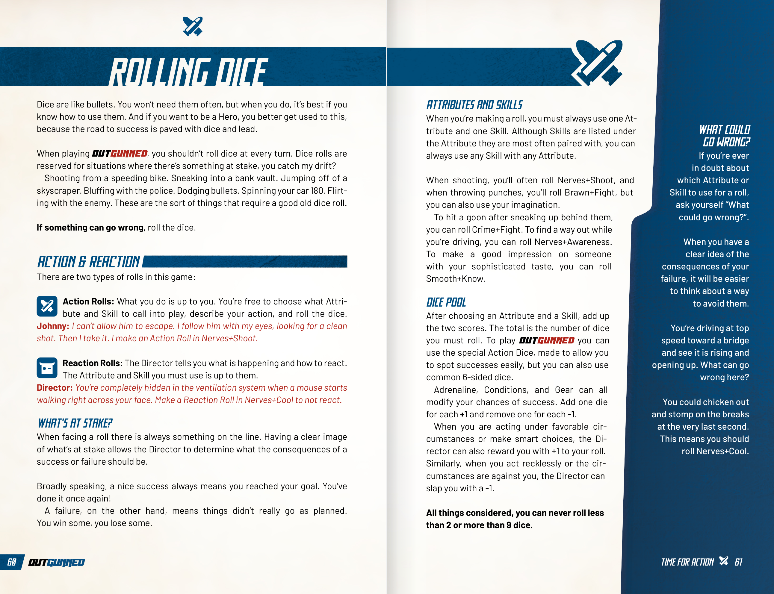
The other book I've been reading/doing layout on this week has been the Outgunned RPG corebook, from the small italian company Two Little Mice, and it's glorious, and single column, and small format:
slyphic wrote: The 2e book is a better layout for sure. Excellent books. They understood the benefit of a restrained use of color.
The vehicle entries are not 1:1 copies from the wargame. They share many stats, but they are not the same. Different levels of abstraction.
[spoiler]
I don't know how else to say it, but lancer and the 4e book, the actual sections explaining rules, the minor differences in textual layout I'm not finding impactful at all. They have more commonality than differences.
I agree to disagree on that, as to me they look absolutely like night and day. I find them greatly impactful for reading comprehension and for being able to read it without getting tired.
As to the stats, it mostly looks like the RPG books have the stats without the pilot baked in, except for the HI (RPG) H/S (wargame)
I still think that having all the vehicles of the whole franchise in the corebook is very, VERY overkill.
EDIT: Sorry, I answered before you edited... I'm gonna spoiler my original answer.
Yeah, I love small format books, Not only they are really convenient and impose some heavy limits on how you can do stuff (which actually is good for creativity) but they also look great on tablets and the like.
This message was edited 3 times. Last update was at 2023/10/25 19:18:36
slyphic wrote: Strips out the 'average pilot' that's used in HGB and gives variables for controls, adds traits that don't appear at the HGB level, incorporates hardpoints for customization.
I don't understand how you can complain about 150 pages in a 480 page book covering all the vehicles is a problem while holding up 150 pages of a 430 page book that has all the units in it as a counterexample.
I guess because those are 1) much less dense in text, 2) have setting info blurbs for all the thingamabobs they add and 3) are player focused rules of things the players are supposed to use by default, instead of every vehicle under the sun like landships or attack helicopters.
In essence, those pages are player material, look good, have gorgeous illustrations, are easy to reference during a game and are exclusively for the players to waddle through, while the HG vehicles are mostly GM material, much harder on the eyes, and almost devoid of setting information.
Gah xD. Let's agree to disagree and that's that ^^
This message was edited 1 time. Last update was at 2023/10/25 19:27:10
2023/10/25 21:48:27
Subject: Re:[Heavy Gear] General Discussion Thread
slyphic wrote:Did we look at the same book? I thought the new art was fantastic. My favorite pieces so far:
Spoiler:
I'm a little late to the discussion but here it goes anyways. Insert "Beauty is in the eye/Art is subjective" disclaimers here. That said, I think the second one is actually decent whereas the tactical booty diorama not so much.
Albertorius wrote:I'm pretty sure we did, and some cool pics does not a good layout make . Those are decent images in and of themselves, but many clash harshly with the old Ghislain's art, which it retains.
Also, you have a lot like these:
Spoiler:
Oof. That reminds me of low budget indie midling quality comic art. I've seen people comment negatively on Ghislain's art in modern times and I don't think I'm able to judge it without my nostalgia bias but the simplicity he sometimes showed in certain images was much better than in those and it had the massive benefit of being cohesive throughout the books.
Automatically Appended Next Post:
Albertorius wrote: The other book I've been reading/doing layout on this week has been the Outgunned RPG corebook, from the small italian company Two Little Mice, and it's glorious, and single column, and small format:
Spoiler:
For me, that's great for a modern rules light layout rpg though I wouldn't prefer it for something in the more moderately crunchy tier of RPGs. I wouldn't expect it to win any awards (assuming there is such a thing in the Ennies or somesuch) though but it is perfectly serviceable and easy on the eyes. One of many things that indicated to me that I'm old now is when I looked at Mork Borg and almost got a headache trying to follow along with the minimal rules/text, lol. Easy on the eyes is important to me now!
This message was edited 2 times. Last update was at 2023/10/25 21:52:36
I only got into HG over the last six years or so. No nostalgia here. I have come to really love Ghislain Barbe’s art, but for me it was an acquired taste.
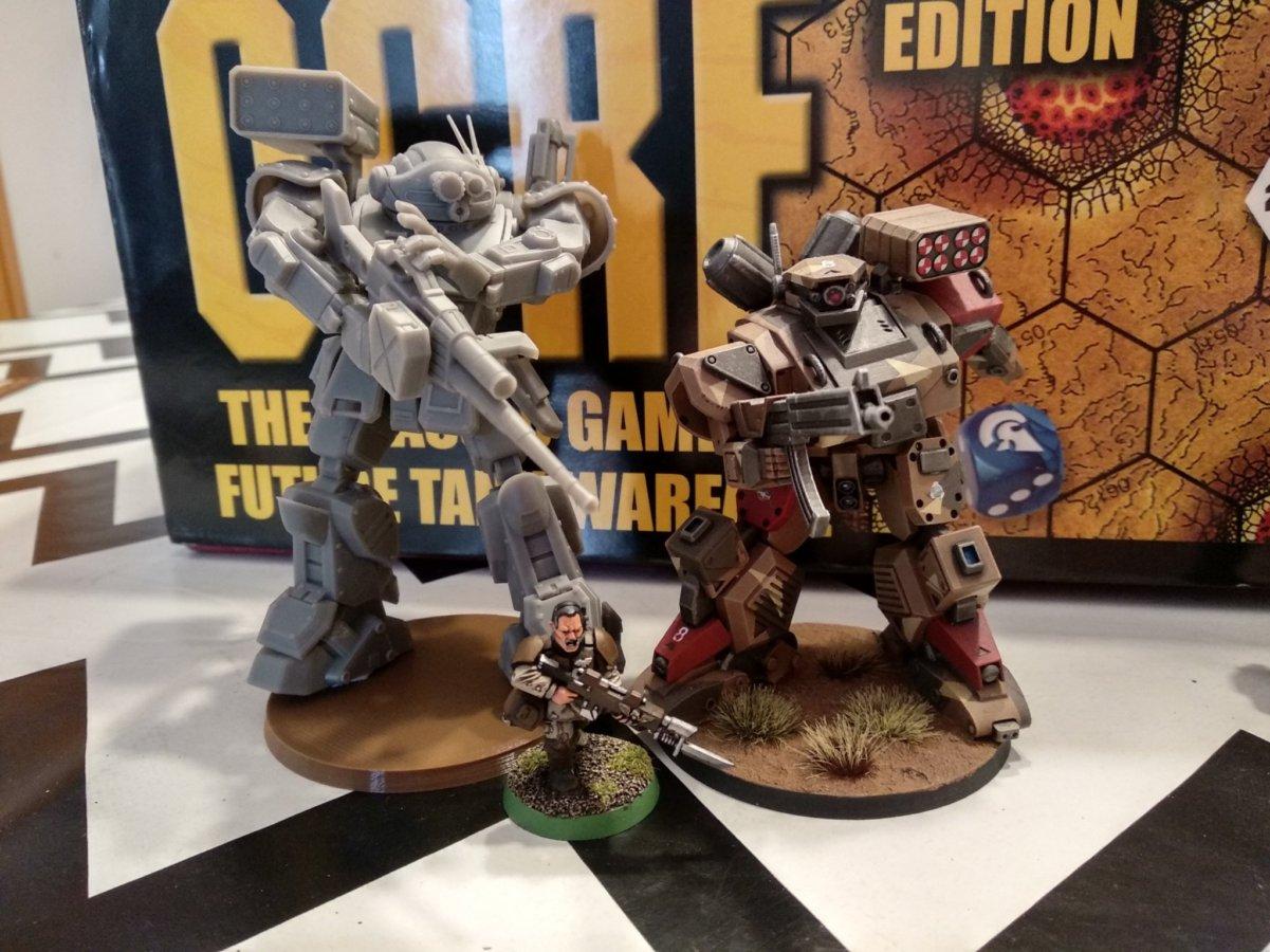
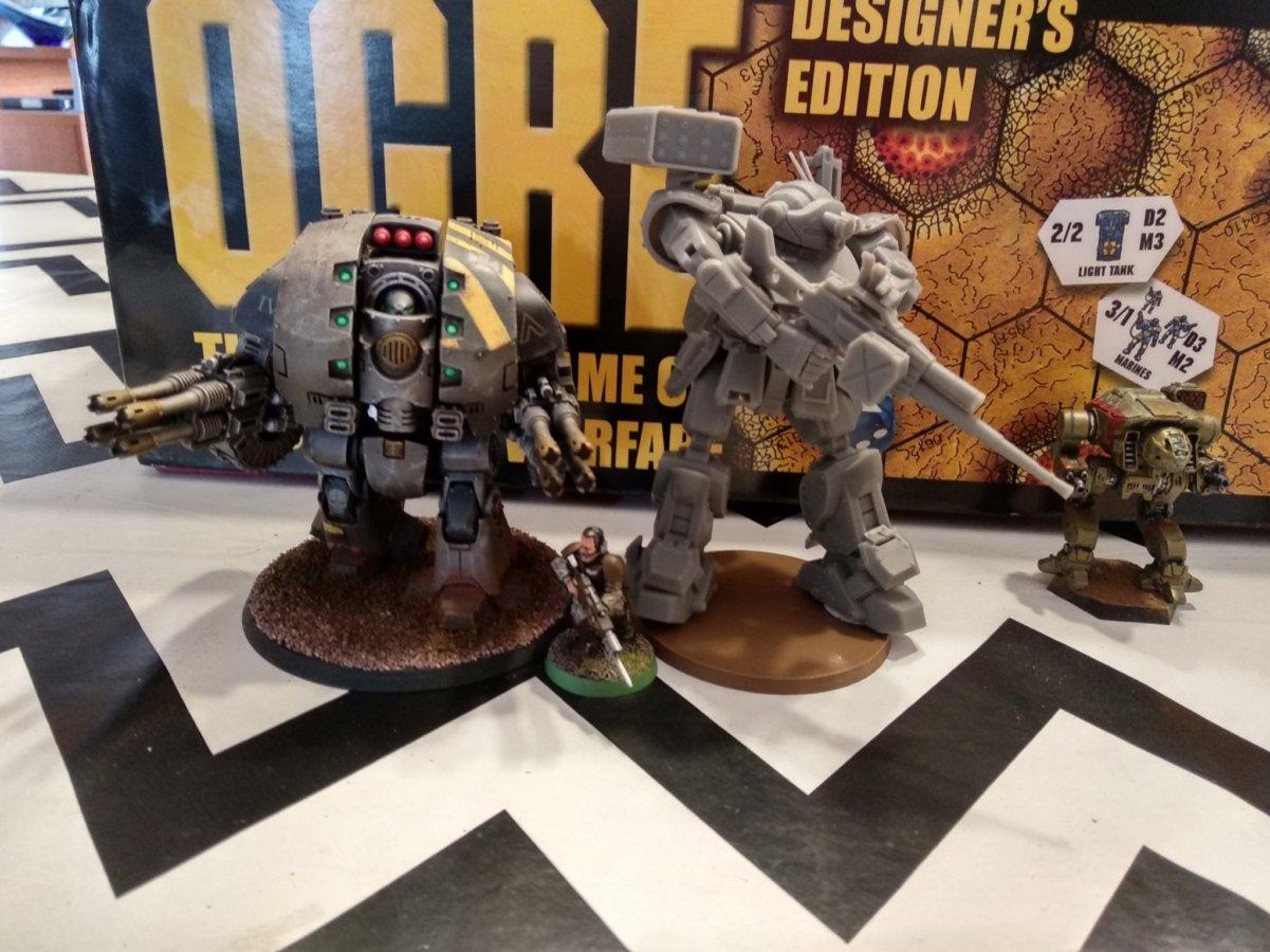
Golden Gear submission deadline pushed back to November 30th. Saw that post about 4 hours after I submitted the third attempt to make my minis not look like gak for it. Turns out, giving my incompetent self a better camera and lighting conditions doesn't make a huge difference, but still a noticeable one. I threw in for all four categories, actually had valid models for each from the last year, but I only think I have any kind of shot in Group and Custom.
Realistically, if I had waited a day and saw the deadline push, I would have done the exact same thing but later producing the same inept photos, but I can't shake the feeling I messed it up.


 Of course, the caveat is that only about two years separated them and that was part of the problem so...


 . Those are decent images in and of themselves, but many clash harshly with the old Ghislain's art, which it retains.