Well, queen_annes_revenge sums it up pretty well, so I'll do it by colour:
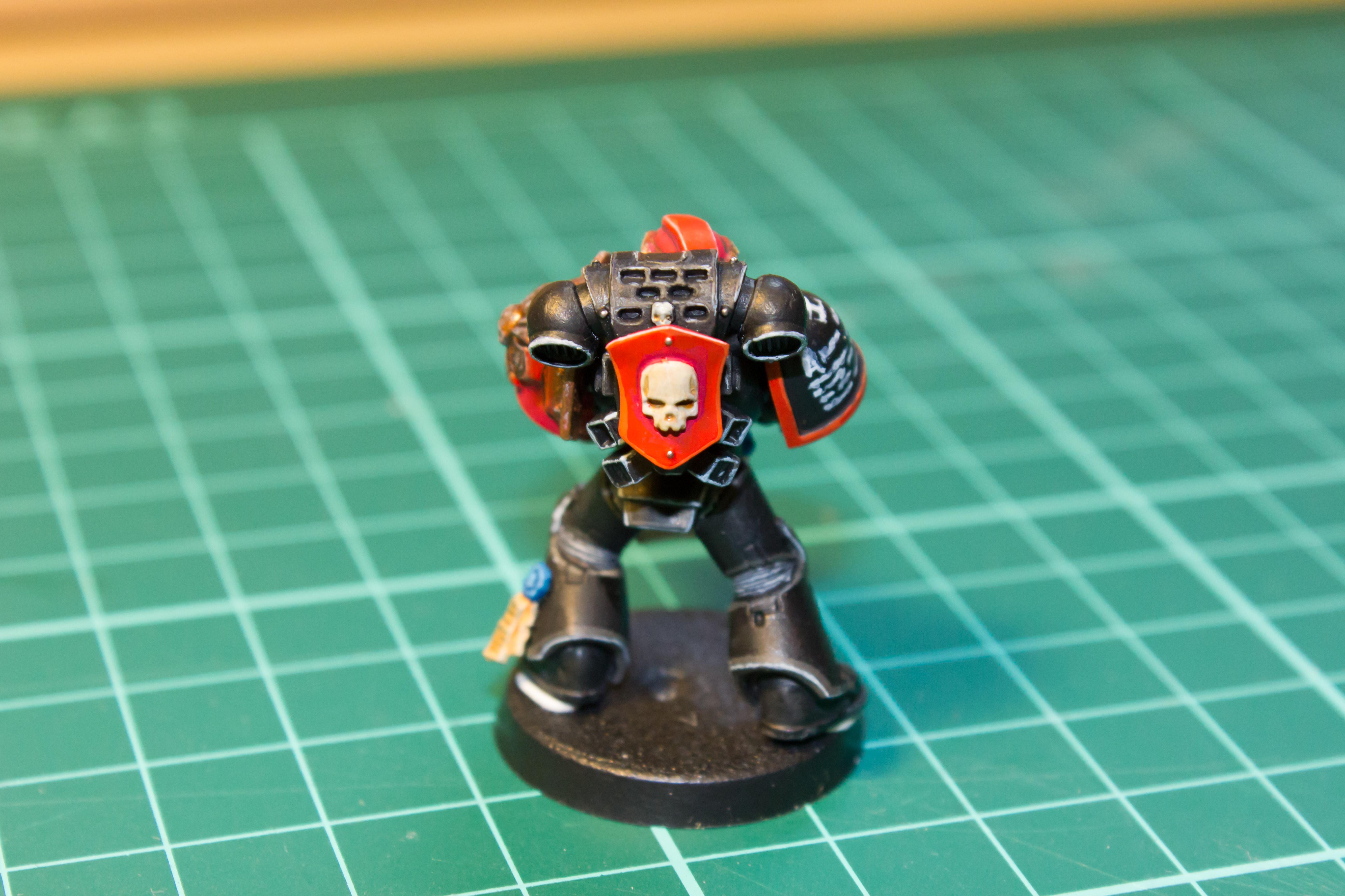
Red - Your red is fantastic! From what I can see it appears very smooth, with just the right amount of highlighting and a solid body of colour.
IMHO - everyone can always do better, but if I were you I'd be perfectly happy with that red and focus my attentions elsewhere.
Bronze - For me, this is the major detractor to the model (It's by no means a bad model, this is just the bit that limits you the most if you get my meaning). For my tastes, it's lacking definition around the raised areas. It appears you have applied highlights, but perhaps further, more defined highlights and shading could be applied. I'd recommend a quick wash with Agrax Earthshade and highlighting it up towards Runefang Steel (Old Range: Milthril Silver).
Bone - I presume the Eagle and skull on the Chest-plate are bone and if so, again that's an area which you've hit spot on - I can't think of anything to point out on that part.

White - The White on the bolter looks great! Like the red, it's very smooth and you've got good coverage - something that most people, including me, struggle with immensely. I do agree with queen_annes_revenge in saying that the white text on the pauldron could do with being thinner - but I suppose that's personal preference.
Highlights - I didn't mention Black as it falls into this. I think, the best way in which you could improve upon this model is simply to keep practicing your highlights. Again, this is simply my opinion (Feel free to disregard it), but as you practice your highlights, you'll get a feel for thinning the lines down and possibly applying more than two shades of highlight to blend things together. I really feel that if you just make those highlights a tad thinner - then it'l go from a good to a great in no time at all.
To sum it all up - your model looks really good as it is, but work on those highlights will vastly increase the quality of the job. Good work - keep it up! (Oh, and welcome back to the hobby

)


 otherwise,
 Heresy World Eaters/Emperors Children