| Author |
Message |
 |
|
|
|
|
Advert
|
Forum adverts like this one are shown to any user who is not logged in. Join us by filling out a tiny 3 field form and you will get your own, free, dakka user account which gives a good range of benefits to you:
- No adverts like this in the forums anymore.
- Times and dates in your local timezone.
- Full tracking of what you have read so you can skip to your first unread post, easily see what has changed since you last logged in, and easily see what is new at a glance.
- Email notifications for threads you want to watch closely.
- Being a part of the oldest wargaming community on the net.
If you are already a member then feel free to login now. |
|
 |
2015/06/26 01:38:02
Subject: Re:The quality, beauty, grimdark, terror and epicness of 7th edition artwork, all in one picture.
|
|

Longtime Dakkanaut
|
number9dream wrote:
The Harlequin codex had some good pieces in it... but ye, overall flipping through these new dexes makes me miss the black and white days >_<
Yes it varies from codex to codex, I think Necrons had the worst offenders for me and Dark Eldar was mostly ok, though every book seems to get at least one or two cartoonish, characterless and mediocore pictures.
For a new art, that one was good imo:
http://www.belloflostsouls.net/wp-content/uploads/2015/03/p.txt-31.jpeg
|
From the initial Age of Sigmar news thread, when its "feature" list was first confirmed:
Kid_Kyoto wrote:
It's like a train wreck. But one made from two circus trains colliding.
A collosal, terrible, flaming, hysterical train wreck with burning clowns running around spraying it with seltzer bottles while ring masters cry out how everything is fine and we should all come in while the dancing elephants lurch around leaving trails of blood behind them.
How could I look away?
|
|
|
 |
|
2015/06/26 02:06:27
Subject: Re:The quality, beauty, grimdark, terror and epicness of 7th edition artwork, all in one picture.
|
|

Bonkers Buggy Driver with Rockets
|
 Asmodai Asmodean wrote: Asmodai Asmodean wrote:What reaaaaaaaaaaaalllllllyy bothers me about 7th edition art is how every piece of artwork has to a) Be of the models GW is selling and b) be in the official colour scheme from 'Eavy Metal.
The Mechanicus codex is a particularly serious offender in this regard. Because the codex has only five units (Kataphron, Dominus, Electro-Priest, Baymax and Datasmith) they're repeated in every. single. piece. of. art. The Kastellans in particular are jarring as they don't fit the aesthetic at al. The Cult mech codex should have been full of weird, Blanchian monstrosities- all artwork to date has
portrayed the Mech as singularly contemptuous of repetition in their war-creations, instead we're bludgeoned with essentially ads for the GW kits. It's no longer art, it's advertistment.
The art should inspire and suggest and hint, like in 2nd and 3rd and 4th and 5th. Post-Chapterhouse, it just annoys.
Don't get me started on the horrible art in the new DA...
I agree. The photos of models show me what those troops look like. The point of the art is to capture the portion of the setting that is not represented by the models. Help us imagine the other beings, places and characters that populate this universe. Draw us in to the depths of the setting without revealing everything as models or rules. Let us know the setting is wider than we can imagine and inspire us to convert our own models and armies based on the art.
|
|
|
|
|
|
2015/06/26 02:36:57
Subject: Re:The quality, beauty, grimdark, terror and epicness of 7th edition artwork, all in one picture.
|
|
Regular Dakkanaut
|
So flat and soulless. That describes 7th edition and the artwork for sure .
|
While they are singing "what a friend we have in the greater good", we are bringing the pain! |
|
|
|
|
2015/06/26 03:34:12
Subject: Re:The quality, beauty, grimdark, terror and epicness of 7th edition artwork, all in one picture.
|
|
Imperial Guard Landspeeder Pilot
On moon miranda.
|
most newer 40k art, even going back to 5E, just doesn't quite match the same feel most of the older stuff had. Be it RT/2E's very 80's heavy metal feel, or 3E/4E's oppressive darkness, the newer stuff, really starting about in 5E, really feels a whole lot less immersive.I mean, even the 4E Tau codex managed to have an air of Grimdark about it (with the very post-apocalyptic Admech stuff, pictures of Tau civilians fleeing under cover of airdropping Firecast, etc)
From a technical level, most of it's great, but just doesn't capture the same level of atmosphere, and often really feels increasingly appropriate to something like League of Legends or World of Warcraft.
|
IRON WITHIN, IRON WITHOUT.
New Heavy Gear Log! Also...Grey Knights!
The correct pronunciation is Imperial Guard and Stormtroopers, "Astra Militarum" and "Tempestus Scions" are something you'll find at Hogwarts. |
|
|
|
|
2015/06/26 04:22:49
Subject: The quality, beauty, grimdark, terror and epicness of 7th edition artwork, all in one picture.
|
|
Ork-Hunting Inquisitorial Xenokiller
Strike Cruiser Vladislav Volkov
|
Hmm. I'm a fan of the style of the new art in the SM codex, but I do have to agree with you on that point. Not all art needs to be of official buildable kits you can purchase from the GW webstore.
|
|
|
|
|
|
2015/06/26 05:05:00
Subject: The quality, beauty, grimdark, terror and epicness of 7th edition artwork, all in one picture.
|
|

Growlin' Guntrukk Driver with Killacannon
|
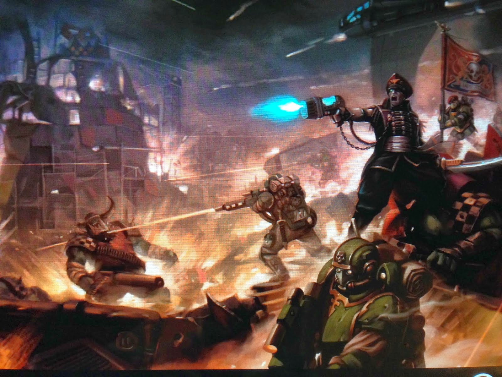
While 6th edition was probably my least favorite iteration of wh40k so far, the artwork on the rulebook and some of the codex covers has yet to be matched. Well, it has been matched, sort of, by 7th edition, which recycled most of it 
7th is, IMHO, the weakest edition of all in terms of art. Art style has moved from evocative to merely representative. GW now employs mostly freelance artists for 40k (I guess the efforts of their own art department have been focused on Age of Sigmar for a while now) and, while some of the newbloods are certainly very talented, they don't have as much creative freedom as GW's own artists, and it shows.
|

War does not determine who is right - only who is left. |
|
|
|
|
2015/06/26 05:15:24
Subject: Re:The quality, beauty, grimdark, terror and epicness of 7th edition artwork, all in one picture.
|
|
Hellish Haemonculus
|
Plumbumbarum wrote:number9dream wrote:
The Harlequin codex had some good pieces in it... but ye, overall flipping through these new dexes makes me miss the black and white days >_<
Yes it varies from codex to codex, I think Necrons had the worst offenders for me and Dark Eldar was mostly ok, though every book seems to get at least one or two cartoonish, characterless and mediocore pictures.
For a new art, that one was good imo:
http://www.belloflostsouls.net/wp-content/uploads/2015/03/p.txt-31.jpeg
The new Dark Eldar book was garbage for art work. The Covens supplement had some truly dynamit pieces, but far too few for my taste.
|
|
|
|
|
|
2015/06/26 06:06:36
Subject: Re:The quality, beauty, grimdark, terror and epicness of 7th edition artwork, all in one picture.
|
|
Hardened Veteran Guardsman
Salt Lake City
|
|
|
|
|
|
2015/06/26 06:16:34
Subject: The quality, beauty, grimdark, terror and epicness of 7th edition artwork, all in one picture.
|
|
Freelance Soldier
|
Brought to you by John Woo.
|
|
|
|
|
2015/06/26 06:27:52
Subject: The quality, beauty, grimdark, terror and epicness of 7th edition artwork, all in one picture.
|
|
Imperial Guard Landspeeder Pilot
On moon miranda.
|
I don't even think that's new, is that from an actual GW publication or fan-art (or from FFG)? That's the pre-5E codex Necron Wraith, which certainly wouldn't appear in newer GW art.
|
IRON WITHIN, IRON WITHOUT.
New Heavy Gear Log! Also...Grey Knights!
The correct pronunciation is Imperial Guard and Stormtroopers, "Astra Militarum" and "Tempestus Scions" are something you'll find at Hogwarts. |
|
|
|
|
2015/06/26 06:45:48
Subject: The quality, beauty, grimdark, terror and epicness of 7th edition artwork, all in one picture.
|
|

Angered Reaver Arena Champion
Connah's Quay, North Wales
|
Fan art will always have more free reign to do what they like, but i think this picture captures the Grim-Darkness of being a normal human in 40K.
http://ukitakumuki.deviantart.com/art/Only-War-No-Surrender-399727799
|
|
|
|
|
|
2015/06/26 07:46:21
Subject: The quality, beauty, grimdark, terror and epicness of 7th edition artwork, all in one picture.
|
|

Mysterious Techpriest
|
The biggest problem in all the new art... are the proportions. Wasn't always really perfect, but the new art really, really took a turn for the worse.
Check out this DA Codex "artwork":
Tiny Head Syndrom (4th pic). Also, stretched Plasma Pistol, tiny Chainsword and the forearms look way off.
https://twitter.com/Lady_Atia/status/614059286055022592
That RW Knight in the front looks really unhealthy with that neck (4th pic). Also, why does the background guy not have any legs?!
https://twitter.com/Lady_Atia/status/614060069630668800
They even managed to make a effing DREAD look terrible.
https://twitter.com/Lady_Atia/status/614060455502417920
And the compressed spine syndrome gets ridicolous... The legs are about 150% the size of the rest of the body.
https://twitter.com/Lady_Atia/status/614061333244452864
|
|
This message was edited 3 times. Last update was at 2015/06/26 08:29:55
Data author for Battlescribe
Found a bug? Join, ask, report:
https://discord.gg/pMXqCqWJRE |
|
|
|
|
2015/06/26 08:33:10
Subject: The quality, beauty, grimdark, terror and epicness of 7th edition artwork, all in one picture.
|
|

Servoarm Flailing Magos
|
And they are... not part of the necron faction?
|
|
|
|
|
|
2015/06/26 10:02:11
Subject: The quality, beauty, grimdark, terror and epicness of 7th edition artwork, all in one picture.
|
|
Morphing Obliterator
|
What does that have to do with anything? The defining feature of Wraiths is that they phase through solid matter (hence the in-game 3++), so that bolter round should do absolutely nothing to it.
It's also a cool piece of art, and I'd really like to know where it came from.
|
See, you're trying to use people logic. DM uses Mandelogic, which we've established has 2+2=quack. - Aerethan
Putin.....would make a Vulcan Intelligence officer cry. - Jihadin
AFAIK, there is only one world, and it is the real world. - Iron_Captain
DakkaRank Comment: I sound like a Power Ranger.
TFOL and proud. Also a Forge World Fan.
I should really paint some of my models instead of browsing forums. |
|
|
|
|
2015/06/26 14:09:48
Subject: The quality, beauty, grimdark, terror and epicness of 7th edition artwork, all in one picture.
|
|
Omnipotent Necron Overlord
|
 -Shrike- wrote: -Shrike- wrote:
What does that have to do with anything? The defining feature of Wraiths is that they phase through solid matter (hence the in-game 3++), so that bolter round should do absolutely nothing to it.
It's also a cool piece of art, and I'd really like to know where it came from.
If you can phase through matter - you'd literally be indestructable at all times. A few wraiths could overtake entire planets - since that doesn't actually happen. I think we need to assume that the phasing is temporary and unsustainable - therefore bolts should actually be able to hurt them.
In any case - it would just be a better piece if the SOB didn't look to be gloriously useless - even some sparks flying off it would have been fine. Or even some kind of phase shifting going on. What I see is a solid wraith being shot by explosive bolts with no interaction. It bothers me.
|
If we fail to anticipate the unforeseen or expect the unexpected in a universe of infinite possibilities, we may find ourselves at the mercy of anyone or anything that cannot be programmed, categorized or easily referenced.
- Fox Mulder |
|
|
|
|
2015/06/26 14:13:01
Subject: The quality, beauty, grimdark, terror and epicness of 7th edition artwork, all in one picture.
|
|
Servoarm Flailing Magos
|
-Shrike- wrote:
What does that have to do with anything? The defining feature of Wraiths is that they phase through solid matter (hence the in-game 3++), so that bolter round should do absolutely nothing to it.
It's also a cool piece of art, and I'd really like to know where it came from.
Alright, no need to get sassy. I don't know the Necron fluff, so when all you say is "um, it's a wraith" (and I can sort of hear the "duh!" after that in my mind) it doesn't explain anything. The models I face on the table do not phase. They just sort of stand there, being plastic.
|
|
|
|
|
|
2015/06/26 15:42:02
Subject: Re:The quality, beauty, grimdark, terror and epicness of 7th edition artwork, all in one picture.
|
|

Mutilatin' Mad Dok
|
I think my new favourite is the art on the inside cover of the 6th edition Space Marines codex, where a marine with a powerfist punches a Chaos Marine's head off. The action in that piece is very well done
|
|
|
|
|
2015/06/26 15:47:46
Subject: The quality, beauty, grimdark, terror and epicness of 7th edition artwork, all in one picture.
|
|
Gore-Soaked Lunatic Witchhunter
Seattle
|
On the subject of Wraiths, those green cores in its body and running down its tail are the powercells it uses to do the phase in/out thing. Its Codex entry in 6th noted that this ability was rather voracious when it came to energy-consumption, hence being a flying battery-pack with ginsu knife fingers.
|
It is best to be a pessimist. You are usually right and, when you're wrong, you're pleasantly surprised. |
|
|
|
|
2015/06/26 22:54:30
Subject: Re:The quality, beauty, grimdark, terror and epicness of 7th edition artwork, all in one picture.
|
|
Heroic Senior Officer
|
Personal fav of GW stuff, otherwise I prefer the things FW does.
|
|
This message was edited 1 time. Last update was at 2015/06/26 22:54:54
|
|
|
|
|
2015/06/26 23:07:48
Subject: Re:The quality, beauty, grimdark, terror and epicness of 7th edition artwork, all in one picture.
|
|
Longtime Dakkanaut
|
 Jimsolo wrote: Jimsolo wrote:Plumbumbarum wrote:number9dream wrote:
The Harlequin codex had some good pieces in it... but ye, overall flipping through these new dexes makes me miss the black and white days >_<
Yes it varies from codex to codex, I think Necrons had the worst offenders for me and Dark Eldar was mostly ok, though every book seems to get at least one or two cartoonish, characterless and mediocore pictures.
For a new art, that one was good imo:
http://www.belloflostsouls.net/wp-content/uploads/2015/03/p.txt-31.jpeg
The new Dark Eldar book was garbage for art work. The Covens supplement had some truly dynamit pieces, but far too few for my taste.
Well I meant mostly ok as in nothing jumped at me screaming complete crap, the style was bad and not 40kish and there was a lot of videogamey) cartoonish art in there afair but those were imo a notch above the pic from my opening post or some from the eldar or necron books. Same with Skitarii, I hate the palette but cant pinpoint any obvious offender. In general all of the recent art is worse than older stuff, just some are acceptable or have redeeming qualities and some are really abysmal, especialy in context of 40k.
I liked a few pictures in DE 7th though, I think those were old coloured art like the one with IG and those Dark Eldar crazy dogs (Khymerae? I don't know much about DE tbh).
|
From the initial Age of Sigmar news thread, when its "feature" list was first confirmed:
Kid_Kyoto wrote:
It's like a train wreck. But one made from two circus trains colliding.
A collosal, terrible, flaming, hysterical train wreck with burning clowns running around spraying it with seltzer bottles while ring masters cry out how everything is fine and we should all come in while the dancing elephants lurch around leaving trails of blood behind them.
How could I look away?
|
|
|
|
|
2015/06/26 23:11:04
Subject: The quality, beauty, grimdark, terror and epicness of 7th edition artwork, all in one picture.
|
|
Pulsating Possessed Chaos Marine
|
Wow, those do look terrible. First and second examples are simply atrocious, and the whole picture in the 3rd example... looks wrong. Like everything's badly proportioned, and quite awkward. It would be acceptable from the style GW employed in the late 80s and early 90s, but looks incredibly ridiculous amidst the whole "so serious business" flair they currently stick to.
|
Progress is like a herd of pigs: everybody is interested in the produced benefits, but nobody wants to deal with all the resulting gak.
GW customers deserve every bit of outrageous princing they get. |
|
|
|
|
2015/06/27 06:18:14
Subject: The quality, beauty, grimdark, terror and epicness of 7th edition artwork, all in one picture.
|
|
Hallowed Canoness
|
Vaktathi wrote:I don't even think that's new, is that from an actual GW publication or fan-art (or from FFG)? That's the pre-5E codex Necron Wraith, which certainly wouldn't appear in newer GW art.
If I have not been mislead, its from Shield of Baal.
|
   
"That time I only loaded the cannon with powder. Next time, I will fill it with jewels and diamonds and they will cut you to shrebbons!" - Nogbad the Bad. |
|
|
|
|
2015/06/27 06:22:31
Subject: Re:The quality, beauty, grimdark, terror and epicness of 7th edition artwork, all in one picture.
|
|
Regular Dakkanaut
|
 Jambles wrote: Jambles wrote:I think my new favourite is the art on the inside cover of the 6th edition Space Marines codex, where a marine with a powerfist punches a Chaos Marine's head off. The action in that piece is very well done
Ah, yes
|
|
|
|
|
2015/06/27 06:31:45
Subject: The quality, beauty, grimdark, terror and epicness of 7th edition artwork, all in one picture.
|
|
Imperial Guard Landspeeder Pilot
On moon miranda.
|
 Furyou Miko wrote: Furyou Miko wrote:Vaktathi wrote:I don't even think that's new, is that from an actual GW publication or fan-art (or from FFG)? That's the pre-5E codex Necron Wraith, which certainly wouldn't appear in newer GW art.
If I have not been mislead, its from Shield of Baal.
It's at least got to be older than 2013, it's up on a Bolter and Chainsword thread over there from May of that year, I suspect much older given the pre-2011 Wraith design.
Hrm...
|
IRON WITHIN, IRON WITHOUT.
New Heavy Gear Log! Also...Grey Knights!
The correct pronunciation is Imperial Guard and Stormtroopers, "Astra Militarum" and "Tempestus Scions" are something you'll find at Hogwarts. |
|
|
|
|
2015/06/27 06:45:20
Subject: Re:The quality, beauty, grimdark, terror and epicness of 7th edition artwork, all in one picture.
|
|
Longtime Dakkanaut
|
 Vaktathi wrote: Vaktathi wrote:most newer 40k art, even going back to 5E, just doesn't quite match the same feel most of the older stuff had. Be it RT/2E's very 80's heavy metal feel, or 3E/4E's oppressive darkness, the newer stuff, really starting about in 5E, really feels a whole lot less immersive.I mean, even the 4E Tau codex managed to have an air of Grimdark about it (with the very post-apocalyptic Admech stuff, pictures of Tau civilians fleeing under cover of airdropping Firecast, etc)
From a technical level, most of it's great, but just doesn't capture the same level of atmosphere, and often really feels increasingly appropriate to something like League of Legends or World of Warcraft.
Yes since 3rd the art got progresively more toned down and lost a lot of its style, horror and madness but some of the 7th art is a full nosedive on all fronts, quality grimdark etc just as in thread title. Looking at 6th edition art, I still see mostly beautiful, well crafted and still grimdark just not grimdark enough pictures showing epic battles but looking at 7th I see mostly Iphone game loading screens with vibrant palette showing not really that epic anymore battles.
5th went into let's get real direction which had some merits imo, not my favourite but showing the ott ridiculous universe in a 'realistic' tone worked and had a hard sf vibe to it. Now they seem to be aping Blizzard and LoL indeed, I noticed it first in that blood angels vs nids campaign book, looking at the latter it just screamed starcraft to me. Well at least they were quality pieces, not a trend anymore.
|
From the initial Age of Sigmar news thread, when its "feature" list was first confirmed:
Kid_Kyoto wrote:
It's like a train wreck. But one made from two circus trains colliding.
A collosal, terrible, flaming, hysterical train wreck with burning clowns running around spraying it with seltzer bottles while ring masters cry out how everything is fine and we should all come in while the dancing elephants lurch around leaving trails of blood behind them.
How could I look away?
|
|
|
|
|
2015/06/27 08:28:38
Subject: The quality, beauty, grimdark, terror and epicness of 7th edition artwork, all in one picture.
|
|
Freelance Soldier
|
That's because 7th edition art is by and large outsourced to generic CG artists of wildly variable skill, and they are explicitly commissioned to follow the designs of particular models. Yes, models. Current art has devolved to being 2D representations of 3D simplified representations of 2D concept art.
It used to be the other way around - household artists would let their imagination run wild and explore all the many facets of both universes, and models would be sculpted based on their art work. This is sadly no more, and the continuing deterioration of the art is painful to watch.
There is a number of veteran artists left at GW, but they are apparently overwhelmed by the pace of releases.
|
|
|
|
|
2015/06/27 09:52:19
Subject: The quality, beauty, grimdark, terror and epicness of 7th edition artwork, all in one picture.
|
|

Hallowed Canoness
|
According to DeviantArt, this is some fan-art by… the Lead Concept Artist at Privateer Press .
http://nicholaskay.deviantart.com/art/Massacre-at-Sanctuary-101-316785001?offset=200#comments
|
"Our fantasy settings are grim and dark, but that is not a reflection of who we are or how we feel the real world should be. [...] We will continue to diversify the cast of characters we portray [...] so everyone can find representation and heroes they can relate to. [...] If [you don't feel the same way], you will not be missed"
https://twitter.com/WarComTeam/status/1268665798467432449/photo/1 |
|
|
|
|
2015/06/27 10:09:11
Subject: Re:The quality, beauty, grimdark, terror and epicness of 7th edition artwork, all in one picture.
|
|
Commander of the Mysterious 2nd Legion
|
some of the newer art's not nesscarily bad. it's DIFFERNT but differnt isn't bad.
that said IMHO the khorne bloodtide book's art is just bad. It was bad eneugh to influance my decision to not buy the book
|
Opinions are not facts please don't confuse the two |
|
|
|
|
2015/06/27 11:51:28
Subject: The quality, beauty, grimdark, terror and epicness of 7th edition artwork, all in one picture.
|
|
Hallowed Canoness
|
My favorite recent art :
Sisters looking like badass, fighting until the bitter end, despite completely impossible odds. They continue to shoot even when the ground below them is exploding from whatever that is, I guess some Tyranid organism bursting from underground. Also look at the effect the bolts are having on that drop spore!
That does not seem very different from old-style art, though.
|
"Our fantasy settings are grim and dark, but that is not a reflection of who we are or how we feel the real world should be. [...] We will continue to diversify the cast of characters we portray [...] so everyone can find representation and heroes they can relate to. [...] If [you don't feel the same way], you will not be missed"
https://twitter.com/WarComTeam/status/1268665798467432449/photo/1 |
|
|
|
|
2015/06/27 22:09:56
Subject: The quality, beauty, grimdark, terror and epicness of 7th edition artwork, all in one picture.
|
|
Krazed Killa Kan
|
Yup, the new DA Codex art is way terrible. The best art in the codex is by far the older dioramas and character portraits, like the old Librarian art.
|
Fang, son of Great Fang, the traitor we seek, The laws of the brethren say this: That only the king sees the crown of the gods, And he, the usurper, must die.
Mother earth is pregnant for the third time, for y'all have knocked her up. I have tasted the maggots in the mind of the universe, but I was not offended. For I knew I had to rise above it all, or drown in my own gak. |
|
|
|
|
|
|

 ! Thanks Alex Kolodotschko!

 Member of
  DKoK Blog:
 Have a look, I guarantee you will not see greyer armies, EVER! Now with at least 4 shades of grey