| Author |
Message |
 |
|
|
|
|
Advert
|
Forum adverts like this one are shown to any user who is not logged in. Join us by filling out a tiny 3 field form and you will get your own, free, dakka user account which gives a good range of benefits to you:
- No adverts like this in the forums anymore.
- Times and dates in your local timezone.
- Full tracking of what you have read so you can skip to your first unread post, easily see what has changed since you last logged in, and easily see what is new at a glance.
- Email notifications for threads you want to watch closely.
- Being a part of the oldest wargaming community on the net.
If you are already a member then feel free to login now. |
|
 |
2015/06/29 04:21:13
Subject: How on earth do 'Eavy Metal paint such fine text?
|
|

Fixture of Dakka
|
kb_lock wrote:So how did you do it?
Just super thin brush strokes and a small animal sacrifice?
I think it only works when the animal sacrifice comes first 
|
|
|
 |
|
2015/06/29 04:28:16
Subject: How on earth do 'Eavy Metal paint such fine text?
|
|

Incorporating Wet-Blending
|
That makes so much more sense, will try when I get home!
|
|
|
|
|
2015/06/29 06:01:52
Subject: How on earth do 'Eavy Metal paint such fine text?
|
|
Grizzled Space Wolves Great Wolf
|
kb_lock wrote:So how did you do it? Just super thin brush strokes and a small animal sacrifice?
I find 1 goat or small horse is sufficient for both words. However if you don't have a goat on hand, 1 kitten/rabbit/guinea pig per letter also works. Be sure to dip the handle of your brush in the blood before attempting any double lined text. But aside from that I just used a #1 brush with a good tip and used oil paints rather than acrylics. I tried both a Kolinsky brush and also a synthetic (Delta) brush, in the end I preferred the Delta. Oil paints have several benefits that make them better for this. 1. They take hours to dry. This is usually a negative when it comes to painting miniatures, but for painting fine text it's brilliant. You can spend time getting the consistency just right on your palette, you can spend time forming the tip of the brush to a perfect point, you can do lots of test lines off the model to get it just right and then when you go to paint the model itself, the paint will still flow just as well as it did 5, 10, 15+ minutes ago. You can add drying retarder to acrylics but it's just not as good. 2. They flow a lot better. You can add stuff to acrylics to make them flow better, but they''ll never be as good as oils. Oils just get far more consistent lines for longer because the paint flows off the brush more smoothly. 3. They can be cleaned up with white spirit (make sure the underlying paint is good and dried before you try this!). This is great because if you make a mistake you can just erase it and try again. It also means you can paint the lines longer than you need and just sweep away the excess (this may sound silly, but when you try it you'll find it's very hard to paint a line which is the perfect length the first time, it's easier just to paint an excessively long line and clean off the excess). That's why it boggles my mind if the 'eavy metal guys produced their models with citadel colours. I couldn't even achieve what they did with oils, with acrylics I was miles off (and by miles I mean about 0.05mm ).
|
|
This message was edited 3 times. Last update was at 2015/06/29 06:04:45
|
|
|
|
|
2015/06/29 08:55:57
Subject: How on earth do 'Eavy Metal paint such fine text?
|
|
Fixture of Dakka
|
AllSeeingSkink wrote: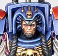 Talys wrote: Talys wrote:I just looked through my pics for comparison.. the double lined text does look nicer now that I look side-by-side again. I will have to try to do it on a model and re-evaluate
Try it on Zael and see how you go I can do the double lined text on spare bits of plastic, but not quite small enough to fit neatly in the box on the actual model.
Challenge Accepted! (grumble grumble grumble) Okay, well, this ain't gonna win no Golden Demon, but at least I didn't totally humiliate myself... 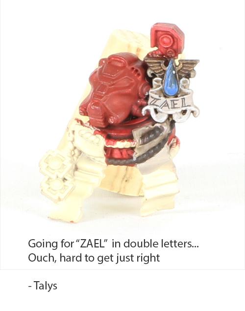 The first try was actually better :\ I thought I could improve it, but of course I'm too lazy to strip the model, so I just painted over it, and it was harder to get nice straight lines when the surface isn't as perfect. The A is slightly gibbled in the center, and the Z is yuck (ARRRGH the original A was perfect and Z was almost perfect, but the L **slightly**... like 1 mm... too far to the right). But all in all, it's not terrible. If I wanted to blow another hours or two, I could strip it, and do it again But I think I'll pass LOL. Edit... dammit, looking at the photo, I want to shorten the top horizontal of the Z. Trying to mess with the center of the A (too much paint on the right side) is a recipe for disaster. BLAH. Anyhow... what I did: 1. Rhinox Hide, diluted with Lahmian Medium. Not THAT much. Just enough to get it so that it barely flows. 2. Raphael 8404 6/0 brush. 3. *** NO WET PALETTE!! 4. Keep brush super clean! 5. I painted all of the HORIZONTAL lines first, to give me a guide (and so that all the letters would be the same height and angle, and spaced correctly). So the top and the bottom of the Z. The top and bottom of the E. The bottom fo the L. 6. I finished the left vertical for the E, went to do two diagonals for the A, and then basically filled everything in. I forgot to mention #3 earlier. Really important! If you use a wet palette, it will start off great. A little while into it, water will wick up, and your nice, perfect consistency paint will go *splotch*. Instead, use a regular palette/piece of plastic/glass/etc. If it gets too dry, ditch it, and make a new puddle. Also, I clean the brush completely, including drying it, every time before going back to the well for paint. A little ball at the tip of the brush will mess things up, and less obviously, if the brush has a little paint on it, it won't hold paint quite the same. The difference is *tiny* but these strokes we're making are like, smaller than 0.3mm so it doesn't take much to jinx it. Oy yes, try to use decisive, clean strokes. Stroke-stroke-stroke for 1 line won't look as nice -- it looks good when the lines are all the same width; it looks really messed up if the lines are inconsistent. Automatically Appended Next Post: AllSeeingSkink wrote:That's why it boggles my mind if the 'eavy metal guys produced their models with citadel colours. I couldn't even achieve what they did with oils, with acrylics I was miles off (and by miles I mean about 0.05mm ).
Other than the primer (Vallejo), I did the above with Citadel paints. The "ZAEL" writing is Rhinox on Rakkarth Flesh with an Agrax wash, and then another layer of Rakkarth on top; the rest of the colors are pretty obvious/boring. I have no experience with oils, except with gigantic brushes on canvas, big stinky turpentine, and blobs of paint
|
|
This message was edited 6 times. Last update was at 2015/06/29 09:14:40
|
|
|
|
|
2015/06/29 09:29:33
Subject: How on earth do 'Eavy Metal paint such fine text?
|
|
Grizzled Space Wolves Great Wolf
|
Nice work. It does look better than mine, though like I said I have no artistic ability so I'm not surprised Maybe I do just need to invest in some new brushes. My Kolinsky is over a year old now and the synthetic I used was just a cheap one I got from the local hobby store. I think you should definitely give oils a crack some time. If you think you can do better, instead of having to strip or paint over it you can just clean them off and try again 
|
|
This message was edited 1 time. Last update was at 2015/06/29 09:30:34
|
|
|
|
|
2015/06/29 09:39:34
Subject: How on earth do 'Eavy Metal paint such fine text?
|
|
Fixture of Dakka
|
Thanks, Skink!
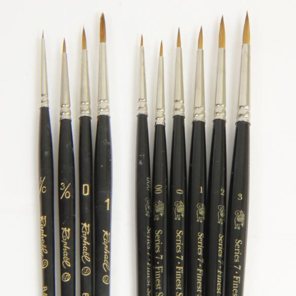
It's the brush on the far left that I used, by the way. I keep 2 of them in my painting tools, one for doing things like metallic highlights and gem dots, and the other for painting eyes and text.
I think it's an invaluable brush to paint the little stuff.. the difference between it and a cheap $3 20/0 or an Army Painter Insane Detail brush is just huge (mostly in how much paint it holds while being such a fine brush). They weren't even that expensive. I think MSRP was about $14 Canadian, and I bought 6 of them with a 30% off coupon at my art store.
When I did the ZAEL text, I was able to get 2 strokes per trip to the well.
|
|
|
|
|
2015/06/29 10:01:36
Subject: How on earth do 'Eavy Metal paint such fine text?
|
|
Grizzled Space Wolves Great Wolf
|
I had another go and got a slightly better result, but still not awesome. I should probably stop because it's good enough that the flaws only really appear under a zoom lens I probably need to repaint the area if I want to have a proper go at it because it's been over a day since my first attempt and I can't completely clean off my first attempt  But the more I play around, I definitely am being limited by the brush. The margin of error is tiny because the brush tapers too broadly. There's also a tiny hook on the tip of the brush which means if I have the orientation wrong, I get a squiggly line. I am still preferring the oils though, I just can't get the acrylics to flow off the brush nicely. Maybe when I'm next at the hobby shop I might pick up another synthetic and see how it goes as well, the one I'm currently using has had a lot of abuse because it's my go-to brush for painting enamels, it's amazing it still holds a tip at all I also had a play with needles again, too hard, the paint doesn't flow off them.
|
|
This message was edited 1 time. Last update was at 2015/06/29 10:02:15
|
|
|
|
|
2015/06/29 10:40:46
Subject: How on earth do 'Eavy Metal paint such fine text?
|
|

Quick-fingered Warlord Moderatus
|
You can also use something like a 0.01 fineliner (Copic runs a good range)
|
Click here for my Swap Shop post - I'm buying stuff!
DR:90-S++G++M+B++I+Pw40kPbfg99#+D++A++/eWDR++T(T)DM+
 Black Legion/Iron Warriors/Night Lords Black Legion/Iron Warriors/Night Lords  Inquisitorial Friends & Co. (Inq, GK, Elysians, Assassins) Inquisitorial Friends & Co. (Inq, GK, Elysians, Assassins)  Elysian Droptroops, soon-to-add Armored Battlegroup Elysian Droptroops, soon-to-add Armored Battlegroup  Adeptus Mechanicus Forge World Lucius Adeptus Mechanicus Forge World Lucius
 |
|
|
|
|
2015/06/29 21:59:57
Subject: How on earth do 'Eavy Metal paint such fine text?
|
|
Fixture of Dakka
|
By the way, I would like to point out that the studio art version has a HORRIBLE gold teardrop to the right of the ZAEL (on the left shoulder pad). What was the guy thinking!!
|
|
|
|
|
2015/06/29 23:40:03
Subject: How on earth do 'Eavy Metal paint such fine text?
|
|

Stern Iron Priest with Thrall Bodyguard
|
he did it on the legs, too, Talys...
those drops are not in settings, so they aren't gems...
at least that is what the logic behind the choice seems to be...
cheers
jah
|
Paint like ya got a pair!
Available for commissions.
|
|
|
|
|
2015/06/30 04:32:50
Subject: How on earth do 'Eavy Metal paint such fine text?
|
|
Grizzled Space Wolves Great Wolf
|
I painted mine gold as well I considered painting it blue the same as the other gems, but then I thought there'd be too much blue vs red contrast where I only wanted blue for a spot colour here and there.
|
|
|
|
|
2015/06/30 05:29:11
Subject: How on earth do 'Eavy Metal paint such fine text?
|
|
Fixture of Dakka
|
 jah-joshua wrote: jah-joshua wrote:he did it on the legs, too, Talys... those drops are not in settings, so they aren't gems... at least that is what the logic behind the choice seems to be... cheers jah
I don't think I have an issue with it being gold, actually. Just THE gold that is used on the shoulder. Maybe it's just the photography, but it looks like a noob-ish gold paintjob -- at least, compared to the awesomeness that is his writing! THe gold drop near the scroll on his left leg, for instance, looks really smooth, in comparison. I do a lot of my blood angels with the inset drops with gold too (basically the ones that are not in settings). Sometimes it's just that I'm tired of painting endless gems
|
|
This message was edited 1 time. Last update was at 2015/06/30 05:30:32
|
|
|
|
|
2015/06/30 05:56:01
Subject: How on earth do 'Eavy Metal paint such fine text?
|
|
Quick-fingered Warlord Moderatus
|
It's the GW gold. It's a crappy gold that layers on really thinly and watery, so to get it a nice golden sheen, it looks like he layered it on really thick, so it looks "blobby" most of the times.
|
Click here for my Swap Shop post - I'm buying stuff!
DR:90-S++G++M+B++I+Pw40kPbfg99#+D++A++/eWDR++T(T)DM+
Black Legion/Iron Warriors/Night Lords Inquisitorial Friends & Co. (Inq, GK, Elysians, Assassins) Elysian Droptroops, soon-to-add Armored Battlegroup Adeptus Mechanicus Forge World Lucius
|
|
|
|
|
2015/06/30 13:39:55
Subject: Re:How on earth do 'Eavy Metal paint such fine text?
|
|
Longtime Dakkanaut
|
If you are willing to spend some money (around $40 - $50). . .
You can buy technical pens, called a "Rapidiograph," which have nibs that go down to .013mm
Beware, though. Nibs are expensive, and at that size, you can easily destroy a nib working on a miniature (the painted surface needs to be both sealed completely, and very smooth, as the nibs are not like a ball-point pen, and they scrape up the surface over which they are drawn, slightly.
This can lead to particulate matter building up in the nib. Ultrasonic cleaners can often clear a nib when this happens, but they can be tricky to get re-assembled when this occurs.
Also, they work best with only black ink, even though other colors can be used (I used one for doing white runes on my Orc Shields for Middle-earth Orcs, until I ruined the nib by not cleaning it often enough).
They also have nibs available in sizes not quite as small as 1/70th-mm (.014 is around 1/70th), such as a more "sane" .03mm (3/100th of a mm). That is usually tiny enough for most work.
MB
|
|
|
|
|
2015/06/30 15:44:46
Subject: How on earth do 'Eavy Metal paint such fine text?
|
|
Quick-fingered Warlord Moderatus
|
I mentioned this earlier in the thread, but you don't need a rapidiograph for this kind of stuff. A fineliner like copic sells gets down to that level of fineness (mine goes down to 0.01) is perfect for scroll text, corner shadows, etc. without needing to run the risk of breaking a nib.
|
Click here for my Swap Shop post - I'm buying stuff!
DR:90-S++G++M+B++I+Pw40kPbfg99#+D++A++/eWDR++T(T)DM+
Black Legion/Iron Warriors/Night Lords Inquisitorial Friends & Co. (Inq, GK, Elysians, Assassins) Elysian Droptroops, soon-to-add Armored Battlegroup Adeptus Mechanicus Forge World Lucius
|
|
|
|
|
2015/06/30 17:32:59
Subject: How on earth do 'Eavy Metal paint such fine text?
|
|
Fixture of Dakka
|
Has anyone tried India ink? I have some Windsor & Newton black India Ink for calligraphy pens and quills, but I've never tried it with a brush (because if you don't get it all off the brush right away, you'll destroy the brush). If nobody has given it a go, maybe I'll sacrifice my old AP insane detail brush to try it out.
|
|
|
|
|
2015/06/30 21:15:44
Subject: How on earth do 'Eavy Metal paint such fine text?
|
|
Grim Dark Angels Interrogator-Chaplain
|
@Talys: That's a great effort with the Zael text. Nicely done!
|
|
|
|
|
|
2015/07/01 06:07:45
Subject: How on earth do 'Eavy Metal paint such fine text?
|
|
Quick-fingered Warlord Moderatus
|
Talys wrote:Has anyone tried India ink? I have some Windsor & Newton black India Ink for calligraphy pens and quills, but I've never tried it with a brush (because if you don't get it all off the brush right away, you'll destroy the brush). If nobody has given it a go, maybe I'll sacrifice my old AP insane detail brush to try it out.
Do it
|
Click here for my Swap Shop post - I'm buying stuff!
DR:90-S++G++M+B++I+Pw40kPbfg99#+D++A++/eWDR++T(T)DM+
Black Legion/Iron Warriors/Night Lords Inquisitorial Friends & Co. (Inq, GK, Elysians, Assassins) Elysian Droptroops, soon-to-add Armored Battlegroup Adeptus Mechanicus Forge World Lucius
|
|
|
|
|
2015/07/01 07:15:52
Subject: How on earth do 'Eavy Metal paint such fine text?
|
|
Regular Dakkanaut
|
Slightly off-topic, but this thread has reminded me of the art of Willard Wigan and an imgur image posted a few days ago.
http://www.willard-wigan.com/gallery/
http://imgur.com/gallery/wbz9GZN
Both are amazing examples of micro art that go beyond what most of us would dream is possible. So I guess there's always a way if you train for long enough but it probably helps to be gifted!
|
|
|
|
|
2015/07/01 08:55:55
Subject: How on earth do 'Eavy Metal paint such fine text?
|
|
Fixture of Dakka
|
@Enigwolf -- Challenge accepted!  Ignore the ugly paint job on the shoulder. It has like 30 layers of paint whislt I tested different colors, and I was going to strip this anyway (last version is testing colors for a sergeant's shoulder pad). The writing on the shoulder is done with india ink, this stuff specifically: A couple of caveats... the surface I was writing on was not ideal (I had tested different greys, off-whites, etc. for the scroll), and it wasn't really sketched out. I just kind of did my best unplanned freehand. The S being ugly is just me. I wasn't really sure how to write a double-lined S, and never looked up an example, so it came out... really wierd. I didn't look up any of them or sketch them first for a reference; I just winged it, so try to look past crappy shape of some of the letters and focus on the technical capability of the ink and brush, ability to get lines close together, etc. I think it turned out ok (though not great). Some thoughts: - India ink is awesome flat. It dries with like, no raised surface at all. I mean, NONE -- I believe it stains, permanently. So you can cover it, easily, without leaving a ridge that would occur with acrylic paint. - The india ink when painted onto acrylic did not bleed *at all*. I mean, the application was beautiful. - It was a little hard to get the lines to be perfectly consistent - It wasn't hard keeping the brush wet (at all). Though you MUST clean the brush immediately after use, or it will permanently stain your brush. If I had planned this out more carefully, it would have probably looked pretty darned good. TLDR -- I actually like it a lot. WAY, WAY better than Acrylic Ink (like daler rowney inks). Mebbe I try it "for real" on soon!
|
|
This message was edited 2 times. Last update was at 2015/07/01 08:59:17
|
|
|
|
|
2015/07/01 12:13:33
Subject: How on earth do 'Eavy Metal paint such fine text?
|
|
Grizzled Space Wolves Great Wolf
|
I bought a 10/0 brush from the local hobby store today and had a play. It's definitely easier to be consistent. I don't think I can produce lines that are any thinner than previously, but my lines are more consistent now. Unfortunately he didn't have any 20/0 brushes. I'm not sure if 20/0 is much sharper or it's just shorter bristles, but he said he'd have some in stock this week so I'll pick one up and try it. I think you're definitely hamstringing yourself if you stick to acrylics They just aren't well suited to this type of stuff.
|
|
This message was edited 1 time. Last update was at 2015/07/01 12:14:43
|
|
|
|
|
2015/07/01 19:13:14
Subject: How on earth do 'Eavy Metal paint such fine text?
|
|
Fixture of Dakka
|
The 20/0 will have a ferule of half the size, if it's the same brand. I should point out that I can do WAY better detail work with a Raphael 8404 6/0 than I can with a Royal 20/0. It's not even close for me.
What brand of oil paint do you use, Skink?
I'll give it a shot!
|
|
|
|
|
2015/07/02 13:01:36
Subject: How on earth do 'Eavy Metal paint such fine text?
|
|
Grizzled Space Wolves Great Wolf
|
I picked up some Copic 0.03mm pens. I don't really like it so far. I think it'd work well if I was trying to do letters that were 50% larger, but on the scale that I'm trying to do text, I can get finer lines with a brush than with the pen. The pen is easier for doing curvy letters, but to actually get a super thin line you have to apply almost no pressure and move quite quickly, which you can't do when trying to paint lines that are only 1mm in length The brush has more control, but when you try and do a curvy line with a brush it's tricky because you end up making the line thicker when it sweeps across instead of straight down. I need to get some more sable brushes to test more. It seems to me that oil paint flows better off the synthetic, BUT, my sable brush is very old and I should probably replace it. I'll see if I can get myself a Raphael 6/0. There's a shop about 15 minutes up the road from where I work that sells them.... unfortunately it's 15 minutes the opposite direction from home and work is already an hour drive from home so I may not get there I'm just using some cheap art store oils that I bought for doing oil washes. I'm using white spirit to thin them, I don't know if there's another option as sable brushes do not like white spirit because it can remove the natural oils in the brush. Even if I plan on painting with the sable brushes, I thin the paint on my palette with a synthetic brush to avoid soaking the sable brush excessively in the white spirit. People will usually clean up after using oils with white spirit, but I've been using soap and water instead (again to avoid drenching the brushes in white spririt). I might pick up some linseed oil and see if that helps with thinning as my Mum always used to tell me to use linseed oil, lol. The one thing I think you probably won't like about oils is I know you like things that dry fast so you can paint over them. Oils take ages to dry. If I'm using oils, I make it the last thing I do on the model so I can just leave it on the shelf for a while to dry the oil paint.
|
|
This message was edited 1 time. Last update was at 2015/07/02 13:03:45
|
|
|
|
|
2015/07/02 14:35:16
Subject: Re:How on earth do 'Eavy Metal paint such fine text?
|
|
Regular Dakkanaut
|
I've seen some people who do freehands that are insane with detail on a level that probably only very few can achieve. I think its possible with a brush the person I'm thinking of uses GW paint for his fine work http://www.puttyandpaint.com/projects/5522
|
|
|
|
|
2015/07/02 15:50:32
Subject: How on earth do 'Eavy Metal paint such fine text?
|
|
Quick-fingered Warlord Moderatus
|
Talys wrote:...
That looks amazing. I like that it doesn't create a raised edge, it makes cleaning mistakes look so much better!
AllSeeingSkink wrote:I picked up some Copic 0.03mm pens. I don't really like it so far. I think it'd work well if I was trying to do letters that were 50% larger, but on the scale that I'm trying to do text, I can get finer lines with a brush than with the pen. The pen is easier for doing curvy letters, but to actually get a super thin line you have to apply almost no pressure and move quite quickly, which you can't do when trying to paint lines that are only 1mm in length The brush has more control, but when you try and do a curvy line with a brush it's tricky because you end up making the line thicker when it sweeps across instead of straight down.
Yup, unfortunately 0.03 is the smallest it goes. :/
|
Click here for my Swap Shop post - I'm buying stuff!
DR:90-S++G++M+B++I+Pw40kPbfg99#+D++A++/eWDR++T(T)DM+
Black Legion/Iron Warriors/Night Lords Inquisitorial Friends & Co. (Inq, GK, Elysians, Assassins) Elysian Droptroops, soon-to-add Armored Battlegroup Adeptus Mechanicus Forge World Lucius
|
|
|
|
|
|
|


 Legion: Dark Angels