Hello Dakka!
I was feeling a bit saucy and decided to take the plunge into light effects on a Deathwatch Ultramarine pauldron. The effect turned out a bit off to me but not sure how to correct it. It seems a bit too bright, so I was thinking maybe a glaze. Please forgive the poor images and my dirty meat sausages holding the models. I'm slowly beginning to realize my Galaxy S5 is not the greatest choice for model pics and I desperately need a stand. Also, I'm torn between making the Ultramarines logo gold or leaving it white with the contrast against the blue.
As always, all feedback and comments are greatly welcome and appreciated!
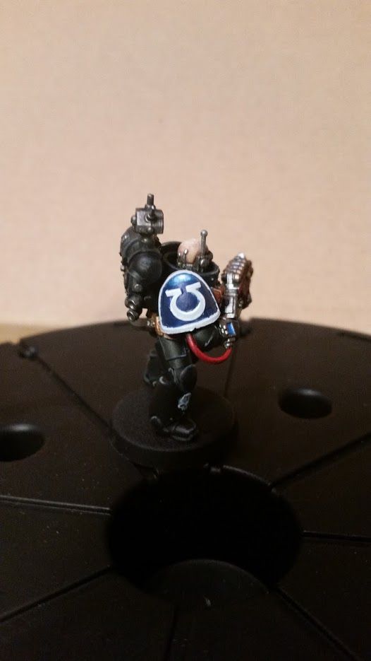

Vallejo grey surface primer, Citadel teclis blue base coat, Citadel lothern blue/Citadel lahmian medium 1:1 for the highlight, Citadel lothern blue/ceramite white 1:1 for highlight 2 and then same thing but 1:2 for highlight 3.
Any correction ideas or suggestions would be appreciated!
EDIT: Added MUCH clearer shots, thanks to Dakka forum users helping me out with my photography!


 4500
4500 


 Use a shade (like Nuhln Oil) and carefully paint it along the raised edge of the ultramarine U. the shade will flow along the symbol and you'll get a nice looking effect.