| Author |
Message |
 |
|
|
|
|
Advert
|
Forum adverts like this one are shown to any user who is not logged in. Join us by filling out a tiny 3 field form and you will get your own, free, dakka user account which gives a good range of benefits to you:
- No adverts like this in the forums anymore.
- Times and dates in your local timezone.
- Full tracking of what you have read so you can skip to your first unread post, easily see what has changed since you last logged in, and easily see what is new at a glance.
- Email notifications for threads you want to watch closely.
- Being a part of the oldest wargaming community on the net.
If you are already a member then feel free to login now. |
|
 |
2016/11/20 13:01:11
Subject: Help me fix this please!
|
|

Irked Necron Immortal
|
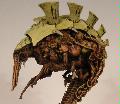
Hi Dakka 
I've been painting a model and I'm really not happy with how it's turned out.
The model just doesn't look very good. The blending looks pretty shoddy and overall isn't really that appealing to look at. The paint also looks very glooped on, which it shouldn't as I do thin my paint (honest!).
He looks okay in the flesh, but overall I'm really not happy with the end result, especially how it photographs.
the below image is probably the best one for showing where it's all gone wrong! 

So this is where you come in! Can anyone offer any suggestions to improve this, or should I just strip him and start again?
Any input would be really appreciated! Thanks for reading. 
|
|
This message was edited 2 times. Last update was at 2016/11/20 13:22:12
|
|
|
 |
|
2016/11/20 13:43:48
Subject: Help me fix this please!
|
|

Powerful Phoenix Lord
|
If you really don't like it, you can always strip it down and start over. I think he looks fine, but the eye is a little jarring. Never been a fan of painted eyes on most models.
|
|
|
|
|
2016/11/20 14:05:02
Subject: Help me fix this please!
|
|
Irked Necron Immortal
|
Well since posting this I've added some more edge highlights in grey, which has helped.
I'm still not sold just yet. I'll have a think overnight.
Thanks for the comments though Elbows, I agree with you on the eye, but I know the next time I go near it with a brush, he'll end up with a blob there instead! 
|
|
This message was edited 1 time. Last update was at 2016/11/20 14:05:17
|
|
|
|
|
2016/11/20 14:17:08
Subject: Re:Help me fix this please!
|
|
Regular Dakkanaut
|
I'll start off by saying that I think he looks pretty good, definitely table ready. If you want him to look better I would also start with the eye. With the way his head is positioned and the fact that he has an eye piece means that he can't be looking in two directions at once. I would repaint the eye so that it's fixed on the same point of focus as the eye piece.
As for the armor I would take it back to "start" by reprinting it with another thin coat of your base dark blue color and then re blend/highlight from there.
Also, try drilling the barrels, storm bolters always look better with drilled out barrels
|
|
|
|
|
2016/11/20 16:18:37
Subject: Help me fix this please!
|
|

Grizzled Space Wolves Great Wolf
|
He looks pretty good to me, you could look up some tutorials on blending if you want to improve on that, it is a very time consuming thing to blend well.
|
|
|
|
|
2016/11/20 16:53:12
Subject: Help me fix this please!
|
|
Irked Necron Immortal
|
Thanks guys, I think it might just be because I've been staring at him for so long that I'm focusing on the bits I don't like!
But I agree, blending is a nightmare!
|
|
|
|
|
|
2016/11/20 18:19:16
Subject: Help me fix this please!
|
|

Ancient Space Wolves Venerable Dreadnought
I... actually don't know. Help?
|
Hmm, I'd recommend thinning a lot more when blending. Milk concistency is the best.
|
|
|
|
|
|
2016/11/20 18:23:42
Subject: Help me fix this please!
|
|
Towering Hierophant Bio-Titan
|
I think it looks a bit off because you have used the same or very similar colors and techniques on all of the 5 red elements. Bolter casings, sword hilt, lenses, loin cloth amd purity seals.
It makes the model look cartoonish and for want of a better word playschoolish. This is made worse by the primary red, blue and yellow(gold) scheme. Perhaps consider changing the hair colour away from yellow too, it looks a little unnatural.
Try some heavier shading on the loin cloth.
Some lighter almost orange hard edge highlights on the bolters.
Some gloss on the lenses or even a different colour to get a bit more pop.
Some weathering could help to break up the sea of blue too.
Don't be offended by this it's just my 2 cents.
|
|
This message was edited 2 times. Last update was at 2016/11/20 18:26:08
Oli: Can I be an orc?
Everyone: No.
Oli: But it fits through the doors, Look! |
|
|
|
|
2016/11/20 19:45:03
Subject: Help me fix this please!
|
|
Irked Necron Immortal
|
 Alex Kolodotschko wrote: Alex Kolodotschko wrote:I think it looks a bit off because you have used the same or very similar colors and techniques on all of the 5 red elements. Bolter casings, sword hilt, lenses, loin cloth amd purity seals.
It makes the model look cartoonish and for want of a better word playschoolish. This is made worse by the primary red, blue and yellow(gold) scheme. Perhaps consider changing the hair colour away from yellow too, it looks a little unnatural.
Try some heavier shading on the loin cloth.
Some lighter almost orange hard edge highlights on the bolters.
Some gloss on the lenses or even a different colour to get a bit more pop.
Some weathering could help to break up the sea of blue too.
Don't be offended by this it's just my 2 cents.
Hi Alex, I definitely am not offended by your input, so no worries there I appreciate you taking the time to comment and I totally get the suggestions.
I followed the scheme on the box artwork (mainly) but I can now see that GW used a few different varieties of red which helps break up their scheme.
I've actually gone and added some more highlighting to the bolter and powerfist to try and distinguish them from the loin cloth.
Will have another look at there hair too!
|
|
|
|
|
|
2016/11/20 20:19:25
Subject: Help me fix this please!
|
|

Kovnik
|
It´s a solid paintjob as it is.
But you can see that you don´t thin your paints enough. When you look at the wrist that holds the bolter you can actually see traces of the paintbrush, that´s a solid indicator for thick paint.
|
|
|
|
|
2016/11/20 20:29:02
Subject: Help me fix this please!
|
|
The Marine Standing Behind Marneus Calgar
|
It’s also worth noting that extreme camera close ups always show every last little flaw. Even the ones that aren’t there.
Hold it at arms length. Love your work. Hate your camera.
|
|
|
|
|
|
2016/11/20 20:47:40
Subject: Help me fix this please!
|
|
Jovial Plaguebearer of Nurgle
|
You could try a blues wash like drakenhoff to bring it all together and then blending the main color back over it from there. Doesn't look to bad. I think your highlight color is so much brother than the base blue that you'll need a lot of layering to transition up to it
|
|
|
|
|
|
|

 ~2800 points
  Ultramarines, 3rd Co. and friends, 16k+
  4k
4k  4k Points
 Competition Index