Switch Theme:

Trying to execute NARD's amazing cel-shaded look. Could use some advice based on my results so far.  [RSS] Share on facebook Share on Twitter Submit to Reddit
»
Author Message
Advert


Forum adverts like this one are shown to any user who is not logged in. Join us by filling out a tiny 3 field form and you will get your own, free, dakka user account which gives a good range of benefits to you:
  • No adverts like this in the forums anymore.
  • Times and dates in your local timezone.
  • Full tracking of what you have read so you can skip to your first unread post, easily see what has changed since you last logged in, and easily see what is new at a glance.
  • Email notifications for threads you want to watch closely.
  • Being a part of the oldest wargaming community on the net.
If you are already a member then feel free to login now.


Made in us
Regular Dakkanaut


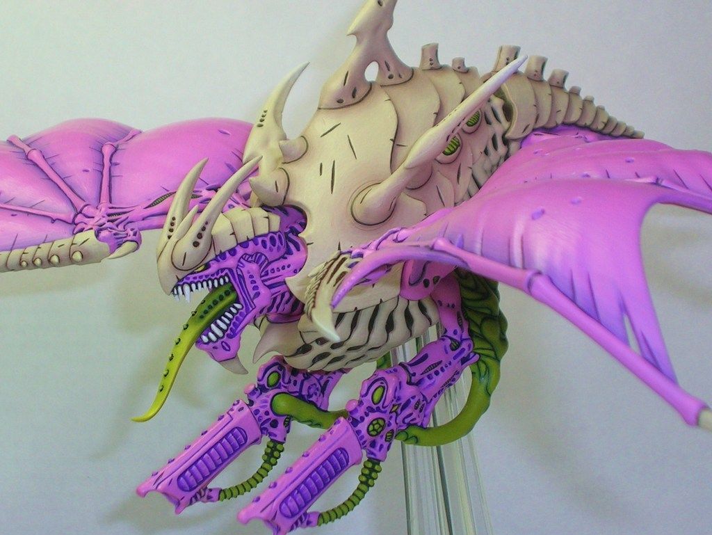
I'm using some Cthulhu Wars miniatures to try new painting techniques, and one of the ones that I absolutely had to try was Nard's amazing "Cel Shaded Tyranids" look. I'm really looking to learn some unorthodox techniques, and I love the way that Nard's work preserves detail while simultaneously making the model look somewhat two dimensional. I'm working from the following guide for general direction:

https://www.dakkadakka.com/dakkaforum/posts/list/0/369038.page

and here is a gallery of his work that I used for more inspiration:

https://www.dakkadakka.com/dakkaforum/jforum.page?module=search&action=search&search_keywords=&match_type=all&search_author=38024&search_titles=0&forum=&daterange=-1&daterange2=0&sort_by=time&sort_dir=DESC&resulttype=1

I tried PMing Nard himself for some advice but I think he may be currently inactive.

Anywho, I did the base color on one test model. I'm partially happy with the results and partially unhappy:


I haven't done any of the details -- the fins, eyes, and teeth.

Also please note that there are some weird things about Cthulhu Wars models that differ substantially from GW. They are made of a softer plastic and the mould lines can be in really inconvenient places. The softer plastic makes them much more difficult to remove without marring the model, so I've left some residual mould lines on the model. They make it look worse in places but I'm not too worried about that. The casting is also quite inconsistent and inferior to GW casting, so some of the detail looks off or sloppy in places. Again, I'm not too worried. I'm mainly concerned with the actual paint here.

I generally used Nard's procedure in the following way:

1. Prime black, select P3 Necrotite Green as the fundamental color.
2. Mix Necrotite Green with Reaper Master Series Swamp Green to darken substantially. Paint the entire model with a couple of thinned layers of this paint, leaving an exposed black line where surfaces intersect or there are gouges in the model (eg: the "gills" along the flanks of the torso)
3. Add a little Necrotite Green to the remaining paint on my wet palette, and do another couple of layers this time ending a tiny bit further from the edge of each line so a small amount of the previous layer is exposed.
4. Repeat this process about 4-5 times, ending with a final layer of pure Necrotite Green. Again, each layer is a bit further from the black lines.

Overall, I think the effect is there but there are a few problems I can identify:

1. The model is much smaller than most of the Tyranid monsters (it's about the size of a 3rd edition Termagant, maybe a tiny bit smaller), and my hands can be a bit shaky at times, so my lines and borders are not as crisp as Nard's. I can work on this but am going to be limited by my physiology to some extent.

2. I'm not actually implementing the technique exactly as Nard describes. Specifically, I'm using the style that he used for the armor plates in his guide. Maybe I should paint it like the body, so that there are only three shades -- the undercoat color for the lines, a dark green at the very edge of the lines and then straight into pure Necrotite green. That'd certainly be less time consuming and might give better results for the style.


Then there is a third problem that I really am not sure how to fix:

3. The paint just doesn't look as smooth as Nard's. I end up with more visible brush marking and such. Nard's are so smooth that they almost look airbrushed, which is just incredible. Mine.... do not look like that. They look fine, but I'd really like it to look a lot smoother if possible. I could use some help troubleshooting what might be going wrong here.


There also may be problems that I'm not identifying, so any advice on how I might get my results closer to Nard's would be much appreciated!


TLDR I could use some help figuring out how to get the models in the attachments to look smoother and more like the models in the guide that I am using!

This message was edited 3 times. Last update was at 2017/03/09 06:01:51


Made in ca
Fireknife Shas'el


I do a lot of 'clean' painting and there's three problems you're running into:

1.) The model you're painting isn't really good for smooth paint jobs because it's a complex organic shape. Nard's tyranids, while organic, consist of mostly big smooth plates and even the fiddly organic bits are pretty smooth.

2.) Paint smoothness, which is a technique issue. There's three main ways to get really smooth paint. The first is to use an airbrush. It's probably the quickest and easiest way, though you obviously need an airbrush.

The second is a wet painting method, where instead of simply applying the paint with the stroke of a brush, you 'pool' the paint on the surface and move the pool of paint to cover the surface, and leave it in place to dry smooth with zero brush marks. This is how I paint my Tau (objective markers as an example).


The final way is a bunch of thin layers of reasonably watered down paint. You want it thin enough that it cannot leave brush marks, but drys smooth much like the wet painting method I mention above.

3.) Paint opacity. Green does NOT go over black in an opaque manner easily. Looking at Nard's work, he's carefully layered colors that will go over each other while remaining opaque. Your Cthulhu model is green over black, which is really hard to get opaque. If you use a black primer, go over the model in a darker, more opaque green and if you must have black in between the areas of green, use good old fashioned black-lining techniques.

This message was edited 1 time. Last update was at 2017/03/08 23:17:18


Made in us
Regular Dakkanaut


Thanks, that's really helpful. I think I can give it a basecoat in a Reaper HD series green that should get better coverage over the black. I definitely had a lot of opacity problems with my first layer, so I had to give it at least 3-4 coats before I was reasonably satisfied to move on.

I'm not entirely sure I understand the wet painting method. It seems awfully close to what I'm doing already, except in very narrow areas where I can't afford to deal with pooling. How do you move the paint around without creating brush marks?

I do think that thinning a bit more would improve my results. I don't think I added any thinner as I added more of the Necrotite green for each layer, trusting the wet palette to do more work than I probably should have especially considering that the paint gets a bit more tacky between sessions even on a wet palette.

Point taken on the organic shape bit. I'm kinda SOL there but will still try to make it work as best as I can!

Thank you very much for the response!
   
Made in ca
Fireknife Shas'el


swarmofseals wrote:

I'm not entirely sure I understand the wet painting method. It seems awfully close to what I'm doing already, except in very narrow areas where I can't afford to deal with pooling. How do you move the paint around without creating brush marks?


It's largely a matter of having the right thickness of paint. You need enough surface tension that the paint doesn't run around freely, but watered down enough that it doesn't clump or make brush marks.Basically it's a very heavy layer of paint that's very fluid - you could literally call it a puddle of paint (if a shallow one). If you water your paint down to the consistency of milk, you should have the control you need for larger areas.

In really narrow areas you have a very light touch with thin paints because of the problem you mention - surface tension will draw the paint away out of control. Minimize the amount of paint on the brush in this circumstance, and you might have to do several coats. It's a better method for armies like Tau, Eldar, Space Marines or Tyranids that have large smooth areas to paint, not so great for bumpy, warty stuff like the Cthulhu minis. Here's another pic of a Tau vehicle I did:


This was primed in black and a single layer of Codex Grey (the old name for it, not sure what it's called now) was applied using the wet painting method. It's very slow and time consuming (especially giving the paint time to dry, much longer than thin coats), but it gives a great smooth effect.

   
Made in au
Grizzled Space Wolves Great Wolf


NARD's models are deceptively well blended and I think that's what makes them pop so nicely.

Being an organic toad, I don't think you want to go pure black lines in the crevices for your "cell shaded" look, I think you just want to go dark green (not even super dark since the skin is quite light green).

But then what really makes NARD's pop is the blending done after the high contrast cell shaded crevices, the non-cell shaded parts still have a decent amount of contrast, but it's a soft and well blended contrast so the dark lines still stand out. How in the hell NARD has such a large Tyranid army I have no bloody idea because it must take him bloody ages to do all that blending, it'd take me a lifetime to paint an army with such nice blending.

Personally, me being a lazy bastard who owns an airbrush, I'd probably go the other way, airbrush the light green to get smooth blends and then come back afterwards with a dark green and hairy brush paint the cell shading lines in to the crevices.

This message was edited 3 times. Last update was at 2017/03/09 06:06:30


Made in us
Regular Dakkanaut


AllSeeingSkink wrote:
NARD's models are deceptively well blended and I think that's what makes them pop so nicely.

Being an organic toad, I don't think you want to go pure black lines in the crevices for your "cell shaded" look, I think you just want to go dark green (not even super dark since the skin is quite light green).

But then what really makes NARD's pop is the blending done after the high contrast cell shaded crevices, the non-cell shaded parts still have a decent amount of contrast, but it's a soft and well blended contrast so the dark lines still stand out. How in the hell NARD has such a large Tyranid army I have no bloody idea because it must take him bloody ages to do all that blending, it'd take me a lifetime to paint an army with such nice blending.

Personally, me being a lazy bastard who owns an airbrush, I'd probably go the other way, airbrush the light green to get smooth blends and then come back afterwards with a dark green and hairy brush paint the cell shading lines in to the crevices.


What specifically do you mean by the blending? If you follow the guide (https://www.dakkadakka.com/dakkaforum/posts/list/0/369038.page) he doesn't really talk about doing any blending more complex than just numerous receding areas on the bone parts, and the purple parts appear to be just a fairly simple three step process.
   
Made in au
Grizzled Space Wolves Great Wolf


Yeah so in the guide you can see he says he used around 7 layers, which you can see on the palette at the beginning of his post, and in between the layers he says "When applying the new coat ensure that you wet your brush and rub it gently over the edge of the coat (while still wet). This will blend the new coat into the previous (see below). "

So that's a decent amount of blending involved. The purple in his guide does look like a simple process, but if you look at the models in his actual gallery you can see there's way more blending on the purple areas. Take this model for example...


You can see the purple on the wings is actually blended gradually out from the darker bluish purple up to the pinkish purple. Other more detailed purple areas he doesn't seem to have blended as much, but even those areas you can still see there's 2 or 3 shades of purple in addition to the really dark purple in the crevices.

The green areas and bone areas you can see are more heavily blended. Like the tongue goes from a medium green at the root to a yellowish green nearer the tip.

This message was edited 1 time. Last update was at 2017/03/09 06:19:24


Made in gb
Posts with Authority


Norn Iron

I get a different image in my head when I see the term 'cel shading' - shading achieved with two flat shades of a colour and a hard line between them. (Which, when I think of it, could make a pretty great effect for minis)
In my eyes Nard's technique is more blacklining (which is where the 'cartoony' look comes from, IMO) combined with subtle blending. Not that it isn't also an interesting look.

So I agree with the Skink: there's more blending in there than is apparent at first glance. I think the contrast of the blacklining draws the eye away from it, to some extent.

I'm sooo, sooo sorry.

Plog - Random sculpts and OW Helves 9/3/23 
   
Made in au
Grizzled Space Wolves Great Wolf


Yeah, the lining definitely draws the eye away from the blending, but the blending I think is key to avoid making it look too flat, especially on the larger beasties or on the green areas which pop really nicely.

True cel shading, it'd be interesting to see but I think cel shading like that on a 3D static object like a miniature might look a bit odd.

Another option would be to combine a rougher oil-paint-like shading with black lining to achieve something like Telltale's video games (The Walking Dead or Game of Thrones for example).

This message was edited 1 time. Last update was at 2017/03/09 14:59:14


Made in gb
Posts with Authority


Norn Iron

AllSeeingSkink wrote:
Yeah, the lining definitely draws the eye away from the blending, but the blending I think is key to avoid making it look too flat, especially on the larger beasties or on the green areas which pop really nicely.


True. Looking at it again, it seems to also match one of the conventions of cel shading: just two colours, not a lot of triads or extra highlights etc. Although there are some lighter areas of the purple that make me think twice - or is that just reflected light?

True cel shading, it'd be interesting to see but I think cel shading like that on a 3D static object like a miniature might look a bit odd.


I think it'd have to focus less on the recesses-n-highlights way of things and use a more OSL approach, concentrating on the planes of the overall form first, and where the light would fall on them. IIRC Tyler Provick at the General's Tent blog uses a similar method, though with blending and more than two colours. Here's the gist of it:

http://tyler.provick.ca/blog/forget-blending-how-light-really-works/

I'm sooo, sooo sorry.

Plog - Random sculpts and OW Helves 9/3/23 
   
 
Forum Index » Painting & Modeling
Go to: