| Author |
Message |
 |
|
|
|
|
Advert
|
Forum adverts like this one are shown to any user who is not logged in. Join us by filling out a tiny 3 field form and you will get your own, free, dakka user account which gives a good range of benefits to you:
- No adverts like this in the forums anymore.
- Times and dates in your local timezone.
- Full tracking of what you have read so you can skip to your first unread post, easily see what has changed since you last logged in, and easily see what is new at a glance.
- Email notifications for threads you want to watch closely.
- Being a part of the oldest wargaming community on the net.
If you are already a member then feel free to login now. |
|
 |
2017/08/02 13:15:53
Subject: Review of work and helpful tips
|
|

Librarian with Freaky Familiar
|
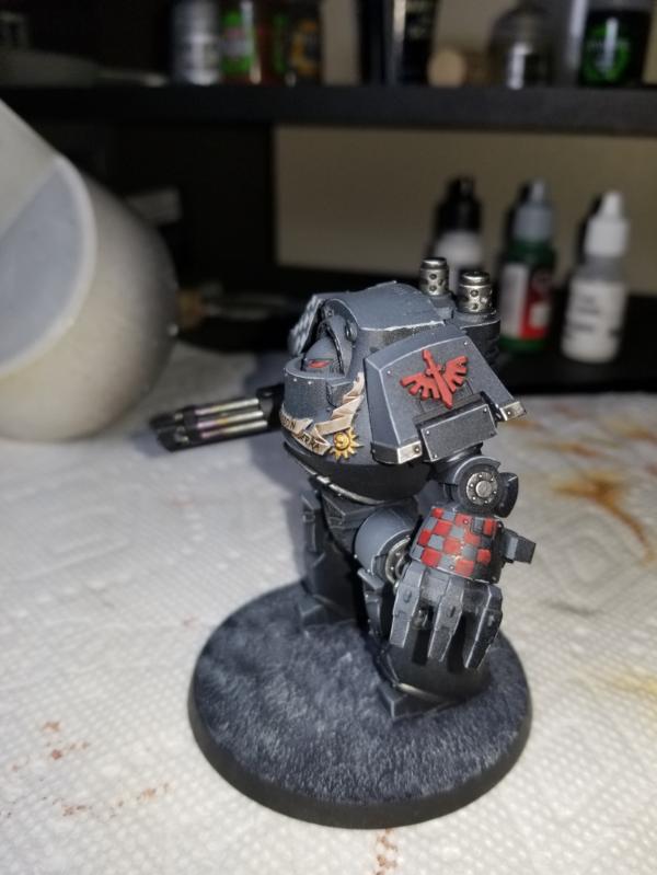
Hello dakka, I have not had a good review of my work and I really would like to get some opinions and helpful tips from you all. This is some of the most recent stuff i have painted, and would love some feed back on it. Even things like how to take a better picture would be super.
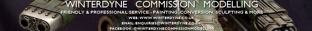
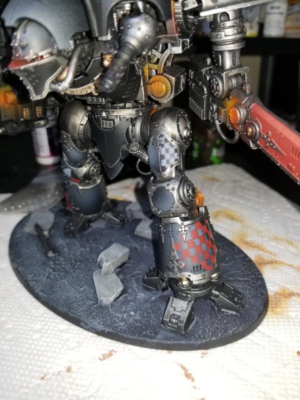
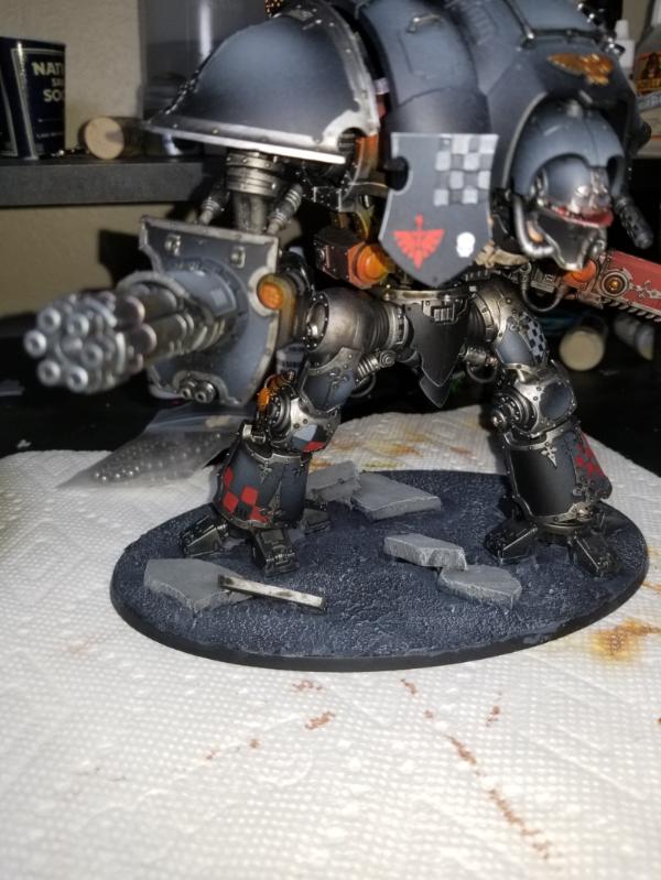
So the first one up is a knight, first knight, i had done. I played a lot with this one so thats why the checkers vary so much. I tried diffrent things to get even checkers but some worked some did not, i realizing the shield checkers are gaky. But looking more for feed back on the rest of it, areas of improvement
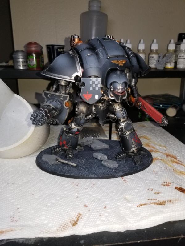
This was my attempt at OSL from the engine, which i think came off more as rust, probably should have thrown some white in there but again, thoughts.
For the checkers on the bottom leg here i actually ended up carving the lines in with an exacto knife, not sure how i felt about it.
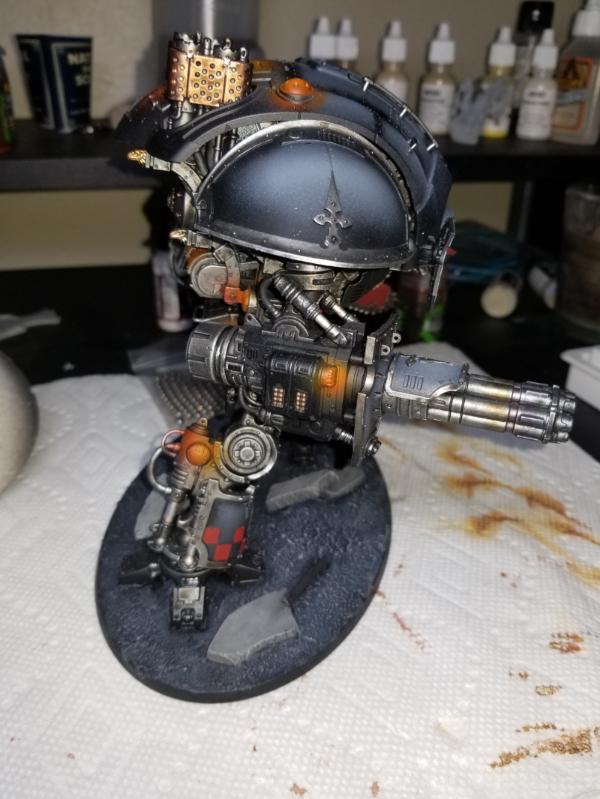
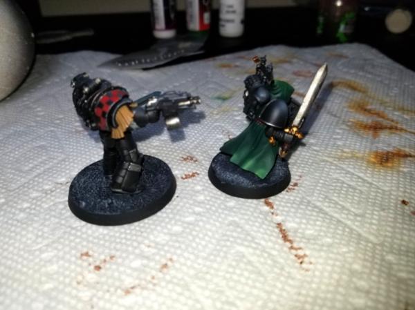
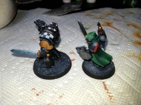
Next is a dreadnought
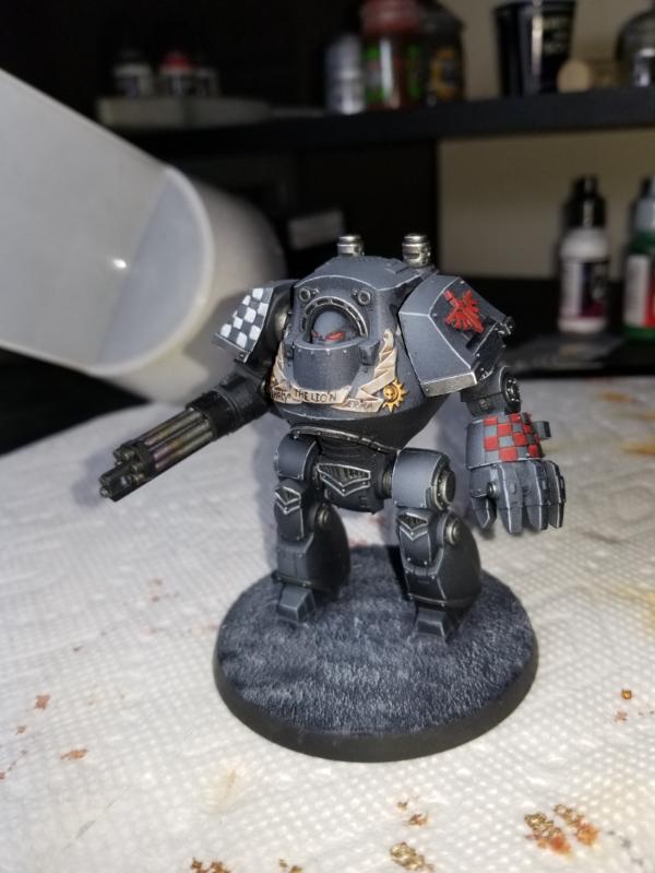
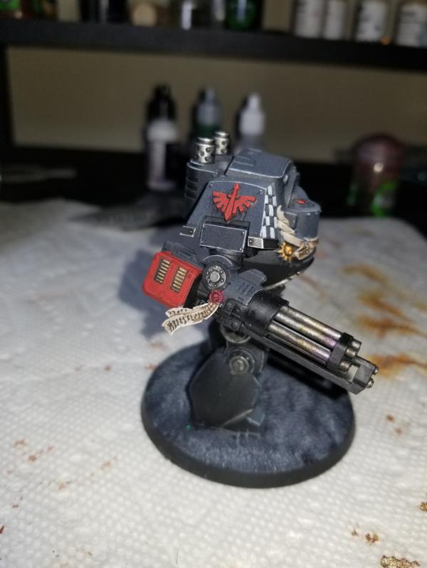
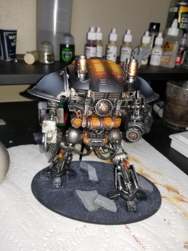
These last two came out kinda poopy because of focus.
Any feed back is always welcomed.
|
To many unpainted models to count. |
|
|
 |
|
2017/08/02 13:38:22
Subject: Review of work and helpful tips
|
|

Longtime Dakkanaut
|
Ok;
You're off to a pretty good start - you're 'in the lines' and your edges are neat enough.
Starting with the black. As you're probably aware yours looks more like grey.
This is a theory thing. Black surfaces are normally defined mostly by how glossy they are - and this picks out the edges and hot spots in the direction of light. This boils down to two kinds of reflectivity on the surface - diffuse, and specular.
Specular reflectivity is concentrated in the direction of the light source. For most models we paint as if they're standing under a lamp, or the noon sun, so the light direction is 'up'. Anything not in a tight angle to that doesn't get light, leading to a very high contrast between shade and highlight tones.
Diffuse reflectivity scatters out from the light direction and leads to a gradient.
You've got way too much grey going down, too light for the diffuse portion, and you're not pushing the contrast enough on the specular side.
What you should aim for is a very subtle shift to a dark grey at the top, with tight edge highlights in mid grey along lower edges, lighter grey on top edges, with brighter spots on corners.
From the looks of it, you've got too few mixes in your airbrush coats - more mixes makes for a smoother, less speckly finish.
You can fix the large grey things (on the knight and dreadnought) by glazing back with thin black to darken the overall surface, reduce the speckliness (if that's a word) and tighten the top highlight before hitting it up again with lighter greys. Glazing on larger areas is easier with a wide, flat brush.
Don't be afraid to go back and tighten checks up - it's apparent here that you've painted a grid then filled it in, but you don't actually want to keep that grid there when you're done - hit the edges of the squares to break the lines. Pointy brush, thin paint, not too much load and take your time.
You've got some mould and join lines quite visible (and some injection points) on the knight. Probably not worth going to fix, but worth bearing in mind those need cleaning and filling for future. Liquid greenstuff, sanding sticks (400grit) should do the job in conjunction with an x-acto #11.
|
|
|
|
|
|
2017/08/02 13:59:29
Subject: Review of work and helpful tips
|
|
Librarian with Freaky Familiar
|
AWESOME! thank you for the advice. I had gotten similar advice for the black. I really like it being not black if that makes sense, but at the same time i can see how its not black enough. I think what i will try next time, i blasting it with a light coat of nulin oil outta the airbrush to tone it back.
The speckly bits on the knight where the black is was me experimenting with going back in and shading the crevices, which i liked how it turned out.
As for the checkers, yeah, i was doing a lot of exprimenting with the best way to do it, did about 40+ 30k dark angels so checkers everywhere, tward the end it ended up cleaner.
|
To many unpainted models to count. |
|
|
|
|
2017/08/02 14:08:28
Subject: Review of work and helpful tips
|
|
Longtime Dakkanaut
|
 Backspacehacker wrote: Backspacehacker wrote:AWESOME! thank you for the advice. I had gotten similar advice for the black. I really like it being not black if that makes sense, but at the same time i can see how its not black enough. I think what i will try next time, i blasting it with a light coat of nulin oil outta the airbrush to tone it back.
The speckly bits on the knight where the black is was me experimenting with going back in and shading the crevices, which i liked how it turned out.
As for the checkers, yeah, i was doing a lot of exprimenting with the best way to do it, did about 40+ 30k dark angels so checkers everywhere, tward the end it ended up cleaner.
Glad to help.
Glazing back by hand with a 1/4 filbert or similar is likely to work better, as you'll get a lot more control over the gradient. You could try black ink (thinned in the airbrush or glazed) - inks have their pigment in solution rather than suspension, so they tend to leave a smoother result. This said, I find VMC flat black glazes very smoothly anyway. I could swear I've posted this exact advice in the not too distant past.
Hit the red with some edges on the top as well, that'll help it pop some.
|
|
|
|
|
|
2017/08/02 16:22:49
Subject: Review of work and helpful tips
|
|
Powerful Phoenix Lord
|
While not an artist, the things which stick out to me:
1) Grey figures on a grey base. This is reaaally aesthetically boring. Definitely needs contrast between the figure and the base.
2) The red checkers over grey/black is not working. Doesn't stand out, and the colours aren't stark enough to really appeal to the eye.
3) The quasi-OSL on the Knight is pretty overbearing.
All in all, as Dyne said - you've got competence showing, and you're absolutely going in the right direction.
|
|
|
|
|
2017/08/02 16:27:38
Subject: Review of work and helpful tips
|
|
Librarian with Freaky Familiar
|
Yeah as to the boring bases it was for the inner circle which scored on various things bases was one of them so k just decided to base them quickly. Guess something i did not note was this was part of a large batch of 40+ marines.
The checkers were an experiment through out I was trying a bunch of things to find what I liked and how to get them to pop. I think not having my armor dark/black enough was the main issue there. If I could go back k would darker the checkers over all. Possibly a khorne red base then a layer up then edge all of the checkers really bright.
|
To many unpainted models to count. |
|
|
|
|
|
|