| Poll |
 |
|
|
|
| Author |
Message |
|
|
|
|
|
Advert
|
Forum adverts like this one are shown to any user who is not logged in. Join us by filling out a tiny 3 field form and you will get your own, free, dakka user account which gives a good range of benefits to you:
- No adverts like this in the forums anymore.
- Times and dates in your local timezone.
- Full tracking of what you have read so you can skip to your first unread post, easily see what has changed since you last logged in, and easily see what is new at a glance.
- Email notifications for threads you want to watch closely.
- Being a part of the oldest wargaming community on the net.
If you are already a member then feel free to login now. |
|
 |
2017/12/15 00:34:23
Subject: My first 'nids, trying out some paint schemes. C&C appreciated. EDITED
|
|

Mutilatin' Mad Dok
Norway, Tønsberg
|
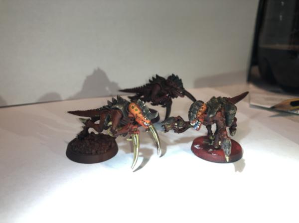
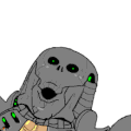
Hi guys, I'm tyring out some paint schemes for my nids. I threw these together in one evening, so i didn't pay too much attention to detail.
Just trying to decide on what paint scheme to go for. Let me know what you guys think.
Also I would like some opinions on the sponge technique i used on the carapace on the Brown-red and Blue-green, does it look ok? Or should i do the edge highlights like i did on Purple-green?
Any comments are appreciated, ty.
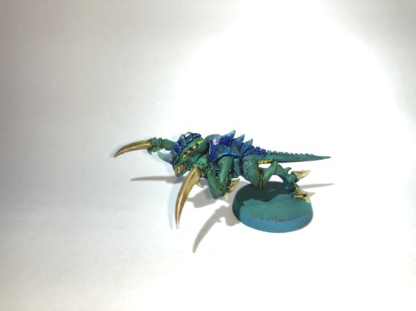
Blue-green
Brown-red

Purple-green
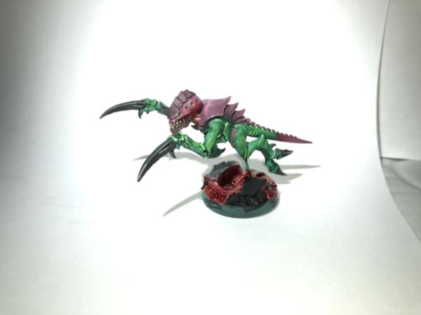
Brown-Orange
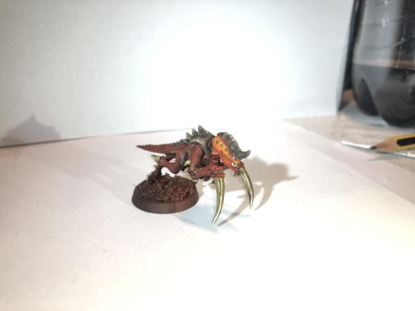
Brown-Magenta
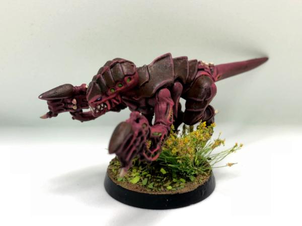
I've added 2 more options after the initial 3 first pictures, so the poll might be a bit of, but whatever 
|
|
This message was edited 2 times. Last update was at 2017/12/19 18:11:06
|
|
|
 |
|
2017/12/15 00:38:58
Subject: My first 'nids, trying out some paint schemes. C&C appreciated.
|
|

Adolescent Youth with Potential
|
Prefer the last one. What ever you did it looks fantastic
|
|
|
|
|
2017/12/15 00:41:21
Subject: My first 'nids, trying out some paint schemes. C&C appreciated.
|
|
[MOD]
Fixture of Dakka
|
I prefer the middle one, not sure if this is really in the right forum though.
|
On parle toujours mal quand on n'a rien à dire. |
|
|
|
|
2017/12/15 01:37:16
Subject: My first 'nids, trying out some paint schemes. C&C appreciated.
|
|

Decrepit Dakkanaut
|
I wont help because I like both 2 and 3. Both grabbed my eyes equally
|
|
|
|
|
2017/12/15 03:54:28
Subject: My first 'nids, trying out some paint schemes. C&C appreciated.
|
|
Guardsman with Flashlight
|
I would say that the third one is the most unique, but I think that the first is my actual favorite of the three.
|
Current Armies: Guard, Dark Eldar, Raven Guard, Bretonnians |
|
|
|
|
2017/12/15 09:50:09
Subject: My first 'nids, trying out some paint schemes. C&C appreciated.
|
|

Been Around the Block
|
I prefer the last one as well! It could be worth a shot to try the middle one's red skin tone with the upper ones more light bone color though!
|
|
|
|
|
2017/12/15 10:41:21
Subject: My first 'nids, trying out some paint schemes. C&C appreciated.
|
|
Mutilatin' Mad Dok
Norway, Tønsberg
|
 ingtaer wrote: ingtaer wrote:I prefer the middle one, not sure if this is really in the right forum though.
Oh, I'm sorry about that. I just saw that the bases also has to be finished to post here. Thanks for the feedback though. Automatically Appended Next Post:
Thanks! Nothing special, just some airbrushing and edge highlighting.
|
|
This message was edited 1 time. Last update was at 2017/12/15 13:42:08
|
|
|
|
|
2017/12/15 21:37:19
Subject: Re:My first 'nids, trying out some paint schemes. C&C appreciated.
|
|
Regular Dakkanaut
|
Purple and Green for sure!
|
BLAH BLAH....blah. |
|
|
|
|
2017/12/15 21:50:24
Subject: My first 'nids, trying out some paint schemes. C&C appreciated.
|
|
Longtime Dakkanaut
|
Middle one has a more natural look to it, colours work nicely instead of contrasting too much.
Carapace looks good.
Only thing I'd note though, consider how long each takes to paint, how many steps etc...
|
|
|
|
|
2017/12/15 22:12:56
Subject: My first 'nids, trying out some paint schemes. C&C appreciated.
|
|
Norn Queen
|
I like the blue green best. The little yellow line marking on the head really goes a long way to making that scheme realy work. You could probably expand it a little. Slight yellow markings on the shell or a couple more lines on the torso/limbs.
|
These are my opinions. This is how I feel. Others may feel differently. This needs to be stated for some reason.
|
|
|
|
|
2017/12/15 23:17:01
Subject: My first 'nids, trying out some paint schemes. C&C appreciated.
|
|
Mutilatin' Mad Dok
Norway, Tønsberg
|
leopard wrote:Middle one has a more natural look to it, colours work nicely instead of contrasting too much.
Carapace looks good.
Only thing I'd note though, consider how long each takes to paint, how many steps etc...
Thanks for the feedback! I think the carapace looks good on the brown-red one, not so much the blue-green one. It takes a few seconds just to dab the sponge, so that’s no doubt a technique I could find myself using on the entire army.
|
|
|
|
|
2017/12/16 00:23:24
Subject: My first 'nids, trying out some paint schemes. C&C appreciated.
|
|
Powerful Phoenix Lord
|
I prefer the second one, but it's incredible bias because I typically hate green as a colour...on almost anything (unless it's very dark, or drab).
|
|
|
|
|
2017/12/16 05:56:11
Subject: My first 'nids, trying out some paint schemes. C&C appreciated.
|
|
[DCM]
Sentient OverBear
|
I moved this to Painting & Modeling, which is a better fit for what you're talking about here.
|
DQ:70S++G+++M+B++I+Pw40k94+ID+++A++/sWD178R+++T(I)DM+++
Trust me, no matter what damage they have the potential to do, single-shot weapons always flatter to deceive in 40k. Rule #1
- BBAP
|
|
|
|
|
2017/12/16 13:36:21
Subject: My first 'nids, trying out some paint schemes. C&C appreciated.
|
|
Mutilatin' Mad Dok
Norway, Tønsberg
|
 Lorek wrote: Lorek wrote:I moved this to Painting & Modeling, which is a better fit for what you're talking about here.
Thank you! Sorry for the inconvenience. Automatically Appended Next Post:  Elbows wrote: Elbows wrote:I prefer the second one, but it's incredible bias because I typically hate green as a colour...on almost anything (unless it's very dark, or drab).
Good to know!
I guess it’s all a matter of personal preference. I should have painted a few more so you wouldn’t be forced to pick one of the tree.
|
|
This message was edited 1 time. Last update was at 2017/12/16 13:43:16
|
|
|
|
|
2017/12/17 10:39:46
Subject: My first 'nids, trying out some paint schemes. C&C appreciated.
|
|
Liche Priest Hierophant
|
I find all of them sufficient. I do however miss some contrasting colour to draw the eye. 1 and 3 have so many colours already, adding one more would be to much. But neither of them have much popping contrawt in places that should draw the eye. Number 2 has the colours very close to each other. It could do with a 3rd contrasting colour.
Edit: green and blue are close. Yellow/milky is not a big contrast to green. Try one with orange.
Purple/brown is close to each other. Try white talons or a bright green tallon. Perhaps keep the talons the same as the carapace, but have 2 lines of green run down the carapace.
Purple/green. Keep the head and the tail green. This should clean up the contrast in the model a bit.
|
|
This message was edited 2 times. Last update was at 2017/12/17 10:51:02
|
|
|
|
|
2017/12/18 00:47:59
Subject: My first 'nids, trying out some paint schemes. C&C appreciated.
|
|
Mutilatin' Mad Dok
Norway, Tønsberg
|
|
|
|
|
|
2017/12/18 01:14:42
Subject: My first 'nids, trying out some paint schemes. C&C appreciated.
|
|

Longtime Dakkanaut
*Current meatspace coordinates redacted*
|
I like the third one from the demo models, but the first scheme has some promise if you lightened the blue a little, and went more toward a brighter almost neon green highlight on the green skin. I'd prpbably lighten the bone parts to a lighter overall bone, maybe highlighting to white or at least close to it.
|
He knows that I know and you know that he actually doesn't know the rules at all. |
|
|
|
|
2017/12/18 01:52:30
Subject: My first 'nids, trying out some paint schemes. C&C appreciated.
|
|
Contagious Dreadnought of Nurgle
|
I really like the blue/green one, but the new brown/red ones look fantastic as well.
|
|
|
|
|
|
2017/12/18 04:42:16
Subject: My first 'nids, trying out some paint schemes. C&C appreciated.
|
|
Regular Dakkanaut
|
The new reworked scheme stole my vote!
|
BLAH BLAH....blah. |
|
|
|
|
2017/12/18 09:05:26
Subject: My first 'nids, trying out some paint schemes. C&C appreciated.
|
|

Dakka Veteran
|
Purple/green offers the best contrast, so I'd go with that one.
|
|
|
|
|
|
2017/12/18 11:05:37
Subject: My first 'nids, trying out some paint schemes. C&C appreciated.
|
|
Mutilatin' Mad Dok
Norway, Tønsberg
|
Its a nice look, But I think I'm going for a more natural look.
I'm leaning towards the new red-brown look. But I'm still not sure about the orange head. I think I might try magenta on the head. Automatically Appended Next Post:
Thank you!
|
|
This message was edited 1 time. Last update was at 2017/12/18 11:06:15
|
|
|
|
|
2017/12/18 11:42:56
Subject: My first 'nids, trying out some paint schemes. C&C appreciated.
|
|
Liche Priest Hierophant
|
Have a look at the clour wheel and try to pick contrasring colours. Or read up a bit on contrasting colours. A dark light contrast can work as well, witch is whar your latest bach does with the head.
Try one with the head the same as the body. The talons the same as the carapace. And the orange you have on the head run in 2 lines down the carapace. Phill Kelly i belive painted somd grey nids with yellow ridges. They looked great!
|
|
|
|
|
|
2017/12/18 13:46:10
Subject: My first 'nids, trying out some paint schemes. C&C appreciated.
|
|
Longtime Dakkanaut
*Current meatspace coordinates redacted*
|
You could balance out the highlight on the head by using it in another place or two on the model. The tip of the tail would work, and maybe in a subtle way on the shoulder joints.
If you;re going to paint the talons the same colour as the carapace, I;d make it significantly lighter. The talons are a ket bit of the fig and you want them to pop a little.
|
He knows that I know and you know that he actually doesn't know the rules at all. |
|
|
|
|
2017/12/18 15:31:13
Subject: My first 'nids, trying out some paint schemes. C&C appreciated.
|
|
Mutilatin' Mad Dok
Norway, Tønsberg
|
 Niiai wrote: Niiai wrote:Have a look at the clour wheel and try to pick contrasring colours. Or read up a bit on contrasting colours. A dark light contrast can work as well, witch is whar your latest bach does with the head.
Try one with the head the same as the body. The talons the same as the carapace. And the orange you have on the head run in 2 lines down the carapace. Phill Kelly i belive painted somd grey nids with yellow ridges. They looked great!
I do have some knowledge of the color wheel. The model will probably look better once i get the jungle base in order, that will balance out the contrast between red(model) and green(base) and will make it pop alot more. I use colors that lie close to each other on the wheel for a natural look. I'm gonna try a bright purple/magenta/burgundy on the head and see how it turns out, not too happy about the orange head.
|
|
|
|
|
2017/12/18 16:11:44
Subject: My first 'nids, trying out some paint schemes. C&C appreciated.
|
|
Liche Priest Hierophant
|
The nids I am thinking of are not phill kellies. Phill kelly has a black and yellow bee scheme. Not the one I was thinking of.
The once I was thinking of where all mainly dark grey/black. The only other colour on them where symetrical ridges of colour down the caraphace. It looked very well as a spot colour. It really emphesised the swarm aspect when you saw them on the battlefield. It also loked very natural. Most animals do not have much colour. Except for warning colours, with the ridges functioned as. It looked awsome.
I agree that a green base to a red nid will be nice. I usually do light/dark contrasts on the base. But I suppose red/green functions as well.
I suspect your nids can turn out a bit bland withouth somethic to trick the eye onto some detail. Some sort of spot colour.
Edit: Imagine your big more grey like the carapace. But on the carapce you use your red colour, or keep the model as is and apply the orange on the one head to the carapace in a line.
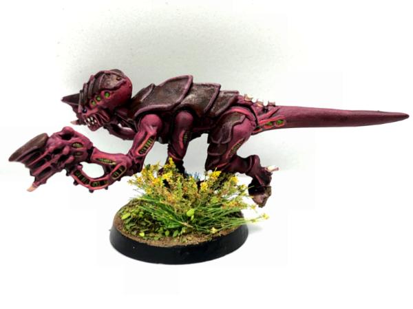
For example, look at the bottom left on this picture. The rest of the model would not really need a lot of work with an eye catcher like that among the carapace.
https://i.pinimg.com/originals/ed/0a/eb/ed0aeba6957ef6e084d799da73e855e8.jpg
|
|
This message was edited 1 time. Last update was at 2017/12/18 16:15:24
|
|
|
|
|
2017/12/18 16:25:03
Subject: My first 'nids, trying out some paint schemes. C&C appreciated.
|
|
Longtime Dakkanaut
*Current meatspace coordinates redacted*
|
 killerpenguin wrote: killerpenguin wrote:
Its a nice look, But I think I'm going for a more natural look.
I'm leaning towards the new red-brown look. But I'm still not sure about the orange head. I think I might try magenta on the head.
I think you may want to go brighter rather than less for the head. Simply running the highlights closer to actual red will get you some nice pop without changing colours. If you highlight the carapace a little higher on the head as well I think you'll be pretty happy with the combo.
|
He knows that I know and you know that he actually doesn't know the rules at all. |
|
|
|
|
2017/12/18 16:51:08
Subject: My first 'nids, trying out some paint schemes. C&C appreciated.
|
|

Regular Dakkanaut
Dublin
|
Reworked brown/red scheme kicks ass!
|
40k Armies :   
Fantasy Armies:
DA:90SG+M-B--I+Pw40k99#--D++++A++/wWD232R++T(M)DM+
"We of the bloody thumb, salute you" - RiTides, Grandmaster of the Restic Knights |
|
|
|
|
2017/12/18 17:03:19
Subject: My first 'nids, trying out some paint schemes. C&C appreciated.
|
|
Mutilatin' Mad Dok
Norway, Tønsberg
|
Thanks! With a green jungle base, I think they’re really gonna stand out
|
|
|
|
|
2017/12/19 18:05:13
Subject: My first 'nids, trying out some paint schemes. C&C appreciated.
|
|
Mutilatin' Mad Dok
Norway, Tønsberg
|
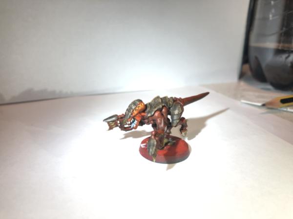
My latest addition, and most likely my last.
I think this is the winner guys. Thank you all for helping me decide!
I think I'll update the poll too, just for fun.
Looking forward to painting the rest of my models!
|
|
|
|
|
|
|