| Author |
Message |
 |
|
|
|
|
Advert
|
Forum adverts like this one are shown to any user who is not logged in. Join us by filling out a tiny 3 field form and you will get your own, free, dakka user account which gives a good range of benefits to you:
- No adverts like this in the forums anymore.
- Times and dates in your local timezone.
- Full tracking of what you have read so you can skip to your first unread post, easily see what has changed since you last logged in, and easily see what is new at a glance.
- Email notifications for threads you want to watch closely.
- Being a part of the oldest wargaming community on the net.
If you are already a member then feel free to login now. |
|
 |
2024/06/17 22:34:57
Subject: mcmattila's hobby projects - 40k, AoS, Underworlds
|
|

Mighty Chosen Warrior of Chaos
|
The Cawdors are great, the exclamation point adds a kind of missionary earnestness that suits them very well.
|
|
|
|
 |
|
2024/06/19 11:48:09
Subject: mcmattila's hobby projects - 40k, AoS, Underworlds
|
|

Dipping With Wood Stain
|
gobert wrote:Great hobby round up, some really great minis for sure.
The Cawdor Templars are fantastic too. If you hadn’t mentioned about the sign there’s no way I’d have thought it wasn’t intentional. The Molotov cocktail looks really cool, though it looks like a waste of whiskey to me 
Thanks as always gobert! I don't believe they used the good stuff for the cocktail. Though who knows what they drink in the underhive, might not have a whole lot of options...
aku-chan wrote:Nice work on the Cawdors! Love the Sign Guys check scarf.
Cheers! Yeah, it was fun doing that check pattern. I think it was my first time doing them without using black as the other color. More will surely follow!
Boss Salvage wrote:Superb Cawdor creeps in general, great take on a great kit. Tying them in with your Templar project is smart and works well, plus gives the marines a little more sense of scale.
I too am totally here for the RePENT! sign, solid Warhammer flare 
Much appreciated! The Cawdor kit is surely one of the coolest Warhammer kits available, I'm glad I was still able to put a bit of my own spin on it. And I'm happy that you all like the sign! I believe I've seen an old piece of 40k artwork where there was this plank banner that said "repent", and now I've finally painted it on a model. Though I haven't been able to find the artwork anymore... Maybe someone can help me? Or maybe it was a figment of my imagination...
Cap'n Facebeard wrote:The Cawdors are great, the exclamation point adds a kind of missionary earnestness that suits them very well.
Hahaha! Thank you very much Cap'n, and thanks for checking out the thread.
---
More Templars, and also more banners! I've painted what I think is my second Marine from the Indomitus box, the Ancient.

It took me two weeks to finish this guy. Frankly speaking, I initially thought he'd be done in a week, but I guess the amount of detail was just too much. Case in point, I had to go back twice to paint a bit I had missed (after I had"finished" the armor, I noticed I hadn't done one of the thigh plates; ditto for a purity seal). There were also more elements/colors to do, compared to the two previous Marines: (large) gold pieces, red trim, red leather and bone. But while I had to spend some time finding appropriate paints and techniques for these elements, I think they should come in handy with the other characters.

As the model has so many details, I took the opportunity to use multiple shades for the different reds and parchments. I think this was really important for separating all the elements, and to keep things more interesting. I also used different techniques for the gold bits: the small trinkets and skulls are painted in the standard "basecoat-shade-highlight" way, whereas the big banner was drybrushed to save time.

While I'm really happy with how the model came out overall, there's one detail I'm not crazy about, and it's the tilt shield. The black cross gets a bit lost on the background. Should've gone with a halved or quartered design, but as I didn't want to repaint the shield, I'll try to come up with (/borrow) a better design on a future model.
I claimed another bingo square with the Ancient: add a unit to your army and paint it before gaming. I suppose this is the first completed unit of the army, and I've certainly not done any gaming with it. (I doubt I ever will, but I think I can still count this...)
|
|
This message was edited 1 time. Last update was at 2024/06/19 11:48:42
|
|
|
|
|
2024/06/23 14:38:57
Subject: mcmattila's hobby projects - 40k, AoS, Underworlds
|
|
Regular Dakkanaut
|
Lovely work on the Ancient mcmatilla, your paint job plus the head swap really transform the mini. The robes and tilt shield really lend themselves to the Templar aesthetic as well. I think the tilt shield looks great, but if you were looking to make it pop a bit more, maybe a touch of yellow?
Also, those Cawdor gangers are the perfect accompaniment to your Black Templars, genius!! They really evoke the crazed followers and henchmen present in much of John Blanche’s artwork. Such a perfect paring. Always love seeing your updates
|
|
This message was edited 1 time. Last update was at 2024/06/23 14:39:27
|
|
|
|
|
2024/06/23 20:50:38
Subject: mcmattila's hobby projects - 40k, AoS, Underworlds
|
|

Ancient Venerable Dreadnought
|
Awesome work on the ancient, so many great textures that really add to the realism. The faces is particularly cool. I’m also in awe of the earthen tones you get on the bases. I can’t for the life of me figure out how you do them
|
Goberts Gubbins - P&M Blog, started with Oldhammer, often Blackstone Fortress and Void Panther Marines, with side projects along the way |
|
|
|
|
2024/06/26 22:50:37
Subject: Re:mcmattila's hobby projects - 40k, AoS, Underworlds
|
|
Sinewy Scourge
|
I've always loved your crisp tones and you are somehow able to push the contrast on your models.
This guy is no exception. He looks magnificent!
Regarding the shield, I don't necessarily think that the design needs to change.
What might work, is to either create a small outline with a different tone or to add some lighter volume in the middle?
Not sure, just something to think about.
|
|
|
|
|
|
2024/06/27 22:26:48
Subject: mcmattila's hobby projects - 40k, AoS, Underworlds
|
|
Dipping With Wood Stain
|
zahnib wrote:Lovely work on the Ancient mcmatilla, your paint job plus the head swap really transform the mini. The robes and tilt shield really lend themselves to the Templar aesthetic as well. I think the tilt shield looks great, but if you were looking to make it pop a bit more, maybe a touch of yellow?
Also, those Cawdor gangers are the perfect accompaniment to your Black Templars, genius!! They really evoke the crazed followers and henchmen present in much of John Blanche’s artwork. Such a perfect paring. Always love seeing your updates
Many thanks for the compliments and the suggestion! Yellow would be a good color to add in there, perhaps like Ezki suggests below as an outline or a fill for the cross...
gobert wrote:Awesome work on the ancient, so many great textures that really add to the realism. The faces is particularly cool. I’m also in awe of the earthen tones you get on the bases. I can’t for the life of me figure out how you do them
Much appreciated gobert! The bases are actually very simple, but if I hadn't borrowed the recipe from Maxime Corbeil (the armor and lots of others are from him as well), I'd be scratching my head as well The base is basecoated with Ungor Flesh and then washed randomly with Trollslayer Orange, Doombull Brown and Eshin Grey (I've used 1:3 paint:water ratio). The whole base is then drybrushed with Screaming Skull. Finally, the rocks and skulls are drybrushed with white, and quickly edge-highlighted as well.
Ezki wrote:I've always loved your crisp tones and you are somehow able to push the contrast on your models.
This guy is no exception. He looks magnificent!
Regarding the shield, I don't necessarily think that the design needs to change.
What might work, is to either create a small outline with a different tone or to add some lighter volume in the middle?
Not sure, just something to think about.
Thank you very much Ezki! Contrast really is king, and I try to create and push it with almost every color/material on a model. And yeah, good suggestion on the shield design. I also thought about outlining the cross, but thought I couldn't make it sharp enough, at least without spending a whole lot of time on it, and couldn't settle on a color either. But yellow might work, as suggested by zahnib. Maybe filling the cross with yellow/gold and scribbling some pattern on it as well... But, in all honesty I'm probably not going to go back to this guy as there are other models to get to.
---
I started working on the two Chaplains (Judiciars are apparently Chaplains-in-training), and made some pretty good progress on them. The major parts are mostly done (armor, cloths) and the metallics have been basecoated. I painted the (eventual) gold bits silver as well, they'll get their color from a yellow Contrast paint. After the metallics are done, it's just a couple of details, some clean-up as well as the heads and the bases.

|
|
|
|
|
|
2024/06/30 00:00:47
Subject: mcmattila's hobby projects - 40k, AoS, Underworlds
|
|
Ancient Venerable Dreadnought
|
Great looking minis so far mcmatilla. The red on the judiciar is gorgeous!
Thanks for sharing the base recipe, it’s certainly very effective!
|
Goberts Gubbins - P&M Blog, started with Oldhammer, often Blackstone Fortress and Void Panther Marines, with side projects along the way |
|
|
|
|
2024/07/04 22:39:13
Subject: mcmattila's hobby projects - 40k, AoS, Underworlds
|
|
Dipping With Wood Stain
|
 gobert wrote: gobert wrote:Great looking minis so far mcmatilla. The red on the judiciar is gorgeous!
Thanks for sharing the base recipe, it’s certainly very effective!
Thanks again gobert! And yeah, the base recipe is really neat! I've been thinking about using the same procedure (well, mainly the random washes) on some other colored bases as well, just have to find a suitable model too...
---
A quick update on the chappies. Got the metallics done, and basecoats on all the details. Starting to see the finish line! The painting will have to wait for a week or so, however, as I and the family are going on a trip. But while I won't be painting, I'll take a box of minis with me, in case I have time to build a model or two.

|
|
|
|
|
|
2024/07/06 17:01:07
Subject: mcmattila's hobby projects - 40k, AoS, Underworlds
|
|
Ancient Venerable Dreadnought
|
Gorgeous golds on the chaplain in particular. Is it just a wash over the silver then tough ups? Enjoy the trip!
|
Goberts Gubbins - P&M Blog, started with Oldhammer, often Blackstone Fortress and Void Panther Marines, with side projects along the way |
|
|
|
|
2024/07/06 22:51:46
Subject: mcmattila's hobby projects - 40k, AoS, Underworlds
|
|
Master Engineer with a Brace of Pistols
|
Awesome chaplains, the leather on the sword gadgie (can't remember his name ) is brilliant.
Enjoy the holiday!
|
|
|
|
|
|
2024/07/21 20:49:52
Subject: mcmattila's hobby projects - 40k, AoS, Underworlds
|
|
Dipping With Wood Stain
|
gobert wrote:Gorgeous golds on the chaplain in particular. Is it just a wash over the silver then tough ups? Enjoy the trip!
Thanks man! I'm afraid there was a couple more steps: the silver was VMC Dark Aluminium (basecoat/coverage) and Light Aluminium (so that the Contrast paint is nice and saturated). Then tinted it with Nazdreg Yellow. Then for some additional contrast (and also removing some shine) a wash of Reikland Fleshshade. And finally edge highlights with Light Aluminium. I think I'll go with Retributor Armor, shade and highlight next time...
Olthannon wrote:Awesome chaplains, the leather on the sword gadgie (can't remember his name ) is brilliant.
Enjoy the holiday!
Cheers! Yeah, damn GW and their new copyrightable unit names! I've had to check so many times! (He's the Judiciar.)
---
Alright, the Chaplain duo are done!

I kept the Chaplain stock as I think he's pretty much perfect, and an awesome refresh of an old model. The Judiciar, however, got some tweaks like the Ancient. First and foremost, I did a head-swap, as I didn't like the original very much. Fortunately there was a suitably stern-faced one in the BT upgrade kit. I also thought an alien psyker skull was cooler than the hourglass, so put that on instead. I had to carve and smoothe the power armor glove a bit to make it look like the leather glove, but I think that turned out really well.

On the painting side, these were of course pretty similar to the Ancient, but I highlighted the armor with greys instead of blues. It makes the Chaplain armor subtly different to the other Templars, adding a bit of variety to the force (and my painting, too). Another new major element was the leather coat on the Judiciar, which I wanted to be red (burgundy? Maroon?) leather. I used the same colors as for the leather tome on the Ancient (basecoated with Khorne Red and Doombull Brown) and am happy with the result.

I also had fun painting the purity seals. There were a whole lot of them on the Chaplain, so I used different tones on them. I also took cues from the studio paintjob, and scribbled on some imperial motifs and did some of the writing in red. And while we're talking about small details, I'll mention the decals. Like other recent decals from GW, they went on with no issues at all, but it's a shame that white decals seem to be lower resolution than black ones, and you can see jagged edges on the crosses. I saw the same effect on the decal I used on my Ultramarine. But not every white decal has the problem (e.g. the small default Ultramarine decal sheet), so I don't really know what's up with that.

While I'm once again super happy with how these came out, there are a couple of paint recipes I'll change on future models. Firstly, the gold. It's needlessly complicated, so next time I'll just suck it up and use Retributor Armor instead of basecoating with dark and light silvers and Nazdreg Yellow. Secondly, when painting further Chaplains (I've still got Grimaldus in The Pile), I'll change the gray armor highlights a bit too, as now there was an unnecessary mix. These changes shouldn't affect the end result, but make the process a bit quicker.

That being said, I could do with a more straightforward model next! Characters are awesome when you get them done, but there's so many details to do that it really bogs you down. Too bad I don't have any Intercessors ready to go...
|
|
|
|
|
|
2024/07/21 22:38:16
Subject: mcmattila's hobby projects - 40k, AoS, Underworlds
|
|
Mighty Chosen Warrior of Chaos
|
Excellent headswap for the Judiciar. No more Billy Corgan in power armour.
|
|
|
|
|
|
2024/07/22 06:59:34
Subject: mcmattila's hobby projects - 40k, AoS, Underworlds
|
|

Regular Dakkanaut
|
Stunning paintjob as usual, and very good kitbashes.
About the skull: isn't it actually a Navigator skull, due to the third eye? Warp user for sure, I think is a great touch.
|
|
|
|
|
|
2024/07/22 22:41:01
Subject: mcmattila's hobby projects - 40k, AoS, Underworlds
|
|
Dipping With Wood Stain
|
Cap'n Facebeard wrote:Excellent headswap for the Judiciar. No more Billy Corgan in power armour.
Cheers, glad you like it!
muette wrote:Stunning paintjob as usual, and very good kitbashes.
About the skull: isn't it actually a Navigator skull, due to the third eye? Warp user for sure, I think is a great touch.
Many thanks!
Yeah, a navigator came to my mind as well (they're a type of psyker, right?), but the skull is bigger than a human. WarCom tells us it's a relic, "skull of Cacodominus", which was some kind of mind controlling xenos.
|
|
|
|
|
|
2024/07/22 22:59:41
Subject: Re:mcmattila's hobby projects - 40k, AoS, Underworlds
|
|
Sinewy Scourge
|
Absolutely stellar, box art worthy pieces!
The faces have so much depth and the metallics look so darn good. Well done mate!
|
|
|
|
|
|
2024/08/03 07:42:05
Subject: mcmattila's hobby projects - 40k, AoS, Underworlds
|
|
Regular Dakkanaut
|
Wow, beautiful work mcmatilla! As Ezki said, box art worthy stuff! The subtle conversion on the Judiciar looks fantastic and makes the model feel far more grounded than the stock one. The face on the chaplain is really well done, as are those purity seals; love the variation in parchment colours and all that freehand! As others have said, your metallics are fantastic. I’ll be interested to see your new gold recipe. Would also love to see your basing style tried out with different colours as you mentioned.
I’m really enjoying your overall write ups, they are a great inspire into your process and thinking. Get this man an article on Warhammer Community!
|
|
|
|
|
|
2024/08/05 20:31:36
Subject: Re:mcmattila's hobby projects - 40k, AoS, Underworlds
|
|
Dipping With Wood Stain
|
Ezki wrote:Absolutely stellar, box art worthy pieces!
The faces have so much depth and the metallics look so darn good. Well done mate!
Thank you very much Ezki, I really appreciate it!
zahnib wrote:Wow, beautiful work mcmatilla! As Ezki said, box art worthy stuff! The subtle conversion on the Judiciar looks fantastic and makes the model feel far more grounded than the stock one. The face on the chaplain is really well done, as are those purity seals; love the variation in parchment colours and all that freehand! As others have said, your metallics are fantastic. I’ll be interested to see your new gold recipe. Would also love to see your basing style tried out with different colours as you mentioned.
I’m really enjoying your overall write ups, they are a great inspire into your process and thinking. Get this man an article on Warhammer Community!
Cheers, much appreciated zahnib! I wouldn't hold my breath for the "new" gold recipe, my plan is just to simplify and replace three paints with one for the basecoat, then it's going to be the same washes and highlight. But we'll see when I get there...
And I'm glad to hear you like the writing. I like doing the write-ups and spend quite a bit of time thinking about what to say (and what to leave out). Nice to hear people are reading them too! Getting featured on WarCom would be cool, though I'm not sure how one would get picked for an article. A while back I sent a couple of e-mails with pictures of my minis to the White Dwarf team, in the hopes of getting featured in the magazines, but heard nothing back. Again, I don't know how they pick the models to feature, but I'm sure they get a ton of photos and there's only so much space on the mag every month, so it'd be a small miracle if my models were picked.
---
Okay, so something simpler than the Templar characters next... I ended up painting a Kruleboy I got from the Getting Started with AoS (3rd ed.) magazine.

Though the model might seem complex, it's actually pretty simple. There's only a few elements (skin, rags, a few bits of metal and the shield), and being fairly textured the model takes well to speed paints. My intent was to paint the model in a couple of evenings, but of course I ended up fiddling with it for a whole week!

As this model was another one-off, I used it to try out new paint recipes and techniques. I used different paints for the skin than what I've used for my Orks so far (though the end result is fairly similar). I used a universal highlight (Ice Yellow) and a universal shade (Magos Purple) on everything. Works surprisingly nicely and ties all the different elements together. This was also one of the first times (if not the first) that I did the basing entirely after finishing the model, using texture pastes. I used two different ones - one that cracks and another that looks like dirt - and sprinkled on some sand and pebbles to add a bit of texture to the flat base.

I enjoyed painting the model, and am very happy with how it came out. My favorite bit is probably the skin, I once again tried to pay attention to the highlight placement, as well as make sure that there are still shadows left after I've done the highlighting I also love the bright red on the shield, Baal Red is pretty awesome! There are a couple of things that I need to work on with future models, though. First and foremost the verdigris. It seems I can't just slap on Nihilakh Oxide and hope for the best! I think there needs to be some shading or something to integrate it better. I'll need to do some research... I also think there could be more separation between the face and the helmet (dark-lining), but it's not a big issue. On future Kruleboyz I'd also add some freehand patterns on the clothes, but here I let it be.

I got to claim a square with this Gutrippa, and I went with the "model from a new faction". While I'm not getting any more Kruleboyz anytime soon, I wouldn't be opposed to painting some more. Fun models!
Alright, so work started today, after a nice and long summer holiday. Not quite as productive on the hobby front as I had hoped, but it never is, is it? As always, we'll see how work affects my output, but I'll try to keep building and painting.
|
|
|
|
|
|
2024/08/07 16:28:05
Subject: mcmattila's hobby projects - 40k, AoS, Underworlds
|
|
Ancient Venerable Dreadnought
|
Flipping awesome work on the chaplains! WarCom really should be all over these minis, but as with you I have no idea how one gets noticed.
|
Goberts Gubbins - P&M Blog, started with Oldhammer, often Blackstone Fortress and Void Panther Marines, with side projects along the way |
|
|
|
|
2024/08/24 20:10:32
Subject: mcmattila's hobby projects - 40k, AoS, Underworlds
|
|
Dipping With Wood Stain
|
gobert wrote:Flipping awesome work on the chaplains! WarCom really should be all over these minis, but as with you I have no idea how one gets noticed.
Thank you very much gobert, as always! I wager that social media presence is probably something that helps you get noticed, something which I very much lack.
---
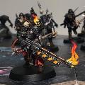
It's back to Space Marines! Or the Chaos variety, to be specific. It took some time, but I now have a finished Noise Marine!

I painted this model to commemorate the birth of my daughter, which was a bit over a year ago now. When I originally bought the model (a couple years or so ago) I was going to paint the box art scheme, as I think it looked like a fun challenge with all the bright colors and fun patterns. But then my wife asked me what model I was going to paint pink for our girl (I previously painted a "baby blue" Space Wolf for our son). I kinda wanted to do an official scheme instead of just a random pink mini, and realized that I have the Noise Marine in my pile. The painting plan changed, I went to look for examples of Emperor's Children on the net.

I ended up borrowing the scheme from this superbly cool model. I recently picked up a couple pinks and purples from the new Vallejo Game Color range, and this was the perfect opportunity to give them a try. I used Hexed Lichen and Squid Pink for the most part, and mixed them together for an in-between tone. Kislev Flesh was used for the final highlighted. I was really impressed with the VGC paints, they're beautiful colors and the coverage was great. The finish is also more matt than Citadel, which contrasts nicely with the satin black bits on this particular model. I like the look, but the camera seems to pick out my rough blends more easily than with satin paint.

For the black I used the blue highlights that I use for my Black Templars as well. Beyond the pink and the black there weren't too many colors to do, and those details were left more simple. The white(-ish) hair didn't come out quite as I intended, as I started with a too dark basecoat and left too much of it showing. However, I was satisfied enough with it, so didn't have another try.

As for the base, my idea was to do a concert stage. In my mind, those are mostly black and featureless, which made creating an interesting base a bit of a challenge. I settled for smooth plasticard with a seam. I drilled some holes next to the seam to imply sunk bolts, but those are not too visible in the photos. I then added a tangled cable, some patches of rubble and a scattering of shell casings. They're just pieces of plastic rod, but nice enough before I decide to buy a set of resin ones. Like with my son's Space Wolf, I wrote my daughter's date of birth to the underside of the base.

I claimed another square with this model, the "model not intended for gaming". I could do that with pretty much every model I paint, but this one's a bit more special.
Oh yeah, and I guess this is my first model for a collection of the nine original Chaos legions. I'll get back to it after I get those first-founding chapters finished...
|
|
|
|
|
|
2024/08/29 17:17:01
Subject: mcmattila's hobby projects - 40k, AoS, Underworlds
|
|
Ancient Venerable Dreadnought
|
That is one glorious Noise Marine for your daughter! Love it! The pink/purples are lush.
I look forward to seeing the Loyal and Traitor legions painted up too
|
Goberts Gubbins - P&M Blog, started with Oldhammer, often Blackstone Fortress and Void Panther Marines, with side projects along the way |
|
|
|
|
2024/09/01 19:42:57
Subject: mcmattila's hobby projects - 40k, AoS, Underworlds
|
|
Utilizing Careful Highlighting
|
Nice job on the Noise Marine!
|
|
|
|
|
2024/09/01 22:35:42
Subject: mcmattila's hobby projects - 40k, AoS, Underworlds
|
|
Mighty Chosen Warrior of Chaos
|
Excellent colours on the Noise Marine, and I normally prefer outrageous pied ones.
Also love how GW made the Noise Marine an expensive luxury item. Slaanesh would be pleased.
|
|
|
|
|
|
2024/09/20 21:48:14
Subject: mcmattila's hobby projects - 40k, AoS, Underworlds
|
|
Dipping With Wood Stain
|
gobert wrote:That is one glorious Noise Marine for your daughter! Love it! The pink/purples are lush.
I look forward to seeing the Loyal and Traitor legions painted up too
Thank you very much! Was very happy with the pinks as well!
A whole set of the 18 legions would... let's say will be awesome, and shouldn't take more than a decade at my pace. If I keep focused... Still, I've finished another!
aku-chan wrote:Nice job on the Noise Marine!
Much appreciated aku-chan!
Cap'n Facebeard wrote:Excellent colours on the Noise Marine, and I normally prefer outrageous pied ones.
Also love how GW made the Noise Marine an expensive luxury item. Slaanesh would be pleased.
Glad you like it! Heh, never thought about the Noise Marine like that, but you're right! I wonder how long it'll take GW to make an EC/ NM upgrade frame...
---
The first-founding collection grows by one! After painting many (mostly) black Marines this year, I wanted to have a go in the opposite direction. Enter White Scar.

I built the model as close to the box art as I could. Ever since I saw it I thought whoever built that model hit the nail right in the head, that was the model I wanted. I guess rules-wise he has a pistol to go with the sword, and he's probably a sergeant, but I guess he'd go for any Assault Intercessor too. In the end I don't really care. He looks cool and that's what matters!

As for the paintjob, I wanted to avoid painting white with a brush for as much as possible. I primed the model with Grey Seer and then White Scar from above to get clean white with some shadows. I then followed Juan's guide on white armor, though I had to substitute a missing Gryph-Charger Grey with Basilicanum Grey. I thought the process was alright to paint, though trying to avoid mistakes was a bit stressful at times. Thankfully, not many mistakes were made, and those few were quick to cover with Celestra Grey. Using white ink to highlight was a nice trick, it flowed smoothly off the brush and didn't dry in the tip, and the coverage was surprisingly good as well!

For the red, black and brown details I referenced 'eavy Archive, though again I made some changes as I didn't have all the paints. I quite like the darker Khorne Red for this scheme, though it meant I had to recolor the tactical arrow decal. If I painted more White Scars, I'd likely use a brighter shade to match the decals.

I painted the base using the 'eavy Metal recipe, though I started with texture paint rather than sand. I used the same recipe for my Ultramarine, but I think this one came out a bit better, less yellow (Zamesi Desert). I then applied a bunch of tufts to get a base resembling a steppe. I felt The Army Painter tufts were a bit too long, so I trimmed them with scissors after glueing them down. Some day I'll try painting/washing the tufts to better integrate them to the base, but it wasn't this time...

For the most part I'm super happy with how this one came out, but when taking these photos I noticed a couple of small things I might change at some point. First of all, his face seems to have this sad clown outline around his mouth. It's partly because of the sculpt, but I should've caught that and fixed it with paint. And secondly, I forgot to add any damage to the sword. I mean, I tried to keep the weathering on the armor really subtle, which I think was a success, but the clean sword looks a bit weird as that's the thing most likely to take get scuffed...
I claimed another square on the hobby bingo card with this model, the "technique you haven't mastered". I've said it before, but really I could use any model for this square. The particular technique I was thinking about here, however, was using Contrast paints on smooth surfaces/armor. Before I started painting the model I dreaded the Contrast stage a bit, I was afraid that I'd be left with a stained mess, but in the end I got a surprisingly smooth result and only had to fix a couple of splotches. Definitely made me more confident in using Contrast paints on any model.
|
|
|
|
|
|
2024/10/02 18:30:36
Subject: mcmattila's hobby projects - 40k, AoS, Underworlds
|
|
Ancient Venerable Dreadnought
|
That is one sweet looking White Scar! I think you can safely say the contrast method was a roaring success! The 18 Legions WILL be awesome when their done
|
Goberts Gubbins - P&M Blog, started with Oldhammer, often Blackstone Fortress and Void Panther Marines, with side projects along the way |
|
|
|
|
2024/10/02 22:33:04
Subject: Re:mcmattila's hobby projects - 40k, AoS, Underworlds
|
|
Sinewy Scourge
|
Holy heck that is one crisp looking white marine!
Stellar work as always mcmattila!
Just recently painted some sisters with a white color scheme and I second the notion of avoiding to paint white with a brush haha!
|
|
|
|
|
|
2024/10/03 18:07:44
Subject: mcmattila's hobby projects - 40k, AoS, Underworlds
|
|
Regular Dakkanaut
|
Amazing as usual! Looking proper savage.
|
|
|
|
|
|
2024/10/03 22:46:28
Subject: mcmattila's hobby projects - 40k, AoS, Underworlds
|
|
Mighty Chosen Warrior of Chaos
|
Stunning Marine, looks completely perfect.
|
|
|
|
|
|
2024/10/04 18:22:48
Subject: mcmattila's hobby projects - 40k, AoS, Underworlds
|
|
Dipping With Wood Stain
|
gobert wrote:That is one sweet looking White Scar! I think you can safely say the contrast method was a roaring success! The 18 Legions WILL be awesome when their done
Thanks a lot! Yeah, the result was definitely great, and pretty enjoyable to paint as well. I'll see if I can get at least one of the remaining loyalists done this year, but there will be a detour or two (or more) before that...
Ezki wrote:Holy heck that is one crisp looking white marine!
Stellar work as always mcmattila!
Just recently painted some sisters with a white color scheme and I second the notion of avoiding to paint white with a brush haha!
Much appreciated Ezki! The white armor was an interesting process, as before adding the red and the other details I thought the armor looked too gray and lacked a bit of contrast. But with the rest of the colors added and putting him next to the other marines he's definitely white!
I just checked out your sisters, and likewise, they look awesome!
muette wrote:Amazing as usual! Looking proper savage.
Cheers! I think that's fitting for a 'Scar!
Cap'n Facebeard wrote:Stunning Marine, looks completely perfect.
Thank you very much! The few nitpicks aside, I agree! Super happy with how he came out.
---
I've finished three more Poxwalkers, and with that reached a milestone of having painted each of the 16 unique sculpts!

These three were a fairly quick project for me, as I got them finished in a single week. I estimate each of the models took around three hours of work to complete. That's quite a bit longer than what it was for my first Poxwalkers way back in 2020, but I think the quality has gone up as well, and I find myself taking more time as I just enjoy painting all the details on these models.

Painting-wise, there's not really anything new that I didn't do on previous models. Some of the color recipes might be a tad different than previously because I hadn't written down how I did them. This was partly because I didn't think I'd paint so many, and partly because if I did, I'd maybe get some variation by using slightly different colors. I think this worked great and gave me an opportunity to try out different colors and getting some reps in with different techniques on models that in the end still look cohesive together. I'm sure this would be possible with pretty much any models, but these organic, quite busy models really lend themselves to this practice over, say, a squad of Space Marines.
Alright, time for a group photo of the "horde" as it is.

I'm sure I'll come back and paint some more 'walkers at some point (I do have another ten on sprue...), but for now I'll put this project into the back-burner. Lots of other models competing for my limited hobby time as well, so let's try to finish some of those! Maybe something for Orktober, even?
|
|
|
|
|
|
2024/10/06 08:26:39
Subject: mcmattila's hobby projects - 40k, AoS, Underworlds
|
|
Ancient Venerable Dreadnought
|
That’s a glorious shambling horde! The mixed colours work really well with the mutations and pox unifying them nicely. Excited at the prospect of your Orks making a reappearance
|
Goberts Gubbins - P&M Blog, started with Oldhammer, often Blackstone Fortress and Void Panther Marines, with side projects along the way |
|
|
|
|
2024/10/07 06:46:15
Subject: mcmattila's hobby projects - 40k, AoS, Underworlds
|
|
Utilizing Careful Highlighting
|
That's a snazzy looking gang of spotty zombies!
|
|
|
|
|
|
|
|


