Forum adverts like this one are shown to any user who is not logged in. Join us by filling out a tiny 3 field form and you will get your own, free, dakka user account which gives a good range of benefits to you:
No adverts like this in the forums anymore.
Times and dates in your local timezone.
Full tracking of what you have read so you can skip to your first unread post, easily see what has changed since you last logged in, and easily see what is new at a glance.
Email notifications for threads you want to watch closely.
Being a part of the oldest wargaming community on the net.
If you are already a member then feel free to login now.
I am about to begin a Dark Eldar army and I would like some feedback on the paint/basing scheme I plan to use. I will be painting my models with the color scheme of the Kabal of the Last Hatred. This is mainly a dark purple color scheme as shown here by the "Eavy Metal team.
For the base I was thinking of using a stirland mud texture, with a ryza rust drybrush to give an orange hue. To wrap it up I'd apply some tufts of grass and paint the rim of the base a similar green to what is in the 'Eavy Metal picture. I am trying to take advantage of the purple, orange, and green triangle. I will also paint the eyes orange and apply some bronze to the armor. What do you guys think? Is it too much or do you suggest something different? I really like the Kabal color scheme so I am mainly just trying to figure out the basing scheme. I also like that the texture paints are a little quicker to apply.
It's hard to go wrong when basing a color scheme off a preexisting faction in the universe - That being said, the color scheme itself is pretty striking and your color theory is good as well. Personally I like the colors you've chosen and it'll probably look awesome when you've painted up several guys.
Regarding your basing ideas, I've done a very similar color for my bases and it has ended up looking great.
I'm personally not a bit fan of purple and green together in any color scheme. It almost always conjures up images of Barney the friendly dinosaur. That said if you are really set on a color triad I would tip your green towards the yellow end of the spectrum.
cweg127 wrote: I'm personally not a bit fan of purple and green together in any color scheme. It almost always conjures up images of Barney the friendly dinosaur. That said if you are really set on a color triad I would tip your green towards the yellow end of the spectrum.
Are you referring to painting the rim green, the added grass or both? I definitely would like to avoid a Barney look haha. I think the green rim in the picture shown doesn't look to bad but I could try a black or dark grey. What changes would you recommend? I am pretty set on the purple color scheme for the model, but open to different basing schemes. I don't have much experience so I don't have a wealth of ideas to draw on.
Not much to critique - I like purple scheme. But I can agree with cweg127 that the green on the picture you showed don't look too convincing. In my opinion there's lack of contrast in that scheme with faded a bit green. Maybe go for the weapon parts with the same color as loincloth?
Blog mostly about fast painting miniatures for WH40k and AOS
WishWarGaming wrote: Not much to critique - I like purple scheme. But I can agree with cweg127 that the green on the picture you showed don't look too convincing. In my opinion there's lack of contrast in that scheme with faded a bit green. Maybe go for the weapon parts with the same color as loincloth?
Do you recommend something else for the base then?
One thing that occurred to me: the base may be better with a dark color, preferably black.
The thing about bases is they are at the bottom of the model. The eye tends to perceive darker colors at the bottom of things, not the top.
I just get the sense it would be more aesthetically pleasing. But this is a base, right? You don't need to know the answer to get started on the rest of the model.
techsoldaten wrote: One thing that occurred to me: the base may be better with a dark color, preferably black.
The thing about bases is they are at the bottom of the model. The eye tends to perceive darker colors at the bottom of things, not the top.
I just get the sense it would be more aesthetically pleasing. But this is a base, right? You don't need to know the answer to get started on the rest of the model.
Well if I go for an authentic texture such as sand, I'd like to glue it on before priming. If I use the texture paint, then I'll put it on after the rest of the model is painted. But yeah, I know I am over analyzing a bit. I won't be able to start building for about a week so I figured I'd spend some extra time brainstorming. I don't have any basing materials currently so it would be a bit expensive to try out a bunch of different looks. I can play around with the rim color easy enough. Do you think I should ditch the Stirland Mud and look at something else? Maybe instead of gluing on grass spots, I can add a few rocks??
GW's 'universal' base scheme (with Steel Legion Drab rim like that in the OP's post) good for almost all paint schemes:
Spoiler:
This message was edited 1 time. Last update was at 2018/11/30 22:39:58
'It is a source of constant consternation that my opponents cannot correlate their innate inferiority with their inevitable defeat. It would seem that stupidity is as eternal as war.'
- Nemesor Zahndrekh of the Sautekh Dynasty Overlord of the Crownworld of Gidrim
I've watched all the Warhammer TV videos haha. The universal base scheme looks like a safe bet. I was just exploring some options that are a little less common and might fit the color scheme nicely.
This one also caught my attention too. I can't tell if the yellow would highlight the purple or distract from it. Ultimately, I think I would be hesitant to go this bold, but I do think it looks interesting.
Something that looks good and is time efficent. That's why I am focusing on the texture paints. I could do the GW universal scheme but I wanted to see if the orange mud or the yellow dirt would be more interesting and not distract from the model. I appreciate the feedback from everyone.
This message was edited 1 time. Last update was at 2018/12/01 14:32:19
Hmmm, IMHO orange mud can be good here, but I would go for some darker rant color (dark brown?). But to be totally honest I would recommend to make test run with first model and see how colors will fit together. In this case if you don't try it you'll really dont know it for sure
Blog mostly about fast painting miniatures for WH40k and AOS
I like your colours, though as many people have suggested I think the green looks a bit off.
Not that it's a bad idea but it kinda just looks weird, perhaps if you could use the same shade of green on some of the weapon parts it would look less awkward.
Outsmart what you can't beat, and beat what you can't outsmart.
I think I'm gonna try the orange mud scheme but instead of adding grass, I'm gonna add some small stones. I'll paint the stones a dark gray and the base rim black. I think that will be a simple but effective scheme. I'll post pictures of my test model when I am finished.
DrunkinChaps44 wrote: I think I'm gonna try the orange mud scheme but instead of adding grass, I'm gonna add some small stones. I'll paint the stones a dark gray and the base rim black. I think that will be a simple but effective scheme. I'll post pictures of my test model when I am finished.
Mhmmm - sound good. Looking forward to see this done
Blog mostly about fast painting miniatures for WH40k and AOS
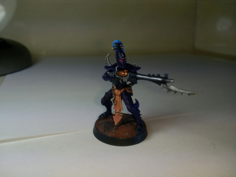
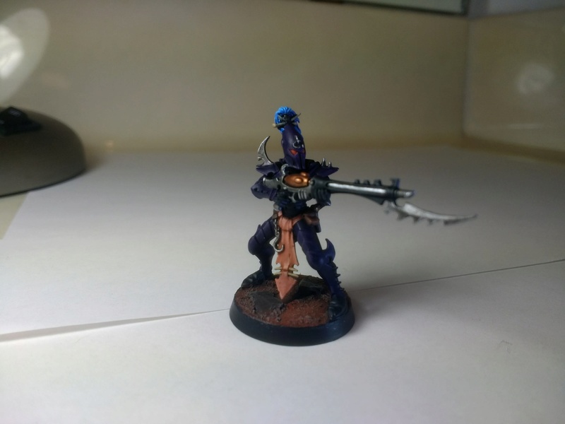
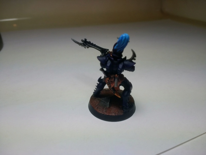
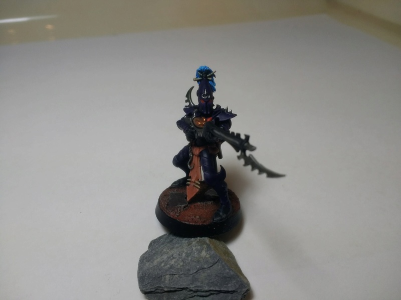
Here are some pictures of my test model. I apologize for the very poor lighting in my apartment. Overall I am very happy with how the armor came out. I love the purple armor with the blue hair and orange eyes. A couple of changes/adjustments I am considering:
1) Adding an extra layer of purple highlights to the very tips of all the pointy parts
2) Painting the silver on the back half of the gun black
3) Using a darker brown for the pouches and leather parts around the waist.
I initially wasn't super thrilled with the base as it was more difficult to dry brush than I anticipated resulting in more orange than I wanted. I think the bone colored drybrush over the top helped break it up and its grown on me a bit more. I know the pictures are high quality but what do you guys think?
I like the scheme for the model, but it's very dark overall.
The oranges and browns should be breaking up the outline a bit, but they can't so much when the base is so similar. I'd suggest trying something like a light grey or even a snow base to really offset the warm and dark colours on your model with light and cold.
You have to edge highlight the carapace a bit more with a lighter purple/grey(I suggest dechala lilac/ or Lucius lilac); especially around the legs to break up the solid colors.
EDIT: edge highlighting tips: keep the brush tip perpendicular to the armor edge, make the highlight edge thin with a mid tone color of the armor, then highlight selective triangular areas of the armor where 3 edges meet with a lighter tone of the armor, that way the armor highlights won't look too anime.
Spoiler:
This message was edited 1 time. Last update was at 2018/12/07 05:28:07
I agree the model is quite dark which is something I was concerned about when selecting the "ferric mud" basing scheme. That being said, it is a little less dark in person than what it appears in those pictures. I'm not a big fan of the snow base as there is something about Dark Eldar and snow that doesn't mesh well in my brain. If I were to select a brighter base, I would probably go with the golden brown "badlands" scheme that I posted above. I am a little concerned that would come out as too bright or detracting however.
As for the edge highlighting, I think I will add a lighter purple to the various points on the model. I like my edge highlights to be a little more subtle or else I think it begins to look too unnatural.
Thanks for the feedback!
This message was edited 1 time. Last update was at 2018/12/07 04:12:37