Forum adverts like this one are shown to any user who is not logged in. Join us by filling out a tiny 3 field form and you will get your own, free, dakka user account which gives a good range of benefits to you:
No adverts like this in the forums anymore.
Times and dates in your local timezone.
Full tracking of what you have read so you can skip to your first unread post, easily see what has changed since you last logged in, and easily see what is new at a glance.
Email notifications for threads you want to watch closely.
Being a part of the oldest wargaming community on the net.
If you are already a member then feel free to login now.
It's growing on me, as someone else said, in an 80s toy/cartoon/movie sort of way. If I can say "I feel the need, the need for speed" every time I feel my Ravenwing now, it's a good day. (yes, i could have said it before...just not the same).In fact, Top Gun might ruin every game my opponent will have vs my Ravenwing. The quotes will be endless....
dark talon losing wounds rapidly.."Engine one is out, engine two is out...this is not good Mav". Playing harlequins......"Jester's dead, yee hah".
Looks to me like a neon-lit bar insignia, that could be integrated in Les Miséroïdes... Just me being strange.
In all seriousness I'd say it looks more sci-fi and less grimdark, but since the debate about how grimdark 40k still is, I think this aspect has been lowered. <So a less grimdark logo would be consistent with the current direction of the universe's atmosphere. My random 2 cents
This message was edited 1 time. Last update was at 2020/06/02 18:30:19
40k: Necrons/Imperial Guard/ Space marines
Bolt Action: Germany/ USA
Project Z.
"The Dakka Dive Bar is the only place you'll hear what's really going on in the underhive. Sure you might not find a good amasec but they grill a mean groxburger. Just watch for ratlings being thrown through windows and you'll be alright." Ciaphas Cain, probably.
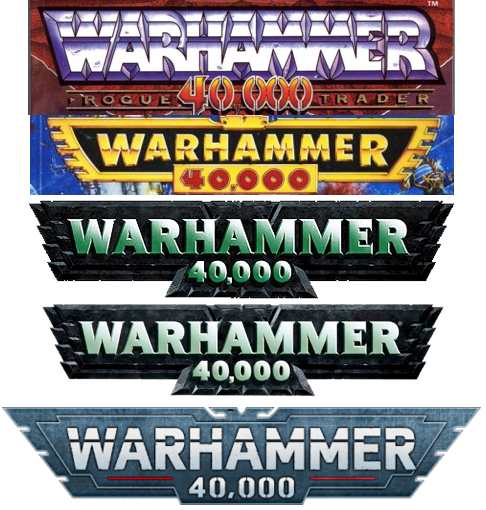
It's like the logo has taken one thing form each of the previous logos; the line from the rogue trade logo, serifless front of the 2nd edition logo, and the computer-style of 3.5 codices.
Frankly, my biggest problem with it is that I just don't like the blue color. It's better than the darkness of the last logo, but I wish they went with rogue trader red.
jeff white wrote: Poll numbers have been consistently about two thirds against...
From what I've heard, the community was against the logo change in third edition as well, but it grew on the community over time and I see it being largely the same. Plus it's been something like 16 years since the last logo change, and GW has changed their company logo to boot. Seems fair to want to change it now.
Actually most changes to anything is most often confronted with strong backlash anyway. The logo isn't primordial to your enjoiment of the setting or the game in my opinion so it'll make it's way in time.
Still I personally find that the newer lore, said to be less grimdark, and this new logo, less gothic, are consistent. Although I'm no great fan of the new lore.
40k: Necrons/Imperial Guard/ Space marines
Bolt Action: Germany/ USA
Project Z.
"The Dakka Dive Bar is the only place you'll hear what's really going on in the underhive. Sure you might not find a good amasec but they grill a mean groxburger. Just watch for ratlings being thrown through windows and you'll be alright." Ciaphas Cain, probably.
jeff white wrote: Poll numbers have been consistently about two thirds against...
From what I've heard, the community was against the logo change in third edition as well, but it grew on the community over time and I see it being largely the same. Plus it's been something like 16 years since the last logo change, and GW has changed their company logo to boot. Seems fair to want to change it now.
Actually most changes to anything is most often confronted with strong backlash anyway. The logo isn't primordial to your enjoiment of the setting or the game in my opinion so it'll make it's way in time.
Still I personally find that the newer lore, said to be less grimdark, and this new logo, less gothic, are consistent. Although I'm no great fan of the new lore.
I find the new lore has plenty of grimdark still in it, but putting a spot of hope into the setting just lets the darker parts of the setting stand out more (to me).
Honestly the new logo is fine. I mean it doesn't inspire me or any outlandish claim like that, but the logo has never done that for me. It's more of a bit of background around the rest of the thing I'm more interested in.
I've grown up with the iconic green-white writing on the black background, and that's gone and replaced with something that just feels more cartoony and flimsy. Doesn't help that the damn thing isn't even centred properly.
Feels like a needless change, although it might be a nod to the way the aesthetics of the game/lore are shifting (for worse, in my opinion).
This message was edited 1 time. Last update was at 2020/06/03 16:50:08
Honestly, it's not really about whether any of you like it or not. Rather, it's about what the logo says to an outsider who's not familiar with the universe or the wider hobby.
To me (as someone who teaches this stuff), the new logo says a lot about the brand's aspirations, and the sorts of people it's trying to appeal to.
On a deeper level, what this change in logo also shows us is that GW is finally moving away from being the domain of sweaty, beardy teenagers (who are quite off-putting to a lot of people!), and is moving towards a wider mass appeal. It's friendly, it's modern, it's light, and it makes a clear statement of what the hobby is about, and where it stands in the pantheon of modern wargames.
Academic based in Lancaster (UK). Co-founder of Warhammer Conference, the world's first academic conference dedicated to all things Warhammer.
MJRyder wrote: Honestly, it's not really about whether any of you like it or not. Rather, it's about what the logo says to an outsider who's not familiar with the universe or the wider hobby.
To me (as someone who teaches this stuff), the new logo says a lot about the brand's aspirations, and the sorts of people it's trying to appeal to.
On a deeper level, what this change in logo also shows us is that GW is finally moving away from being the domain of sweaty, beardy teenagers (who are quite off-putting to a lot of people!), and is moving towards a wider mass appeal. It's friendly, it's modern, it's light, and it makes a clear statement of what the hobby is about, and where it stands in the pantheon of modern wargames.
I get that but the fact it's squint ruins the effect IMHO
It would be like the apple logo with the leaf touching the appple.
Arschbombe wrote: I'm neutral on the new logo. I think it's better than some of the old ones, but inferior to the 4th-8th version.
Spoiler:
Thanks for that.
I like the RT style best, and... as I looked at these stacked together (thanks to you) I noticed that the new one recalls some elements from the RT version. Compared, I do see it as "flimsy", a word used above, and ... maybe a bit safe. Vanilla. Meh.
Also interesting is that since my last post, suggesting the 2/3 results against the new graphic, results have slightly shifted favorably with some posts in defense. Now, 60/40
Automatically Appended Next Post:
MJRyder wrote: Honestly, it's not really about whether any of you like it or not. Rather, it's about what the logo says to an outsider who's not familiar with the universe or the wider hobby.
To me (as someone who teaches this stuff), the new logo says a lot about the brand's aspirations, and the sorts of people it's trying to appeal to.
On a deeper level, what this change in logo also shows us is that GW is finally moving away from being the domain of sweaty, beardy teenagers (who are quite off-putting to a lot of people!), and is moving towards a wider mass appeal. It's friendly, it's modern, it's light, and it makes a clear statement of what the hobby is about, and where it stands in the pantheon of modern wargames.
Wow.
What does this mean, exactly?:
where it stands in the pantheon of modern wargames.
This message was edited 3 times. Last update was at 2020/06/03 18:18:12
MJRyder wrote: Honestly, it's not really about whether any of you like it or not. Rather, it's about what the logo says to an outsider who's not familiar with the universe or the wider hobby.
To me (as someone who teaches this stuff), the new logo says a lot about the brand's aspirations, and the sorts of people it's trying to appeal to.
On a deeper level, what this change in logo also shows us is that GW is finally moving away from being the domain of sweaty, beardy teenagers (who are quite off-putting to a lot of people!), and is moving towards a wider mass appeal. It's friendly, it's modern, it's light, and it makes a clear statement of what the hobby is about, and where it stands in the pantheon of modern wargames.
Wow.
What does this mean, exactly?:
where it stands in the pantheon of modern wargames.
Well, put it next to all the other logos of all the other wargames companies and other sci-fi wargames and compare them.
Academic based in Lancaster (UK). Co-founder of Warhammer Conference, the world's first academic conference dedicated to all things Warhammer.
Arschbombe wrote: I'm neutral on the new logo. I think it's better than some of the old ones, but inferior to the 4th-8th version.
Spoiler:
Thanks for that.
I like the RT style best, and... as I looked at these stacked together (thanks to you) I noticed that the new one recalls some elements from the RT version. Compared, I do see it as "flimsy", a word used above, and ... maybe a bit safe. Vanilla. Meh.
Also interesting is that since my last post, suggesting the 2/3 results against the new graphic, results have slightly shifted favorably with some posts in defense. Now, 60/40
You're welcome. I knew the logo had changed over time and I wanted to see for myself how they all stacked up. The new one isn't bad. I don't care about the R over the line. I think the most jarring thing about it for me is the lack of depth. All the others have some significant relief to them whereas the new one is just so flat. But I expect attitudes will soften over time. I know mine already has.
It's a little bland, but not awful. I didn't notice that the "R" is outside the border, or that the middle "A" isn't properly centered till it was pointed out, and now I can't unsee it, and it's a bit annoying.