| Author |
Message |
 |
|
|
|
|
Advert
|
Forum adverts like this one are shown to any user who is not logged in. Join us by filling out a tiny 3 field form and you will get your own, free, dakka user account which gives a good range of benefits to you:
- No adverts like this in the forums anymore.
- Times and dates in your local timezone.
- Full tracking of what you have read so you can skip to your first unread post, easily see what has changed since you last logged in, and easily see what is new at a glance.
- Email notifications for threads you want to watch closely.
- Being a part of the oldest wargaming community on the net.
If you are already a member then feel free to login now. |
|
 |
2021/02/03 12:55:20
Subject: Re:The art that sold you on 40k
|
|

Longtime Dakkanaut
|
These and many like these.
|
|
|
 |
|
2021/02/03 12:58:10
Subject: The art that sold you on 40k
|
|

Joined the Military for Authentic Experience
|
I was looking for the middle one as an example of the awesome black and white art.
|
|
|
|
|
|
2021/02/03 14:32:15
Subject: The art that sold you on 40k
|
|
Longtime Dakkanaut
|
 Da Boss wrote: Da Boss wrote:I was looking for the middle one as an example of the awesome black and white art.
So much awesome black and white stuff from that era especially for the ORKS who were my first love.
|
|
|
|
|
2021/02/03 14:57:20
Subject: Re:The art that sold you on 40k
|
|

Regular Dakkanaut
|
A lot of the initial stuff that drew me in has already been posted (especially Space Crusade and 2nd ed box art, the former was my entry way into GW) but dotted throughout the source books were little vignettes of the 40K universe that were so evocative that my mind couldn't help but build them into whole stories.
|
|
|
|
|
2021/02/03 15:00:25
Subject: The art that sold you on 40k
|
|
Longtime Dakkanaut
|
Always really liked that last one you posted. Like Valhallen storm troopers. If they made those I’d be all over it.
|
|
|
|
|
2021/02/03 15:08:11
Subject: The art that sold you on 40k
|
|
Joined the Military for Authentic Experience
|
Yup, that would be another of my picks for "really good black and white art". I wish that is what IG looked like.
|
|
|
|
|
|
2021/02/04 05:14:05
Subject: Re:The art that sold you on 40k
|
|

Regular Dakkanaut
|
Way back in the day (after my middle school art teacher showed me his Space Marine army) when I was first getting interested in 40k, I looked at all the codices to see which ones looked the coolest. Right away, I was captivated by the art on the 4th edition T'au codex. While I may not be working on a T'au army, it's still one of my favorite pieces of artwork.
Spoiler for size, it's a big 'un.
|
Leigen_Zero wrote:nectarprime wrote:
Um, isn't styrene + gasoline = napalm?
More or less yes...Great, we've gone from cheap resin substitutes to weapons banned by the geneva convention...
|
|
|
|
|
2021/02/04 10:35:31
Subject: The art that sold you on 40k
|
|
Regular Dakkanaut
|
Andykp wrote:Always really liked that last one you posted. Like Valhallen storm troopers. If they made those I’d be all over it.
Da Boss wrote:Yup, that would be another of my picks for "really good black and white art". I wish that is what IG looked like.
Totally agree, if that is what the IG looked like, I would have sunk a fortune into infantry and tanks.
|
|
|
|
|
2021/02/04 12:49:15
Subject: Re:The art that sold you on 40k
|
|
Agile Revenant Titan
|
I've played since Rogue Trader, but the models and artwork from WD 127 has captured my imagination painting and playing Eldar for so many years now.
|
No earth shattering, thought provoking quote. I'm just someone who was introduced to 40K in the late 80's and it's become a lifelong hobby. |
|
|
|
|
2021/02/04 14:48:03
Subject: The art that sold you on 40k
|
|
Regular Dakkanaut
|
 Inquisitor Lord Katherine wrote: Inquisitor Lord Katherine wrote: Cybtroll wrote: Cybtroll wrote:
About Blanche (and other old artwork) I think you're missing the point. They're not "good" in terms of realism or composition or whatev. They are good because they really convey the idea that the setting is both historical and futuristic.
They reminded me of the Ortodox iconography, or of medieval miniature. Do you think they draw like they did because they were not good enough?
Illustrations covers a lot of meaning, and make a lot of sense that in the future the exact representation of reality is not the main goal.
So, those were this borderline in-setting out-setting idea going on with illustration.
Compare it to the current publicity poster we have...
But they don't seem historical, futuristic, or evocative of the idea of the darkest possible future of man where we live under a fascist theocracy in perpetual war against everything. Just kind of weird and very 80's with big hair, high heels & leather, disco colors on armor and a dose of just weird random body-horror stuff.
Like compare
to
It's just an aesthetic choice that I don't feel is particularly evocative of the grim darkness of the far future where there is only war, fascist oppression and brutal suppression of independence and will, and a theocracy to guide the masses to their deaths for the gain of distant oligarchs.
John Blanche's style was the guiding hand for all of the tighter, more realistic, more "technically accurate" illustrations that would come afterward. There was a very good reason why HE was the guy in charge of directing the art department and why HE was the one responsible for building and managing the team of illustrators that have brought us all of this incredible artwork over the years. It's because his work is essentially a concentrated dose of pure expression. His work arrives at the tradeoff between traditional, technical "accuracy" and visual expressiveness, and it chooses expressiveness, every, single, time.
In some ways you can think of John's work vs his team's work like the difference between the late 19th century realist painters and avant-garde painters of the 20th century. By the end of the 19th century, realism as a painting style was already extremely well understood and well documented. You had virtuosos like Bougereau and John Singer Sargent running around demonstrating complete mastery of the technique, mastery of perspective, of value control, of composition, of the rendering of light and shadow. Realism was a "solved problem" at that point. As far as expressive possibility there wasn't much left you could do with it. We had already mastered the ability to render exactly what our eyes can see, onto a canvas. That's why the avant-garde stuff afterwards was such a big deal. It started to explore methods of expression that were not bound by traditional thinking, by hundreds of years of classical painting techniques and venerable institutions. The 20th century painters basically thought to themselves, "Is painting a photorealistic, technically-accurate rendering of "fire" the best way to express "fire"? Is it the most powerful way of expressing "fire"? Or are there other ways of expressing that same idea using paint on canvas? Ways that are more evocative or more emotionally engaging? Can we express other ideas that are not merely visual, but instead social, cultural, intellectual, or psychological?"
John Blanche's work essentially pursues this same line of thought. Expression is the name of the game, not just literal representation. Once you understand this it becomes obvious that there is no other artist at GW that does what John does. Where the works of Bonner, Dainton, Smith, and Kopinski were the flesh and bones of warhammer, John's work was the soul. It was the DNA that would decide how everything else was shaped around it.
|
|
This message was edited 3 times. Last update was at 2021/02/04 14:52:07
|
|
|
|
|
2021/02/04 17:14:23
Subject: The art that sold you on 40k
|
|
Shas'la with Pulse Carbine
Sacratomato
|
In 1986 I drove to the South Coast Plaza Mall and into a small game shop. I walked by the 40k Rogue Trader rule book and then tore through it.
Never looked back!
|
 70% of all statistics are made up on the spot by 64% of the people that produce false statistics 54% of the time that they produce them. 70% of all statistics are made up on the spot by 64% of the people that produce false statistics 54% of the time that they produce them. |
|
|
|
|
2021/02/04 22:20:22
Subject: The art that sold you on 40k
|
|
Longtime Dakkanaut
|
Probably a mix of 7th, 6th, and 5th era art.
|
|
|
|
|
|
2021/02/05 00:30:53
Subject: The art that sold you on 40k
|
|

Longtime Dakkanaut
|
artific3r wrote: Inquisitor Lord Katherine wrote: Cybtroll wrote:
About Blanche (and other old artwork) I think you're missing the point. They're not "good" in terms of realism or composition or whatev. They are good because they really convey the idea that the setting is both historical and futuristic.
They reminded me of the Ortodox iconography, or of medieval miniature. Do you think they draw like they did because they were not good enough?
Illustrations covers a lot of meaning, and make a lot of sense that in the future the exact representation of reality is not the main goal.
So, those were this borderline in-setting out-setting idea going on with illustration.
Compare it to the current publicity poster we have...
But they don't seem historical, futuristic, or evocative of the idea of the darkest possible future of man where we live under a fascist theocracy in perpetual war against everything. Just kind of weird and very 80's with big hair, high heels & leather, disco colors on armor and a dose of just weird random body-horror stuff.
Like compare
to
It's just an aesthetic choice that I don't feel is particularly evocative of the grim darkness of the far future where there is only war, fascist oppression and brutal suppression of independence and will, and a theocracy to guide the masses to their deaths for the gain of distant oligarchs.
John Blanche's style was the guiding hand for all of the tighter, more realistic, more "technically accurate" illustrations that would come afterward. There was a very good reason why HE was the guy in charge of directing the art department and why HE was the one responsible for building and managing the team of illustrators that have brought us all of this incredible artwork over the years. It's because his work is essentially a concentrated dose of pure expression. His work arrives at the tradeoff between traditional, technical "accuracy" and visual expressiveness, and it chooses expressiveness, every, single, time.
In some ways you can think of John's work vs his team's work like the difference between the late 19th century realist painters and avant-garde painters of the 20th century. By the end of the 19th century, realism as a painting style was already extremely well understood and well documented. You had virtuosos like Bougereau and John Singer Sargent running around demonstrating complete mastery of the technique, mastery of perspective, of value control, of composition, of the rendering of light and shadow. Realism was a "solved problem" at that point. As far as expressive possibility there wasn't much left you could do with it. We had already mastered the ability to render exactly what our eyes can see, onto a canvas. That's why the avant-garde stuff afterwards was such a big deal. It started to explore methods of expression that were not bound by traditional thinking, by hundreds of years of classical painting techniques and venerable institutions. The 20th century painters basically thought to themselves, "Is painting a photorealistic, technically-accurate rendering of "fire" the best way to express "fire"? Is it the most powerful way of expressing "fire"? Or are there other ways of expressing that same idea using paint on canvas? Ways that are more evocative or more emotionally engaging? Can we express other ideas that are not merely visual, but instead social, cultural, intellectual, or psychological?"
John Blanche's work essentially pursues this same line of thought. Expression is the name of the game, not just literal representation. Once you understand this it becomes obvious that there is no other artist at GW that does what John does. Where the works of Bonner, Dainton, Smith, and Kopinski were the flesh and bones of warhammer, John's work was the soul. It was the DNA that would decide how everything else was shaped around it.
Thanks Artific3r, you've explained what I've always thought of JB's work in relation to 40k, although I've only ever been able to express it as 'art' vs 'illustration'. His stuff is pure evocation and when I was younger I didn't like it as much (it seemed weird) and preferred Mark Gibbons' work.
But when I think of what 40k 'is' or how it 'feels' I am always drawn to JB's work, as it expresses the universe so well.
|
|
|
|
|
|
2021/02/05 01:37:08
Subject: Re:The art that sold you on 40k
|
|
Perfect Shot Black Templar Predator Pilot
|
4th ed Dark Angels
|
|
|
|
|
2021/02/05 21:57:41
Subject: Re:The art that sold you on 40k
|
|

Inquisitorial Keeper of the Xenobanks
|
I am reposting your first one. It is important. It puts the entire foundation of the universe into context.
https://www.dakkadakka.com/s/i/at/at2/2021/2/3/d2c6e8fa478765646991c009bca3dbdb_111831.jpg
|
|
This message was edited 5 times. Last update was at 2021/02/05 22:02:04
. |
|
|
|
|
2021/02/06 01:05:55
Subject: Re:The art that sold you on 40k
|
|
Nasty Nob
|
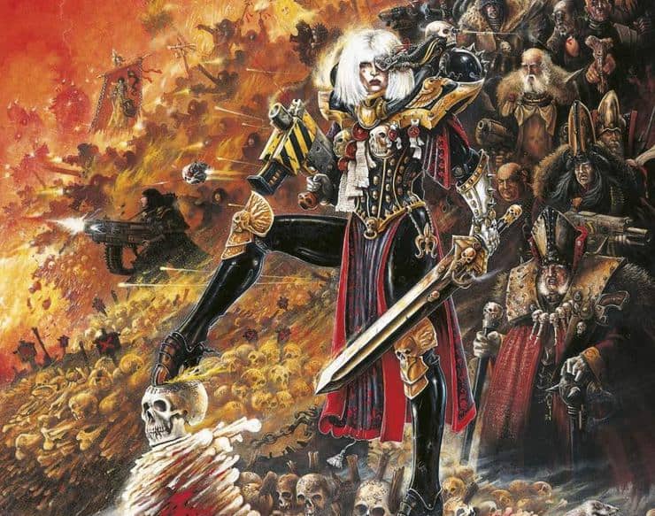
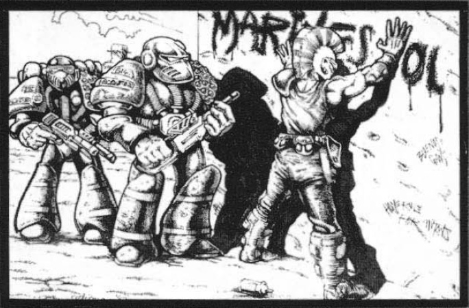
The first time I saw the original Rogue Trader cover art, I was hooked.
The over the top violence, anarchy and grim hopeless determination of that Crimson fist last stand was, and still is Iconic. To me that one image encapsulates and encompasses everything about 40k.
I don't think there is a better piece of art for the whole series. That cover IS 40k, it's never been bettered even by Blanche.
|
"All their ferocity was turned outwards, against enemies of the State, foreigners, traitors, saboteurs, thought-criminals" - Orwell, 1984 |
|
|
|
|
2021/02/06 03:17:01
Subject: Re:The art that sold you on 40k
|
|
Pestilent Plague Marine with Blight Grenade
|
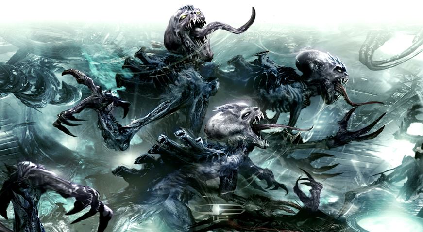
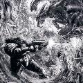
I would have to say these pieces. The raw nastiness and brutality of how these genestealers are portrayed really captivated me:
|
|
|
|
|
2021/02/06 03:58:13
Subject: Re:The art that sold you on 40k
|
|
Abel
|
Eldar Wraithguard.

|
Kara Sloan shoots through Time and Design Space for a Negative Play Experience |
|
|
|
|
0012/02/07 20:38:11
Subject: The art that sold you on 40k
|
|
Insect-Infested Nurgle Chaos Lord
|
Karol wrote:There is a picture of an ultramarine of crimsion fist land raider, that looks like a tank attack durning the battle of Somme. First art for w40k I ever saw, and I liked it very much.
This one?

It's a direct homage to the art of the Airfix Mk1 tank box.

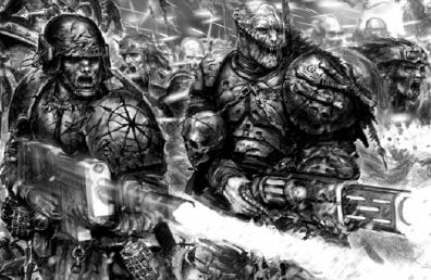
As for the art that go me into this, it was several. I remember being in the local toy shop and there being copies of Dark Millennium and various boxes for Space Marine the below one particularly sticks out in my mind:

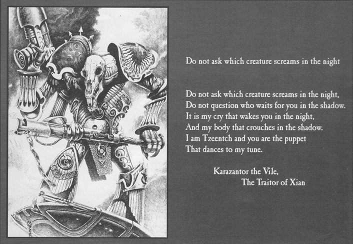
I had no idea what was going on, but it was in my subconscious for several years. I didn't get into 40k until a few years later via playing a prepainted game by Bluebird toys called Havok, the art of that which also had a dim 40k vibe to it. It wasn't truly until a friend lent me the various 2nd ed books that I was truly hooked with much of the artwork already shown ITT. The one that always stuck out for me in those books being the art of Karazantor the Vile and the accompanying text.
|

Games Workshop Delenda Est.
Users on ignore- 53.
If you break apart my or anyone else's posts line by line I will not read them. |
|
|
|
|
2021/02/07 20:58:01
Subject: The art that sold you on 40k
|
|

Fixture of Dakka
|
yes. It looks really nice.
|
If you have to kill, then kill in the best manner. If you slaughter, then slaughter in the best manner. Let one of you sharpen his knife so his animal feels no pain. |
|
|
|
|
2021/02/07 22:47:20
Subject: The art that sold you on 40k
|
|
Regular Dakkanaut
|
Show the “2000AD didn’t influence 40K” brigade this Judge Mortis fan art.
|
|
|
|
|
2021/02/07 23:26:02
Subject: The art that sold you on 40k
|
|
Fixture of Dakka
|
 Horla wrote: Horla wrote:
Show the “2000AD didn’t influence 40K” brigade this Judge Mortis fan art.
Only the ignorant can't see 200ADs influence.... I mean, what do they THINK the Adeptus Arbites were inspired by? Hive cities? The Necromunda gangs? SM bikes? Nice hefty eagle sculpts on shoulder pads?
|
|
|
|
|
2021/02/08 00:01:24
Subject: The art that sold you on 40k
|
|
Ancient Venerable Dreadnought
|
You should go read the thread in the background section....there are plenty denying it!
|
|
|
|
|
2021/02/08 00:34:24
Subject: The art that sold you on 40k
|
|
Krazy Grot Kutta Driva
|
The painting earlier in the thread of the Crimson Fist circled up started me in the hobby. Then the second edition Ork codex sealed the deal. Today's art just doesn't compare.
|
|
|
|
|
|
2021/02/08 01:23:25
Subject: The art that sold you on 40k
|
|
Fixture of Dakka
|
Racerguy180 wrote:You should go read the thread in the background section....there are plenty denying it!
Oh I don't doubt it.
|
|
|
|
|
2021/02/08 01:41:00
Subject: The art that sold you on 40k
|
|
Ancient Venerable Dreadnought
|
When you look at the beginnings of 40k thru the lense of current 40k, superficially there is no connection.
Go back 30+yrs and then look at nerd/geek/subversive pop culture thru that same lense, and it's painfully obvious.
|
|
|
|
|
2021/02/08 02:34:01
Subject: Re:The art that sold you on 40k
|
|

Secretive Dark Angels Veteran
Canada
|
 Hellebore wrote: Hellebore wrote:I think my first exposure to 40k in any form was the Space Crusade box cover.
I didn't think anything of it after I got it until I walked passed the hobby shop down the road and saw things very similar to it in the store. I picked up my first white dwarf (182) partly because of the amazing cover.
I was hooked at space crusade, but not necessarily due to it being 40k.
What absolutely cemented it was the art in the 2nd ed rulebooks. John Blanche has always been the soul of 40k, an artist that puts emotion into his art. While the other illustrators at GW are fantastic, I've always found JB's work to have an atmosphere nothing else can really match.
That was the cover of my first White Dwarf!
|
All you have to do is fire three rounds a minute, and stand |
|
|
|
|
2021/02/09 20:02:43
Subject: Re:The art that sold you on 40k
|
|
Bounding Assault Marine
United Kingdom
|
As someone who started with the release of Rogue Trader, for me it was the old black & white artwork that grabbed me and it's still something that gives the feels when I see it now, in a way which the modern colour art doesn't quite capture.
|
40k:  Space Marines (Rift Wardens) - 8050pts. Space Marines (Rift Wardens) - 8050pts.
T9A:  Vampire Covenants 2060pts. Vampire Covenants 2060pts. |
|
|
|
|
2021/02/11 08:38:33
Subject: Re:The art that sold you on 40k
|
|
Mutating Changebringer
|
I can never find a picture of it...
The image that made me say "yes, I shall partake in this warhammer thing" was the first Chaos codex of 3rd edition.
Specifically, the small image of the Obliterator next to their unit entry.
That furious looking Iron Warrior with a vindicator cannon sticking out of his chest captured my imagination like no other picture in all the 2nd ed books.
|
|
|
|
|
|
2021/02/11 09:08:17
Subject: Re:The art that sold you on 40k
|
|

The Dread Evil Lord Varlak
|
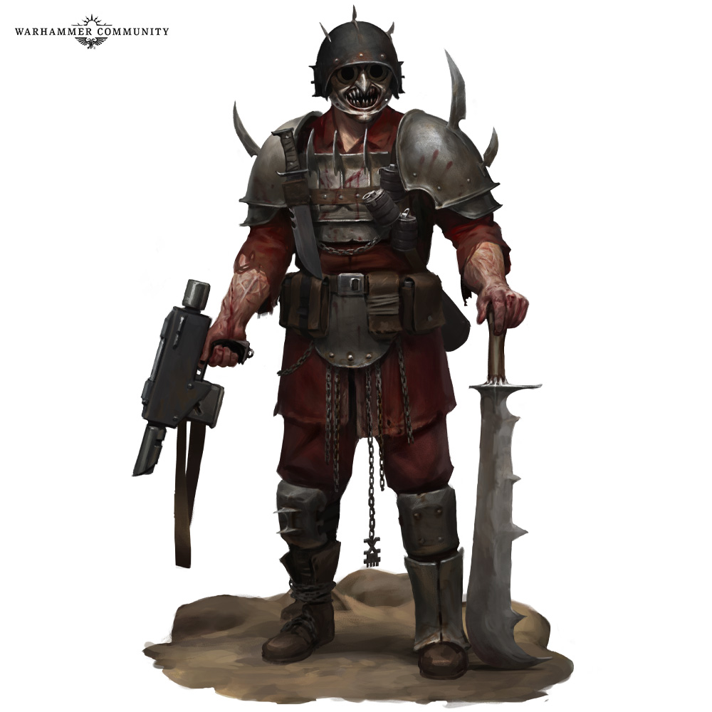
My permanent fav that cemented my like for Chaos was from the campaign the lost and the damned artwork within:
Then of course there's also that one of the Vraksian Militia member:

Bloodpact.
|
|
This message was edited 1 time. Last update was at 2021/02/11 09:08:57
https://www.dakkadakka.com/dakkaforum/posts/list/0/766717.page
A Mostly Renegades and Heretics blog.
GW:"Space marines got too many options to balance, therefore we decided to legends HH units."
Players: "why?!? Now we finally got decent plastic kits and you cut them?"
Chaos marines players: "Since when are Daemonengines 30k models and why do i have NO droppods now?"
GW" MONEY.... erm i meant TOO MANY OPTIONS (to resell your army to you again by disalowing former units)! Do you want specific tyranid fighiting Primaris? Even a new sabotage lieutnant!"
Chaos players: Guess i stop playing or go to HH. |
|
|
|
|
|
|