| Poll |
 |
|
|
|
| Author |
Message |
|
|
|
|
|
Advert
|
Forum adverts like this one are shown to any user who is not logged in. Join us by filling out a tiny 3 field form and you will get your own, free, dakka user account which gives a good range of benefits to you:
- No adverts like this in the forums anymore.
- Times and dates in your local timezone.
- Full tracking of what you have read so you can skip to your first unread post, easily see what has changed since you last logged in, and easily see what is new at a glance.
- Email notifications for threads you want to watch closely.
- Being a part of the oldest wargaming community on the net.
If you are already a member then feel free to login now. |
|
 |
2008/03/16 14:32:00
Subject: Paint test on my nids - Which looks best?
|
|

Longtime Dakkanaut
|
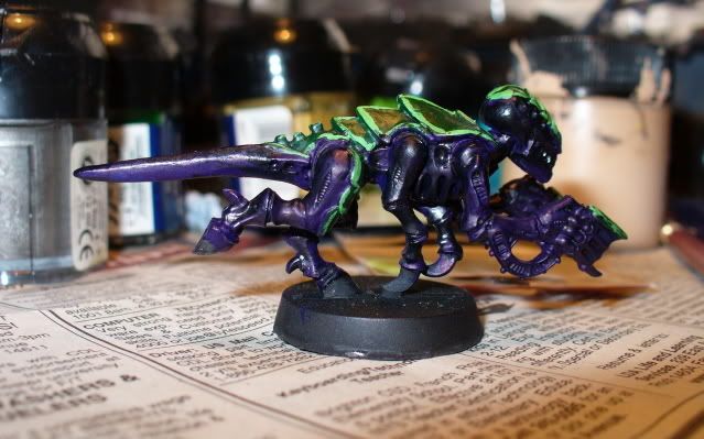
I tried a couple different techniques on the purple part of my nids here. Just wondering which people think looks best
Exhibit A:
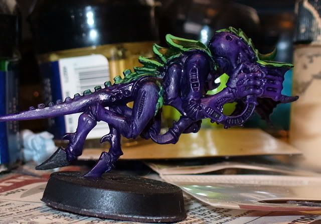
Exhibit B:
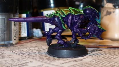
Exhibit C:
|
|
|
 |
|
2008/03/16 15:49:54
Subject: Paint test on my nids - Which looks best?
|
|

Regular Dakkanaut
|
They all look very similar with this camera and the flash on. A seems to have the best coverage while still leaving details. C is spotty and B looks like it filled in every crack.
|
|
This message was edited 1 time. Last update was at 2008/03/16 15:51:50
|
|
|
|
|
2008/03/16 16:18:50
Subject: Paint test on my nids - Which looks best?
|
|

Infiltrating Broodlord
|
A
Could you enlighten us what you did with'em?
Greets
Schepp himself
|
40k:  
Fantasy: Skaven, Vampires |
|
|
|
|
2008/03/16 16:31:52
Subject: Paint test on my nids - Which looks best?
|
|
Prescient Cryptek of Eternity
Mayhem Comics in Des Moines, Iowa
|
The third one looks darker and I'm not as fond of it, but the first two I can't tell a difference between.
|
|
|
|
|
|
2008/03/16 21:23:34
Subject: Paint test on my nids - Which looks best?
|
|
Longtime Dakkanaut
|
The base color on all of them is Midnight Blue.
The first one, I used Blue Ink then drybrushed with Liche Purple.
The second one is Blue Inked, then drybrushed with Midnight Blue again.
The third one is Black Inked and then drybrushed with Midnight Blue again.
|
|
|
|
|
2008/03/16 21:24:31
Subject: Paint test on my nids - Which looks best?
|
|
Ancient Chaos Terminator
South Pasadena
|
I cannot tell a difference in them. If the casual observer cannot clearly see a difference, then I recommend using whatever technique was the fastest for you.
Darrian
|
|
|
|
|
|
2008/03/16 22:40:48
Subject: Paint test on my nids - Which looks best?
|
|
Morally-Flexible Malleus Hearing Whispers
Well I kind of moved near Toronto, actually.
|
honestly, they all look the same.
maybe its the flash. Or maybe put them in the same picture.
|
|
|
|
|
|
2008/03/16 23:00:54
Subject: Paint test on my nids - Which looks best?
|
|
Secretive Dark Angels Veteran
Baltimore, MD
|
I agree with tacobake. I can't tell the difference.
|
Proud owner of  & & 
Play the game, not the rules.
|
|
|
|
|
2008/03/16 23:59:44
Subject: Paint test on my nids - Which looks best?
|
|
Ultramarine Land Raider Pilot on Cruise Control
|
I voted for A.
The differences are very subtle but after he mentioned it you can see them.
You can tell that C is darker (looke at the back of the head). For A and B its a little harder, you'll have to compare A's thigh to B's tail to notice the little bit of chalky-ness to it. Overall I think the purple drybrush gives it more of a pop, and taking pictures without the flash would help a ton.
|
|
|
|
|
|
2008/03/17 00:20:24
Subject: Paint test on my nids - Which looks best?
|
|
Secretive Dark Angels Veteran
Baltimore, MD
|
Um... if it's a "subtle" difference that one can hardly see in a closeup, nobody is going to notice from 10 feet away. At that point, does it really matter?
|
|
This message was edited 3 times. Last update was at 2008/03/17 00:27:06
Proud owner of &
Play the game, not the rules.
|
|
|
|
|
2008/03/17 18:26:03
Subject: Re:Paint test on my nids - Which looks best?
|
|
Crazed Witch Elf
Albuquerque, NM
|
I voted for B, but like everyone else I was sitting here thinking "Is this a trick question?"
|
Imperial Guard 
40k - 6-12-0
City Fight - 0-0-0
Planetstrike - 0-0-1
Apocolypse - 4-2-1 |
|
|
|
|
2008/03/17 20:13:15
Subject: Paint test on my nids - Which looks best?
|
|
Fixture of Dakka
|
Whew... I am glad it was not just me! I was thinking "Man, I always have sucked at 'find 10 differences!' puzzles."
I think A is superior, but I would not notice the difference even a few feet away.
|
|
|
|
|
|
2008/03/17 20:37:42
Subject: Paint test on my nids - Which looks best?
|
|
Growlin' Guntrukk Driver with Killacannon
No. VA USA
|
I think c looks a bit darker on the flesh, while a and b have hardly any difference.
I would say c is better looking for the flesh, but the pictures really make it hard to observe what's really going on.
|
A woman will argue with a mirror..... |
|
|
|
|
2008/03/17 21:04:34
Subject: Paint test on my nids - Which looks best?
|
|
Phanobi
|
I think you might need a lighter base color to really see a difference in techniques. That said, I like A the best.
Ozymandias, King of Kings
|
My name is Ozymandias, King of Kings.
Look on My works, Ye Mighty, and despair.
Chris Gohlinghorst wrote:Holy Space Marine on a Stick.
This conversation has even begun to boggle my internet-hardened mind.
A More Wretched Hive of Scum and Villainy |
|
|
|
|
2008/03/17 22:57:44
Subject: Re:Paint test on my nids - Which looks best?
|
|
Long-Range Ultramarine Land Speeder Pilot
|
I am gonna have to say that A looks the best to me.
B looks like its dipped in purple chrome.(Probably the flash from the camera)
C looks like you forgot to paint over the all of the areas with purple.
Just my two 
|
DQ:80+S+++G+MB++I+Pw40k96#++D++A++/sWD-R++++T(T)DM+
Note: D+ can take over 12 hours of driving in Canada. It's no small task here.
GENERATION 5: The first time you see this, copy and paste it into your sig and add 1 to the number after generation. Consider it a social experiment.
|
|
|
|
|
2008/03/17 23:32:15
Subject: Paint test on my nids - Which looks best?
|
|
Infiltrating Oniwaban
|
Have you considered drybrushing _before_ the ink with a much lighter shade, and then thinning your inks? you would probably get more contrast that way, while the ink would keep it all together.
|
Infinity: Way, way better than 40K and more affordable to boot!
"If you gather 250 consecutive issues of White Dwarf, and burn them atop a pyre of Citadel spray guns, legend has it Gwar will appear and answer a single rules-related question. " -Ouze |
|
|
|
|
2008/03/18 01:35:55
Subject: Paint test on my nids - Which looks best?
|
|
Focused Fire Warrior
|
I agree w/Darrian, cause lets face it you're going to paint alot of them, & sorry to say it but the layman/passer by isn't going to know the difference. I do like how the green stands out.
|
"Before I have to hit him I hope he has the sense to run" Jerry Garcia
"Blood is Freedom's Stain" Bruce Dickinson/Steve Harris |
|
|
|
|
2008/03/18 04:46:04
Subject: Paint test on my nids - Which looks best?
|
|
Nasty Nob on Warbike with Klaw
|
Savnock wrote:Have you considered drybrushing _before_ the ink with a much lighter shade, and then thinning your inks? you would probably get more contrast that way, while the ink would keep it all together.
Best advice in the thread, yet.
I suggest a 5:1 Water:Ink mix... or 6:1.
Eric
|
Black Fiend wrote: Okay all the ChapterHouse Nazis to the right!! All the GW apologists to the far left. LETS GET READY TO RUMBLE !!!
The Green Git wrote: I'd like to cross section them and see if they have TFG rings, but that's probably illegal.
Polonius wrote: You have to love when the most clearly biased person in the room is claiming to be objective.
Greebynog wrote:Us brits have a sense of fair play and propriety that you colonial savages can only dream of.
Stelek wrote: I know you're afraid. I want you to be. Because you should be. I've got the humiliation wagon all set up for you to take a ride back to suck city.
Quote: LunaHound--- Why do people hate unpainted models? I mean is it lacking the realism to what we fantasize the plastic soldier men to be?
I just can't stand it when people have fun the wrong way. - Chongara
I do believe that the GW "moneysheep" is a dying breed, despite their bleats to the contrary. - AesSedai
You are a thief and a predator of the wargaming community, and i'll be damned if anyone says differently ever again on my watch in these forums. -MajorTom11 |
|
|
|
|
|
|


