| Author |
Message |
 |
|
|
|
|
Advert
|
Forum adverts like this one are shown to any user who is not logged in. Join us by filling out a tiny 3 field form and you will get your own, free, dakka user account which gives a good range of benefits to you:
- No adverts like this in the forums anymore.
- Times and dates in your local timezone.
- Full tracking of what you have read so you can skip to your first unread post, easily see what has changed since you last logged in, and easily see what is new at a glance.
- Email notifications for threads you want to watch closely.
- Being a part of the oldest wargaming community on the net.
If you are already a member then feel free to login now. |
|
 |
2011/04/17 07:58:00
Subject: Jadpanzer IV
|
|

Fresh-Faced New User
|
|
|
|
 |
|
2011/04/17 10:43:13
Subject: Jadpanzer IV
|
|

Long-Range Black Templar Land Speeder Pilot
|
Wow thats really cool man well done loving the tracks
|
 Templars 1800pts Templars 1800pts   Guard 3600 pts Guard 3600 pts   Ba 3400. Ba 3400.  Grey Knights 3600 pts Grey Knights 3600 pts |
|
|
|
|
2011/04/17 14:46:02
Subject: Re:Jadpanzer IV
|
|
Ferocious Blood Claw
|
Really cool loving the scheme
|
|
|
|
|
2011/04/17 21:15:18
Subject: Jadpanzer IV
|
|

[DCM]
Procrastinator extraordinaire
|
It looks ok, but first off, get rid of the the figure in the tank, its way out of scale and it looks strange.
Sorry, but I don't like the camoflage, if you paint historic or even present day era models, you have to do the colour schemes right.
What scale is it? And what company is it from?
|
|
|
|
|
|
2011/04/27 08:45:18
Subject: Re:Jadpanzer IV
|
|

Flameguard
|
The figure is to scale. Both look to be at 15mm. Tanks were not THAT huge, a guys shoulder and head would fit in a hatch like that. But I agree about the scheme. The point of Ambush pattern camo is to blend, and having neon green doesn't work well. I think with historicals the challenge is to match the general look with personal style changes making the quality, not changing that general look.
|
|
|
|
|
2011/04/27 20:26:47
Subject: Re:Jadpanzer IV
|
|

Bounding Assault Marine
|
the figure looks to be almost so scale, here is a period photo: 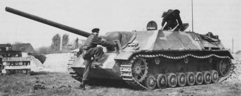
a bit bright camo wise but a nice idea
|
|
|
|
|
|
2011/04/27 23:50:21
Subject: Jadpanzer IV
|
|
Chalice-Wielding Sanguinary High Priest
Arlington TX, but want to be back in Seattle WA
|
Definately brighter that a typical camo scheme...but the final result looks fantastic! Really catches the eye.
|
4250 points of Blood Angels goodness, sweet and silky W12-L6-D4
 1000 points of Teil-Shan (my own scheme) Eldar Craftworld in progress 1000 points of Teil-Shan (my own scheme) Eldar Craftworld in progress
 800 points of unassembled Urban themed Imperial Guard 800 points of unassembled Urban themed Imperial Guard
 650 points of my do-it-yourself Tempest Guard 650 points of my do-it-yourself Tempest Guard
 675 points of Commoraghs finest! 675 points of Commoraghs finest!
The Dude - "Jackie Treehorn treats objects like women, man."
Lord Helmet - "I bet she gives great helmet."
|
|
|
|
|
2011/04/28 00:03:14
Subject: Re:Jadpanzer IV
|
|
Oberleutnant
|
Doesn't look all that unfeasible as a WW2 German scheme to me. Some of them are frankly quite painful to look at, and act more like dazzle paint than proper camo per se. When you've looked long and hard enough, it seems that the men of the Wermacht wore almost every combination of colours possible in an attempt to dodge bullets. As I recall, Battlefront did a nice page of colour swatches of German camo in their Art of War books. "Glowy" springs to mind.
|
"There's a time when the operation of the machine becomes so odious—makes you so sick at heart—that you can't take part. You can't even passively take part. And you've got to put your bodies upon the gears and upon the wheels, upon the levers, upon all the apparatus, and you've got to make it stop. And you've got to indicate to the people who run it, to the people who own it that unless you're free, the machine will be prevented from working at all" Mario Savio |
|
|
|
|
2011/04/28 05:26:19
Subject: Jadpanzer IV
|
|

Long-Range Ultramarine Land Speeder Pilot
|
Great job mate!
|
"Each path must be chosen with care,
Lest disaster swallow us whole."
Varo Tigurius
Ultramarines Chief Librarian

Wh40k: Ultramarines, Blood Angels, Dark Angels, Space Wolves, Black Templars, Grey Knights, Imperial Guard, Inquisition, Eldar, Dark Eldar, Harlequins, Tyranids, Orks, Chaos Space Marines, Daemons of Chaos.
Wh: Dark Elves, Vampire Counts, Empire, Dwarfs, High Elves, Warriors of Chaos, Bretonnia. |
|
|
|
|
2011/04/28 08:33:02
Subject: Re:Jadpanzer IV
|
|
Lord Commander in a Plush Chair
|
spackledgoat wrote:The figure is to scale. Both look to be at 15mm. Tanks were not THAT huge, a guys shoulder and head would fit in a hatch like that.
The man's shoulders look too wide to fit through the hatch, he's grossly disproportionate in scale.
Here's a model made in better proportion.
http://www.modellversium.de/galerie/img/9/3/3/2933/41627/jagdpanzer-iv-l-70-italeri.jpg
But I agree about the scheme. The point of Ambush pattern camo is to blend, and having neon green doesn't work well. I think with historicals the challenge is to match the general look with personal style changes making the quality, not changing that general look.
He uses two shades of brown, green and yellow which doesn't seem right to me, and there's the little spots that are different colours again. I've never seen something use more than three colours for the basic scheme. The little blobs all over don't look right either, they're too bright and there's too many of them. But the ambush scheme is a hard one to pull off even on bigger models, what with different colours and the application of spots, size and frequency, it's very difficult to get it looking attractive.
|
|
|
|
|
2011/04/28 11:25:16
Subject: Re:Jadpanzer IV
|
|
Oberleutnant
|
Howard A Treesong wrote:spackledgoat wrote:The figure is to scale. Both look to be at 15mm. Tanks were not THAT huge, a guys shoulder and head would fit in a hatch like that.
The man's shoulders look too wide to fit through the hatch, he's grossly disproportionate in scale.
Here's a model made in better proportion.
http://www.modellversium.de/galerie/img/9/3/3/2933/41627/jagdpanzer-iv-l-70-italeri.jpg
But I agree about the scheme. The point of Ambush pattern camo is to blend, and having neon green doesn't work well. I think with historicals the challenge is to match the general look with personal style changes making the quality, not changing that general look.
He uses two shades of brown, green and yellow which doesn't seem right to me, and there's the little spots that are different colours again. I've never seen something use more than three colours for the basic scheme. The little blobs all over don't look right either, they're too bright and there's too many of them. But the ambush scheme is a hard one to pull off even on bigger models, what with different colours and the application of spots, size and frequency, it's very difficult to get it looking attractive.
IN the first part, the model looks to be a Battlefront one. They have a tendency to make "pumpkinhead" figures, which is probably what is throwing off the look of it.
As far as the second goes: Due to the nature of field applied camo, there is huge variety in the nature of application, or even the mediums used, or the tools used to apply it. If "ambush" is tricky for people who spend every hour of their waking life trying to paint camo on things, imagine how tricky it is to get right for serving soldiers in a warzone using a mop and mucky water. Add in the effects of weathering, fading and general abuse, and its surprising that any two vehicles in any theatre look at all similar.
|
"There's a time when the operation of the machine becomes so odious—makes you so sick at heart—that you can't take part. You can't even passively take part. And you've got to put your bodies upon the gears and upon the wheels, upon the levers, upon all the apparatus, and you've got to make it stop. And you've got to indicate to the people who run it, to the people who own it that unless you're free, the machine will be prevented from working at all" Mario Savio |
|
|
|
|
|
|


 THE EMPEROR PROTECTS