| Author |
Message |
 |
|
|
|
|
Advert
|
Forum adverts like this one are shown to any user who is not logged in. Join us by filling out a tiny 3 field form and you will get your own, free, dakka user account which gives a good range of benefits to you:
- No adverts like this in the forums anymore.
- Times and dates in your local timezone.
- Full tracking of what you have read so you can skip to your first unread post, easily see what has changed since you last logged in, and easily see what is new at a glance.
- Email notifications for threads you want to watch closely.
- Being a part of the oldest wargaming community on the net.
If you are already a member then feel free to login now. |
|
 |
2013/01/21 03:59:15
Subject: Dark Angels - New Models - Librarian, Belial, and Alternate color scheme test model
|
|

Regular Dakkanaut
|
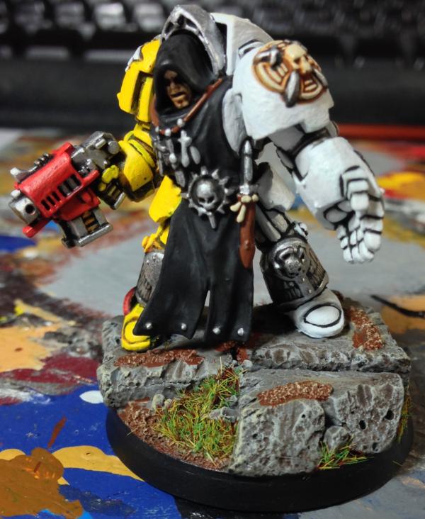
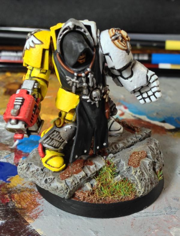
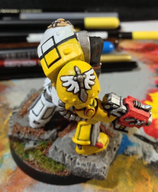
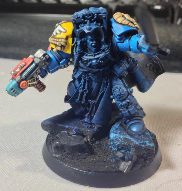
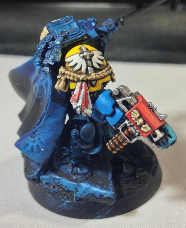
Below is the start of my Deathwing Army. I am trying to lock down a color scheme. I dont want to do something traditional. I did a test model in white / yellow split. I am satisfied with the technique, but I dont think I like the model. I have converted my own librarian and belial, and I have `20 terminators assembled to far. I am going to do they all in robes. I also think I am going to add in two of the new fliers.
The librarian is made from the terminator body. I chopped off the right arm, and added Belial's Sword of Silence arm. The arm is half a grey knight arm and half the belial arm. I then chopped off the sword and added a grey knight force sword. For the gun arm, I used a grey knight arm. Its actually quite easy because the arms for the new DA and GK are close to the same. I just had to do a little cutting on the combi weapon since it was originally for a left arm. Finally, I added one of the DA Cloaks from the new kit. I also had a Exorcist shoulder pad lying around from a Badab War army. I added it as a librarian shoulder pad.
Any suggestions on an alternate color scheme?
What is your take on the current test model?
Thoughts on the Librarian or Belial conversion?


|
|
|
 |
|
2013/01/21 05:10:31
Subject: Re:Dark Angels - New Models - Librarian, Belial, and Alternate color scheme test model
|
|
Fixture of Dakka
West Michigan, deep in Whitebread, USA
|
I really like the halved color scheme, the effect is really striking! I was originally going to paint my Terminators in a "quartered" color scheme (as if you had done yellow on the left torso and right legs and then white vice versa).
An entire army should look very cool!
|
       
"By this point I'm convinced 100% that every single race in the 40k universe have somehow tapped into the ork ability to just have their tech work because they think it should." |
|
|
|
|
2013/01/21 05:25:33
Subject: Dark Angels - New Models - Librarian, Belial, and Alternate color scheme test model
|
|

Lone Wolf Sentinel Pilot
|
I like the cartoony thing you're doing with the black lining. Your paint looks like it could do with a bit of thinning though.
The librarian conversion and Belial are equally nice. But one thing that really stood out was the librarian looks like he's wearing two suits of terminator armour! That bit above his hood, isn't there a way to cut it off?
|
|
|
|
|
2013/01/21 05:29:30
Subject: Dark Angels - New Models - Librarian, Belial, and Alternate color scheme test model
|
|
Fixture of Dakka
|
The yellow/white spilt is really good mix. I how ever am not a fan of the solid black line bisecting the two colours. The black cloth looks good, the line does not. I also agree that your paint could use some thinning.
The Librarian conversion looks really good. Any more pictures of it?
|
|
|
|
|
|
2013/01/21 05:31:17
Subject: Re:Dark Angels - New Models - Librarian, Belial, and Alternate color scheme test model
|
|
Fixture of Dakka
West Michigan, deep in Whitebread, USA
|
But one thing that really stood out was the librarian looks like he's wearing two suits of terminator armour! That bit above his hood, isn't there a way to cut it off?
I believe that's an "open book" bit, not armor.
|
"By this point I'm convinced 100% that every single race in the 40k universe have somehow tapped into the ork ability to just have their tech work because they think it should." |
|
|
|
|
2013/01/21 16:12:01
Subject: Dark Angels - New Models - Librarian, Belial, and Alternate color scheme test model
|
|

Fresh-Faced New User
|
Liking the combi-plasma you've done on the libby
|
|
|
|
|
|
2013/01/21 16:30:27
Subject: Re:Dark Angels - New Models - Librarian, Belial, and Alternate color scheme test model
|
|

Longtime Dakkanaut
|
as already said, white and yellow both need lots of thinner. both are somewhat difficult to work with.
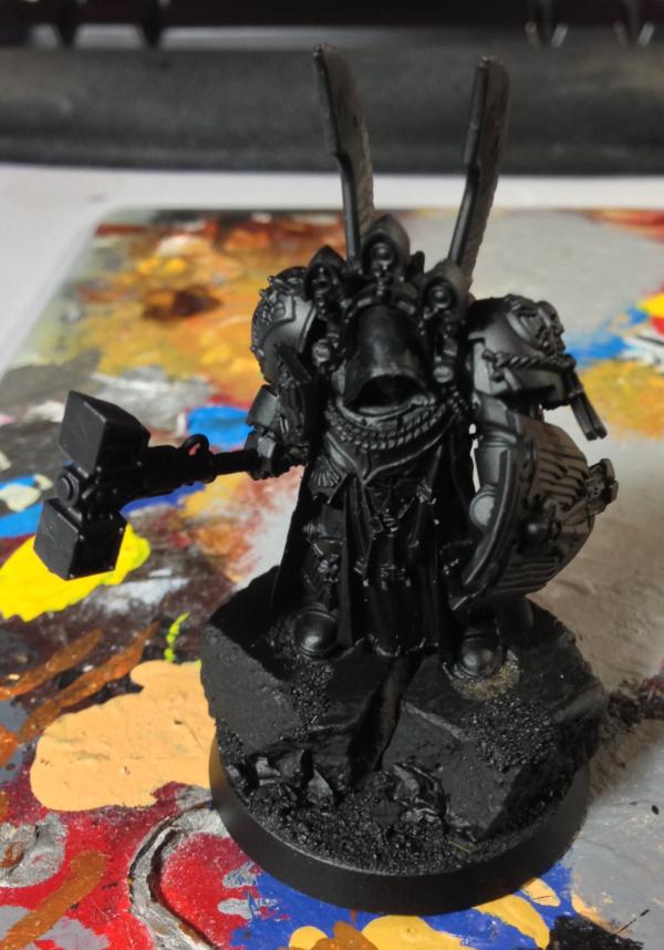
priming black is obviously not a good choice if you're going to go with that colour scheme.
|
|
|
|
|
2013/01/21 16:30:56
Subject: Dark Angels - New Models - Librarian, Belial, and Alternate color scheme test model
|
|
Been Around the Block
|
nice bases
|
|
|
|
|
|
2013/01/21 17:58:16
Subject: Dark Angels - New Models - Librarian, Belial, and Alternate color scheme test model
|
|
Fresh-Faced New User
|
Seconded! What are you using to create the chunks of rock?
|
|
|
|
|
2013/01/21 19:33:23
Subject: Dark Angels - New Models - Librarian, Belial, and Alternate color scheme test model
|
|
Wicked Canoptek Wraith
Mandragora, Eastern Fringe
|
I'm just mirroring what everyone else is saying. Thin down the paints.
My only other suggestion is instead of basing straight black with spray, use a thinned down black or a black wash to base. The end details will pop more because there is a thinner layer of paint as the base and the layers are also thinner.
Overall though, great job!
|
|
This message was edited 1 time. Last update was at 2013/01/21 19:35:31
Sautekh Dynasty 5000 pts
|
|
|
|
|
2013/01/21 20:03:43
Subject: Re:Dark Angels - New Models - Librarian, Belial, and Alternate color scheme test model
|
|
Lone Wolf Sentinel Pilot
|
 AegisGrimm wrote: AegisGrimm wrote:But one thing that really stood out was the librarian looks like he's wearing two suits of terminator armour! That bit above his hood, isn't there a way to cut it off?
I believe that's an "open book" bit, not armor.
Ah. Ignore what I said please ! 
|
|
|
|
|
2013/01/21 20:03:50
Subject: Re:Dark Angels - New Models - Librarian, Belial, and Alternate color scheme test model
|
|

Longtime Dakkanaut
|
Was said above but can't be stressed enough - doesn't make sense to paint yellow and white on black primer. Good job though, in the same conditions I would create a caricature.
|
From the initial Age of Sigmar news thread, when its "feature" list was first confirmed:
Kid_Kyoto wrote:
It's like a train wreck. But one made from two circus trains colliding.
A collosal, terrible, flaming, hysterical train wreck with burning clowns running around spraying it with seltzer bottles while ring masters cry out how everything is fine and we should all come in while the dancing elephants lurch around leaving trails of blood behind them.
How could I look away?
|
|
|
|
|
2013/01/23 04:39:30
Subject: Re:Dark Angels - New Models - Librarian, Belial, and Alternate color scheme test model
|
|
Regular Dakkanaut
|
Thanks a ton for all the feed back. Its odd the paint looks so thick in the pictures because the paint is quite thinned out. I use a wet pallet. I will try keeping it a little thinner on my next model. These scheme is growing on me, and I think it will look alot better with a full squad. I also think the contrast on the battle field will stand out. The bit on the top of the librarian is an open book piece. The model looks like it has two tops because of the psychic hood. The bases are done with Gale Force 9 cement blocks and rocks / sand. Pics below of my Librarian in progress. I have done the right arm and so far.
|
|
|
|
|
2013/01/23 04:56:57
Subject: Re:Dark Angels - New Models - Librarian, Belial, and Alternate color scheme test model
|
|
Lone Wolf Sentinel Pilot
|
donkeee wrote:Thanks a ton for all the feed back. Its odd the paint looks so thick in the pictures because the paint is quite thinned out. I use a wet pallet. I will try keeping it a little thinner on my next model.
If that's the case, I think you're putting your camera too close to your models. Cameras are annoyingly good at picking up fine details on macro mode, so try pulling it back a couple of cm next time
|
|
|
|
|
|
|